Material Design Buttons in Android with Example - Software Development PDF Download

Material Design Buttons in Android with Example
Last Updated: 02 Sep, 2020Material Design Components (MDC Android) provide a way for designers and developers to incorporate Material Design into their Android applications. Developed by a team at Google, these components streamline the development process for creating visually appealing and functional Android apps.
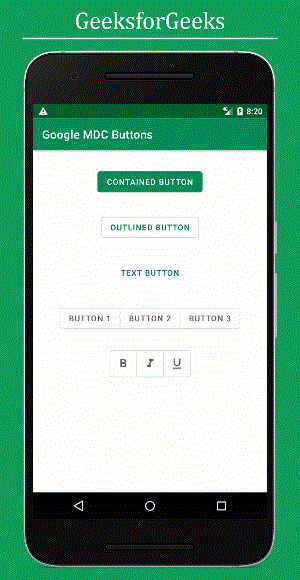
If you appreciate the UI elements from Google Material Design Components for Android, then you might be interested in Google Material Design Components (MDC) Buttons. A button is a key UI element used to trigger actions when clicked or tapped. There are four main types of buttons in Google Material Design Components:
- Contained Button
- Outlined Button
- Text Button
- Toggle Button
Before delving into the implementation of these buttons, let's explore why opting for these material components is advantageous over using ordinary built-in components in Android:
- Choosing material components saves time and enhances the app's visual appeal, making user interactions smoother for developers.
- For instance, when creating a ripple effect for buttons, Google MDCs eliminate the need for manually creating a ripple layout, unlike ordinary buttons.
- Google Material Design Components are open source and free, allowing for contribution and widespread adoption across platforms like Android, iOS, Flutter, and web applications.
- Furthermore, Google MDCs offer support for cross-platform development, ensuring consistency across different operating systems.
- Notably, Google MDC buttons seamlessly adapt to system theme changes, such as switching to a Dark Theme, by adjusting their colors and backgrounds accordingly. In contrast, ordinary widgets do not automatically adjust to such theme changes.
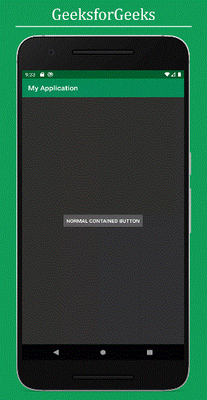
Illustration of a Normal Contained Button's behavior under a dark theme.
- Creating a New Project in Android Studio: Begin by creating a new project in Android Studio. For detailed steps, you can refer to the process of starting a new project in Android Studio.
- Adding Required Dependency: To integrate Google Material Design components, include the necessary dependency in the build.gradle file. Remember to sync the project after adding the dependencies.
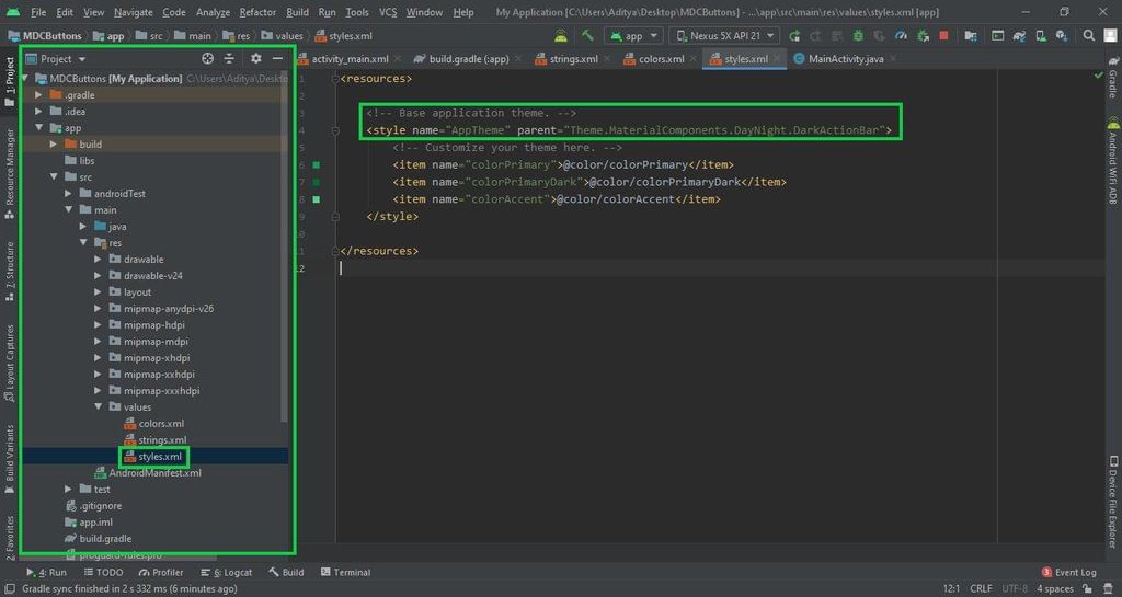
- Changing the Base Application Theme: Navigate to the styles.xml file in the app directory and modify the base application theme to accommodate MaterialComponents. This step is crucial for utilizing Google MDC widgets in your Android application.
Creating a New Project in Android Studio
- Start by creating a new project in Android Studio.
- Refer to instructions on how to initiate a new project in Android Studio.
Adding Required Dependency
- Integrate the Google Material Design components by adding the necessary dependency in the build.gradle file.
- After adding dependencies, ensure to synchronize the project by clicking on the "Sync Now" button.
Changing the Base Application Theme
- Access the styles.xml file located in app -> src -> main -> res -> values directory.
- Adjust the application's base theme to support MaterialComponents for utilizing Google MDC widgets.
- It's essential to switch to the Material theme to leverage all Google MDC components in your Android app.
- Using AppCompat action bar theme may lead to immediate crashes upon app launch due to incompatibility with Google MDC components.
Why Change the Theme?
- Google Material Design components are encapsulated within the MaterialTheme for Android applications.
- Opting for the AppCompat action bar theme can result in application crashes post-launch.
Styles.xml Configuration
If you encounter difficulties with the aforementioned steps, you can refer to the provided image for guidance.
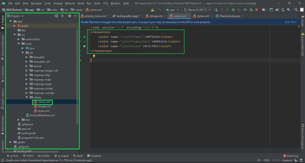
Step 4: Changing Application Colors
Changing the color scheme of the application is an optional step. To do this:
- Go to app -> src -> main -> res -> colors.xml file.
The colors.xml file contains color values defined like:
| Color Name | Color Value |
|---|---|
| colorPrimary | #0f9d58 |
| colorPrimaryDark | #006d2d |
| colorAccent | #55cf86 |
If you need visual guidance, refer to the provided image of colors.xml:
Step 5: Adding Google MDC Buttons
In the activity_main.xml file, we will design Google MDC buttons based on user requirements. There are different styles for these buttons:
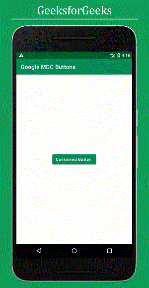
- Button Style 1: Contained Button
Contained buttons are prominent buttons with elevation and fill, signifying primary app actions. The default style is the contained button. Below is the XML code for the contained button:
- XML Code
Ensure to set the style attribute for each button style accordingly.
For instance, a contained button would look like:
Android Constraint Layout
- Android Constraint Layout is a layout type in Android development that allows you to create flexible layouts using constraints to define the position of UI elements.
- It helps in creating complex UI designs with a flat view hierarchy, which is efficient for the system to render.
- Constraints define the position of a UI element relative to other elements or parent layout.
- For example, you can specify that a button should be positioned vertically in the center of the screen using constraints.
Main Features of Android Constraint Layout
- Responsive Design: Constraint Layout helps in creating responsive UIs that adapt well to different screen sizes and orientations.
- Chains: Elements can be connected in chains to create flexible layouts that adapt to changes in one or more elements.
- Bias: The bias attribute allows you to position an element closer to one of its constraints.
- Guidelines: Guidelines are invisible helper lines that assist in placing elements relative to them.
Benefits of Using Constraint Layout
- Simplified UI Hierarchies: Constraint Layout reduces the complexity of nested view hierarchies, making layouts easier to manage.
- Improved Performance: By using Constraint Layout, you can achieve better performance compared to nested layouts like RelativeLayout or LinearLayout.
- Flexibility: It offers a high degree of flexibility in positioning elements, making it easier to create dynamic UIs.
- Visual Layout Editor: Android Studio provides a visual editor for Constraint Layout that simplifies the process of designing layouts.
Output UI:
Button Styles
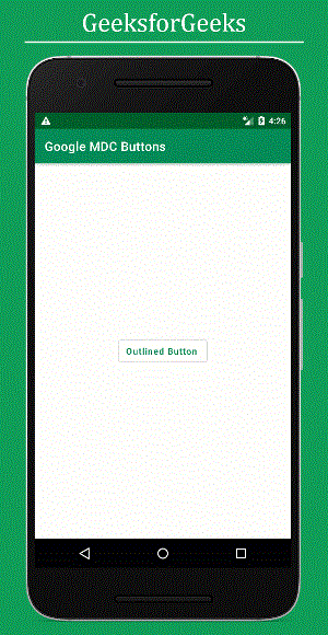
Outlined Button
Outlined buttons are buttons with medium emphasis. They are used for important actions in an app that are not the primary action. These buttons provide more emphasis than text buttons due to their stroke.
Below is the XML code for the Outlined button:
Text Button
Text buttons are mainly used for actions that are less pronounced, such as those found in dialogs and cards. In cards, text buttons help to maintain focus on the card content. These buttons are typically used for less important actions.
Below is the XML code for the Text button:
Button Style 4: Toggle Button
- Toggle buttons group a set of actions using layout and spacing.
- They are utilized less frequently than other button variants.
Types of Toggle Buttons
- Toggle Button
- Toggle Button with icons
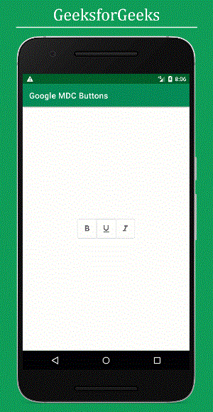
Toggle Button with icons
- Pre-Task for Button Implementation
- Before delving into the design aspect, some preliminary tasks are necessary for the implementation of these two buttons. It is essential to modify the styles and attributes such as padding and margin of the buttons in the toggle group. To achieve this, open the 'styles.xml' file located in the 'values' folder and include the following code snippet:
- Snippet from styles.xml:
<resources> <style name="AppTheme" parent="Theme.MaterialComponents.DayNight.DarkActionBar"> <item name="colorPrimary">@color/colorPrimary</item> <item name="colorPrimaryDark">@color/colorPrimaryDark</item> <item name="colorAccent">@color/colorAccent</item> </style> <style name="Widget.App.Button.OutlinedButton.IconOnly" parent="Widget.MaterialComponents.Button.OutlinedButton"> <item name="iconPadding">0dp</item> <item name="android:insetTop">0dp</item> <item name="android:insetBottom">0dp</item> <item name="android:paddingLeft">12dp</item> <item name="android:paddingRight">12dp</item> <item name="android:minWidth">48dp</item> <item name="android:minHeight">48dp</item> </style> </resources> - Design Customization
- The specified attributes and styles exclusively impact the MaterialButtonToggleGroup widget. Notably, the styles are applicable only to the Widget.App.Button.OutlinedButton.IconOnly style, inheriting from Widget.MaterialComponents.Button.OutlinedButton. Key attributes that are modified include iconPadding, insetTop, insetBottom, paddingLeft, paddingRight, minWidth, and minHeight.
- Toggle Button Functionality
- The toggle button serves the purpose of switching between two states, typically representing an 'on' and 'off' state. It allows users to alternate between options with a single click, providing a clear visual indication of the current selection.
Toggle Button XML Code
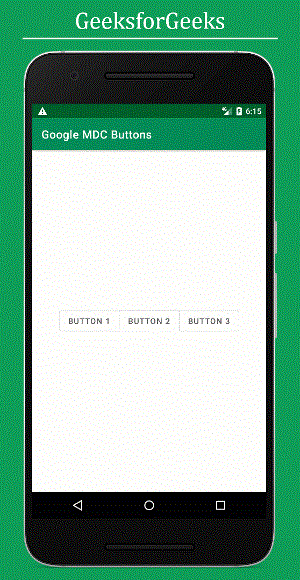
- To highlight collections of related toggle buttons, it's recommended that a group shares a common container. Below is the XML code for the Toggle button:
Toggle Button with icons:
XML Structure for Toggle Button
- The XML structure for a toggle button involves a ConstraintLayout container from the AndroidX library.
- Instead of using a regular ToggleButton, the Google Material Design Components (MDC) library offers MaterialButtonToggleGroup for grouped buttons.
- Each button within the MaterialButtonToggleGroup is defined using the Button tag.
- Attributes like id, style, layout_width, layout_height, and text are specified for each button.
- For instance, Button 1, Button 2, and Button 3 are included within the MaterialButtonToggleGroup.
Implementing Toggle Button with Icons
- To add toggle button with icons, import the necessary icons into the drawable folder.
- Icons such as format_black, format_italic, and format_underline can be imported.
- Import icons by right-clicking on the drawable folder, selecting Vector Asset, and choosing the desired icons.
Importing Icons to Drawable Folder
- After selecting Vector Asset, choose the specific icon you wish to import into the drawable folder.
- Ensure that the desired icons are successfully imported before proceeding.
XML Code for Toggle Button with Icons
- Integrate the following XML code into the activity_main.xml file:
Additional Information
- For more components such as alert dialogue, SnackBars, etc., refer to the official documentation.
- Explore further resources and customization options through official channels.
Please Login to comment...
LoginLike
ppt
,Extra Questions
,mock tests for examination
,Semester Notes
,Material Design Buttons in Android with Example - Software Development
,shortcuts and tricks
,study material
,Sample Paper
,Summary
,practice quizzes
,Material Design Buttons in Android with Example - Software Development
,Important questions
,Previous Year Questions with Solutions
,Material Design Buttons in Android with Example - Software Development
,MCQs
,Exam
,Free
,Viva Questions
,Objective type Questions
,video lectures
,past year papers
;


Material Design Buttons in Android with Example Free PDF Download
Importance of Material Design Buttons in Android with Example
Material Design Buttons in Android with Example Notes
Material Design Buttons in Android with Example Software Development Questions
Study Material Design Buttons in Android with Example on the App
|
© EduRev
|
Education Revolution
|


|