Overview: Bar Charts/Graphs | CSAT Preparation - UPSC PDF Download
| Table of contents |

|
| Importance in CSAT |

|
| Bar Charts/Graphs |

|
| Different Parts of a Bar Chart |

|
| Types of Bar Charts |

|
| Type II Grouped Multiple Bar Chart |

|
Importance in CSAT
As per the analysis of Previous Years’ Papers, it has come to notice that, in years 2022-2018, no question was asked from this chapter. While in year 2023, only one question was asked from this chapter. But no one can predict the trend of UPSC, so it is necessary to prepare all the topics very well. These questions can be based on ratio, percentage and analysis of graphs, etc.
Bar Charts/Graphs
Charts and graphs provides the numerical data in a well organised and easily recognisable form. Hence, they become easy to understand and facilitate comparisons. They have been using extensively, since time immemorial, as due to their visual impact they save a lot of time and effort.

Bar chart or bar graph is one of the oldest and most commonly used diagram for presenting data. It is a chart with rectangular bars (equidistant from each other) with lengths proportional to the values which they represent. Bar graphs are one-dimensional diagrams which have either vertical or horizontal bars. The thickness of the bars is not relevant to the data. The value of the bar is determined by the height of the bar. Therefore, it becomes easy to compare the values of a variable.
Bar diagrams are visual aids for presenting statistical data. Very often in bar charts, different colours, shades, dots, dashes, etc., are used in the bars to distinguish between different continuous variables being represented. There will always be an explanatory index indicating the meanings of the different colours, shades and markings.
⇒ It should be noted that in a bar chart what matters is the length of the bar and not the width of the bar.
Different Parts of a Bar Chart
Now, let’s look at the components of a bar chart individually.
- Graph title: The graph title gives an overview of the information being presented in the graph. The title is given at the top of the graph.
- Axes and their labels: Each graph has two axes. The axes labels tell us what information is presented on each axis. One axis represents data groups while the other represents the amounts or frequencies of the data groups.
- Grouped data axis: The grouped data axis is always at the base of the bars.
- This axis displays the type of data being graphed.
- Frequency data axis: The frequency axis has a scale that is a measure of the frequencies or amounts of the different data groups.
- Axes scale: Scale is the range of the values being presented along the frequency axis.
- Bars: The bars are rectangular blocks that can have their base at either vertical axis or horizontal axis.
Each bar represents the data for one of the data groups.

Following Points to be Kept in Mind
While Attempting the Questions Based on Bar Charts/Graphs
- Give proper attention to the title of the bar graph as it provides the basic information related to the bar graph.
- Learn carefully the techniques of calculation of averages, ratio, percentange; etc., as these play a vital role in solving the questions.
- Properly analyse the data given in graph and give full attention to the scales followed.
Types of Bar Charts
There are there types of bar charts :
Type I Simple Bar chart
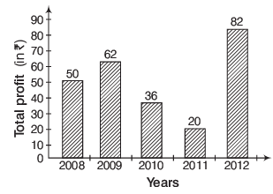
A simple bar chart is used to represent only one variable. The values of the variable may relate to different years or different items.
The above graph shows the total profits of WIPRO in rupees in various respective years.
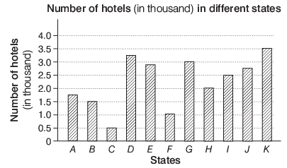
Directions (Illustrations 1-3) Study the graph carefully to answer the questions that follow.
Illustration 1: Number of hotels in state J is what per cent of the total number of hotels from all the states together?
(a) 15.12%
(b) 17.24%
(c) 9.36%
(d) 11. 15%
Sol: (d) Number of hotels in state J = 2.75 thousand Number of hotels in all the states = 1.75 + 1.5 + 0.5 + 3.25 + 2.9 + 1 + 3 + 2 + 2.5 + 2.75 + 3.5
= 24.65 thousand
Illustration 2: The respective ratio between number of hotels in state E to those in state I is approx. 11 : 10.
How many more hotels in state I would make the ratio between state E and state I 11 : 13, respectively?
(a) 920
(b) 550
(c) 300
(d) 800
Sol: (a) Number of hotels in state E = 2.9 thousand Number of hotels in state I = 2.5 thousand Let a hotels be added to state I.
Then,
⇒ 2.9 × 13 = 11 × 2.5 + 11 × a
⇒ 11a = 37.7 − 27.5 = 10. 2
∴
= 920 (approx)
Illustration 3: Total number of hotels from states B, D and F together form approximately what per cent of the total number of hotels from all states together?
(a) 19%
(b) 23%
(c) 40%
(d) 32%
Sol: (b) Number of hotels from states B, D and F
= 1.5 + 3.25 + 1 = 5.75 thousand
∴ Required percentage = 
= 23.32% ≈ 23%
Type II Grouped Multiple Bar Chart
In this type two or more bars are constructed adjoining each other to represent either different components of a total or to show multiple variables.
The above graph shows the average salaries of graduate from IIM-A and IIM-B in lakh per annum having different specialisations.
In such type of questions, we have to deal with more than one bar chart for a particular subject or it can be said that bar charts are combination of two or more than two bar charts.
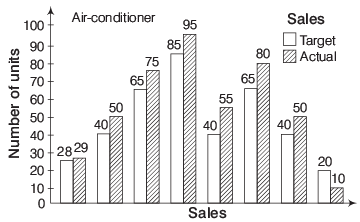
Illustration 4: A company manufacturing air conditioners set a monthly target. The target and realised values are shown in the bar chart.
Consider the following statements based on the chart.
I. The targeted sales on a monthly basis have been achieved.
II. The overall target value has been exceeded by 7.5% .
III. The sales department deserves a pat on the back.
Which of the above statements is/are correct?
(a) Only I
(b) Only II
(c) I and II
(d) II and III
Sol: (b) After the observation of bar chart and above statements, it is clear that except one month, each month target sale is less than actual sale, so Statement I is wrong and when sale is automatically in flow, so no need to pat on the back of sales department, so Statement III is also incorrect. It is true that overall target value has been exceeded by 7.5% by the help of bar chart. Hence, only statement II is correct.
Type III Composite / Stacked Bar Chart
In general, composite bar diagram is used to show the breakdown of a total into its component parts. A composite bar chart is used to represent various parts or subclasses of total magnitude of a given variable.
A → Expenditure on defence
B → Expenditure on education
C → Expenditure on plan implementation
D → Expenditure on subsidy
The above stacked bar graph shows the expenditure of Indian Government in various sectors in 9th and 10th five year plans, respectively.
In such type of questions, we have to deal with subdivided bar chart that contain more than one variable as the subclasses of total magnitude.
|
208 videos|137 docs|138 tests
|
FAQs on Overview: Bar Charts/Graphs - CSAT Preparation - UPSC
| 1. What is the purpose of using bar charts/graphs in data visualization? |  |
| 2. What are the different parts of a bar chart? |  |
| 3. What are the types of bar charts that can be used for data visualization? |  |
| 4. What is a Type II Grouped Multiple Bar Chart? |  |
| 5. How can bar charts/graphs help in analyzing data and making informed decisions? |  |

|
Explore Courses for UPSC exam
|

|


