Year 7 Exam > Year 7 Notes > Pie Charts
Pie Charts - Year 7 PDF Download
Key points
 Image caption
 - A pie chart is a graphical representation used to illustrate proportions in a sample of data. It shows a part-to-whole comparison, where each part of a ratio is depicted as a fraction of the entire set. For example, in the ratio 3 : 5, the first part represents 3/8 of the whole dataset. This aids in understanding proportions within a dataset.
- The structure of a pie chart resembles a circle divided into sectors, each sector representing a proportion of the total data sample. The angle of each sector corresponds to the proportion it represents. If colors are used to differentiate sectors, a legend should accompany the chart to explain each color's significance.
- Percentages can be utilized to represent the proportions in a pie chart, making it easier to comprehend the distribution visually. Each percentage reflects a portion out of one hundred, providing a clear indication of the relative sizes of the sections.
- Drawing a pie chart accurately involves using a protractor to measure and draw the angles of each sector. Familiarity with protractor usage is essential for creating precise and informative pie charts.
Proportion
- A proportion is a part-to-whole comparison, where each part of a ratio is seen as a fraction of the whole. For instance, in the ratio 3 : 5, the first part constitutes 3/8 of the whole, showcasing a proportion of the entire entity.
- Understanding proportions is crucial in various scenarios like finance, cooking recipes, and statistical analysis.
Sector
- A sector refers to a portion of a circle demarcated by two radii and an arc.
- In real-life applications, sectors are commonly used in fields such as engineering (for sector gears) and geometry (to calculate areas of shaded regions).
Angle of Sectors
- The angle of each sector symbolizes the proportions within the complete dataset or sample used in a survey.
- For example, in a pie chart representing sales data, each sector's angle denotes the percentage of total sales contributed by a specific category.
Understanding Pie Charts
- If the sectors are colored, a key should be included to explain what each color represents.
- The proportions in a pie chart may be represented as a percentage - a proportion out of one hundred.
- When drawing a pie chart, a protractor will be used to draw the angles accurately. Being familiar with how to use a protractor will be helpful.
Key Points to Remember
- Color Key: In a pie chart, if different sectors are colored, a key is necessary to clarify what each color signifies. For instance, in a sales pie chart, green might represent profits, while red could symbolize losses.
- Percentage Representation: Pie charts often display proportions as percentages. For example, if a sector represents 25% of the chart, it means that this portion constitutes a quarter of the whole.
- Accuracy in Drawing: When creating a pie chart, utilizing a protractor ensures precise angle measurements. Understanding protractor usage is essential for accurately depicting data.
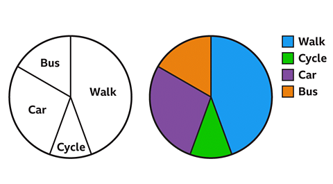 Image captionBack to top
Creating a Pie Chart
- To generate a pie chart, you need data typically organized in a table format.
- Calculating the angle sizes is crucial in pie chart creation.
Examples
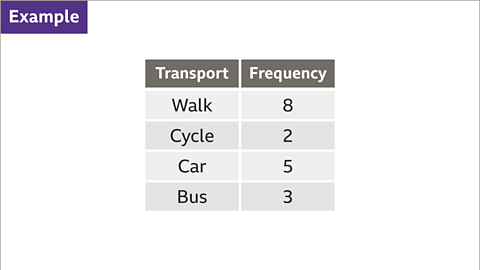
- Imagine a scenario where a student surveys their friends about their mode of transportation to school. The resulting data needs to be represented in a pie chart.
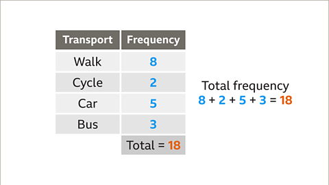
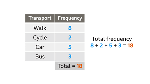
When creating a pie chart, it's essential to calculate the angles. Begin by summing up the frequencies. For instance, in a given table, the total frequency might be 18.
Understanding Pie Charts
Friend Representation in Pie Chart
- Each friend in the pie chart represents an angle of 20°.
- To find the angles for different modes of transport, multiply the frequency by 20.
- If the angles for different modes of transport do not add up to 360°, there might be an error in the calculations.
Constructing the Pie Chart
- Start by drawing a circle and adding a vertical line from the center to the circumference.
- To draw specific sectors like the one for friends who walk to school, use a protractor to mark and draw the angles accurately.
| Mode of Transport | Frequency | Angle (in degrees) |
|---|---|---|
| Walk | 8 | 160 |
| Cycle | 2 | 40 |
| Car | 5 | 100 |
| Bus | 3 | 60 |
| Total | - | 360 |
Steps to Draw Pie Chart Sectors
Friend Transportation Representation
Representing different modes of transportation to school using a pie chart.
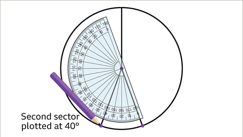
- Draw a sector for friends who cycle to school at 40°:
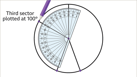
- Draw a sector for friends who use a car at 100°:
- Verify the final sector at 60°:
Rotate the protractor to 40°, aligning with the previous line, and draw.
Rotate the protractor to 100°, aligning with the previous line, and draw.
Ensure the angle is correct by checking with a protractor and marking it.
 |  |
 |  |
Pie Chart Construction Process
- Checking Accuracy of Pie Chart
- Ensure the last sector angle remains at 60°, verified using a protractor.
- Labelling the Pie Chart
- Label each sector or use color codes with a key; suggest a fitting title like 'A pie chart to show mode of transport to school'.
Example: Data Representation
| Transport | Frequency |
|---|---|
| Walk | 8 |
| Cycle | 2 |
| Car | 5 |
| Bus | 3 |
- Students surveyed on their mode of transport to school
- Construct a pie chart based on the provided data
Question
Back to top
 |
Download the notes
Pie Charts
|
Download as PDF |
Download as PDF
Interpreting a pie chart
- Understanding a pie chart involves analyzing the proportions of its sectors.
- By examining the angles within a pie chart, we can determine the fraction each sector represents of the whole population, measured in degrees out of 360°.
- A pie chart often displays the percentages corresponding to each sector, aiding in the interpretation of proportions within the entire population.
Examples
Image gallerySkip image gallery- Image caption: The pie chart illustrates the seasonal results of a rugby team, detailing wins, draws, and losses.
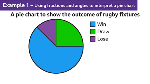 Image caption:
The pie chart shows the outcome of results for a rugby team during a season.
Pie Chart Analysis
Finding Draw Results
If a pie chart with 24 fixtures is given, and one quarter represents drawn fixtures, then the number of drawn games can be calculated as follows:- The sector representing draws is 1/4 of the total, hence 1/4 × 24 = 6 games.
- Therefore, there were 6 games that resulted in a draw.
Determining Winning Outcomes
When a sector measuring 225° in a pie chart represents won fixtures, which is 5/8 of the whole chart:- Calculating the number of wins: 5/8 × 24 = 15 games.
- Thus, there were 15 games that resulted in a win.
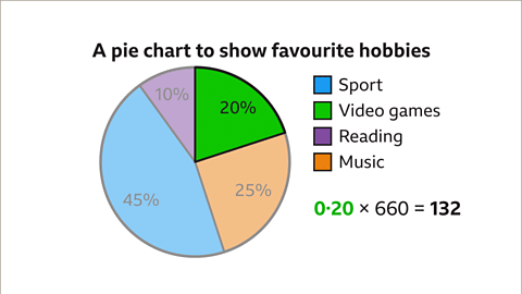
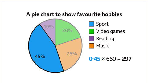
Favorite Hobbies of Pupils
Analyzing a pie chart illustrating the favorite hobbies of 660 students:- Interpreting percentages: green (20%), orange (25%), blue (45%), and purple (10%).
- Correlating colors with hobbies: blue (sport), green (video games), purple (reading), orange (music).
Pupils Enjoying Video Games
If the segment for video game enthusiasts in a pie chart is 20%:- Number of pupils interested in video games: 20% of 660 = 0.20 × 660 = 132.
- Hence, 132 students have playing video games as their favorite hobby.
 |  |
 |
Take a Practice Test
Test yourself on topics from Year 7 exam
|
Practice Now |
Practice Now
Interpreting Pie Charts
- Key Concept: Understanding Pie Chart Sectors
- Rather than numbers, pie charts represent data in proportions, where each sector corresponds to a portion of the whole.
- Example: In a pie chart showcasing student hobbies, a 45% sector denotes that 45% of 660 pupils enjoy playing sports.
- Visual Representation: Pie Chart Interpretation
- Pie charts visually display data distribution through sectors, each representing a category or value.
- Example: A pie chart depicting rugby match outcomes shows sectors colored green for draws, blue for wins, and purple for losses.
Using Fractions and Angles
- Analysis Approach: Utilizing Angles to Decode Data
- Angles in pie charts help visualize the relative size of each category.
- Example: A sector with a 90-degree angle in a chart could represent a specific data subset.
- Deciphering Results: Linking Colors to Outcomes
- Assigning colors to sectors aids in quickly comprehending chart information.
- Example: In a rugby fixture chart, blue might symbolize wins, green draws, and purple losses.
 |  |
Question
Back to topPractise comparing and interpreting pie charts
Quiz
Practise comparing and interpreting pie charts with this quiz. You may need paper and a pen to help you.
Back to topGame - Divided Islands
Back to topSummary
- Paraphrasing of Information
- Pie Chart Comparison Practice
- Engage in activities to enhance your skills in comparing and interpreting pie charts.
- Quiz Preparation
- Utilize quizzes to test your understanding of pie charts. Have paper and a pen ready for this task.
- Game - Divided Islands
- Explore the game "Divided Islands" to further practice your pie chart interpretation skills.
- Pie Chart Comparison Practice
Related Exams
About this Document

Apr 17, 2025
Last updated
Document Description: Pie Charts for Year 7 2025 is part of Year 7 preparation. The notes and questions for Pie Charts have been prepared according to the Year 7 exam syllabus. Information about Pie Charts covers topics like Key points, Proportion, Understanding Pie Charts, Creating a Pie Chart, Steps to Draw Pie Chart Sectors, Pie Chart Construction Process, Interpreting a pie chart, Pie Chart Analysis, Interpreting Pie Charts, Practise comparing and interpreting pie charts and Pie Charts Example, for Year 7 2025 Exam. Find important definitions, questions, notes, meanings, examples, exercises and tests below for Pie Charts.
Description
Full syllabus notes, lecture & questions for Pie Charts - Year 7 - Year 7 | Plus excerises question with solution to help you revise complete syllabus | Best notes, free PDF download
Information about Pie Charts
In this doc you can find the meaning of Pie Charts defined & explained in the simplest way possible.
Besides explaining types of Pie Charts theory,
EduRev gives you an ample number of questions to practice Pie Charts tests, examples and also practice Year 7 tests.
Download as PDF

Related Searches
mock tests for examination
,ppt
,MCQs
,study material
,Previous Year Questions with Solutions
,Exam
,video lectures
,Summary
,Viva Questions
,Extra Questions
,Objective type Questions
,past year papers
,Sample Paper
,Pie Charts - Year 7
,Pie Charts - Year 7
,practice quizzes
,Semester Notes
,Pie Charts - Year 7
,Free
,shortcuts and tricks
,Important questions
;


Additional Information about Pie Charts for Year 7 Preparation
Pie Charts Free PDF Download
The Pie Charts is an invaluable resource that delves deep into the core of the Year 7 exam.
These study notes are curated by experts and cover all the essential topics and concepts, making your preparation more efficient and effective.
With the help of these notes, you can grasp complex subjects quickly, revise important points easily,
and reinforce your understanding of key concepts. The study notes are presented in a concise and easy-to-understand manner,
allowing you to optimize your learning process. Whether you're looking for best-recommended books, sample papers, study material,
or toppers' notes, this PDF has got you covered. Download the Pie Charts now and kickstart your journey towards success in the Year 7 exam.
Importance of Pie Charts
The importance of Pie Charts cannot be overstated, especially for Year 7 aspirants.
This document holds the key to success in the Year 7 exam.
It offers a detailed understanding of the concept, providing invaluable insights into the topic.
By knowing the concepts well in advance, students can plan their preparation effectively.
Utilize this indispensable guide for a well-rounded preparation and achieve your desired results.
Pie Charts Notes
Pie Charts Notes offer in-depth insights into the specific topic to help you master it with ease.
This comprehensive document covers all aspects related to Pie Charts.
It includes detailed information about the exam syllabus, recommended books, and study materials for a well-rounded preparation.
Practice papers and question papers enable you to assess your progress effectively.
Additionally, the paper analysis provides valuable tips for tackling the exam strategically.
Access to Toppers' notes gives you an edge in understanding complex concepts.
Whether you're a beginner or aiming for advanced proficiency, Pie Charts Notes on EduRev are your ultimate resource for success.
Pie Charts Year 7 Questions
The "Pie Charts Year 7 Questions" guide is a valuable resource for all aspiring students preparing for the
Year 7 exam. It focuses on providing a wide range of practice questions to help students gauge
their understanding of the exam topics. These questions cover the entire syllabus, ensuring comprehensive preparation.
The guide includes previous years' question papers for students to familiarize themselves with the exam's format and difficulty level.
Additionally, it offers subject-specific question banks, allowing students to focus on weak areas and improve their performance.
Study Pie Charts on the App
Students of Year 7 can study Pie Charts alongwith tests & analysis from the EduRev app,
which will help them while preparing for their exam. Apart from the Pie Charts,
students can also utilize the EduRev App for other study materials such as previous year question papers, syllabus, important questions, etc.
The EduRev App will make your learning easier as you can access it from anywhere you want.
The content of Pie Charts is prepared as per the latest Year 7 syllabus.
|
© EduRev
|
Education Revolution
|


|


Signup to see your scores
go up within 7 days!
Access 1000+ FREE Docs, Videos and Tests
Takes less than 10 seconds to signup