Frequency Diagrams and Frequency Polygons | Year 9 Mathematics IGCSE (Cambridge) - Class 9 PDF Download

Key points
 Image caption
- A frequency diagram is a type of graph used to represent a continuous set of grouped data. It shows how continuous data, such as time or mass, can be visually displayed for analysis.
- When dealing with multiple individual values, grouping data is essential for meaningful analysis. For instance, tracking daily rainfall over a year requires data organization before graphing.
- Unlike a bar chart, a frequency diagram uses bars of varying heights to depict frequency without gaps between them. This method visually represents how often specific ranges occur.
- In a frequency diagram, the vertical axis displays the frequency, while the horizontal axis features a continuous number scale for clear labeling.
- Similar to a frequency diagram, a frequency polygon uses connected lines to represent frequencies instead of bars, offering an alternative visualization method.
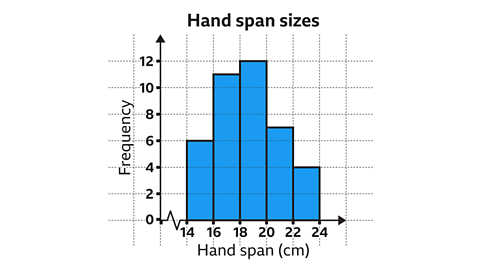 Image captionBack to top
Drawing and Interpreting Frequency Diagrams and Polygons
Frequency diagrams are visual representations of data collected in a table format. They help us understand how often certain values occur within a dataset. Here's a step-by-step guide to creating and interpreting frequency diagrams:
Steps to Create a Frequency Diagram:
- Identify the highest frequency value from the data table.
- On graph paper, draw a vertical axis using an appropriate scale, with labels up to the highest frequency value. Common scales include increments of one, two, five, or ten.
- Determine the data range for the horizontal axis and choose a suitable scale. Sometimes, a false origin (a symbol indicating a break in the scale) might be necessary.
- Draw and label the horizontal axis.
- Construct bars on the graph, ensuring each bar's height corresponds to the frequencies and falls within the class intervals (the allowed range of values within each group of data).
- Verify that both axes are correctly labeled before giving the diagram a title.
For instance, imagine you have a dataset of student scores in a class. The highest frequency is in the range of 80-90. You would draw a vertical axis with appropriate markings up to 90. The horizontal axis could represent score ranges (e.g., 0-10, 10-20, etc.). Each bar's height would represent how many students scored within that range.
Examples
- Image gallery
- Skip image gallery
Frequency Diagram Construction
- Constructing a Frequency Diagram based on Data:
A student measured the hand spans of 40 pupils and recorded the data.
- Identifying Scale for Axes:
To construct the diagram, identify the largest frequency, set vertical axis scale accordingly, and determine the horizontal axis range.
- Axis Labeling and Numbering:
Draw and label the vertical axis with appropriate intervals for 'Frequency'. Similarly, label and number the horizontal axis for 'Hand span'.
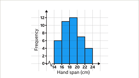
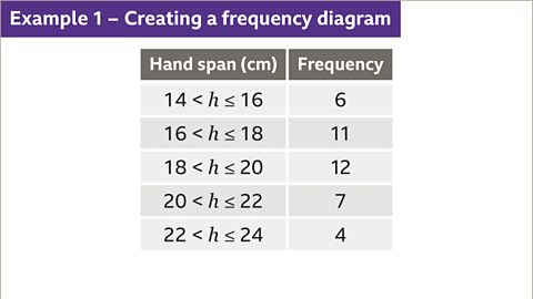 Image Caption: A student recorded the length of 40 pupils' hand spans. Construct a frequency diagram based on the data. |
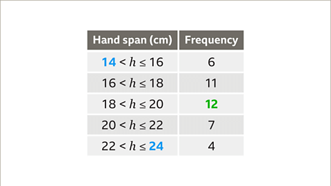 Image Caption: First, identify the largest frequency. The largest frequency is 12. Therefore, the scale on the vertical axis must go up to at least 12. The smallest and largest value for the horizontal scale are 14 and 24 centimetres. The horizontal axis will need to include this range. |
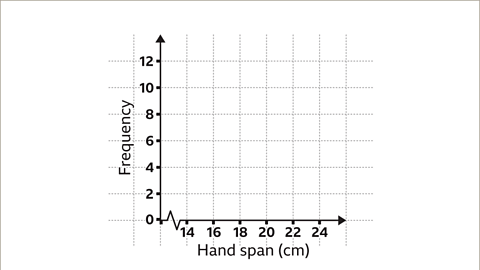 Image Caption: Now draw the vertical axis and number it in regular intervals. In this example, the scale is increasing in increments of two. Label the axis as 'Frequency'. Draw the horizontal axis and number it in regular intervals. In this example, the scale is increasing in increments of two. A false origin has also been used. Label the axis appropriately. In this example, the label is 'Hand span'. |
Creating Frequency Diagrams
Bar Graphs
Bar graphs are visual representations of data using bars of different heights.
Each bar corresponds to a range of values and its height represents the frequency of data points falling within that range.
For instance, a bar between 16 and 18 with a height of 11 indicates there are 11 data points in the range 16 to 18.
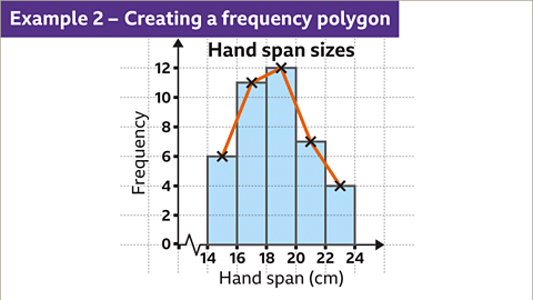
Frequency Polygon
A frequency polygon connects the midpoints of the class intervals with line segments.
Instead of bars, points are plotted and connected by line segments.
It allows for easy comparison between different datasets on the same graph.
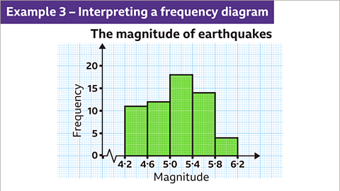
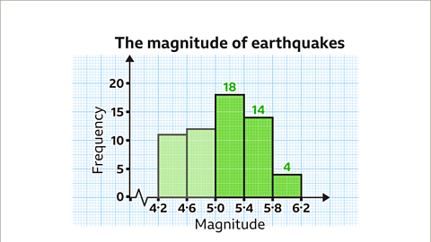
Frequency Diagram Interpretation

Creating a Frequency Diagram Example
1 of 9
Slide 1 of 9 , Example one. Creating a frequency diagram. An image of a grouped frequency table. The table has two columns and six rows. The first column is labelled, hand span, measured in centimetres, and is populated with the groups, fourteen is less than h, is less than or equal to sixteen. Sixteen is less than h, is less than or equal to eighteen. Eighteen is less than h, is less than or equal to twenty. Twenty is less than h, is less than or equal to twenty two. Twenty two is less than h, is less than or equal to twenty four. The second column is labelled frequency and is populated with the numbers, six, eleven, twelve, seven, and four. The cells for the labels are coloured dark grey. , A student recorded the length of 40 pupils’ hand spans. Construct a frequency diagram based on the data.
Slide 1 of 9 , Example one. Creating a frequency diagram. An image of a grouped frequency table. The table has two columns and six rows. The first column is labelled, hand span, measured in centimetres, and is populated with the groups, fourteen is less than h, is less than or equal to sixteen. Sixteen is less than h, is less than or equal to eighteen. Eighteen is less than h, is less than or equal to twenty. Twenty is less than h, is less than or equal to twenty two. Twenty two is less than h, is less than or equal to twenty four. The second column is labelled frequency and is populated with the numbers, six, eleven, twelve, seven, and four. The cells for the labels are coloured dark grey. , A student recorded the length of 40 pupils’ hand spans. Construct a frequency diagram based on the data.
Practise using frequency diagrams and frequency polygons
- Practice understanding and utilizing frequency diagrams and frequency polygons with this exercise. Have a pen and paper ready to assist with your responses.
Real-life maths

Manufacturers use testers and statisticians to evaluate new products before releasing them to the public. Statisticians analyze data to estimate product lifespan based on variations in manufacturing.
- Testing a sample of light bulbs and plotting their lifespans on a frequency diagram helps manufacturers estimate product durability.

Game - Divided Islands
|
40 videos|55 docs|18 tests
|


Frequency Diagrams and Frequency Polygons | Year 9 Mathematics IGCSE (Cambridge) - Class 9
,practice quizzes
,video lectures
,Previous Year Questions with Solutions
,Free
,Frequency Diagrams and Frequency Polygons | Year 9 Mathematics IGCSE (Cambridge) - Class 9
,Important questions
,Exam
,Objective type Questions
,Frequency Diagrams and Frequency Polygons | Year 9 Mathematics IGCSE (Cambridge) - Class 9
,shortcuts and tricks
,ppt
,MCQs
,study material
,Viva Questions
,Extra Questions
,past year papers
,Summary
,Semester Notes
,mock tests for examination
,Sample Paper
;


Frequency Diagrams and Frequency Polygons Free PDF Download
Importance of Frequency Diagrams and Frequency Polygons
Frequency Diagrams and Frequency Polygons Notes
Frequency Diagrams and Frequency Polygons Class 9 Questions
Study Frequency Diagrams and Frequency Polygons on the App
|
© EduRev
|
Education Revolution
|


|


