Frequency Diagrams and Frequency Polygons - Year 7 PDF Download
Key points
 Image caption
- A frequency diagram is a visual representation of grouped continuous data, such as time, length, or mass measurements, showing the distribution across different ranges.
- Grouping data is essential to derive meaningful insights, like analyzing the daily rainfall over a year by aggregating individual values.
- Unlike a bar chart, a frequency diagram uses bars of varying heights to depict the frequency of occurrences within each range without gaps between them.
- The vertical axis of a frequency diagram represents frequency, while the horizontal axis features a continuous number scale.
- A frequency polygon, resembling a frequency diagram, connects lines to show frequencies rather than using bars.
 Image captionBack to top
Drawing and interpreting frequency diagrams and polygons
To create a visual representation of data using a frequency diagram, you need data usually presented in a table format.
Steps to create a frequency diagram:
- Identify the highest frequency value in the data table.
- Sketch a vertical axis on square or graph paper.
- Determine a suitable scale for the vertical axis, ensuring it accommodates the highest frequency. For instance, increments of one, two, five, or ten could be appropriate choices.
- Examine the data range for the horizontal axis. Establish a fitting scale for this axis, considering the need for a false origin if the scale is discontinuous.
- Label the horizontal axis appropriately.
- Draw bars on the diagram, each bar representing the correct height corresponding to the frequencies and spanning across the class intervals. Class intervals define the range of values within a specific data grouping.
- Verify the correct labeling of both axes and provide a title for the frequency diagram.
Let's understand this process better with an example:
Imagine you have a table displaying the number of books read by students in a month. The highest frequency is 20 students who read 5 books.
- You draw a vertical axis on graph paper and label it up to 20.
- For the horizontal axis representing the number of books, you choose a suitable scale.
- You draw bars corresponding to each frequency, ensuring they are proportional to the number of students who read that specific number of books.
- Finally, you label both axes and give your diagram a title like "Books Read by Students in a Month".
By following these steps, you can effectively create and interpret frequency diagrams, offering a visual representation of data distribution.
Creating a Frequency Diagram
In this lesson, we will learn how to construct a frequency diagram based on given data.
Examples
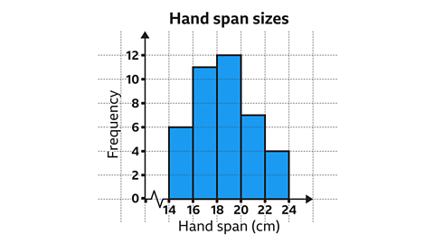
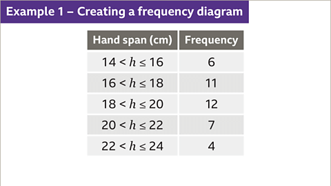
Image gallerySkip image gallery- Image caption: A student recorded the length of 40 pupils' hand spans. Construct a frequency diagram based on the data.
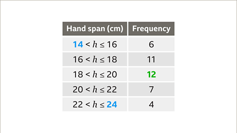
- Image caption: First, identify the largest frequency. The largest frequency is 12. Therefore, the scale on the vertical axis must go up to at least 12. The smallest and largest value for the horizontal scale are 14 and 24 centimetres. The horizontal axis will need to include this range.
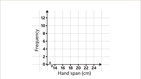
- Image caption: Now draw the vertical axis and number it in regular intervals. In this example, the scale is increasing in increments of two. Label the axis as 'Frequency'. Draw the horizontal axis and number it in regular intervals. In this example, the scale is increasing in increments of two. A false origin has also been used. Label the axis appropriately. In this example, the label is 'Hand span'.
 Image caption:
A student recorded the length of 40 pupils' hand spans. Construct a frequency diagram based on the data.

 Image caption:
First, identify the largest frequency. The largest frequency is 12. Therefore, the scale on the vertical axis must go up to at least 12. The smallest and largest value for the horizontal scale are 14 and 24 centimetres. The horizontal axis will need to include this range.

 Image caption:
Now draw the vertical axis and number it in regular intervals. In this example, the scale is increasing in increments of two. Label the axis as 'Frequency'. Draw the horizontal axis and number it in regular intervals. In this example, the scale is increasing in increments of two. A false origin has also been used. Label the axis appropriately. In this example, the label is 'Hand span'.
Frequency Diagrams
- Creating a Frequency Diagram
To create a frequency diagram, draw bars representing the frequency of each class interval. The height of each bar corresponds to the frequency of that interval. For odd numbers, the bars should be positioned exactly between the even numbers on the vertical axis.
- Adding Titles to Frequency Diagrams
It is essential to give each frequency diagram an appropriate title to provide context and clarity to the graph.

Frequency Polygons
- Creating a Frequency Polygon
Instead of bars, a frequency polygon involves plotting the midpoints of class intervals and connecting them with line segments. This method offers a different visual representation of the data.
- Comparing Data with Frequency Polygons
Frequency polygons enable easy comparison between different datasets on the same graph. By observing the plotted points and line segments, comparisons between datasets become more straightforward.

| Key | Class A | Class B |
|---|---|---|
| Line Color | Orange | Blue |
Frequency Diagrams and Earthquake Magnitudes
In this lesson, we delve into the interpretation of frequency diagrams and how they can help us understand earthquake magnitudes.
Interpreting Frequency Diagrams
- Frequency diagrams display the distribution of data in intervals, offering a visual representation of quantities within specified ranges.
- Each bar in a frequency diagram corresponds to a specific range of values, highlighting the frequency of occurrences within that range.
Understanding Earthquake Magnitudes
- Earthquake magnitudes are typically measured using the Richter scale, which quantifies the energy released during an earthquake.
- The Richter scale is logarithmic, meaning each whole number increase indicates a tenfold increase in the amplitude of seismic waves.
Interpreting Data
- By analyzing the frequencies of bars in a diagram, we can infer the number of earthquakes within specific magnitude ranges.
- For instance, if bars represent magnitudes 5.0 or larger, adding up the frequencies of these bars gives us the total number of such earthquakes.
| Frequency Range | Number of Earthquakes |
|---|---|
| Magnitude 5.0 or larger | 36 earthquakes |
Creating Frequency Diagrams
- Frequency diagrams are constructed based on grouped data, showcasing the frequency of values falling within specific intervals.
- They provide a clear visual overview of data distribution, aiding in the analysis and interpretation of datasets.
By mastering the interpretation of frequency diagrams, we can gain valuable insights into various phenomena, such as earthquake magnitudes, and effectively communicate complex data in a visual format.
Question
Back to topPractise using frequency diagrams and frequency polygons
Quiz
Practise understanding and using frequency diagrams and frequency polygons with this quiz. You may need a pen and paper to help you with your answers.
Back to topReal-life maths
 Image caption,
 Manufacturers of products employ testers and statisticians to assess new products before they go on sale to the general public.
Statisticians analyze data to provide insights into product quality and performance. By conducting tests and creating frequency diagrams, manufacturers estimate product lifespans.For instance, variations in the manufacturing process can impact the longevity of lightbulbs.
Through testing and frequency diagram analysis, manufacturers predict product durability.
 Image caption, Back to top


