Notes: Data Handling | Mathematics & Pedagogy Paper 2 for CTET & TET Exams - CTET & State TET PDF Download
| Table of contents |
|
| Data and its Presentation |
|
| Presentation of Data |
|
| Graphical Representation of Data |
|
| Graphical Representation of Data - Histogram and Frequency Polygon |
|
| Circle Graph or Pie Chart |
|

This chapter holds significant importance in CTET and State TETs exams. It covers various methods of data presentation and measures of central tendency. Analyzing past CTET and State TETs exams reveals that typically 1 to 2 questions are asked from this chapter each year.
Data and its Presentation
In our day-to-day life, we often encounter various types of information, such as:
- Runs made by a batsman in the last 10 test matches.
- Number of wickets taken by a bowler in the last 10 ODIs.
- Marks scored by students in a Mathematics unit test.
- Number of story books read by each of your friends.
This information, collected for study purposes, is known as data. Data is typically collected in two types based on their sources:
- Primary data: Data collected directly by the investigator for a specific purpose.
- Secondary data: Data obtained from other sources, whether published or unpublished.
Presentation of Data
Presentation of data involves organizing collected data in a simple form that is easily analyzed and interpreted. There are various methods to represent collected data:
Presentation of Data in Ascending or Descending Order
Consider the marks obtained by 10 students in a Mathematics test as given below:
Raw data: 55, 36, 95, 73, 60, 42, 25, 78, 75, 62
Now, arrange this raw data in ascending order:
Ascending order: 25, 36, 42, 55, 60, 62, 73, 75, 78, 95
By organizing data in this manner, we can easily identify the lowest and highest marks. The difference between the highest and lowest values in the data set is known as the range:
Range: 95 - 25 = 70
Presentation of Data in the Form of Ungrouped Frequency Distribution
If the number of observations in a dataset is large, arranging them in ascending or descending order can be time-consuming. In such cases, data can be presented using a frequency distribution method:
Example: Consider the marks obtained (out of 100 marks) by 25 students of Class IX:
| Marks | Tally Marks | Number of Students (Frequency) |
|---|---|---|
| 36 | III | 3 |
| 40 | IIII | 4 |
| 50 | III | 3 |
| 56 | II | 2 |
| 60 | IIII | 4 |
| 70 | IIII | 4 |
| 88 | II | 2 |
| 92 | III | 3 |
| Total | 25 |
Presentation of Data in the form of Grouped Frequency Distribution
When there are a large number of distinct values in a dataset, it's convenient to present the data in grouped frequency distribution:
(i) In Exclusive Form
| Class Interval | Tally Marks | Number of Students (Frequency) |
|---|---|---|
| 0-10 | ||| | 3 |
| 10-20 | |||| | 4 |
| 20-30 | || | 2 |
| 30-40 | ||||| | 5 |
| 40-50 | |||||| | 6 |
| Total | 20 |
(ii) In Inclusive Form
| Class Interval | Number of Students (Frequency) |
|---|---|
| 0-10 | 4 |
| 10-20 | 3 |
| 20-30 | 3 |
| 31-40 | 5 |
| 41-50 | 5 |
| Total | 20 |
Graphical Representation of Data
Raw data can be represented in various pictorial forms to draw inferences. This process is called graphical representation of data. Some of the common types are:
- Bar graphs
- Histograms
- Frequency polygon
- Pie charts
Bar Graph
A bar graph is a pictorial representation of data where bars of uniform width are drawn with equal spacing between them. One axis (X-axis) represents the categories or variables, while the height of the bars on the other axis (Y-axis) depends on the values or frequencies of the corresponding observations.
Graphical Representation of Data - Histogram and Frequency Polygon
Histogram
A histogram is a graphical representation of a frequency distribution in exclusive form. It consists of rectangles with continuous class intervals as bases and corresponding frequencies as heights. There are no gaps between consecutive rectangles.
Example: Price Growth Percentage
Determine in which year India had the maximum growth in price:
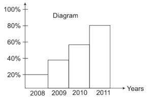
From the histogram, it's clear:
- Percentage growth in year 2008 = 20%
- Percentage growth in year 2009 = 38%
- Percentage growth in year 2010 = 58%
- Percentage growth in year 2011 = 80%
Therefore, in year 2011, the percentage growth in price was higher than in previous years.
Frequency Polygon
A frequency polygon is obtained by joining the mid-points of the upper horizontal sides of all the rectangles in a histogram. It can also be drawn independently without the histogram.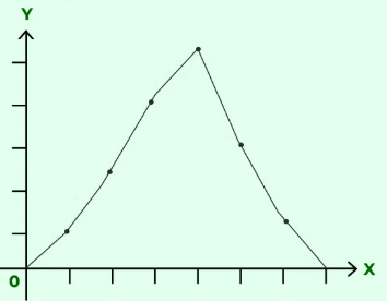
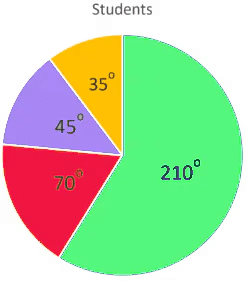
Circle Graph or Pie Chart
What is Circle Graph or Pie Chart?
A circle graph or pie chart shows the relationship between a whole and its parts. The whole circle divided into sectors. The size of each sector is proportional to the activity or information it represents.
The pie chart below shows the time spent by a child in a day.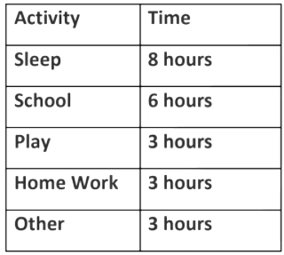
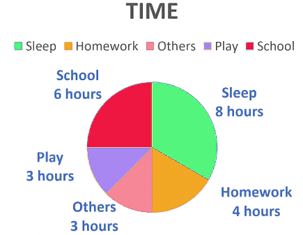
In the above graph, the proportion of the sector for hours spent in sleeping.
= = =
So, this sector is drawn as 1/3rd part of the circle. Similarly, the proportion of the sector for hours spent in School
= = =
So, this sector is drawn as 1/4th part of the circle. Similarly, the size of other sectors can be found.
Drawing Pie Chart
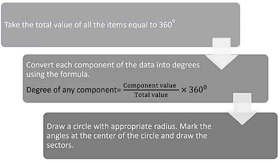
For example,
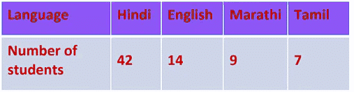
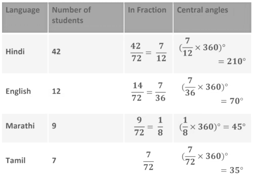
The number of students in a hostel speaking different languages is given below. Present the data in a pie chart.
The central angle of the component = x 360°
Arithmetic Mean [AM]
The arithmetic mean is the average of a given set of numbers. It is calculated by dividing the sum of all observations by the total number of observations.
1. Mean for Frequency Distribution:
If x1, x2,.....,xn are the values and f1, f2, ....,fn are their corresponding frequencies, then the arithmetic mean is given by: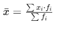
2. Mean for Classified Data:
If x1, x2,.....,xn are the class marks and f1, f2, ....,fn are their frequencies, then the arithmetic mean remains the same :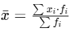
Median
The median of a distribution is the middle value when the data are arranged in ascending or descending order.
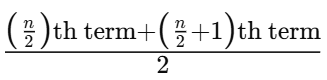
1. Median for Ungrouped Data:
- If the number of observations is odd
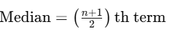
- If the number of observations is even
2. Median for Classified or Grouped Data:
To determine the median class:
Compute the cumulative frequencies of all classes.
Find N/2, where N is the total frequency.
The median class is the class whose cumulative frequency is either equal to N/2 or just greater
Median Formula:
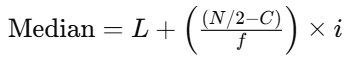
Where
- L = Lower limit of the median class,
- N = Sum of frequencies,
- f = Frequency of the median class,
- C = Cumulative frequency of the preceding class of the median class,
- i = Class interval.
Mode
The mode of a set of observations is the value that occurs most frequently among the given observations.
Example:
Find the mode of the given data: 29, 25, 38, 22, 38, 25, 38, 29.
Solution: Here, 38 is the observation with the maximum frequency. Therefore, the mode is 38.
Relation Between Mean, Median, and Mode
There is a mathematical relationship between the mean, median, and mode:
Mode = 3 Median - 2 Mean
Example:
If the mode of a grouped data is 12 and the mean is 5, then the median will be:
Solution: Given Mode = 12, Mean = 5
Using the relationship: Mode = (3 * Median) - (2 * Mean)
Substituting the given values, we get: 3 * Median = 12 + 10
Therefore, Median = 22 / 3 = 7.33
Range
The range of a set of observations is the difference between the highest and lowest observations.
Range = Maximum observation - Minimum observation
|
82 videos|273 docs|69 tests
|
FAQs on Notes: Data Handling - Mathematics & Pedagogy Paper 2 for CTET & TET Exams - CTET & State TET
| 1. What is the purpose of presenting data in the form of ungrouped frequency distribution? |  |
| 2. How is data typically presented in the form of grouped frequency distribution? | |
| 3. Why is it important to handle data effectively when presenting frequency distributions? | |
| 4. What are some common methods used to present data visually in frequency distributions? | |
| 5. How can grouped frequency distributions help in identifying trends or patterns in data? | |


video lectures
,Notes: Data Handling | Mathematics & Pedagogy Paper 2 for CTET & TET Exams - CTET & State TET
,Notes: Data Handling | Mathematics & Pedagogy Paper 2 for CTET & TET Exams - CTET & State TET
,study material
,Extra Questions
,ppt
,Notes: Data Handling | Mathematics & Pedagogy Paper 2 for CTET & TET Exams - CTET & State TET
,shortcuts and tricks
,Important questions
,Summary
,practice quizzes
,Viva Questions
,Objective type Questions
,Sample Paper
,past year papers
,MCQs
,Semester Notes
,mock tests for examination
,Exam
,Free
,Previous Year Questions with Solutions
;


Notes: Data Handling Free PDF Download
Importance of Notes: Data Handling
Notes: Data Handling
Notes: Data Handling CTET & State TET Questions
Study Notes: Data Handling on the App
|
© EduRev
|
Education Revolution
|


|


