Class 10 Exam > Class 10 Notes > Mathematics for GCSE/IGCSE > Pie Charts
Pie Charts | Mathematics for GCSE/IGCSE - Class 10 PDF Download
What is a pie chart?
- A pie chart is a circular diagram divided into sectors to represent proportion.
- It visually displays the relative sizes of different categories of data, emphasizing proportions over raw numbers.
- For instance, when comparing the number of males to females in a company, a pie chart focuses on the proportions of each gender.
- Since a circle has 360 degrees, these angles help determine the size of each sector in the chart.
How to Draw a Pie Chart?
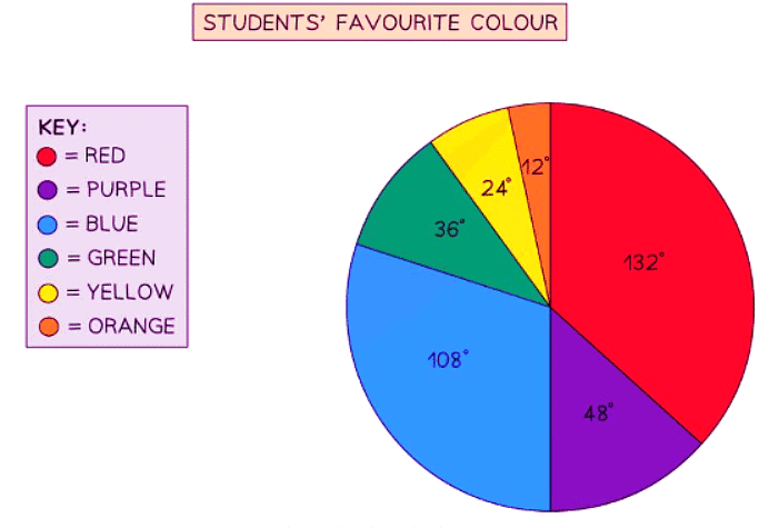
To illustrate the process, let's consider data from a class of 30 students regarding their favorite colors:
- Determine the degrees representing 1 student.
- Calculate the angle for each color category based on the fraction of 360 degrees.

- Step 1: Find the number of degrees that represents 1 student
There are 30 students in total, so 360° = 30 students
Divide both sides by 30, so 12° = 1 student - Step 2: Calculate the angle for each category by finding a fraction of 360°
11 students out of 30 said red was their favourite colour, so this is
4 students out of 30 said purple, so this is
Repeat this for each category, they should sum to 360° in total
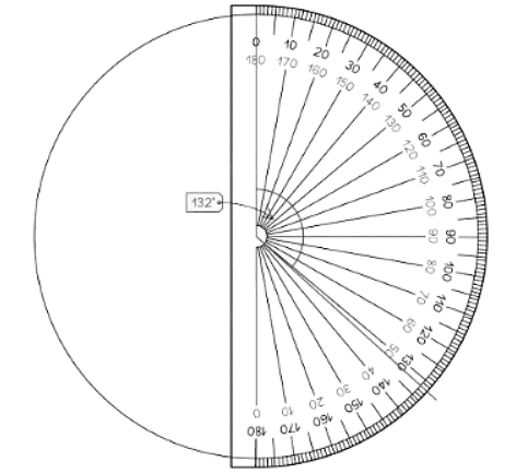
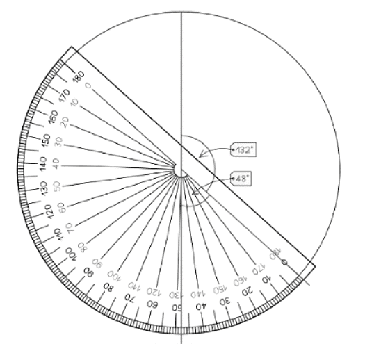
Step 3: Draw the pie chart, using a protractor to measure the angles
Start by drawing a vertical line from the centre of the circle to the top ("12 O'clock")
Then use your protractor to measure the first angle, and draw a line to this point
Move your protractor to this line, and repeat for each category
You should include a key or labels to show which slice represents which category


How do I interpret a pie chart or find missing information?
- A pie chart makes it easy to identify the largest or smallest category.
- You might need to calculate missing data using the pie chart.
- The entire pie chart represents 360 degrees.
- This total can be used to find the degree representation of each category or the data each degree represents.
- For example, if a slice of 30° represents 15 people:
- 30° = 15 people.
- 1° = 0.5 people (by dividing 15 by 30).
- 2° = 1 person (by doubling the 1° value or dividing 30° by 15).
- Use these relationships to solve problems or find missing data.
The document Pie Charts | Mathematics for GCSE/IGCSE - Class 10 is a part of the Class 10 Course Mathematics for GCSE/IGCSE.
All you need of Class 10 at this link: Class 10
|
38 videos|395 docs|19 tests
|
Related Searches


