Class 9 Exam > Class 9 Notes > Year 9 Mathematics IGCSE (Cambridge) > Scatter Graphs
Scatter Graphs | Year 9 Mathematics IGCSE (Cambridge) - Class 9 PDF Download
Correlation
What is correlation?
- Correlation is a method used to explain the relationship between two quantities.
- It is often referred to as linear correlation, although the term "linear" is not typically used in exam questions.
Types of Correlation
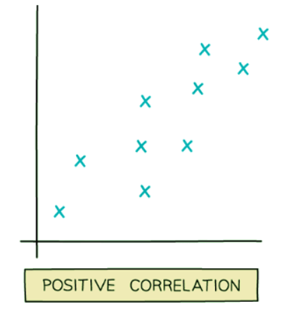
- Positive correlation: This occurs when one quantity increases as the other quantity increases.
- For instance, as the temperature rises, the sales of cold drinks tend to increase.
- Another example is the height of a tree increasing as the tree's age advances.
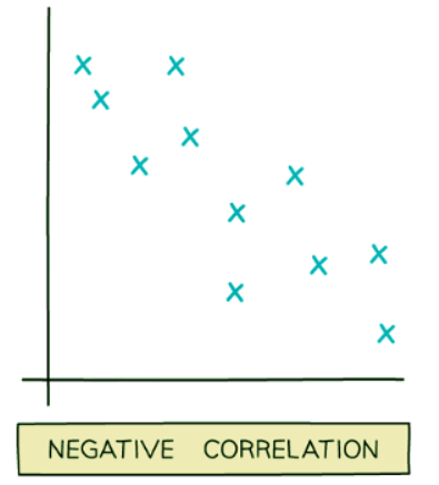
- Negative correlation: This is observed when one quantity decreases as the other quantity increases.
- For example, the value of a car typically decreases as the car ages.
- Similarly, the time spent indoors tends to increase as the number of daylight hours decreases.
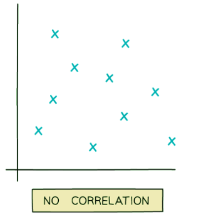
- No correlation: This describes a scenario where there is no recognizable relationship between two quantities.
- For instance, there is no apparent connection between a cricketer's batting average and the cost of a pint of milk.
- Another example could be the relationship between the time spent playing computer games and the weight of an elephant.
Exceptions and Considerations
- It is important to note that correlations may not always hold true under all circumstances.
- For example, a tree will eventually reach a maximum height, and its growth will cease despite its age increasing.
- Exceptions can also exist within correlated quantities, such as an old sports car that is rare and therefore retains a high value.
What does the phrase "correlation doesn't mean causation" mean?
- Correlation refers solely to whether two quantities are connected by the way their values increase or decrease.
- It does not imply a direct causal relationship between the two quantities in real-life.
- An increase or decrease in one quantity does not necessarily cause a corresponding increase or decrease in the other quantity.
- For example, consider the volume of cheese consumed by a population and the number of marriages in that population.
- Both could be increasing, but an increase in cheese consumption does not cause people to get married.
- Sometimes, apparent correlations between two quantities may arise due to a third factor, typically time.
- For instance, consider the height of a sunflower and the weight of a puppy.
- The height of a sunflower doesn't influence the weight of a puppy.
- Both variables may generally increase over time, leading to a perceived correlation.
Scatter Graphs
What is a scatter graph?
- Scatter graphs help us quickly visualize if there is a relationship (correlation) between two sets of data.
- For instance, a teacher might use scatter graphs to check if there's a connection between grades in math tests and physics tests.
- Scatter plots or scatter diagrams are also terms used interchangeably with scatter graphs.
What do scatter graphs look like?
- Points are plotted for each data pair without joining them.
- Points appear scattered around the diagram.
- The shape of the points indicates the type of correlation being shown.
Examples of Scatter Graphs:


How to Draw a Scatter Graph?
- Plot points usually from a table of values.
- Be cautious about how you plot them, especially when values are very similar.
Question for Scatter GraphsTry yourself: What is correlation?View Solution
Line of Best Fit
What is a line of best fit?
- If a scatter graph indicates a positive or negative correlation, a line of best fit can be drawn on the graph. This line helps predict one set of data values based on another. For instance, we might predict a student's math grade based on their physics grade.
How to Draw a Line of Best Fit?
- A line of best fit can be sketched by eye and doesn't have to pass through specific points.
- However, in certain scenarios, it may be appropriate for the line to pass through the origin.
- For instance, when considering the height and weight of a kitten, drawing the line through the origin makes sense.
- Ideally, there should be approximately equal points on each side of the line.
- Additionally, the gaps between the points and the line should be roughly consistent on both sides.
The document Scatter Graphs | Year 9 Mathematics IGCSE (Cambridge) - Class 9 is a part of the Class 9 Course Year 9 Mathematics IGCSE (Cambridge).
All you need of Class 9 at this link: Class 9
|
41 videos|55 docs|19 tests
|
FAQs on Scatter Graphs - Year 9 Mathematics IGCSE (Cambridge) - Class 9
| 1. What is the purpose of using scatter graphs in Year 11 statistics? |  |
Ans. Scatter graphs are used in Year 11 statistics to visually represent the relationship between two variables. They help in identifying patterns, trends, and correlations in the data.
| 2. How can you determine the correlation between two variables from a scatter graph? |  |
Ans. The correlation between two variables can be determined from a scatter graph by observing the direction and strength of the relationship between the points. A positive correlation indicates that as one variable increases, the other variable also increases, while a negative correlation shows that as one variable increases, the other variable decreases.
| 3. What does the line of best fit on a scatter graph represent? |  |
Ans. The line of best fit on a scatter graph represents the most accurate approximation of the relationship between the two variables. It is drawn to show the general trend of the data points and to help predict future values based on the existing data.
| 4. How can outliers affect the interpretation of a scatter graph in Year 11 statistics? |  |
Ans. Outliers can significantly impact the interpretation of a scatter graph in Year 11 statistics by skewing the data and affecting the overall trend. It is important to identify and analyze outliers to determine if they are a result of errors or if they represent important data points.
| 5. What are some common mistakes to avoid when interpreting scatter graphs in Year 11 statistics? |  |
Ans. Some common mistakes to avoid when interpreting scatter graphs in Year 11 statistics include assuming causation from correlation, neglecting to check for outliers, misinterpreting the strength of the relationship, and failing to consider other variables that may influence the data. It is important to be mindful of these factors to accurately analyze and draw conclusions from scatter graphs.
Related Searches


