Presentation of Data

Introduction
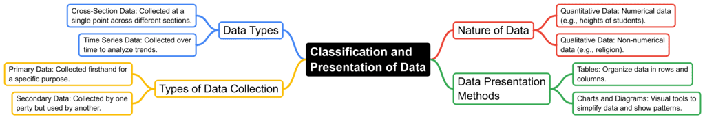
Effective presentation of data is essential for uncovering hidden insights and facilitating a clear understanding of the information. To achieve this, data must be compiled and presented systematically. Here are key concepts related to types of data and methods of collection:
Tabular Presentation of Data
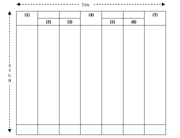
Tabulation involves organizing statistical data into rows and columns to simplify presentation and enable quick comparison. This method helps in identifying errors and omissions easily and reduces the need for repetitive explanatory terms. A well-constructed table for data presentation includes the following components:
- Title: Describes the content and purpose of the table.
- Headings: Labels for rows and columns that define the data categories and variables.
- Body: The main section where the data values are placed, organized according to the row and column headings.
- Rows and Columns: The structure where data is systematically arranged; rows typically represent different categories or observations, while columns represent variables or attributes.
- Footnotes: Additional explanations or clarifications that provide context to the data presented in the table.
By following this structure, tables effectively communicate data, allowing for easier analysis and interpretation.
Charts and Diagrams for Ungrouped Data
Charts and diagrams are valuable tools for presenting data visually. They make data more accessible and can highlight trends and patterns effectively. While they offer a visual representation, they don't provide the detailed data that tables do and may require considerable effort to create. Here are common types of charts and diagrams:
1. Line Diagrams
- Line diagrams are commonly used in business and commerce to show how things change over time.
- They use a line or curve on graph paper with two axes (X and Y) meeting at the center.
- Points are marked on the graph, and lines connect them to show trends or shifts.
Types of Line Diagrams:
- Natural Scale: Equal distances on the diagram represent equal amounts of change.
- Ratio Scale: Equal distances represent equal ratios, which can be useful for comparing proportional differences.
Example: A line diagram might show the monthly sales figures of a company over a year, with the X-axis representing months and the Y-axis representing sales figures. The resulting line or curve helps visualize sales trends and patterns over time.
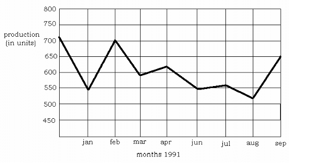 Line diagram showing production of a firm against months of 1991
2. Bar Diagrams
A bar diagram is a visual representation that uses rectangular bars to display data. Each bar corresponds to a category or class of the given data and is differentiated by color or shading. Bars start from a common baseline and have equal width, with their length indicating the value of the data.
Types of Bar Diagrams:
Vertical Bar Diagrams: Bars are oriented vertically, with their heights representing data values.
Horizontal Bar Diagrams: Bars are oriented horizontally, with their lengths representing data values.
Variants of Bar Diagrams:
Grouped Bar Diagrams: Used to compare two or more related sets of data within the same categories. Each group of bars represents a category, with individual bars within the group showing different data sets.
Subdivided Bar Diagrams: Useful for comparing the sizes of various component parts within each category. Each bar is divided into segments that represent different components of the total value.
Paired Bar Diagrams: Consist of pairs of horizontal bars for each category, often used to compare two related sets of data side by side.
Example: A paired bar diagram might display the performance of two different sales teams across several months, with each pair of bars representing the performance of each team for a specific month.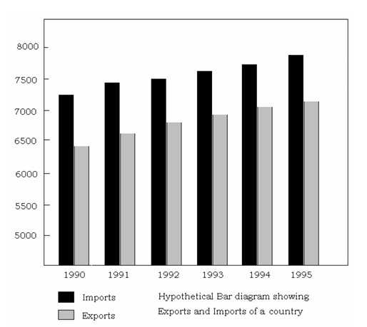
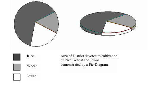
3) Pie diagrams:
- A pie chart is a circle divided into sections using lines from the center to the edge, each representing a different part proportionately.
- Pie charts are helpful for comparing categories in statistical data, showing how much each contributes to the whole.
- To make a pie chart, percentages of each category are calculated based on the total, with each category represented by an angle (3.6 degrees per percentage point).
- The total of all categories in a pie chart adds up to 360 degrees because a circle has 360 degrees.
- You can create a pie chart using a compass and a protractor.
- Refer to the example below for a visual representation of a pie chart.
4) Pictogram: This form of data display shows rows of images or symbols of the same size. Each image or symbol stands for a specific number. Pictograms are useful for showing information to people who can't read or to kids.
Frequency Distribution
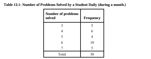
- Frequency of a variable means how many times it shows up in given data.
- If we look at the daily number of accidents in a city over 30 days and find out that 5 accidents happened 6 times, then the frequency of 5 accidents daily is 6.
- When we have a lot of data, we can summarize it by noting how often each value or range of values appears.
- Let's say a variable x has values like x1, x2...xn. The frequency of each x value is usually represented by fi.
- There are two kinds of frequency distributions: simple and grouped. Simple shows individual variable values, while grouped shows values in intervals.
The two types of frequency distributions:
- Simple frequency distribution: Displays variable values individually.
- Grouped frequency distribution: Shows variable values in groups or intervals.
Table 1 shows simple frequency distribution of number of problems solved by a student daily during a month.
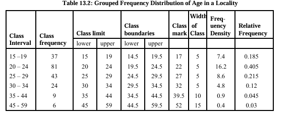
- Class: When you have many different observations that spread widely, you group them into categories based on their values. Each of these categories, defined by a range, is called a class interval or simply a class.
- Class Frequency: The count of observations falling within each class is known as its class frequency or simply frequency.
- Class Limits: The two numbers that mark the boundaries of a class interval for tallying the original observations are called the class limits.
- Class Boundaries: The extreme values of a variable that could be part of a class interval are referred to as class boundaries.
- Mid-Point of Class Interval: The value right in the middle of a class interval is known as the class mark or mid-value, serving as the representative value of the interval.
- Width of a Class: The difference between the upper and lower class boundaries is termed as the width of a class.
- Relative Frequency: The share of a class in the total frequency is referred to as the relative frequency.
- Frequency Density: The frequency per unit width of a class is called the frequency density.
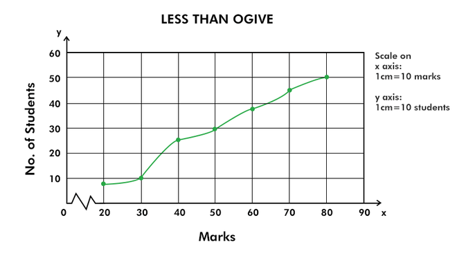
- Cumulative Frequency: The cumulative frequency for a specific value of a variable or class in a grouped frequency distribution is the count of observations smaller or greater than that value or class.
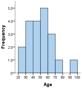
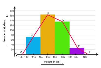
Histogram, Frequency Polygon and Ogives
- Histogram is a common way to show grouped frequency data. It uses rectangles next to each other on a line. Each rectangle's base shows the class width, and the height shows the frequency density.
- Frequency Polygon is made by connecting the midpoints of the tops of consecutive rectangles in a frequency distribution. The ends of the polygon connect to the base line at the midpoints of empty classes at the distribution's ends.
- Ogives are graphs of cumulative distribution. By plotting cumulative frequencies against class mid-values and joining them, we create ogives.
In conclusion, presenting data clearly helps us understand and analyze it better. Different methods like text, tables, diagrams, and graphs each have their strengths. Tables organize data in rows and columns, while diagrams and graphs, like bar charts and pie charts, show information visually. Choosing the right method makes it easier to see trends and patterns and helps in making informed decisions.
FAQs on Presentation of Data
| 1. How can tabular presentation of data be useful in analyzing information? |  |
| 2. What is the purpose of using charts and diagrams for ungrouped data in statistical analysis? | |
| 3. How do histograms, frequency polygons, and ogives help in presenting data effectively? | |
| 4. Why is it important to use meaningful and clear data presentation techniques in SSC CGL exams? | |
| 5. How can candidates improve their data presentation skills for SSC CGL exams? | |