Important Formulas: Data Handling and Presentation


1. What is Data?
Data means information in the form of numbers, facts, or observations.
It tells us something about objects, people, or events.
Examples:
Marks scored by students in a test.
Daily temperature of a city.
2. Organizing Data
Data can be arranged and shown in different ways to make it easy to read and understand.
We can organise data using:
- Lists
- Tally Marks
- Frequency Tables
- Pictographs
- Bar Graphs
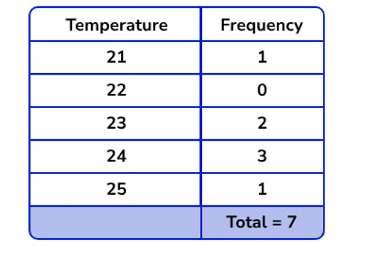
3. Frequency
Frequency tells how many times a particular value occurs in the data.
- Example: Temperatures recorded for 7 days are 25, 24, 23, 24, 24, 21, 23.
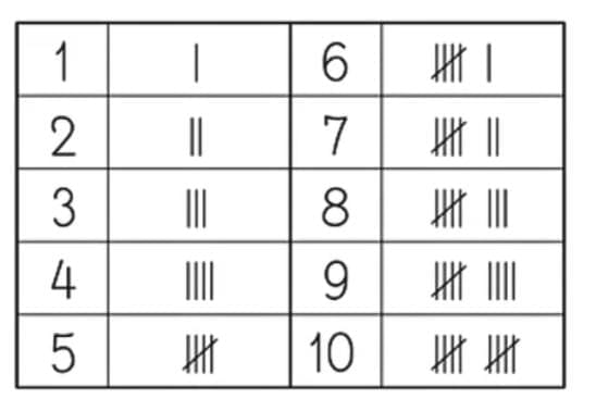
4. Tally Marks
Tally marks are a simple way to record and count data quickly. They help in keeping track of numbers while collecting information.
Draw one vertical line ( | ) for each item counted.
When you reach the fifth item, draw a diagonal line across the four vertical lines to make a group of five.
Each group of five is shown like this:

5. Pictographs
Pictographs represent data using pictures or symbols. Each picture (or symbol) stands for a fixed number of items - this is called the key or scale.
The scale, which indicates what each picture represents, must be clearly specified.
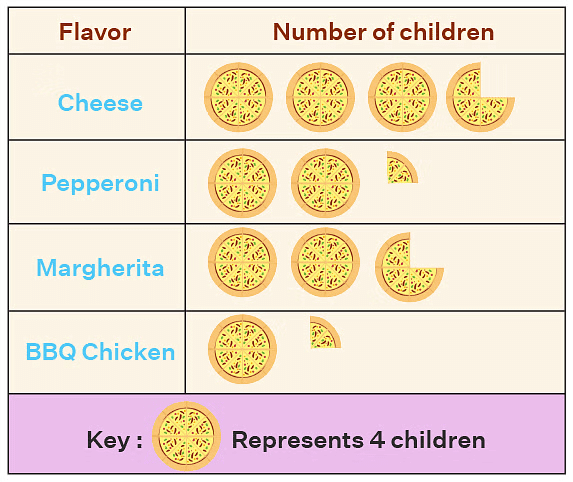
Since we cannot draw so many pictures for a larger data, we represent the key. Key means that one image represents how much frequency. So one pizza picture represents 4 number children.
7. Infographics
Infographics are creative visual presentations that combine graphs, pictures, and colours.
They help to show information in a fun and engaging way.
Infographics are often used in newspapers, websites, and presentations.
Try yourself: The tally mark |||| shows frequency …………..
8. Bar Graphs
A bar graph is a way of showing data using rectangular bars of equal width.
The length or height of each bar shows how often something happens (its frequency).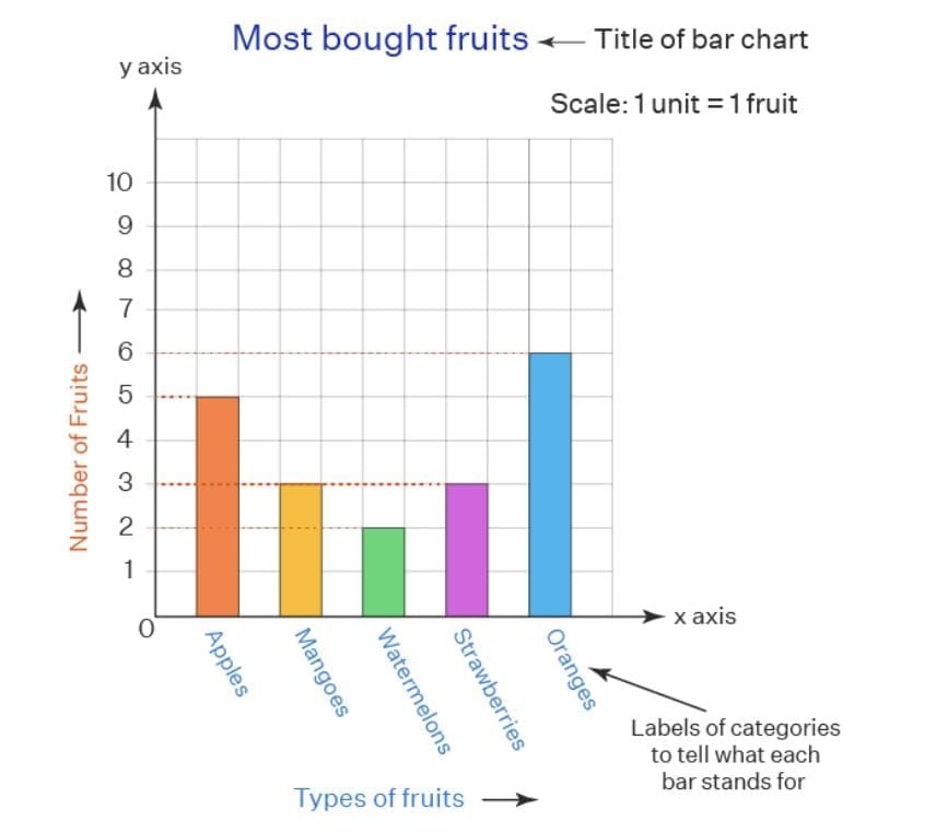
All bars must be of the same width.
The height or length of each bar represents the frequency or quantity.
A scale must be mentioned to show what each unit on the graph stands for.
Bars are usually drawn vertically or horizontally.
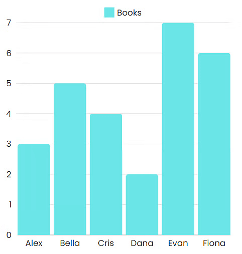
Example: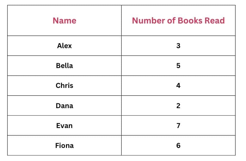
If we draw a bar graph,
Each friend's name will be written on the x-axis (horizontal axis).
The number of books will be shown on the y-axis (vertical axis).
The height of each bar will match the number of books read by that friend.
9. Choosing the Scale
When drawing a pictograph or bar graph, it is important to choose a scale that shows the data clearly and correctly.
The scale tells how much one unit or symbol represents.
A good scale makes the graph easy to read and visually neat.
Example:
If the highest number in your data is 10, you can choose
1 unit = 10 or 1 unit = 2 depending on the space available.
10. How to draw a bar graph:
To show the hours spent on different sports, follow these steps:
Step 1: Draw the Axes:
- The horizontal line (x-axis) shows the names of the sports.
- The vertical line (y-axis) shows the hours spent.
Step 2: Choose a Scale:
- Let 1 unit on the y-axis = 1 hour.
Step 3: Draw Bars:
- Soccer: 8 units high
- Basketball: 5 units high
- Tennis: 7 units high
- Swimming: 6 units high
Each bar must be of equal width and spaced evenly apart.
11. Reading and Interpreting Graphs
From pictographs and bar graphs you can:
- Compare sizes (which category is largest or smallest).
- Find totals by adding frequencies.
- Identify the mode (most frequent category).
- Estimate medians or other positional measures (for grouped data).
Always read the key and scale carefully before interpreting values.
12. Why Bar Graphs Are Useful
Bar graphs help us:
- Compare data easily between categories.
- See trends and differences at a glance.
- Present large data sets clearly.
They make information easy to understand and interpret quickly.
13. Design Tips and Common Mistakes
- Label axes and pictures clearly.
- Do not use different widths for bars unless representing different class widths; equal width is standard for simple bar graphs.
- Keep pictograph keys simple (for example, 1 picture = 5 units) to avoid drawing many small partial pictures.
- Ensure tally marks are grouped in fives for quick counting.
FAQs on Important Formulas: Data Handling and Presentation
| 1. What are some common types of data presentation techniques? |  |
| 2. How can data be organized for effective handling and presentation? | |
| 3. What is the significance of data handling and presentation in academic exams? | |
| 4. How can students improve their data handling and presentation skills for exams? | |
| 5. What are some common mistakes to avoid when handling and presenting data in exams? | |