Statistical Description of data Chapter Notes | Quantitative Aptitude for CA Foundation PDF Download
| Table of contents |

|
| Chapter Overview |

|
| Introduction of Statistics |

|
| Collection of Data |

|
| Presentationof Data |

|
| Drequency Distribution |

|
| Geographical Representation of a Frequency Distribution |

|
Chapter Overview
Introduction of Statistics
Statistics is crucial in various fields such as Management, Commerce, Economics, Social Sciences, and even in everyday life sectors like public services, defence, banking, insurance, and more. It involves collecting, analysing, and drawing conclusions from data to enhance specific domains. Statistics is universally applicable today, aiding government planning, business expansion, political strategies, and research.
History of Statistics
- The term 'statistics' has uncertain origins, possibly from Latin, Italian, German, or French.
- In ancient times, statistics referred to data collected for the welfare of the state.
- Historical records, such as those by Kautilya and in the Ain-i-Akbari, show early statistical practices.
- The first census in Egypt is an example of early statistical record-keeping.
Definition of Statistics
- As a Plural Noun: Refers to qualitative and quantitative data collected for analysis.
- As a Singular Noun: Refers to the scientific method of collecting, analysing, and presenting data to draw inferences.
Application of Statistics
Economics
- Statistics is foundational to modern Economics, with concepts like Time Series Analysis, Index Numbers, and Demand Analysis being integral.
- Econometrics, a branch of Economics, heavily relies on statistical methods.
- Regression analysis is crucial for forecasting demand, sales, prices, and quantities, which are vital for Economic planning.
Business Management
- Modern Business Management relies on statistical methods and operations research for decision-making, moving away from intuition-based approaches.
- Statistical decision theory helps in analyzing complex business strategies by evaluating different alternatives.
Commerce and Industry
- In today’s competitive environment, industrialists and businessmen use statistical procedures to make informed decisions.
- Statistics aids in analysing data on sales, raw materials, wages, and comparable products to maximize profits.
- Methods such as measures of central tendency, correlation and regression analysis, time series analysis, and statistical quality control are commonly employed.
Limitations of Statistics
- Focus on Aggregates: Statistics deals with aggregates, and individual cases hold less significance.
- Quantitative Data: While statistics focuses on quantitative data, qualitative data can be converted into quantitative form.
- Conditional Projections: Future projections are valid under specific conditions; violations can lead to inaccuracies.
- Random Sampling: Statistical inferences rely on random sampling; improper sampling can lead to erroneous conclusions.
Collection of Data
Data can be defined as numerical information about specific characteristics that are being studied. While we can differentiate between qualitative and quantitative characteristics, for statistical analysis, we need to convert qualitative data into quantitative data by assigning numerical values to them.
A quantitative characteristic is also called a variable, which means it is something that can be measured. Variables can be either:
Discrete variables: These can take on a finite or countably infinite set of distinct values. Examples include:
- The number of petals on a flower.
- The number of misprints in a book.
- The number of road accidents in an area.
Continuous variables: These can take any value within a given range. Examples include:
- Height.
- Weight.
- Sales or profit.
Qualitative characteristics are referred to as attributes, such as the gender of a baby, a person’s nationality, or the color of a flower.
Data can be broadly categorized into:
- Primary data
- Secondary data
Primary data is collected firsthand by a researcher or an organization. For example, if Professor Das collects data on the heights of all students in his class, this data is primary for him. If another person, like Professor Bhargava, uses this data to determine the average height, it becomes secondary data for him.
Collection of Primary Data can be done through various methods:
Interview method:
- Personal Interview: The investigator meets respondents in person to gather information.
- Indirect Interview: Information is collected from people associated with the issue when direct contact is not possible.
- Telephone Interview: Data is collected via phone, which is fast and cost-effective, but may have higher non-response rates.
- Mailed questionnaire method: A well-structured questionnaire is sent to respondents with prepaid postage. While it can reach a wide audience, it often results in high non-response rates.
- Observation method: Data is collected through direct observation or measurement, which can be time-consuming but accurate for small groups.
- Questionnaire filled by enumerators: Enumerators collect data directly by interviewing respondents, explaining questions as needed.
Sources of Secondary Data include:
- International sources: Organizations like WHO, ILO, IMF, World Bank.
- Government sources: Publications like Statistical Abstract by CSO and Indian Agricultural Statistics.
- Private and quasi-government sources: Institutions such as ISI, ICAR, NCERT.
- Unpublished sources: Data from research institutes and individual researchers.
Scrutiny of Data: It's vital to ensure the accuracy and consistency of data before conducting statistical analyses. There are no strict rules for this, but one should use intelligence, patience, and experience. Common errors can occur during data collection, such as:
- Errors made by enumerators while writing or copying data.
- Internal consistency can be checked by comparing related data sets, such as verifying population density with the formula: Density = Population / Area.
- Identifying bias in data collection, which can be corrected by re-collecting data on disputed cases.
Presentationof Data
Presentation of Data is a crucial step after collecting and verifying data. It involves organizing the information in a clear and concise manner to highlight its essential features. Proper presentation is the foundation for any statistical analysis.
Data can be classified into different categories such as:
- Chronological or Time Series Data: Data arranged based on successive time points or intervals, like the number of students appearing for CA final exams over the last twenty years.
- Geographical or Spatial Data: Data organized by region, such as the number of students appearing for CA final exams in different states in a specific year.
- Qualitative or Ordinal Data: Data classified based on attributes, like nationality, gender, or smoking habits of individuals.
- Quantitative or Cardinal Data: Data classified based on variables such as height, weight, profits, or salaries.
Data can be further divided into frequency and non-frequency data. Qualitative and quantitative data belong to the frequency group, while time series and geographical data fall under the non-frequency group.
Mode of Presentation of Data
The mode of presentation of data includes:
(a) Textual presentation;
(b) Tabular presentation or Tabulation;
(c) Diagrammatic representation.
(a) Textual Presentation
Textual presentation involves conveying data through paragraphs. While it's straightforward and allows for precise observations, it lacks the comparative and engaging qualities of other methods.
(b) Tabular Presentation or Tabulation
Tabulation is the organized display of data in a statistical table with rows and columns. It should have a reference number, title, and footnotes. Guidelines for effective tabulation include:
- Serial Number and Title: Each table should have a unique number and a clear title.
- Table Structure: Include a caption, box-head, stub, and body. The caption describes columns, the box-head includes column numbers and units, the stub describes rows, and the body contains numerical data.
- Balance: The table's length and breadth should be well-proportioned.
- Facilitate Comparison: Arrange data for easy comparison, showing row and column totals and measurement units.
- Intelligent Arrangement: Organize data in a balanced sequence for visual appeal.
- Footnotes: Include notes at the bottom for clarity about data sources or specific rows/columns.
The textual presentation of data, relating to the workers of Roy Enamel Factory is shown in the following table.
Status of the workers of Roy Enamel factory on the basis of their trade union membership for 2009 and 2010. Table 13.1.1
 Source:
Footnote: TU, M, F and T stand for trade union, male, female and total respectively.
The tabulation method is usually preferred to textual presentation as
(i) It facilitates comparison between rows and columns.
(ii) Complicated data can also be represented using tabulation.
(iii) It is a must for diagrammatic representation.
(iv) Without tabulation, statistical analysis of data is not possible.
(c) Diagrammatic representation of data
Another alternative and attractive representation of statistical data is provided by charts, diagrams and pictures. Unlike the first two methods of representation of data, diagrammatic representation can be used for both the educated section and uneducated section of the society. Furthermore, any hidden trend present in the given data can be noticed only in this mode of representation. However, compared to tabulation, this is less accurate. So, if there is a priority for accuracy, we have to recommend tabulation.
We are going to consider the following types of diagrams :
I. Line diagram or Historiagram;
II. Bar diagram;
III. Pie chart.
Diagrammatic Representation of Time Series Data
I. Line Diagram or Historiagram
- A line diagram is used when data varies over time.
- In a simple line diagram, pairs of values (t, yt) are plotted, where yt represents the time series at time point t.
- The plotted points are connected by line segments, creating the line diagram.
- For time series with wide fluctuations, a logarithmic or ratio chart may be used, plotting Log yt against t.
- A multiple line chart represents two or more related time series data in the same unit, while a multiple-axis chart is used when variables are in different units.
II. Bar Diagram
- There are two types of bar diagrams: Horizontal Bar Diagram and Vertical Bar Diagram.
- Horizontal bar diagrams are used for qualitative data or data varying over space, while vertical bar diagrams are associated with quantitative data or time series data.
- Multiple or grouped bar diagrams are used to compare related series, while component or sub-divided bar diagrams represent data divided into components.
- Divided bar charts or percentage bar diagrams are used to compare different components of a variable and relate components to the whole.
- Pie charts or pie diagrams may also be used in similar situations.
ILLUSTRATIONS:
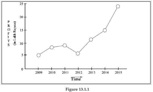
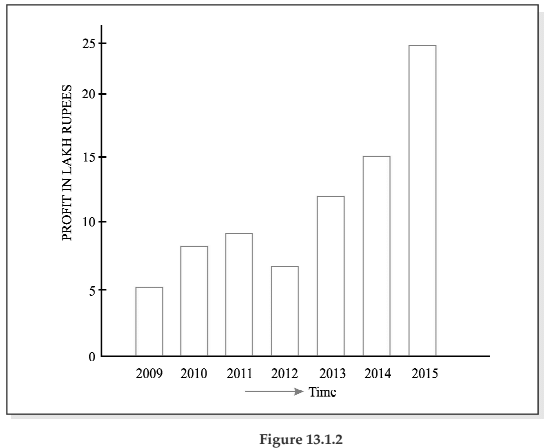
Example 13.1.1: The profits in lakhs of Rupees of an industrial house for 2009, 2010, 2011, 2012, 2013, 2014, and 2015 are 5, 8, 9, 6, 12, 15 and 24 respectively. Represent these data using a suitable diagram.
SOLUTION:
We can represent the profits for 7 consecutive years by drawing either a line chart or a vertical bar chart. Fig. 13.1.1 shows a line chart and figure 13.1.2 shows the corresponding vertical bar chart.
Showing vertical bar diagram for the Profit of an Industrial house from 2009 to 2015.
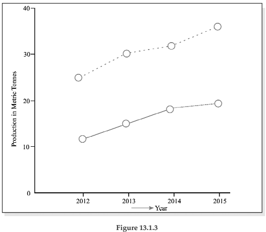
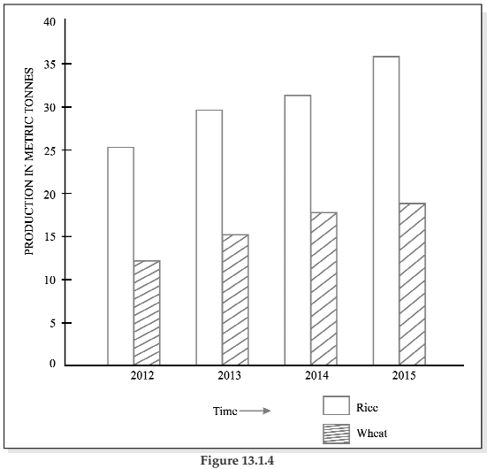
Example 13.1.2: The production of wheat and rice of a region are given below :
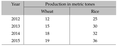
Represent this information using a suitable diagram.
Solution:
We can represent this information by drawing a multiple line chart. Alternately, a multiple bar diagram may be considered. These are depicted in figure 13.1.3 and 13.1.4 respectively.
Multiple line chart showing production of wheat and rice of a region during 2012–2015. (Dotted line represent production of rice and continuous line that of wheat).
Multiple bar chart representing production of rice and wheat from 2012 to 2015.
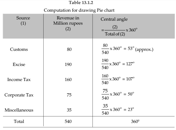
Example 13.1.3: Draw an appropriate diagram with a view to represent the following data :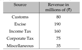
Solution:
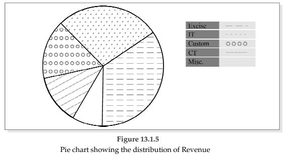
Pie chart or divided bar chart would be the ideal diagram to represent this data. We consider Pie chart.
Drequency Distribution
Frequency data arise when we categorize statistical information based on a variable or an attribute. A frequency distribution is defined as a tabular representation of statistical data, typically arranged in ascending order, that relates to a measurable characteristic based on individual values or groups of values under study.For instance, if the characteristic is an attribute like nationality, we create a table by assigning numerical values to various classes of that attribute, such as counting the number of individuals from India, Britain, France, Germany, etc. This qualitative characteristic is divided into distinct, mutually exclusive, and exhaustive categories, with the corresponding figures indicating how frequently each class occurs, known as the frequency of that class. Therefore, the count of Indians in the dataset represents the frequency for that nationality. In essence, frequency distribution is a statistical table that allocates total frequency among multiple classes.
When tabulating data for a discrete random variable, it is referred to as Discrete or Ungrouped Frequency Distribution. Conversely, if we are dealing with a continuous variable, this classification is termed Grouped Frequency Distribution. In grouped frequency distribution, tabulation is done not for a single value but for a range of values. For example, the distribution of car accidents in Delhi over 12 months in 2005 exemplifies an ungrouped frequency distribution, while the distribution of students' heights at St. Xavier’s College for 2004 illustrates a grouped frequency distribution.
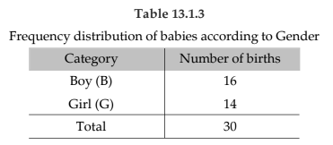
Example 13.1.4: Following are the records of babies born in a nursing home in Bangalore during a week (B denoting Boy and G for Girl):

Construct a frequency distribution according to gender.
Solution:
In order to construct a frequency distribution of babies in accordance with their gender, we count the number of male births and that of female births and present this information in the following table.
Frequency Distribution of a Variable
For the construction of a frequency distribution of a variable, we need to go through the following steps :
- Find the largest and smallest observations and obtain the difference between them, known as Range, in case of a continuous variable.
- Form a number of classes depending on the number of isolated values assumed by a discrete variable. In case of a continuous variable, find the number of class intervals using the relation, No. of class Interval × class length Range.
- Present the class or class interval in a table known as frequency distribution table.
- Apply ‘tally mark’ i.e. a stroke against the occurrence of a particulars value in a class or class interval.
- Count the tally marks and present these numbers in the next column, known as frequency column, and finally check whether the total of all these class frequencies tally with the total number of observations.
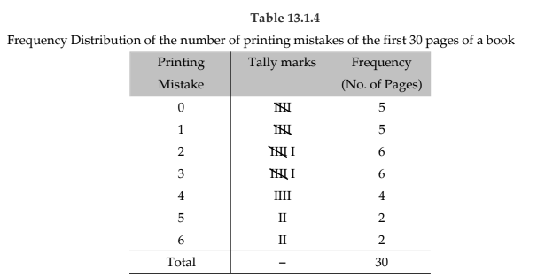
Example 13.1.5: A review of the first 30 pages of a statistics book reveals the following printing mistakes:

Make a frequency distribution of printing mistakes.
Solution:
Since x, the printing mistakes, is a discrete variable, x can assume seven values 0, 1, 2, 3, 4, 5 and 6. Thus we have 7 classes, each class comprising a single value.
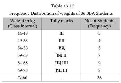
Example 13.1.6: Following are the weights in kgs. of 36 BBA students of St. Xavier’s College.
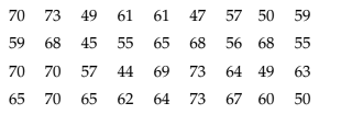
Construct a frequency distribution of weights, taking class length as 5.
Solution:
We have, Range = Maximum weight – Minimum weight
= 73 kgs. – 44 kgs.
= 29 kgs.
No. of class interval × class lengths Range
⇒ No. of class interval × 5 29
⇒ No. of class interval = 29/5 ≅ 6
(We always take the next integer as the number of class intervals so as to include both the minimum and maximum values).
Some important terms associated with a frequency distribution
Class Limit (CL)
- The class limit refers to the minimum and maximum values that a class interval can contain.
- The minimum value is called the lower class limit (LCL), while the maximum value is called the upper class limit (UCL).
- For example, in the frequency distribution of weights of BBA students, the LCL and UCL of the first class interval are 44 kgs and 48 kgs, respectively.
Class Boundary (CB)
- Class boundaries represent the actual limits of a class interval.
- For overlapping or mutually exclusive classification that excludes upper class limits (e.g., 10-20, 20-30), class boundaries coincide with class limits and are used for continuous variables.
For non-overlapping or mutually inclusive classification that includes both class limits (e.g., 0-9, 10-19), applicable for discrete variables, the class boundaries are calculated as:
- Lower Class Boundary (LCB). LCL - 2
- Upper Class Boundary (UCB). UCL + 2
- D is the difference between the LCL of the next class interval and the UCL of the current class interval.
For instance, in the given data, the LCB of the first class interval is calculated as:
- LCB. (49 - 48) + 44 kgs - 2 = 43.50 kgs
The corresponding UCB is calculated as:
- UCB. (49 - 48) + 48 kgs + 2 = 48.50 kgs
id-point or Mid-value or class mark
Corresponding to a class interval, this may be defined as the total of the two class limits or class boundaries to be divided by 2. Thus, we have

Referring to the distribution of weight of BBA students, the mid-points for the first two class intervals are

i.e. 46 kgs. and 51 kgs. respectively.
Width or size of a class interval
The width of a class interval may be defined as the difference between the UCB and the LCB of that class interval. For the distribution of weights of BBA students, C, the class length or width is 48.50 kgs. – 43.50 kgs. = 5 kgs. for the first class interval. For the other class intervals also, C remains same.
Cumulative Frequency
The cumulative frequency corresponding to a value for a discrete variable and corresponding to a class boundary for a continuous variable may be defined as the number of observations less than the value or less than or equal to the class boundary. This definition refers to the less than cumulative frequency. We can define more than cumulative frequency in a similar manner. Both types of cumulative frequencies are shown in the following table.
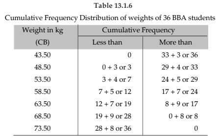
Frequency density of a class interval
It may be defined as the ratio of the frequency of that class interval to the corresponding class length. The frequency densities for the first two class intervals of the frequency distribution of weights of BBA students are 3/5 and 4/5 i.e. 0.60 and 0.80 respectively.
Relative frequency and percentage frequency of a class interval
Relative frequency of a class interval may be defined as the ratio of the class frequency to the total frequency. Percentage frequency of a class interval may be defined as the ratio of class frequency to the total frequency, expressed as a percentage. For the last example, the relative frequencies for the first two class intervals are 3/36 and 4/36 respectively and the percentage frequencies are 300/36 and 400/36 respectively. It is quite obvious that whereas the relative frequencies add up to unity, the percentage frequencies add up to one hundred.
Geographical Representation of a Frequency Distribution
We consider the following types of graphical representation of frequency distribution :(i) Histogram or Area diagram;
(ii) Frequency Polygon;
(iii) Ogives or cumulative Frequency graphs.
(i) Histogram or Area diagram
This is a very convenient way to represent a frequency distribution. Histogram helps us to get an idea of the frequency curve of the variable under study. Some statistical measure can be obtained using a histogram. A comparison among the frequencies for different class intervals is possible in this mode of diagrammatic representation.
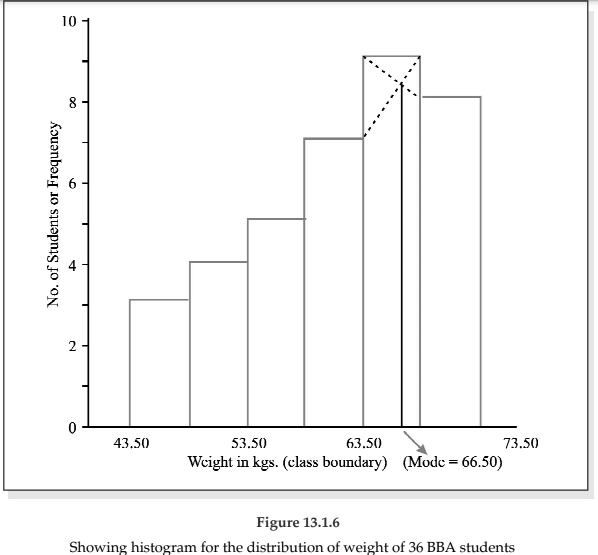
In order to draw a histogram, the class limits are first converted to the corresponding class boundaries and a series of adjacent rectangles, one against each class interval, with the class interval as base or breadth and the frequency or frequency density usually when the class intervals are not uniform as length or altitude, is erected. The histogram for the distribution of weight of 36 BBA students is shown below. The mode of the weights has also been determined using the histogram.
i.e. Mode = 66.50 kgs.
(ii) Frequency Polygon
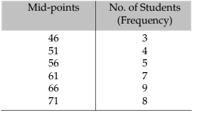
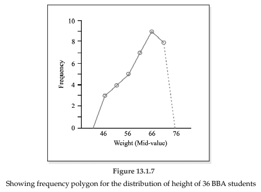
Usually frequency polygon is meant for single frequency distribution. However, we also apply it for grouped frequency distribution provided the width of the class intervals remains the same. A frequency curve can be regarded as a limiting form of frequency polygon. In order to draw a frequency polygon, we plot (xi, f i) for i = 1, 2, 3, ……….. n with xi denoting the mid-point of the its class interval and f i, the corresponding frequency, n being the number of class intervals. The plotted points are joined successively by line segments and the figure, so drawn, is given the shape of a polygon, a closed figure, by joining the two extreme ends of the drawn figure to two additional points (x0, 0) and (xn+1,0).
The frequency polygon for the distribution of weights of BBA students is shown in Figure 13.7. We can also obtain a frequency polygon starting with a histogram by adding the midpoints of the upper sides of the rectangles successively and then completing the figure by joining the two ends as before.
(iii) Ogives or Cumulative Frequency Graph
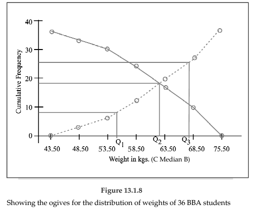
By plotting cumulative frequency against the respective class boundary, we get ogives. As such there are two ogives – less than type ogives, obtained by taking less than cumulative frequency on the vertical axis and more than type ogives by plotting more than type cumulative frequency on the vertical axis and thereafter joining the plotted points successively by line segments. Ogives may be considered for obtaining quartiles graphically. If a perpendicular is drawn from the point of intersection of the two ogives on the horizontal axis, then the x-value of this point gives us the value of median, the second or middle quartile. Ogives further can be put into use for making short term projections.
Figure 13.8 depicts the ogives and the determination of the quartiles. This figure give us the following information.
1st quartile or lower quartile (Q1) = 55 kgs.
2nd quartile or median (Q2 or Me) = 62.50 kgs.
3rd quartile or upper quartile (Q3) = 68 kgs.
We find
Q1 = 55 kgs.
Q2 = Me = 62.50 kgs.
Q3 = 68 kgs.
Frequency Curve
A frequency curve is a smooth curve for which the total area is taken to be unity. It is a limiting form of a histogram or frequency polygon. The frequency curve for a distribution can be obtained by drawing a smooth and free hand curve through the mid-points of the upper sides of the rectangles forming the histogram.
There exist four types of frequency curves namely
(a) Bell-shaped curve;
(b) U-shaped curve;
(c) J-shaped curve;
(d) ixed curve.
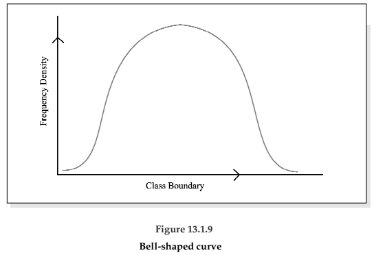
Most of the commonly used distributions provide bell-shaped curve, which, as suggested by the name, looks almost like a bell. The distribution of height, weight, mark, profit etc. usually belong to this category. On a bell-shaped curve, the frequency, starting from a rather low value, gradually reaches the maximum value, somewhere near the central part and then gradually decreases to reach its lowest value at the other extremity.
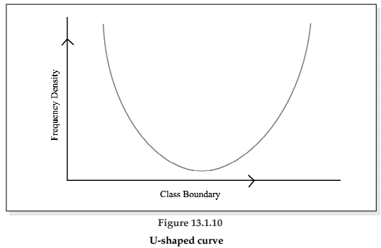
For a U-shaped curve, the frequency is minimum near the central part and the frequency slowly but steadily reaches its maximum at the two extremities. The distribution of Kolkata bound commuters belongs to this type of curve as there are maximum number of commuters during the peak hours in the morning and in the evening.
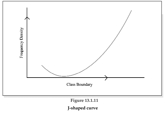
The J-shaped curve starts with a minimum frequency and then gradually reaches its maximum frequency at the other extremity. The distribution of commuters coming to Kolkata from the early morning hour to peak morning hour follows such a distribution. Sometimes, we may also come across an inverted J-shaped frequency curve.
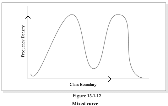
Lastly, we may have a combination of these frequency curves, known as mixed curve. These are exhibited in the following figures.
|
101 videos|209 docs|89 tests
|

