Line Graphs: Introduction & Examples (with Solutions) | CSAT Preparation - UPSC PDF Download
| Table of contents |

|
| A Graph as a Visual Representation of Data |

|
| Understanding Line Graphs |

|
| Features of Line Graphs |

|
| Properties of Line Graphs |

|
| Parts of a Line Graph |

|
| Types of Line Graphs |

|
A Graph as a Visual Representation of Data
A graph provides a visual way to represent data, making it easier to identify trends and patterns compared to tabular formats. Graphs are particularly useful for handling and depicting large volumes of data, as tables may become cumbersome in such scenarios.
Understanding Line Graphs
A line graph is a straightforward method to display data, ideal for representing single or multiple related continuous variables against a specific range of discrete values. It involves plotting two variables in relation to each other on a two-dimensional plane. Typically, the variable used for comparison, known as the independent variable, is placed on the horizontal X-axis. The dependent variable, representing the actual measured values, is plotted on the vertical Y-axis. Points representing the values of a dependent variable are connected by line segments, giving rise to the term “Line Graph.” This type of graph is also referred to as a Cartesian graph.
Features of Line Graphs
The slope of a line graph indicates the magnitude of change between two consecutive points. A steeper slope signifies a greater change in magnitude. Line graphs are effective in illustrating variations or movements of an object by comparing two different parameters displayed on the axes.
Properties of Line Graphs
Some of the properties of line graphs are as follows:
- Line graphs effectively display specific data values, allowing easy determination of one variable based on the other.
- They clearly illustrate trends, showing how one variable changes as the other increases or decreases.
- They assist in predicting outcomes for unrecorded data points.
- Line graphs allow comparison between two or more variables, with each represented along an axis.
- By providing a visual representation, line graphs simplify data interpretation and are particularly helpful for identifying trends and rates of change.
- The slope of a line graph reflects absolute growth rather than percentage growth or other characteristics.
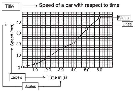
Parts of a Line Graph
Parts of a Line Graph are classified as:
- Title The title of the line graph tells us what the graph is about.
- Labels The horizontal label across the bottom and the vertical label along the side tell us what kinds of facts are listed.
- Scales The horizontal scale across the bottom and the vertical scale along the side tell us how much or how many kinds of facts are there.
- Points The points or dots on the graph show us the facts.
- Lines The lines connecting the points give estimates of the values between the points. e.g. Various parts of a line graph can be shown with the help of a line graph.
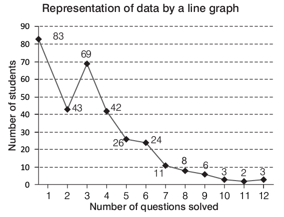
Representation of Data by a Line Graph
The following data shows the number of questions solved by 320 students at the catalyst career in a test on data interpretation.
 This information can be represented by the line graph which is shown below:
Types of Line Graphs
The chapter on "Line Graphs" encompasses a variety of question types, making it challenging to predict the exact nature of the questions that might appear in exams. However, based on observation, analysis, and experience, we have identified common question types that are typically included.
Most questions in this chapter fall into three main categories, which can help streamline and simplify your study process:
Type I Single Dependent Variable Line Graph
These graphs show changes in a single variable, over a certain period of time. Time is normally measured along the X-axis whereas the values of the characteristic under study are plotted along the Y-axis.
Example: Study the following line diagram carefully and answer the questions given below it.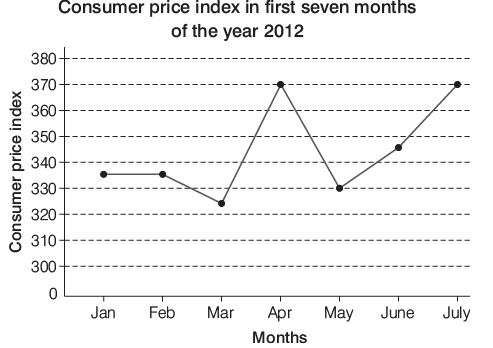
Which month showed the highest percentage difference in the consumer price index over the previous month?
(a) March
(b) April
(c) May
(d) June
Ans: (b)
Sol: Percentage difference in the CPI over the previous month
Thus, in April CPI showed the highest percentage difference.
There is no need to check the percentage difference in the CPI for other months as they have lower percentage difference.
Type II More than One Dependent Variable Line Graph
In this type of graph, two or more lines are drawn to represent two or more dependent variables. This representation is very effective for the representation of two or more dependent variables.
Example: Consider the following graph and answer the question based on it.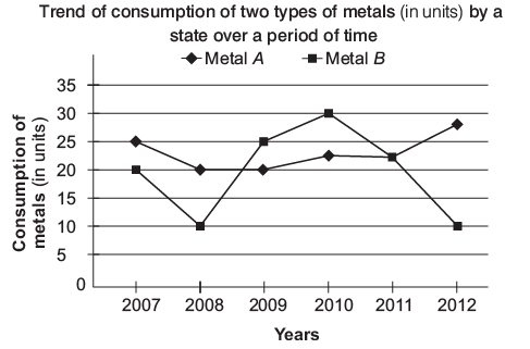 Q: The number of years for which the consumption of metal B was more than the consumption for metal A in the given period was
(a) 1
(b) 2
(c) 3
(d) 5
Ans: (b)
Sol: From the above line graph, it is clear that consumption of metal B was more than that of metal A in 2009 and 2010 i.e. in 2 yr.
Type III Range Graph
For certain types of data, it is crucial to represent the range of variation of a variable. This is achieved through a range graph, which highlights the deviation or the difference between the two extreme values of the variable being analyzed. A range graph emphasizes the extent of variation of a single phenomenon over a specific period, such as daily temperature fluctuations or an individual’s blood pressure readings on different days.
Example: Read the given graph carefully and answer the following question.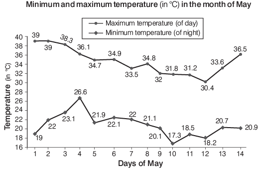
The maximum difference in the day and night temperature is
(a) 15.6°C
(b) 20°C
(c) 22.5°C
(d) 14.2°C
Ans: (b)
Sol: From the above solution, it is clear that maximum difference in the day and night temperature is 20°C on day 1.
Points to Remember While Solving Questions Based on Line Graphs
- Any segment of the line graph parallel to the X-axis indicates no change in the Y-parameter value relative to the X-parameter.
- The steepest segment of the graph signifies the maximum percentage change in value between two consecutive periods.
- A steep upward slope represents the highest percentage growth, while a steep downward slope indicates the maximum percentage decline in the value plotted on the other axis.
Solving Questions
Direction: The following graph shows the average profit of two fruit-sellers. A and B in thousands (₹) per year from the year 1995 to 2000. Consider the greaph and answer the questions that follow.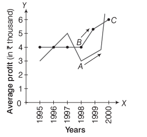
Q1: In which year is the average profit of A and B same?
(a) 1995
(b) 1996
(c) 1997
(d) 1998
Ans: (b)
Sol: It is clear from the given graph that average profit of A and B is the same in the year 1996.
Q2: How much more average profit did A make in the year 2000 than in the year 1999?
(a) ₹ 200
(b) ₹ 1000
(c) ₹ 1500
(d) ₹ 2000
Ans: (d)
Sol: A’s average profit in the year 1999 = ₹ 4000
A’s average profit in the year 2000 = ₹ 6000
∴ A made ₹ 2000 more average profit in the year 2000 than in the year 1999.
Direction: Study the following line graph and answer the questions based on it.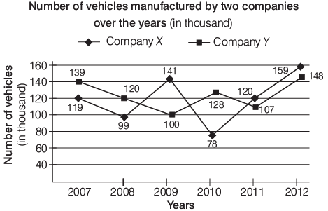
Q3: What is the difference between the number of vehicles manufactured by company Y in 2009 and 2010?
(a) 50000
(b) 42000
(c) 33000
(d) 28000
Ans: (d)
Sol: Number of vehicles manufactured by company Y
in 2009 = 100000
in 2010 = 128000
∴ Required difference = 128000 − 100000 = 28000
Q4: What is the average numbers of vehicles manufactured by company X over the given period? (rounded off to nearest integer)
(a) 119333
(b) 113666
(c) 112778
(d) 111223
Ans: (a)
Sol: Average number of vehicles manufactured by company X
|
208 videos|138 docs|138 tests
|
FAQs on Line Graphs: Introduction & Examples (with Solutions) - CSAT Preparation - UPSC
| 1. What are the main features of a line graph? |  |
| 2. How do you interpret a line graph? |  |
| 3. What are the different types of line graphs? |  |
| 4. What are the properties of line graphs? |  |
| 5. What are the key parts of a line graph? |  |

|
Explore Courses for UPSC exam
|

|


