Data Science Chapter Notes | Artificial Intelligence for Class 10 PDF Download

Introduction
Artificial Intelligence (AI) relies heavily on data to function effectively. The type and quality of data fed into AI systems determine their intelligence and capabilities. Based on the nature of the data, AI can be categorized into three main domains: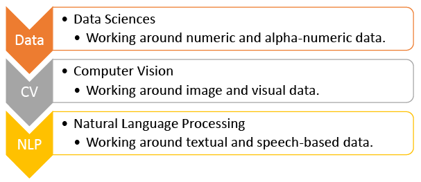
Applications of Data Sciences
Data Science involves analyzing data to derive insights and make informed decisions. In the context of Artificial Intelligence, data analysis is crucial for training machines to perform tasks autonomously. Here are some prominent applications of Data Science in various fields:
1. Fraud and Risk Detection in Finance:
- Data science plays a vital role in identifying and mitigating fraud and risk in the financial sector.
- By analyzing historical data and customer profiles, banks can assess the risk of default and tailor their products accordingly.
- Data scientists help financial institutions leverage their existing data to predict and prevent fraudulent activities, improving overall efficiency and profitability.

2. Genetics and Genomics:
- Data science is revolutionizing personalized medicine through advancements in genetics and genomics.
- By integrating genomic data with other health information, researchers can better understand the relationship between genetics, diseases, and drug responses.
- This research aims to enhance genetic risk predictions and develop more targeted treatment approaches based on individual genetic profiles.

3. Internet Search:
- Search engines like Google, Yahoo, and Bing utilize data science algorithms to deliver relevant search results quickly.
- With millions of queries processed daily, data science is essential for organizing and retrieving information efficiently, contributing to the success and functionality of these platforms.
4. Targeted Advertising:
- Data science plays a crucial role in digital marketing by enabling targeted advertising based on user behavior and preferences.
- Advertisements are tailored to individual users, increasing the likelihood of engagement and conversion, and making digital ads more effective than traditional forms of advertising.

5. Website Recommendations:
- E-commerce and content platforms like Amazon, Netflix, and LinkedIn use data science to provide personalized recommendations to users.
- By analyzing previous user behavior, these platforms suggest relevant products or content, enhancing user experience and driving engagement.

6. Airline Route Planning:
- The airline industry is leveraging data science to optimize operations and improve profitability.
- Data analysis helps airlines predict flight delays, determine the best aircraft types to purchase, and plan efficient flight routes.
- Additionally, data science aids in developing customer loyalty programs, enhancing overall service and operational efficiency.

Introduction to Data Sciences
Data Sciences involves the use of Python along with mathematical concepts such as statistics, data analysis, and probability. These concepts are fundamental for analyzing data effectively in Python and can also be applied in the development of artificial intelligence (AI) applications.
AI Project Cycle and Data Sciences
Before delving deeper into data analysis, it's important to revisit how Data Sciences can be utilized to address pressing issues. Let's explore the AI project cycle framework in the context of Data Sciences through an example.
Remember the AI Project Cycle?
 The Scenario
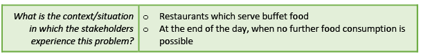
Humans are inherently social beings, which is why we often find ourselves organizing or taking part in various social gatherings. One of the activities we enjoy the most is dining out with friends and family. This love for eating out has led to the proliferation of restaurants everywhere, many of which offer buffets to provide customers with a wide range of food options.
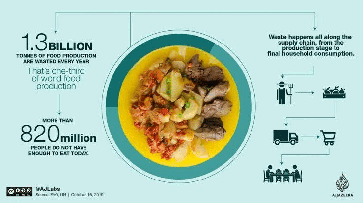
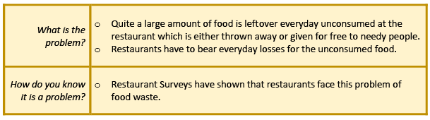
Restaurants typically prepare food in large quantities, anticipating a good number of customers. However, at the end of the day, a significant amount of food often remains unsold. Restaurants are reluctant to serve stale food the next day, so this leftover food becomes unusable.
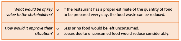
Every day, restaurants cook in bulk based on their expectations of customer turnout. When these expectations are not met, it results in a considerable amount of food waste, leading to financial losses for the establishment. They are faced with the dilemma of either throwing away the excess food or giving it away for free to those in need. Over the course of a year, these daily losses add up to a substantial amount.
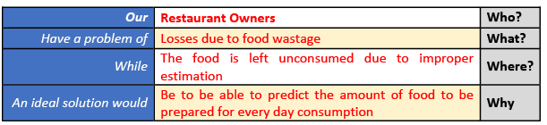
Problem Scoping
In this section, we will explore the problem in detail by filling out the 4Ws problem canvas.
Who Canvas - Who is experiencing the problem?
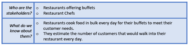
What Canvas - What is the nature of their problem?
 Where Canvas - Where does the problem occur?
Why? - Why is this problem worth solving?
Now that we have identified all the factors related to our problem, let's move on to filling out the problem statement template.
Data Acquisition
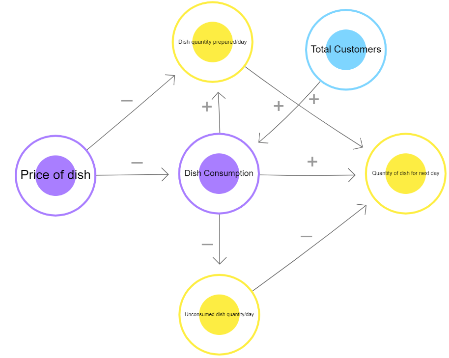
Now that we have finalized the goal of our project, let's focus on the various data features that impact the problem in one way or another. Any AI-based project requires data for testing and training, so it's essential to understand what kind of data needs to be collected to work towards our goal. In our case, several factors influence the quantity of food to be prepared for the next day's consumption in buffets:

Now, let's explore how these factors are related to our problem statement. To do this, we can use the System Maps tool to understand the relationship of these elements with the project's goal. The System Map illustrates the connections between each factor and our objective.
In the System Map, positive arrows indicate a direct relationship between elements, while negative arrows show an inverse relationship.
After examining the factors affecting our problem statement, it's time to look at the data that needs to be acquired for our goal. For this project, we need a dataset that includes all the mentioned elements for each dish prepared by the restaurant over a 30-day period. This data is collected offline through regular surveys, as it is a personalized dataset created for the specific needs of one restaurant.
The collected data falls under the following categories:
Exploring Data
Introduction
- After setting up the database, the next step is to examine and understand the collected data to determine its suitability for our project.
- The objective is to predict the quantity of food to be prepared for the following day.
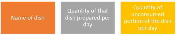
Required Data
To achieve this, we need specific information:
Data Extraction and Cleaning
- We will extract the necessary information from the curated dataset and clean it to ensure there are no errors or missing elements.
Modelling
After preparing the dataset, we proceed to train our model using it. In this instance, we opt for a regression model, where the dataset is input as a dataframe and trained accordingly. Regression falls under the category of Supervised Learning and involves continuous data over a period of time. Since our data consists of continuous information over 30 days, a regression model is suitable for predicting future values in a similar manner.
The 30-day dataset is split into a 2:1 ratio for training and testing. Initially, the model is trained on the first 20 days of data and subsequently evaluated on the remaining 10 days.
Evaluation of the Model
After training the model on the initial 20-day dataset, it's crucial to evaluate its performance and accuracy in predicting food quantities. Here's how the evaluation process works:
Step 1: Inputting Data
- The trained model is provided with data about the name of a dish and the quantity produced for that dish.
Step 2: Historical Data Input
- The model receives information about the quantity of food left unconsumed for the same dish on previous occasions.
Step 3: Model Processing
- The model processes the entries based on the training it received during the modeling stage.
Step 4: Making Predictions
- The model predicts the quantity of food to be prepared for the next day.
Step 5: Comparison with Testing Dataset
- The prediction is compared with the values from the testing dataset. Ideally, the quantity predicted should be the total quantity minus the unconsumed quantity.
Step 6: Testing the Model
- The model is tested against 10 datasets that were set aside during training.
Step 7: Evaluating Prediction Accuracy
- Prediction values from the testing dataset are compared to the actual values.
Step 8: Assessing Model Accuracy
- If the predicted values are similar to the actual values, the model is considered accurate. If not, adjustments are made either by changing the model or training it on more data for better accuracy.
Once the model achieves optimal accuracy, it is ready for deployment in the restaurant for real-time food quantity predictions.
Data Collection
Data collection is an age-old practice that has been part of society for a long time. Even in the past, when people had limited understanding of calculations, records were kept in some form or another to track important information. Data collection is a task that doesn’t require any technological expertise. However, analyzing the data is where the challenge lies for humans, as it involves dealing with numbers and alphanumeric information. This is where Data Science becomes valuable.
Data Science not only provides a clearer understanding of the dataset but also enhances it by offering deeper and more precise analyses. With the incorporation of AI, machines can make predictions and suggestions based on the data.
After discussing an example of a Data Science project, we have a better understanding of the type of data that can be used for such projects. Data used in data domain-based projects is primarily in numerical or alphanumeric format and is organized in the form of tables. These datasets are commonly found in institutions for record-keeping and other purposes.
- Banks
- ATM Machines
- Movie Theatres
Banks
- Databases: Banks maintain databases of loans issued, account holders, locker owners, employee registrations, and bank visitors.
- Usage Details: Information on cash denominations, transaction details, and visitor details is recorded daily.
ATM Machines
- Data Collected: ATM machines collect data on cash withdrawals, deposits, and user transactions.
- Usage Details: Details about cash denominations and transaction types are recorded.
Movie Theatres
- Movie Details: Information about movies being screened, showtimes, and ticket availability is recorded.
- Ticket Sales: Data on tickets sold offline and online, as well as refreshment purchases, is maintained.
Now, let’s explore some sources of data and discuss whether these datasets should be accessible to all.
Classroom
- Data Collected: Attendance records, grades, and student information are maintained.
- Usage: This data is used for monitoring student progress and ensuring accountability.
School
- Data Collected: Student enrollment, teacher assignments, and resource allocations are recorded.
- Usage: This data helps in managing school operations and planning.
City
- Data Collected: Population statistics, resource distribution, and public service usage are tracked.
- Usage: This data is used for urban planning and resource management.
The data mentioned above is typically organized in tables containing numeric or alphanumeric information.
Sources of Data
Data can be collected from various sources, and the process of data collection can be divided into two categories: Offline and Online.
When accessing data from any source, it is important to keep the following points in mind:
- Only use data that is available for public use.
- Personal datasets should only be used with the consent of the owner.
- Do not breach someone’s privacy to collect data.
- Only collect data from reliable sources, as data from random sources can be incorrect or unusable.
- Reliable sources ensure the authenticity of data, which is crucial for proper training of AI models.
Different Formats of Data
In Data Science, data is typically collected in tabular form, and these datasets can be stored in various formats. Here are some commonly used formats:
- CSV (Comma Separated Values): CSV is a straightforward file format for storing tabular data. Each line in a CSV file represents a data record, with fields separated by commas. This is why they are called CSV files.
- Spreadsheet:. spreadsheet is a tool, either on paper or computer, used for organizing and recording data in rows and columns. Microsoft Excel is a popular program for creating and managing spreadsheets.
- SQL (Structured Query Language): SQL is a specialized programming language used for managing and manipulating data in various types of Database Management Systems (DBMS). It is particularly effective for handling structured data.
There are many other database formats available as well, which you can explore further online!
Data Access
To utilize the collected data for programming, it's essential to know how to access it within Python code. Fortunately, there are several Python packages designed to facilitate access to structured data (in tabular format) seamlessly. Let's explore some of these packages:
NumPy
- NumPy, short for Numerical Python, is the foundational package for performing mathematical and logical operations on arrays in Python. It is widely used for numerical computations due to its efficiency and versatility. NumPy provides a broad range of arithmetic operations, making it easier to work with numerical data.
- One of the key features of NumPy is its ability to work with arrays, which are homogeneous collections of data. An array consists of multiple values of the same datatype, such as numbers, characters, or booleans. However, all elements in an array must be of the same datatype. In NumPy, arrays are referred to as ND-arrays (N-Dimensional Arrays) because the package allows the creation of n-dimensional arrays.
To better understand arrays in NumPy, it's helpful to compare them with lists:
Pandas
Pandas is a library in Python designed for data manipulation and analysis, especially for numerical tables and time series. The name "Pandas" comes from "panel data," which refers to data sets with observations over time for the same subjects.
It is suitable for various types of data, including:
- Tabular data with different types of columns, like in SQL tables or Excel spreadsheets.
- Time series data that can be ordered or unordered, not necessarily at fixed intervals.
- Matrix data with labeled rows and columns, whether the data is the same type or different types.
- Any observational or statistical data sets, even if they are not labeled.
The main data structures in Pandas are the Series (for 1-dimensional data) and DataFrame (for 2-dimensional data), which cover most use cases in finance, statistics, social science, and engineering. Pandas is built on NumPy and works well with other scientific computing libraries.
Some key features of Pandas include:
- Handling missing data (NaN) in both floating-point and non-floating-point data.
- Allowing changes in size by adding or deleting columns in DataFrames and higher-dimensional objects.
- Automatic and explicit data alignment to labels during computations.
- Smart label-based slicing, fancy indexing, and subsetting of large datasets.
- Easy merging and joining of datasets.
- Flexible reshaping and pivoting of datasets.
Matplotlib
Matplotlib is a powerful library in Python used for creating 2D plots from arrays. It is built on top of NumPy arrays and is compatible with multiple platforms. One of the main advantages of data visualization is that it enables us to see large amounts of data in a more understandable way through visual representations.
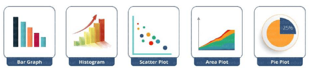
Matplotlib offers a wide range of plots that help in understanding trends, patterns, and making correlations in quantitative information. Some examples of graphs that can be created using this package include:
In addition to plotting, Matplotlib allows users to customize and modify their plots according to their preferences. Users can style their plots and make them more descriptive and communicative. This package, along with others, helps in accessing and exploring datasets to gain a better understanding of them.
Introduction to Basic Statistics with Python
Data Science and Statistics
- Data science involves analyzing data and performing various tasks related to it. To analyze numeric and alphanumeric data in this field, we rely on mathematics, particularly basic statistical methods.
- These statistical tools are readily available in Python and are widely used for data analysis.
Importance of Python Packages
- Using Python packages like NumPy for statistical analysis has significant advantages.
- These packages come with pre-defined functions that simplify the process of calculating statistical measures.
- Instead of creating our own formulas, we can simply use these functions by passing our data to them.
- This makes the process quick and easy.
Key Statistical Concepts
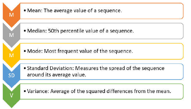
- Mean: The average of a set of numbers, calculated by summing them up and dividing by the count.
- Median: The middle value in a sorted list of numbers. If there is an even number of values, it is the average of the two middle values.
- Mode: The value that appears most frequently in a dataset.
- Standard Deviation:. measure of the amount of variation or dispersion in a set of values. It is calculated by taking the square root of the variance.
- Variance: The average of the squared differences from the mean, indicating how much the values vary from the mean.
Exploring Python for Statistics
- Python provides various syntaxes and functions for performing statistical analyses easily.
- By using Jupyter Notebooks and libraries like NumPy, we can explore and apply these statistical methods effectively.
Data Visualisation
Data quality issues:
- Erroneous data: Data can be erroneous in two ways:
- Incorrect values: These are values that do not match the expected type of data for a particular column. For example, a decimal value in a phone number column or a name in a marks column.
- Invalid or null values: These are corrupted values that cannot be processed, such as NaN values. These invalid values are removed from the database.
- Missing data: Missing data occurs when some cells are empty, and the values are not erroneous. This is not considered an error, as the values may not be missing due to any wrongdoing.
- Outliers: Outliers are data points that fall outside the expected range. For example, if a student receives 0 marks due to absence, including this score could skew the average. Hence, outliers are treated separately to ensure accurate data representation.
Importance of data visualisation:
- Data visualisation is crucial for interpreting and understanding data, as it helps to identify patterns and trends that may not be apparent in raw numerical form.
- Tools like the Matplotlib package in Python are used for data visualisation, allowing the creation of various types of graphs to represent data visually.
Scatter plot
Scatter plots are used to plot discontinuous data; that is, the data which does not have any continuity in flow is termed as discontinuous. There exist gaps in data which introduce discontinuity. A 2D scatter plot can display information maximum upto 4 parameters.
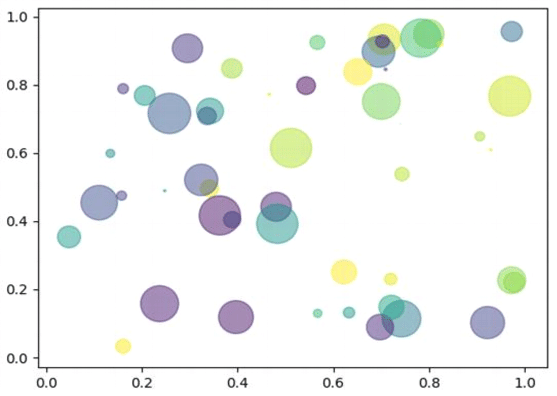
In this scatter plot, 2 axes (X and Y) are two different parameters. The colour of circles and the size both represent 2 different parameters. Thus, just through one coordinate on the graph, one can visualise 4 different parameters all at once.
Bar Chart
It is one of the most commonly used graphical methods. From students to scientists, everyone uses bar charts in some way or the other. It is a very easy to draw yet informative graphical representation. Various versions of bar chart exist like single bar chart, double bar chart, etc.
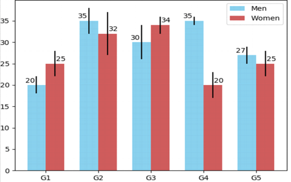
This is an example of a double bar chart. The 2 axes depict two different parameters while bars of different colours work with different entities ( in this case it is women and men). Bar chart also works on discontinuous data and is made at uniform intervals.
Histogram
Histograms are the accurate representation of a continuous data. When it comes to plotting the variation in just one entity of a period of time, histograms come into the picture. It represents the frequency of the variable at different points of time with the help of the bins.
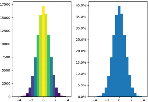
In the given example, the histogram is showing the variation in frequency of the entity plotted with the help of XY plane. Here, at the left, the frequency of the element has been plotted and it is a frequency map for the same. The colours show the transition from low to high and vice versa. Whereas on the right, a continuous dataset has been plotted which might not be talking about the frequency of occurrence of the element.
Box Plots
When the data is split according to its percentile throughout the range, box plots come in haman. Box plots also known as box and whiskers plot conveniently display the distribution of data throughout the range with the help of 4 quartiles.
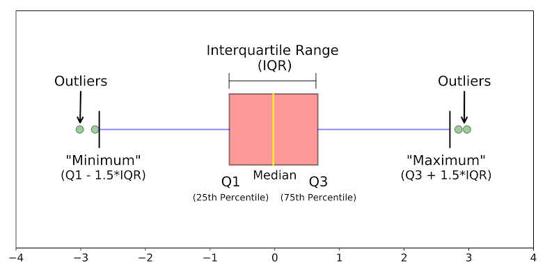
Quartile 3: The range from the 50th percentile to the 75th percentile is plotted within the box because its deviation from the mean is minimal. Quartiles 2 and 3, which span the 25th to the 75th percentiles, together form the Interquartile Range (IQR). The length of the box can vary depending on the spread of the data, similar to the whiskers.
Quartile 4: This quartile represents the range from the 75th percentile to the 100th percentile and corresponds to the whiskers plot for the top 25 percentile of data.
Outliers: Box plots have the advantage of clearly indicating outliers in a data distribution. Points that fall outside the specified range are plotted as dots or circles outside the graph and are considered outliers because they do not conform to the data range. Outliers are not errors; hence, they are included in the graph for visualisation purposes.
Now, let's proceed to explore data visualisation using Jupyter Notebook. The Matplotlib library will assist us in plotting various types of graphs, while Numpy and Pandas will aid in data analysis.
Data Science: Classification Model
In this section, we will explore a classification model used in Data Science. But before diving into the technical aspects of the code, let's start with a fun game.
Personality Prediction
Step 1: Look at the map carefully. The arrows on the map indicate different qualities. Here are the qualities described by the axes:
- Positive X-axis: People-focused - This means you prioritize people and strive to provide them with the best experience.
- Negative X-axis: Task-focused - This indicates that you concentrate more on the task at hand and aim to accomplish it to the best of your ability.
- Positive Y-axis: Passive - This quality reflects your ability to listen to people and understand everything they say without interrupting them.
- Negative Y-axis: Active - This trait shows that you actively participate in discussions and ensure that you express your points in front of the audience.
Understanding K-Nearest Neighbours (KNN)
K-Nearest Neighbours (KNN) is a straightforward and easy-to-use supervised machine learning algorithm suitable for both classification and regression tasks. The core idea behind KNN is that similar items are usually found close to each other, much like the saying, "Birds of a feather flock together." Here are some key features of KNN:
- KNN makes predictions based on the class or group of its surrounding points or neighbours.
- It uses the characteristics of the nearest points to determine how to classify unknown points.
- The algorithm is built on the principle that similar data points should be located near each other.
In a previous activity about personality prediction using KNN, we attempted to guess the animal for four students based on the animals closest to their data points. This is a simplified explanation of how KNN works. The 'K' in KNN represents the number of neighbours considered during the prediction and can be any integer value starting from 1.
Let's explore another example to clarify how KNN functions.
Imagine we want to predict the sweetness of a fruit based on data from similar fruits. We have three maps to make this prediction.
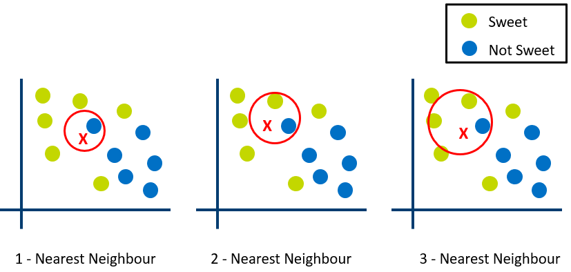
In the first graph, with K set to 1, the algorithm considers only the closest neighbour to the point X. Since the nearest point is blue (not sweet), the 1-nearest neighbour algorithm predicts that the fruit is not sweet.
In the second graph, where K is 2, the algorithm looks at the two nearest points to X. One is sweet (green), and the other is not sweet (blue), making it difficult for the algorithm to make a clear prediction.
In the third graph, with K set to 3, the algorithm considers the three nearest points to X. Two of these points are sweet (green), and one is not sweet (blue). Based on this information, the model predicts that the fruit is sweet.
KNN works by predicting an unknown value based on known values. The algorithm calculates the distance between the unknown point and all known points, selecting K points with the smallest distances to make a prediction.
The choice of K is crucial:
- If K is too small (e.g., K=1), predictions become unstable. For instance, if X is surrounded by mostly green points but has one blue point as the nearest neighbour, KNN might incorrectly predict X as blue.
- If K is too large, predictions become more stable due to majority voting or averaging, but there is a point where increasing K leads to more errors. Finding the right K is essential.
In classification problems where majority voting is used (such as picking the most common label), K is often set to an odd number to avoid ties.
|
26 videos|88 docs|8 tests
|
FAQs on Data Science Chapter Notes - Artificial Intelligence for Class 10
| 1. What is Data Science and why is it important? |  |
| 2. What are the key steps in the AI Project Cycle related to Data Sciences? | |
| 3. How do you acquire data for a Data Science project? | |
| 4. What techniques are used for exploring data in Data Science? | |
| 5. How is model evaluation conducted in Data Science? | |


Viva Questions
,MCQs
,video lectures
,mock tests for examination
,ppt
,practice quizzes
,shortcuts and tricks
,Free
,study material
,Objective type Questions
,Data Science Chapter Notes | Artificial Intelligence for Class 10
,Semester Notes
,Summary
,Data Science Chapter Notes | Artificial Intelligence for Class 10
,Exam
,past year papers
,Important questions
,Data Science Chapter Notes | Artificial Intelligence for Class 10
,Extra Questions
,Previous Year Questions with Solutions
,Sample Paper
;


Chapter Notes: Data Science Free PDF Download
Importance of Chapter Notes: Data Science
Chapter Notes: Data Science
Chapter Notes: Data Science Class 10 Questions
Study Chapter Notes: Data Science on the App
|
© EduRev
|
Education Revolution
|


|


within 7 days!