Class 6 Exam > Class 6 Notes > Mathematics Class 6 ICSE > Revision Notes: Data Handling Including Pictograph and Bar Graph
Revision Notes: Data Handling Including Pictograph and Bar Graph | Mathematics Class 6 ICSE PDF Download

Data Handling (Statistics and Graphs)
- Each number collected for required information is called "data"
- Statistical data can be represented in many ways, e.g. in the form of a table, pictures, graphs, figures, etc.
- In general Bar graphs [Column Graph], Pie graph [Pie chart], Line graph, Pictograph, Histogram are used for representation of data.
Various Types of Graphical Representation of Data
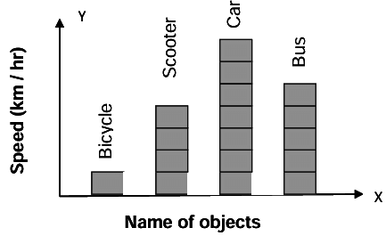
Bar graph- It is the simplest and most widely used graph, in which data is represented by heigth of rectangular cubes
- Take parameters along x-axis and y-axis
- All bars should be of same width.
- Same spaces should be left between the consecutive bars.

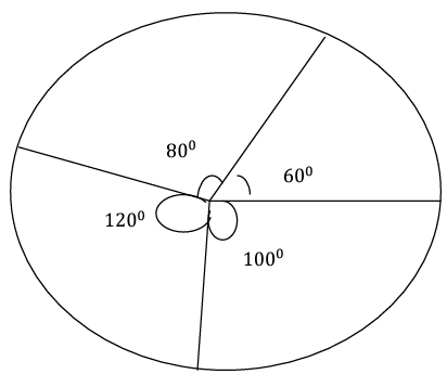
Pie graph
- It is a pictorial representation of numerical data, where the data is represented by sectors of circle.
- An angle whose vertex is a central angle is called "central angle
- Calculate the central angle for each component. = (value of each component / Total value of all components) × 360


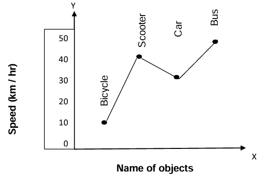
Line graph
- It is a pictorial representation of numerical data, where the data is represented by points (thick points) and then joined by line segments
- An angle whose vertex is a central angle is called "central angle
- Calculate the central angle for each component. = (value of each component / Total value of all components) × 360

The document Revision Notes: Data Handling Including Pictograph and Bar Graph | Mathematics Class 6 ICSE is a part of the Class 6 Course Mathematics Class 6 ICSE.
All you need of Class 6 at this link: Class 6
|
44 videos|201 docs|24 tests
|
FAQs on Revision Notes: Data Handling Including Pictograph and Bar Graph - Mathematics Class 6 ICSE
| 1. What is a pictograph, and how is it used in data handling? |  |
Ans. A pictograph is a type of graph that uses pictures or symbols to represent data. Each picture or symbol corresponds to a specific quantity. For example, if one apple symbol represents 5 apples, then three apple symbols would represent 15 apples. Pictographs are helpful for visualizing data in a simple and engaging way, making it easier for people to understand and interpret the information presented.
| 2. How do you create a bar graph? | |
Ans. To create a bar graph, follow these steps:
1. Determine the data you want to represent.
2. Choose a scale that suits your data range.
3. Draw two axes: a vertical axis (y-axis) for the values and a horizontal axis (x-axis) for the categories.
4. Label each axis appropriately.
5. Draw bars for each category, making sure the height of each bar corresponds to the value it represents.
6. Finally, add a title to your graph to indicate what the data represents.
| 3. What are the advantages of using bar graphs over pictographs? | |
Ans. Bar graphs have several advantages over pictographs. They can represent a larger range of data values and allow for easier comparison between different categories, as the height of the bars can be precisely measured. Bar graphs can also include negative values, which pictographs cannot easily depict. Additionally, bar graphs can accommodate more complex data sets, making them versatile for various types of analysis.
| 4. How can you interpret data from a pictograph? | |
Ans. To interpret data from a pictograph, first identify the symbols used and what each symbol represents in terms of quantity. Then, count the number of symbols present for each category and multiply by the value represented by each symbol. This will give you the total quantity for each category. Lastly, compare these totals to understand trends, differences, or similarities in the data presented.
| 5. What should you consider when choosing between a pictograph and a bar graph? | |
Ans. When choosing between a pictograph and a bar graph, consider the complexity of your data, the audience, and the clarity needed for interpretation. If your data is simple and has a limited range, a pictograph may be more visually appealing and easier to understand. However, if your data requires precise comparisons or includes a wider range of values, a bar graph would be more appropriate. Always consider the audience's familiarity with the graph type as well.
About this Document

4.81/5
Rating

Oct 02, 2025
Last updated
Document Description: Revision Notes: Data Handling Including Pictograph and Bar Graph for Class 6 2025 is part of Mathematics Class 6 ICSE preparation.
The notes and questions for Revision Notes: Data Handling Including Pictograph and Bar Graph have been prepared according to the Class 6 exam syllabus. Information about Revision Notes: Data Handling Including Pictograph and Bar Graph covers topics
like and Revision Notes: Data Handling Including Pictograph and Bar Graph Example, for Class 6 2025 Exam. Find important definitions, questions, notes, meanings, examples, exercises and tests below for Revision Notes: Data Handling Including Pictograph and Bar Graph.
Introduction of Revision Notes: Data Handling Including Pictograph and Bar Graph in English is available as part of our Mathematics Class 6 ICSE
for Class 6 & Revision Notes: Data Handling Including Pictograph and Bar Graph in Hindi for Mathematics Class 6 ICSE course.
Download more important topics related with notes, lectures and mock test series for Class 6
Exam by signing up for free. Class 6: Revision Notes: Data Handling Including Pictograph and Bar Graph | Mathematics Class 6 ICSE
Description
Full syllabus notes, lecture & questions for Revision Notes: Data Handling Including Pictograph and Bar Graph | Mathematics Class 6 ICSE - Class 6 | Plus excerises question with solution to help you revise complete syllabus for Mathematics Class 6 ICSE | Best notes, free PDF download
Information about Revision Notes: Data Handling Including Pictograph and Bar Graph
In this doc you can find the meaning of Revision Notes: Data Handling Including Pictograph and Bar Graph defined & explained in the simplest way possible. Besides explaining types of
Revision Notes: Data Handling Including Pictograph and Bar Graph theory, EduRev gives you an ample number of questions to practice Revision Notes: Data Handling Including Pictograph and Bar Graph tests, examples and also practice Class 6
tests

Related Searches
Summary
,Exam
,past year papers
,Previous Year Questions with Solutions
,practice quizzes
,Important questions
,Free
,Viva Questions
,Extra Questions
,Objective type Questions
,shortcuts and tricks
,Sample Paper
,video lectures
,Semester Notes
,MCQs
,Revision Notes: Data Handling Including Pictograph and Bar Graph | Mathematics Class 6 ICSE
,study material
,Revision Notes: Data Handling Including Pictograph and Bar Graph | Mathematics Class 6 ICSE
,mock tests for examination
,ppt
,Revision Notes: Data Handling Including Pictograph and Bar Graph | Mathematics Class 6 ICSE
;


Additional Information about Revision Notes: Data Handling Including Pictograph and Bar Graph for Class 6 Preparation
Revision Notes: Data Handling Including Pictograph and Bar Graph Free PDF Download
The Revision Notes: Data Handling Including Pictograph and Bar Graph is an invaluable resource that delves deep into the core of the Class 6 exam.
These study notes are curated by experts and cover all the essential topics and concepts, making your preparation more efficient and effective.
With the help of these notes, you can grasp complex subjects quickly, revise important points easily,
and reinforce your understanding of key concepts. The study notes are presented in a concise and easy-to-understand manner,
allowing you to optimize your learning process. Whether you're looking for best-recommended books, sample papers, study material,
or toppers' notes, this PDF has got you covered. Download the Revision Notes: Data Handling Including Pictograph and Bar Graph now and kickstart your journey towards success in the Class 6 exam.
Importance of Revision Notes: Data Handling Including Pictograph and Bar Graph
The importance of Revision Notes: Data Handling Including Pictograph and Bar Graph cannot be overstated, especially for Class 6 aspirants.
This document holds the key to success in the Class 6 exam.
It offers a detailed understanding of the concept, providing invaluable insights into the topic.
By knowing the concepts well in advance, students can plan their preparation effectively.
Utilize this indispensable guide for a well-rounded preparation and achieve your desired results.
Revision Notes: Data Handling Including Pictograph and Bar Graph
Revision Notes: Data Handling Including Pictograph and Bar Graph Notes offer in-depth insights into the specific topic to help you master it with ease.
This comprehensive document covers all aspects related to Revision Notes: Data Handling Including Pictograph and Bar Graph.
It includes detailed information about the exam syllabus, recommended books, and study materials for a well-rounded preparation.
Practice papers and question papers enable you to assess your progress effectively.
Additionally, the paper analysis provides valuable tips for tackling the exam strategically.
Access to Toppers' notes gives you an edge in understanding complex concepts.
Whether you're a beginner or aiming for advanced proficiency, Revision Notes: Data Handling Including Pictograph and Bar Graph Notes on EduRev are your ultimate resource for success.
Revision Notes: Data Handling Including Pictograph and Bar Graph Class 6 Questions
The "Revision Notes: Data Handling Including Pictograph and Bar Graph Class 6 Questions" guide is a valuable resource for all aspiring students preparing for the
Class 6 exam. It focuses on providing a wide range of practice questions to help students gauge
their understanding of the exam topics. These questions cover the entire syllabus, ensuring comprehensive preparation.
The guide includes previous years' question papers for students to familiarize themselves with the exam's format and difficulty level.
Additionally, it offers subject-specific question banks, allowing students to focus on weak areas and improve their performance.
Study Revision Notes: Data Handling Including Pictograph and Bar Graph on the App
Students of Class 6 can study Revision Notes: Data Handling Including Pictograph and Bar Graph alongwith tests & analysis from the EduRev app,
which will help them while preparing for their exam. Apart from the Revision Notes: Data Handling Including Pictograph and Bar Graph,
students can also utilize the EduRev App for other study materials such as previous year question papers, syllabus, important questions, etc.
The EduRev App will make your learning easier as you can access it from anywhere you want.
The content of Revision Notes: Data Handling Including Pictograph and Bar Graph is prepared as per the latest Class 6 syllabus.
|
© EduRev
|
Education Revolution
|


|


Signup to see your scores
go up
within 7 days!
within 7 days!
Takes less than 10 seconds to signup