Grade 9 Exam > Grade 9 Notes > AP Statistics > Chapter Notes: Representing a Categorical Variable with Tables
Representing a Categorical Variable with Tables Chapter Notes | AP Statistics - Grade 9 PDF Download

Introduction to Organizing Data
Raw data can be overwhelming and difficult to interpret without proper organization. Statistics provides tools to structure and analyze data effectively. The process often begins with organizing data into tables, followed by creating visual representations like graphs to uncover patterns and insights. For categorical variables, tables are a foundational step, but graphical displays like bar graphs and pie charts offer a more intuitive way to visualize trends and distributions.
Frequency Tables
Imagine conducting a survey in an AP Statistics class to assess how stressful students find their academic workload, with response options of "very stressful," "somewhat stressful," or "not stressful." After collecting 30 responses, how do we make sense of the data?
A frequency table is an effective way to summarize this data. It lists each category and counts the number of responses in each one. For example, a frequency table for qualitative data, such as stress levels, displays categories in one column and their corresponding counts in another. Tallies (e.g., ||||) can help count responses during data collection.
In this case, the variable "stress level" is an ordinal variable because the categories have a natural order (very > somewhat > not stressful), though the differences between categories aren't precisely measurable. The table below illustrates a hypothetical frequency table for the survey:
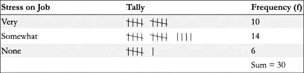 The sum of frequencies always equals the total number of responses, in this case, 30.
Relative Frequency Tables
To gain deeper insights, we can extend frequency tables by calculating relative frequencies and percentages. A relative frequency is computed by dividing the frequency of a category by the total number of responses. The percentage is then found by multiplying the relative frequency by 100.
- Relative Frequency = Frequency of a category / Total frequency
- Percentage = Relative Frequency × 100
A relative frequency table replaces counts with proportions or percentages. For example, using the stress survey data, if 10 students reported "very stressful," the relative frequency is 10/30 = 0.333, or 33.3%. The table might look like this:
From this, we can conclude that 33.3% of students find their workload very stressful, and combining "very" and "somewhat" stressful categories, 80% (33.3% + 46.7%) report at least some stress. The sum of relative frequencies should equal 1.00, and percentages should total 100%, though rounding may cause slight variations.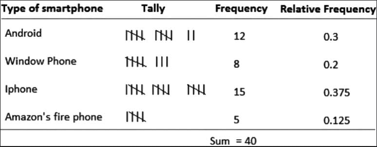
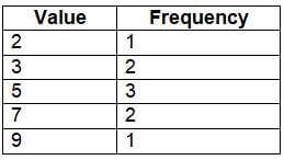
Example: Frequency and Relative Frequency Tables
Consider a dataset: 2, 3, 3, 5, 5, 5, 7, 7, 9. A frequency table counts how often each value appears:
 A relative frequency table expresses these counts as proportions:
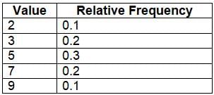 These tables help identify patterns, such as the value 5 being the most frequent, and are essential for summarizing data.
Question for Chapter Notes: Representing a Categorical Variable with TablesTry yourself: What does a frequency table display?View Solution
Key Terms
- Bar Graph: A bar graph uses bars to represent different categories, with each bar’s height or length indicating the frequency or value of that category. It’s an effective way to compare categories and identify trends in categorical data.
- Ordinal Variable: An ordinal variable is a categorical variable with a defined order among its categories, but the differences between categories aren’t measurable. For example, stress levels (very, somewhat, none) can be ranked but not quantified precisely.
- Pie Chart: A pie chart is a circular graph divided into slices, where each slice represents a category’s proportion of the total. It’s useful for visualizing how categories contribute to the whole dataset.
The document Representing a Categorical Variable with Tables Chapter Notes | AP Statistics - Grade 9 is a part of the Grade 9 Course AP Statistics.
All you need of Grade 9 at this link: Grade 9
|
12 videos|106 docs|12 tests
|
FAQs on Representing a Categorical Variable with Tables Chapter Notes - AP Statistics - Grade 9
| 1. What is a frequency table and how is it used in organizing data? |  |
Ans.A frequency table is a tool used to organize data by displaying the number of times each category or value occurs within a dataset. It helps in summarizing the distribution of categorical variables, making it easier to identify patterns and trends in the data.
| 2. How do you create a relative frequency table? | |
Ans.To create a relative frequency table, first, calculate the frequency of each category in your dataset. Then, divide each frequency by the total number of observations to obtain the relative frequency. Finally, present the results in a table format, showing both the categories and their corresponding relative frequencies, often expressed as a percentage.
| 3. What is the difference between frequency tables and relative frequency tables? | |
Ans.Frequency tables display the actual count of occurrences for each category in a dataset, while relative frequency tables show the proportion of each category relative to the total number of observations. This means relative frequency can provide a clearer understanding of the data's distribution, particularly when comparing categories of different sizes.
| 4. Why are frequency and relative frequency tables important in statistics? | |
Ans.Frequency and relative frequency tables are important because they provide a clear and concise way to summarize and analyze categorical data. They help researchers and analysts identify trends, make comparisons, and draw conclusions about the data, facilitating better decision-making based on the findings.
| 5. Can frequency tables be used for both categorical and numerical data? | |
Ans.Frequency tables are primarily designed for categorical data, but they can also be adapted for numerical data by grouping the data into categories or intervals. In such cases, the table will show the number of observations that fall within each interval, allowing for the analysis of the distribution of numerical data in a similar manner to categorical data.
About this Document

Oct 11, 2025
Last updated
Related Exams
Document Description: Chapter Notes: Representing a Categorical Variable with Tables for Grade 9 2025 is part of AP Statistics preparation.
The notes and questions for Chapter Notes: Representing a Categorical Variable with Tables have been prepared according to the Grade 9 exam syllabus. Information about Chapter Notes: Representing a Categorical Variable with Tables covers topics
like Introduction to Organizing Data, Frequency Tables, Relative Frequency Tables and Chapter Notes: Representing a Categorical Variable with Tables Example, for Grade 9 2025 Exam. Find important definitions, questions, notes, meanings, examples, exercises and tests below for Chapter Notes: Representing a Categorical Variable with Tables.
Introduction of Chapter Notes: Representing a Categorical Variable with Tables in English is available as part of our AP Statistics
for Grade 9 & Chapter Notes: Representing a Categorical Variable with Tables in Hindi for AP Statistics course.
Download more important topics related with notes, lectures and mock test series for Grade 9
Exam by signing up for free. Grade 9: Representing a Categorical Variable with Tables Chapter Notes | AP Statistics - Grade 9
Description
Full syllabus notes, lecture & questions for Representing a Categorical Variable with Tables Chapter Notes | AP Statistics - Grade 9 - Grade 9 | Plus excerises question with solution to help you revise complete syllabus for AP Statistics | Best notes, free PDF download
Information about Chapter Notes: Representing a Categorical Variable with Tables
In this doc you can find the meaning of Chapter Notes: Representing a Categorical Variable with Tables defined & explained in the simplest way possible. Besides explaining types of
Chapter Notes: Representing a Categorical Variable with Tables theory, EduRev gives you an ample number of questions to practice Chapter Notes: Representing a Categorical Variable with Tables tests, examples and also practice Grade 9
tests

Related Searches
Summary
,Previous Year Questions with Solutions
,mock tests for examination
,shortcuts and tricks
,Viva Questions
,Representing a Categorical Variable with Tables Chapter Notes | AP Statistics - Grade 9
,ppt
,practice quizzes
,Representing a Categorical Variable with Tables Chapter Notes | AP Statistics - Grade 9
,MCQs
,Objective type Questions
,Important questions
,Sample Paper
,Semester Notes
,video lectures
,past year papers
,Extra Questions
,study material
,Exam
,Representing a Categorical Variable with Tables Chapter Notes | AP Statistics - Grade 9
,Free
;


Additional Information about Chapter Notes: Representing a Categorical Variable with Tables for Grade 9 Preparation
Chapter Notes: Representing a Categorical Variable with Tables Free PDF Download
The Chapter Notes: Representing a Categorical Variable with Tables is an invaluable resource that delves deep into the core of the Grade 9 exam.
These study notes are curated by experts and cover all the essential topics and concepts, making your preparation more efficient and effective.
With the help of these notes, you can grasp complex subjects quickly, revise important points easily,
and reinforce your understanding of key concepts. The study notes are presented in a concise and easy-to-understand manner,
allowing you to optimize your learning process. Whether you're looking for best-recommended books, sample papers, study material,
or toppers' notes, this PDF has got you covered. Download the Chapter Notes: Representing a Categorical Variable with Tables now and kickstart your journey towards success in the Grade 9 exam.
Importance of Chapter Notes: Representing a Categorical Variable with Tables
The importance of Chapter Notes: Representing a Categorical Variable with Tables cannot be overstated, especially for Grade 9 aspirants.
This document holds the key to success in the Grade 9 exam.
It offers a detailed understanding of the concept, providing invaluable insights into the topic.
By knowing the concepts well in advance, students can plan their preparation effectively.
Utilize this indispensable guide for a well-rounded preparation and achieve your desired results.
Chapter Notes: Representing a Categorical Variable with Tables
Chapter Notes: Representing a Categorical Variable with Tables Notes offer in-depth insights into the specific topic to help you master it with ease.
This comprehensive document covers all aspects related to Chapter Notes: Representing a Categorical Variable with Tables.
It includes detailed information about the exam syllabus, recommended books, and study materials for a well-rounded preparation.
Practice papers and question papers enable you to assess your progress effectively.
Additionally, the paper analysis provides valuable tips for tackling the exam strategically.
Access to Toppers' notes gives you an edge in understanding complex concepts.
Whether you're a beginner or aiming for advanced proficiency, Chapter Notes: Representing a Categorical Variable with Tables Notes on EduRev are your ultimate resource for success.
Chapter Notes: Representing a Categorical Variable with Tables Grade 9 Questions
The "Chapter Notes: Representing a Categorical Variable with Tables Grade 9 Questions" guide is a valuable resource for all aspiring students preparing for the
Grade 9 exam. It focuses on providing a wide range of practice questions to help students gauge
their understanding of the exam topics. These questions cover the entire syllabus, ensuring comprehensive preparation.
The guide includes previous years' question papers for students to familiarize themselves with the exam's format and difficulty level.
Additionally, it offers subject-specific question banks, allowing students to focus on weak areas and improve their performance.
Study Chapter Notes: Representing a Categorical Variable with Tables on the App
Students of Grade 9 can study Chapter Notes: Representing a Categorical Variable with Tables alongwith tests & analysis from the EduRev app,
which will help them while preparing for their exam. Apart from the Chapter Notes: Representing a Categorical Variable with Tables,
students can also utilize the EduRev App for other study materials such as previous year question papers, syllabus, important questions, etc.
The EduRev App will make your learning easier as you can access it from anywhere you want.
The content of Chapter Notes: Representing a Categorical Variable with Tables is prepared as per the latest Grade 9 syllabus.
|
© EduRev
|
Education Revolution
|


|


Signup on EduRev and stay on top of your study goals
10M+ students crushing their study goals daily