Representing a Categorical Variable with Graphs Chapter Notes | AP Statistics - Grade 9 PDF Download
| Table of contents |
|
| Bar Graphs: Visualizing Frequencies |
|
| Pie Charts: Showing Proportions |
|
| Contingency Tables: Exploring Relationships |
|
| Real-Life Applications: Trusting Charts |
|

Categorical variables, which group data into distinct categories rather than numerical values, can be effectively summarized and visualized using tables and graphs. This document explores how to represent categorical data using bar graphs, pie charts, and contingency tables, offering insights into their construction, applications, and potential pitfalls. These tools are essential for understanding data distributions and are critical for success in AP Statistics.
Graphs are a powerful way to visualize data, revealing patterns and relationships that might not be obvious in raw numbers. Paired with statistical measures, they provide a comprehensive way to analyze and communicate data insights. Whether you're comparing categories or exploring trends, graphical representations make complex information accessible and engaging.
Bar Graphs: Visualizing Frequencies
Bar graphs are ideal for displaying the frequency (counts) or relative frequency (proportions) of categorical data. Each bar represents a category, with its height or length corresponding to the number or proportion of observations in that category. The bars are uniform in width and separated by gaps to distinguish between categories.
Steps to Create a Bar Graph
- Identify the categories to include in your graph.
- Count the number of observations for each category.
- Label the horizontal axis with categories and the vertical axis with frequencies.
- Draw bars, ensuring each bar's height reflects the frequency of its category.
- Add a title, axis labels, and a consistent scale for the vertical axis. Consider using a legend for multiple data series or different colors for visual appeal.
For example, a bar graph showing workplace stress levels could use relative frequencies or percentages, with each category colored differently for clarity and visual impact.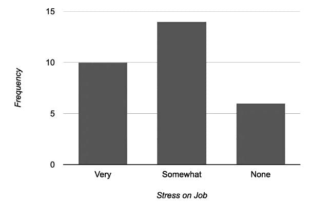
Pie Charts: Showing Proportions
Pie charts are circular graphs divided into slices, each representing a category’s proportion of the whole. They are excellent for visualizing how categories contribute to a total dataset, making it easy to compare relative sizes.
Steps to Create a Pie Chart
- Determine the categories to include (e.g., commuters vs. non-commuters).
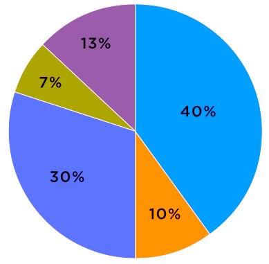
- Calculate each category’s proportion of the total (e.g., 30 commuters out of 50 respondents = 60%, or 3/5 of the pie).
- Draw a circle and divide it into slices proportional to each category’s fraction.
- Label each slice with its category and percentage.
- Add a title to clarify the chart’s purpose.
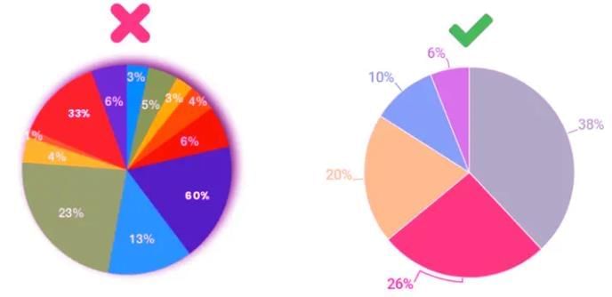
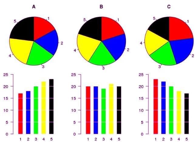
Pie charts shine when comparing relative proportions but are less effective for precise values or small differences. For detailed comparisons, consider using a bar graph instead.
Tips: Choose bar graphs over pie charts when dealing with many categories or categories with similar frequencies, as pie charts with many or equally sized slices can be hard to interpret. Always ensure the area principle is maintained to avoid distortions.
Contingency Tables: Exploring Relationships
A contingency table (or two-way table) organizes categorical data to show relationships between two or more variables. By displaying observation counts across categories, these tables help identify patterns and trends, which is crucial for AP Statistics questions.
Steps to Create a Contingency Table
- Select the variables to analyze.
- Count observations for each category combination.
- Organize counts in a table, with rows for one variable’s categories and columns for the other’s.
- Include row and column totals for clarity.
- Analyze the table to identify relationships. If cell counts vary significantly across categories, the variables may be related; if counts are similar, they may be independent.
For example, a table comparing gender and income might reveal different income distributions, suggesting a relationship between the variables.
Real-Life Applications: Trusting Charts
Bar and pie charts are common in media, news, and textbooks, but they can be misleading if misused. Here are common pitfalls to watch for:
- Different Scales: Comparing variables on different scales can distort interpretations. Ensure categories are on the same scale for fair comparisons.
- Continuous Data: Bar and pie charts are designed for categorical data, not continuous data, which is better suited for line graphs or scatterplots.
- Small Differences: Charts struggle to show small differences between categories accurately.
- Trends Over Time: Use line graphs or time series plots instead of bar/pie charts for temporal trends.
- Multiple Variables: Charts are best for two variables. For more, consider alternative visualizations.
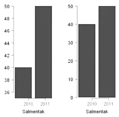
- Truncated Graphs: Bar graphs not starting at zero can exaggerate differences, as seen in comparisons of data from 2010 to 2011.
 In an era of rampant misinformation, selecting the right graph and understanding its limitations is critical to conveying accurate data stories.
- Bar Charts: Graphs using rectangular bars to show frequencies or proportions of categorical data, ideal for comparing groups or trends.
- Bar Graph: A visual tool where bars represent categories, with lengths indicating frequency or value, great for quick comparisons.
- Bar Graphs: Visual displays of categorical data using bars to show quantities, helping identify trends and distributions.
- Categorical Variables: Data types representing groups or categories, like gender or color, used for grouping and comparison.
- Contingency Table (Two-Way Table): A table showing frequency counts for two categorical variables, revealing relationships between them.
- Frequency Table: A table listing categories and their observation counts, simplifying data analysis and visualization.
- Graphical Representations: Visual tools like charts and graphs that summarize data for easier interpretation and comparison.
- Pie Chart: A circular graph with slices showing category proportions, useful for visualizing relative contributions to a whole.
- Pie Charts: Circular graphs dividing data into proportional slices, effective for showing category distributions.
- Relative Frequency Table: A table showing category proportions relative to the total, aiding in comparative analysis.
- Two-Way Table: A table displaying relationships between two categorical variables, used to analyze interactions and correlations.
|
12 videos|106 docs|12 tests
|
FAQs on Representing a Categorical Variable with Graphs Chapter Notes - AP Statistics - Grade 9
| 1. What are the main advantages of using bar graphs to visualize categorical data? |  |
| 2. When should I use a pie chart instead of a bar graph? | |
| 3. How do contingency tables help in exploring relationships between categorical variables? | |
| 4. What are some real-life applications of bar graphs, pie charts, and contingency tables? | |
| 5. How can I ensure the accuracy of the information presented in charts and graphs? | |


Free
,Viva Questions
,Representing a Categorical Variable with Graphs Chapter Notes | AP Statistics - Grade 9
,shortcuts and tricks
,Summary
,MCQs
,Important questions
,Extra Questions
,Representing a Categorical Variable with Graphs Chapter Notes | AP Statistics - Grade 9
,Objective type Questions
,Exam
,practice quizzes
,Representing a Categorical Variable with Graphs Chapter Notes | AP Statistics - Grade 9
,ppt
,past year papers
,mock tests for examination
,Sample Paper
,video lectures
,study material
,Semester Notes
,Previous Year Questions with Solutions
,


Chapter Notes: Representing a Categorical Variable with Graphs Free PDF Download
Importance of Chapter Notes: Representing a Categorical Variable with Graphs
Chapter Notes: Representing a Categorical Variable with Graphs
Chapter Notes: Representing a Categorical Variable with Graphs Grade 9 Questions
Study Chapter Notes: Representing a Categorical Variable with Graphs on the App
|
© EduRev
|
Education Revolution
|


|


