Representing a Quantitative Variable with Graphs Chapter Notes | AP Statistics - Grade 9 PDF Download

Understanding Quantitative Variables
Quantitative variables are those that can be measured or counted, resulting in numerical values. These variables are divided into two subtypes:
- Discrete Variables: These take on a countable number of values, which can be finite or countably infinite (like the set of counting numbers). Examples include the number of students in a classroom, cars in a parking lot, or votes for a mayoral candidate.
- Continuous Variables: These can take on infinitely many values within a range, and those values cannot be counted. For instance, between any two values of a continuous variable (like height), there’s always another possible value. Other examples include the length of a board, marathon running times, or room temperature.
In this guide, we’ll explore how to organize and visualize quantitative data using various graphical displays, including histograms, frequency polygons, ogives, stem-and-leaf plots, and dotplots. Note that frequency tables for quantitative data can be complex, especially with large datasets, but tools like Microsoft Excel or TI-series calculators can generate them quickly. The AP exam doesn’t require creating frequency tables from scratch, so we’ll focus on the key graphical displays instead.
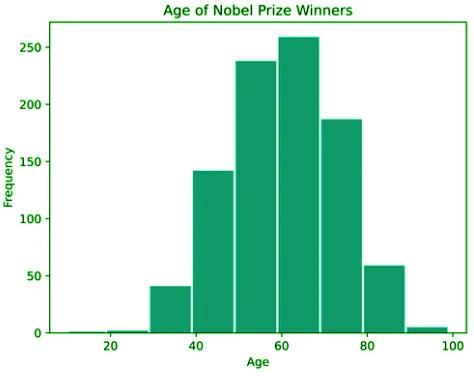
Histograms
A histogram visually represents the distribution of quantitative data by grouping it into intervals called bins. Each bin covers an equal-width range of values, and the height of each bar reflects the frequency or proportion of data points within that range. The x-axis shows the data values, while the y-axis indicates the frequency. Unlike bar graphs, histogram bins are adjacent with no gaps, unless a gap represents an actual absence of data. Always verify that the data is quantitative before selecting a histogram.
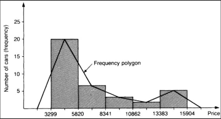
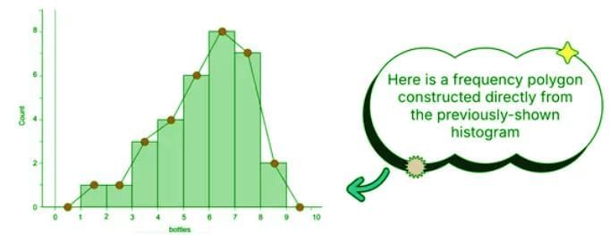
Frequency Polygons
Frequency polygons offer another way to display quantitative data distributions. Instead of bars, they use lines connecting points plotted at the midpoints of each bin’s class, with the y-axis showing the frequency. To create a frequency polygon, first construct a frequency table listing the number of occurrences for each data value or interval. Then, plot points at the top center of each bin and connect them with lines to form the polygon. This method highlights the shape of the distribution in a way similar to histograms but with a continuous line.
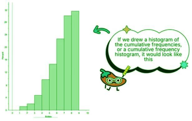
Cumulative Graphs (Ogives)
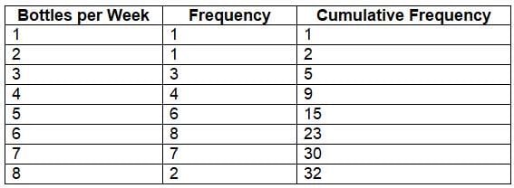
An ogive, or cumulative frequency plot, illustrates the cumulative distribution of data, showing the number or proportion of values less than or equal to a specific value. This is useful for understanding how data accumulates across intervals. To create an ogive, start with a cumulative frequency table, which sums the frequencies up to each class. The x-axis represents the data values or intervals, and the y-axis shows cumulative frequencies. Plot the points and connect them with a line to form the ogive.
Here’s an example of a frequency table with cumulative frequencies for the number of plastic beverage bottles used per week:
Stem-and-Leaf Plots (Stemplots)
Stem-and-leaf plots (stemplots) display quantitative data while preserving individual values, unlike histograms, which group data into bins. In a stemplot, each data value is split into a stem (the leading digit(s)) and a leaf (typically the last digit). Stems are listed vertically, with corresponding leaves arranged horizontally. Always include a key to clarify the context and units.
For example, for the data values 23, 28, 35, 40, 45, 65, 68, 69, and 84, the stemplot would look like this:
2 | 3 8
3 | 5
4 | 0 5
6 | 5 8 9
8 | 4
Key: 2 | 3 = 23. The stem “2” represents values 20–29, and the leaf “3” represents 23.
Tip: Rotate the stemplot sideways to better visualize the data distribution and spot any unusual patterns.
Dotplots
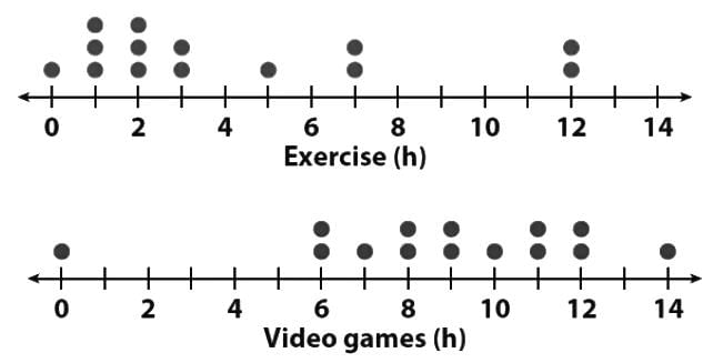
Dotplots are simple displays where each data point is represented by a dot on a horizontal axis, with dots stacked for nearly identical values. They’re ideal for small datasets and are less complex than stemplots, as they don’t require splitting values into stems and leaves. Dotplots are perfect when you need a quick, clear visualization of data distribution. For example, a pediatrician might use dotplots to compare the time 14 children spend on exercise versus video games, with each dot representing a child’s time spent.
Key Vocabulary
- Histogram: A graph that divides quantitative data into bins, with bar heights showing the frequency of data points in each bin, revealing the data’s shape, spread, and central tendencies.
- Relative Frequency Polygon: A line graph connecting points at the midpoints of histogram bins to show the distribution of quantitative data.
- Ogive: A cumulative frequency plot showing the proportion of data below or equal to a given value, useful for analyzing data accumulation.
- Stemplot: A stem-and-leaf plot that organizes data by splitting values into stems and leaves, preserving individual values while showing distribution.
- Dotplot: A simple plot where each data point is a dot on a horizontal axis, ideal for small datasets to show distribution clearly.
Key Terms to Review
- Histogram: A vital tool for visualizing the distribution of numerical data, using bins to show frequency and helping analyze shape, spread, and central tendencies.
- Stemplot: A plot that retains individual data values while displaying distribution, using stems and leaves to highlight patterns and potential outliers.
|
12 videos|106 docs|12 tests
|
FAQs on Representing a Quantitative Variable with Graphs Chapter Notes - AP Statistics - Grade 9
| 1. What are quantitative variables and how are they different from qualitative variables? |  |
| 2. What types of graphs are commonly used to represent quantitative variables? | |
| 3. How can I interpret a histogram of a quantitative variable? | |
| 4. What is the importance of using graphs to represent quantitative data? | |
| 5. How do I choose the right type of graph for my quantitative data? | |


Summary
,Sample Paper
,Previous Year Questions with Solutions
,ppt
,Objective type Questions
,mock tests for examination
,Representing a Quantitative Variable with Graphs Chapter Notes | AP Statistics - Grade 9
,Representing a Quantitative Variable with Graphs Chapter Notes | AP Statistics - Grade 9
,Exam
,MCQs
,study material
,shortcuts and tricks
,Extra Questions
,Viva Questions
,video lectures
,Representing a Quantitative Variable with Graphs Chapter Notes | AP Statistics - Grade 9
,Important questions
,practice quizzes
,Free
,past year papers
,Semester Notes
;


Chapter Notes: Representing a Quantitative Variable with Graphs Free PDF Download
Importance of Chapter Notes: Representing a Quantitative Variable with Graphs
Chapter Notes: Representing a Quantitative Variable with Graphs
Chapter Notes: Representing a Quantitative Variable with Graphs Grade 9 Questions
Study Chapter Notes: Representing a Quantitative Variable with Graphs on the App
|
© EduRev
|
Education Revolution
|


|


