Chapter Notes: Comparing Distributions of a Quantitative Variable

In statistics, understanding how to describe, summarize, and visualize data distributions is essential. Now, let's take it a step further by exploring how to compare multiple datasets using various graphical tools like stem-and-leaf plots, histograms, and box plots. This guide, tailored for AP Statistics students, dives into practical examples to sharpen your skills in analyzing and comparing quantitative variables.
Warming Up: Comparing Groups with Stem-and-Leaf Plots
Before tackling complex AP-style questions, let's practice with a straightforward example using stem-and-leaf plots, a classic tool for visualizing data distributions.
Practice Question
Two groups of eight animals, Group M and Group N, had their weights (in kilograms) recorded and displayed in the stem-and-leaf plots below. Compare the weight distributions of the two groups.
Group M:
1 | 4
2 | 3 4 8
3 | 2 6 8
4 |
5 | 0
Group N:
1 | 0
2 | 3 6
3 | 5
4 | 1
5 | 4 7
6 | 2
Analysis
To compare the groups, we evaluate the range and distribution patterns:
- Range: Group M's weights span from 14 kg to 50 kg, a range of 36 kg. Group N's weights range from 10 kg to 62 kg, a wider range of 52 kg, indicating greater variability in Group N, with some animals notably heavier than Group M's heaviest.
- Distribution Patterns: Group M shows a concentration of weights in the 20s and 30s, suggesting a tighter clustering of similar weights. Group N, however, displays a more spread-out distribution across its range, reflecting greater diversity in weights.
Conclusion: Group N exhibits a broader range and more varied weight distribution compared to Group M, which has a more compact and clustered distribution.
AP-Style Practice: Comparing Groups with Histograms
Let's dive into a real-world AP-style problem. The histograms below represent the pupil-to-teacher (P-T) ratios for U.S. states during the 2001-2002 school year, split by states west (n=24) and east (n=26) of the Mississippi River.
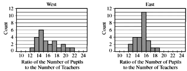
Part A: Estimating the Median
The task is to estimate the median P-T ratio for each group:
- West (n=24): The median lies between the 12th and 13th values, both falling in the 15-16 interval.
- East (n=26): The median lies between the 13th and 14th values, also in the 15-16 interval.
Thus, both groups have a median P-T ratio between 15 and 16 students per teacher.
Part B: Comparing Distributions
Analyze the distributions by examining shape, center, and spread:
- Shape: The West histogram is unimodal and skewed to the right, while the East histogram is unimodal and nearly symmetric, indicating different distribution patterns.
- Center: As established, both medians are approximately 15-16 students per teacher.
- Spread: The West's range is approximately 22 - 12 = 10, while the East's is 19 - 12 = 7. The West shows greater variability in P-T ratios compared to the more consistent East.
Part C: Comparing Means
Given the distribution shapes:
- The West's right skew suggests the mean will exceed the median, pulled higher by larger values in the right tail.
- The East's near-symmetric distribution implies the mean is close to the median.
Conclusion: The mean P-T ratio for the West is likely higher than for the East due to the right skew in the West's distribution.
AP-Style Practice: Comparing Groups with Box Plots
In a study on visualization in basketball, 20 players with similar skills were randomly assigned to two groups. Group 1 (n=10) received visualization training, while Group 2 (n=10) did not. Each player attempted shots from 22 feet until making two consecutive baskets, with attempts recorded and summarized in box plots.
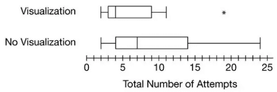
Ques: Based on the boxplots, did basketball players who received visualization training tend to need fewer attempts to make two consecutive baskets from a distance of 22 feet than players who did not receive the training? Explain your reasoning.
Sol: We have two groups, with 10 basketball players randomly assigned to each group. We learn from the question that group 1 received visualization training but group 2. There are a few things here we can compare to find the answer to the question. We can see both groups have the same minimum attempts, and all other measures are different.
25% of the time the group 1 made the basket in 3 trials but group 2 in 4 trials.
Now, look at the median. The median is much lower for group 1 than for group 2. Group 1 has an outlier, which is still less than the maximum of group 2. We can see that the training had an impact on group 1, as all the 5 summary measures are less than from group 2; however, we are not asked to generalize this finding yet.
Finally, to answer the question: it is good enough only to report the median. Because the median number of attempts for players who received visualization training (4) is less than the median number of attempts for players who did not receive training (7), those who received visualization training tend to need fewer attempts to make two consecutive baskets. Talk about talent and persistence!
Key Terms to Understand
- Box Plots: A visual tool displaying a dataset's five-number summary (minimum, Q1, median, Q3, maximum), ideal for comparing spread, center, and outliers across groups.
- Center: The typical value of a dataset, often measured by the mean, median, or mode, serving as a reference point for comparing distributions.
- Distributions: The arrangement of a quantitative variable's values, revealing patterns like central tendency, variability, and outliers, crucial for data comparison.
- Histograms: Graphs that group data into bins to show frequency, aiding in comparing shape, center, and spread of quantitative variables.
- Median: The middle value in an ordered dataset, splitting it into two equal parts, robust against outliers for comparing distributions.
- Outlier: A value significantly different from others, impacting analyses and visualizations, critical for understanding data variability.
- P-T Ratio: A measure comparing a data point's percentile rank to its position, offering insights into a distribution's shape and spread.
- Shape: The overall pattern of a distribution (e.g., symmetric, skewed), key for interpreting data behavior in graphs like histograms or box plots.
- Skewed to the Right: A distribution with a longer right tail, where larger values stretch the distribution, affecting mean and median comparisons.
- Spread: The extent of variability in a dataset, showing how data points are dispersed, essential for comparing distributions.
FAQs on Chapter Notes: Comparing Distributions of a Quantitative Variable
| 1. What are stem-and-leaf plots and how are they used to compare groups? |  |
| 2. How do histograms differ from stem-and-leaf plots when comparing distributions? | |
| 3. What information can box plots provide when comparing groups? | |
| 4. What are some key terms related to comparing distributions of a quantitative variable? | |
| 5. Why is it important to compare distributions of a quantitative variable in statistics? | |