Representing Two Categorical Variables Chapter Notes | AP Statistics - Grade 9 PDF Download

Building on foundational concepts, this section explores methods to represent data involving two categorical variables. These methods include graphical representations like side-by-side bar graphs, segmented bar graphs, and mosaic plots, as well as numerical approaches like two-way tables (also known as contingency tables).
Methods for Representing Two Categorical Variables
Two-Way Tables
Two-way tables, or contingency tables, organize data into rows and columns corresponding to the categories of two variables. Each cell in the table shows the count or percentage of occurrences for a specific combination of categories, illustrating how individuals are distributed across these categories.
For example, a survey of 4,826 people asked about their perceived chances of becoming wealthy. The table below summarizes the data:
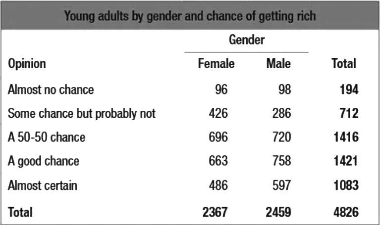
This table reveals that 194 participants believed they had almost no chance of getting rich, 2,367 were female, and 758 males felt they had a good chance of becoming wealthy.
Joint Relative Frequencies
Two-way tables can also display relative frequencies, where each cell represents the proportion of the total sample size. For instance, the joint relative frequency for males who are "almost certain" of getting rich is 486/4,826 ≈ 0.101. In such tables, the sum of all relative frequencies in the bottom-right cell equals 1.00, representing the entire sample.
Side-by-Side Bar Graphs
Side-by-side bar graphs display two categorical variables by placing bar charts for each variable next to each other. This setup allows for easy comparison of proportions across categories. For example, a graph might show the percentage of males and females with specific opinions on wealth and age.
In this graph, gender is the dividing category, with each bar representing the percentage of respondents within a gender who hold a particular view on wealth relative to age.
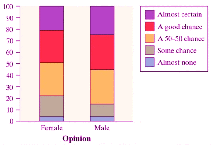
Segmented Bar Graphs
Segmented bar graphs are similar to side-by-side bar graphs but combine proportions within a single bar, with each segment representing a category. This format is ideal for comparing proportions within one variable across categories of another. For instance, a segmented bar graph might show the distribution of responses about wealth for each gender, with each bar totaling 100%.
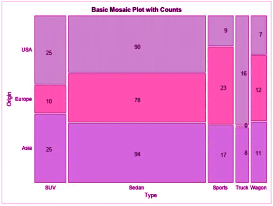
Mosaic Plots
Mosaic plots visually represent the proportions of data across two categorical variables using rectangles. The area of each rectangle corresponds to the joint relative frequency, and the width of each bar reflects the sample size of the primary category. Mosaic plots serve as a graphical equivalent of two-way tables, highlighting relationships and proportions effectively.
Identifying Associations in Graphical Representations
Graphical tools like side-by-side bar graphs, segmented bar graphs, and mosaic plots can reveal associations between two categorical variables. If the heights or widths of corresponding segments differ significantly across categories, the variables are likely associated, indicating dependence or correlation. However, association does not imply causation, as other factors may influence the relationship.
For example, consider data on class level (e.g., junior, senior) and timely homework completion. A side-by-side bar graph or mosaic plot could show whether the proportion of students completing homework on time varies by class. Significant differences suggest an association between class level and homework completion.
Analyzing Bivariate Categorical Data
Bivariate categorical data involves two categorical variables, and analyzing their relationship can uncover patterns or trends. Methods like two-way tables and graphical representations help determine if variables are associated. However, correlation does not imply causation, and other factors must be considered to avoid misinterpretation.
Key Terms to Understand
- Associations: Associations describe relationships between two categorical variables, showing how changes in one may relate to changes in another. They help identify patterns and inform data-driven decisions.
- Bivariate Categorical Data: Data involving two categorical variables, typically organized in contingency tables to analyze relationships and dependencies between categories.
- Correlated: A relationship where changes in one variable correspond to changes in another, aiding in the identification of data patterns.
- Correlation Does Not Imply Causation: A principle reminding us that a relationship between variables does not mean one causes the other, emphasizing careful data interpretation.
- Cumulative Frequency: A running total of frequencies up to a specific point, useful for understanding data distribution and comparing categorical variables.
- Dependent: A relationship where one variable’s value is influenced by another, critical for understanding interactions between categorical variables.
- Mosaic Plots: Graphical tools that use proportional rectangles to show relationships between two categorical variables, facilitating comparison of category distributions.
- Segmented Bar Graphs: Graphs where bars are divided into segments representing categories, useful for comparing proportions within a group across categorical variables.
- Side-by-Side Bar Graphs: Graphs displaying bars for different categories side by side, enabling comparison of distributions across groups.
- Two-Way Tables: Tables that organize data for two categorical variables, allowing analysis of relationships and conditional probabilities.
|
12 videos|106 docs|12 tests
|
FAQs on Representing Two Categorical Variables Chapter Notes - AP Statistics - Grade 9
| 1. What are the common methods for representing two categorical variables? |  |
| 2. How can I identify associations between two categorical variables using graphical representations? | |
| 3. What is a contingency table, and how is it useful in analyzing categorical data? | |
| 4. What is the significance of using a bar chart for two categorical variables? | |
| 5. How do mosaic plots differ from other graphical representations of categorical data? | |


Representing Two Categorical Variables Chapter Notes | AP Statistics - Grade 9
,Exam
,ppt
,practice quizzes
,Free
,Extra Questions
,shortcuts and tricks
,Representing Two Categorical Variables Chapter Notes | AP Statistics - Grade 9
,Important questions
,Sample Paper
,Summary
,video lectures
,Objective type Questions
,study material
,past year papers
,Representing Two Categorical Variables Chapter Notes | AP Statistics - Grade 9
,mock tests for examination
,Viva Questions
,Semester Notes
,Previous Year Questions with Solutions
,MCQs
;


Chapter Notes: Representing Two Categorical Variables Free PDF Download
Importance of Chapter Notes: Representing Two Categorical Variables
Chapter Notes: Representing Two Categorical Variables
Chapter Notes: Representing Two Categorical Variables Grade 9 Questions
Study Chapter Notes: Representing Two Categorical Variables on the App
|
© EduRev
|
Education Revolution
|


|


within 7 days!