Representing the Relationship Between Two Quantitative Variables Chapter Notes | AP Statistics - Grade 9 PDF Download
| Table of contents |
|
| What is a Scatterplot? |
|
| Describing Scatterplots |
|
| Example Analysis |
|
| Outliers, Influential Points, and High Leverage Points |
|

When analyzing data with two quantitative variables, we often deal with a bivariate dataset where the variables are interconnected. One variable, known as the explanatory or independent variable (x), is considered to influence the other, called the response or dependent variable (y). The explanatory variable helps predict or explain changes in the response variable.
For instance, in a study exploring how age affects blood pressure, age would be the explanatory variable, while blood pressure serves as the response variable. By analyzing age, we can estimate its impact on blood pressure levels.
What is a Scatterplot?
A scatterplot is a visual tool used to represent the relationship between two quantitative variables. The explanatory variable is plotted on the horizontal (x) axis, and the response variable is plotted on the vertical (y) axis. This graphical representation helps identify patterns and relationships between the variables.
Describing Scatterplots
In AP Statistics, describing a scatterplot involves analyzing four key aspects: form, direction, strength, and unusual features. These elements provide a comprehensive understanding of the data's behavior.
Form
The form describes the overall shape of the data points in the scatterplot. It can be:
- Linear: Points align in a straight line, suggesting a consistent relationship.
- Curved: Points form a nonlinear pattern, such as a quadratic curve, indicating a more complex relationship.
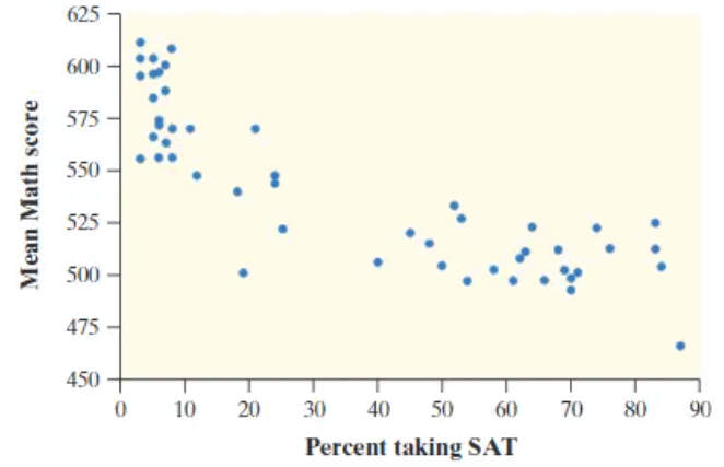
For example, a linear scatterplot might show a steady increase in one variable as the other rises, indicating a strong positive relationship. A curved scatterplot could suggest a nonlinear connection, like a parabolic trend. In the referenced graphs, Graph 1 exhibits a curved form, while Graph 2 is distinctly linear.
Direction
The direction indicates the trend of the data from left to right:
- Positive correlation: As the explanatory variable increases, the response variable also increases, reflected by a positive slope in a linear model.
- Negative correlation: As the explanatory variable increases, the response variable decreases, indicated by a negative slope.
In Graph 1, the direction is decreasing, as the response variable values drop from left to right. In Graph 2, the direction is increasing, with response variable values rising. For example, in a study of age versus height, a positive slope suggests that height increases with age, while a negative slope indicates a decrease in height as age rises.
Strength
The strength of a scatterplot measures how closely the data points follow a specific model, categorized as:
- Strong: Points tightly cluster around the model.
- Moderate: Points are somewhat scattered but still follow the model.
- Weak: Points are widely dispersed, showing little adherence to the model.
Graph 1 demonstrates a moderate strength correlation, while Graph 2 shows a strong correlation. The strength is quantitatively assessed using the correlation coefficient, discussed in later sections.
Unusual Features
Unusual features in a scatterplot include clusters and outliers:
- Clusters: Groups of points that are tightly packed, suggesting subgroups or distinct patterns within the data.
- Outliers: Points that deviate significantly from the main trend, possibly due to measurement errors or unique cases in the dataset.
These features are critical as they can affect the interpretation of the relationship between variables and influence statistical analyses.
Example Analysis
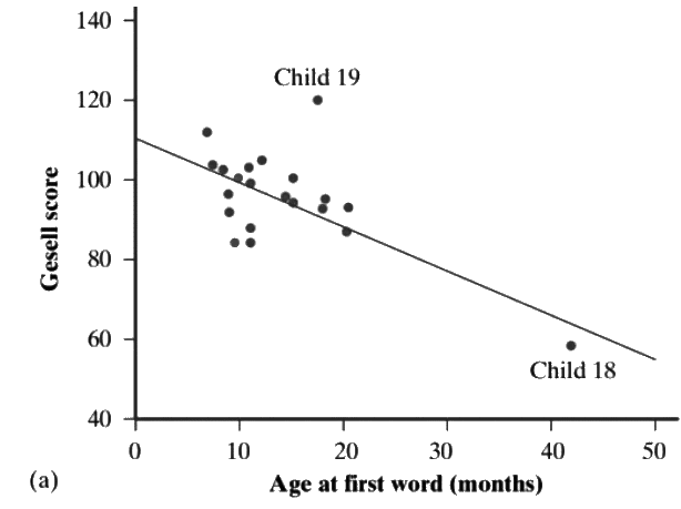
Sample Description: The scatterplot displays a linear pattern with a negative correlation, as the Gesell score decreases as the age at first word increases. The correlation strength is moderate, with some points aligning closely with the trend while others deviate. A notable cluster is present, with an outlier at Child 19, where the actual Gesell score significantly differs from the predicted value. Additionally, Child 18 is an influential point with high leverage, strongly affecting the negative correlation of the dataset.
Tips: Always describe scatterplots in the context of the problem to maximize clarity and relevance, especially for AP Statistics grading.
Outliers, Influential Points, and High Leverage Points
Understanding the distinctions between outliers, influential points, and high leverage points is crucial for accurate data analysis:
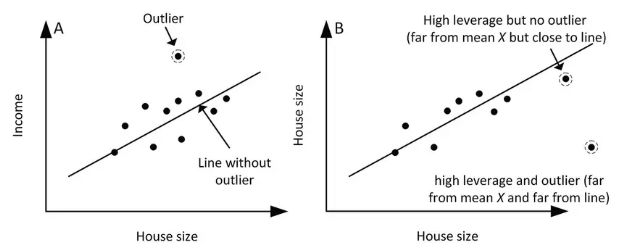
- Outlier: A data point that significantly deviates from the rest, potentially skewing statistical results.
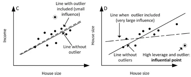
- Influential Point: A point that significantly affects the regression line’s slope or shape but may not be an outlier. It can alter the model’s direction or curvature.
- High Leverage Point: A point with an extreme value in the explanatory variable, exerting significant influence on the regression model, whether or not it’s an outlier.
These points can dramatically impact scatterplot trends and regression analyses, requiring careful consideration.
Key Terms to Understand
- Clusters: Groups of closely packed data points in a scatterplot, indicating potential subgroups or patterns that reveal relationships between variables.
- Correlation Coefficient: A value between -1 and 1 that measures the strength and direction of the relationship between two variables. A value of 1 indicates a perfect positive correlation, -1 a perfect negative correlation, and 0 no correlation.
- Explanatory Variable: The independent variable (x) used to predict or explain changes in the response variable, central to understanding variable relationships.
- High Leverage Points: Data points with extreme explanatory variable values that significantly influence regression model outcomes, requiring careful analysis.
- Negative Correlation: A relationship where an increase in one variable corresponds to a decrease in the other, visualized as a downward-sloping scatterplot.
- Outliers: Data points that differ significantly from others, potentially affecting statistical analyses and requiring investigation for accuracy or insight.
- Positive Correlation: A relationship where both variables increase together, shown as an upward-sloping scatterplot, useful for predicting trends.
- Scatterplot: A graph plotting two quantitative variables as dots, enabling visualization of relationships, trends, and correlations.
|
12 videos|106 docs|12 tests
|
FAQs on Representing the Relationship Between Two Quantitative Variables Chapter Notes - AP Statistics - Grade 9
| 1. What is a scatterplot and how is it used in data analysis? |  |
| 2. How can I interpret a scatterplot? | |
| 3. What are outliers in a scatterplot and why are they important? | |
| 4. What are influential points and how do they differ from outliers? | |
| 5. What are high leverage points and how can they affect data interpretation? | |


Semester Notes
,Free
,MCQs
,practice quizzes
,Viva Questions
,Representing the Relationship Between Two Quantitative Variables Chapter Notes | AP Statistics - Grade 9
,Representing the Relationship Between Two Quantitative Variables Chapter Notes | AP Statistics - Grade 9
,Sample Paper
,Summary
,Representing the Relationship Between Two Quantitative Variables Chapter Notes | AP Statistics - Grade 9
,mock tests for examination
,ppt
,study material
,video lectures
,Important questions
,past year papers
,Exam
,Previous Year Questions with Solutions
,Objective type Questions
,shortcuts and tricks
,Extra Questions
;


Chapter Notes: Representing the Relationship Between Two Quantitative Variables Free PDF Download
Importance of Chapter Notes: Representing the Relationship Between Two Quantitative Variables
Chapter Notes: Representing the Relationship Between Two Quantitative Variables
Chapter Notes: Representing the Relationship Between Two Quantitative Variables Grade 9 Questions
Study Chapter Notes: Representing the Relationship Between Two Quantitative Variables on the App
|
© EduRev
|
Education Revolution
|


|


