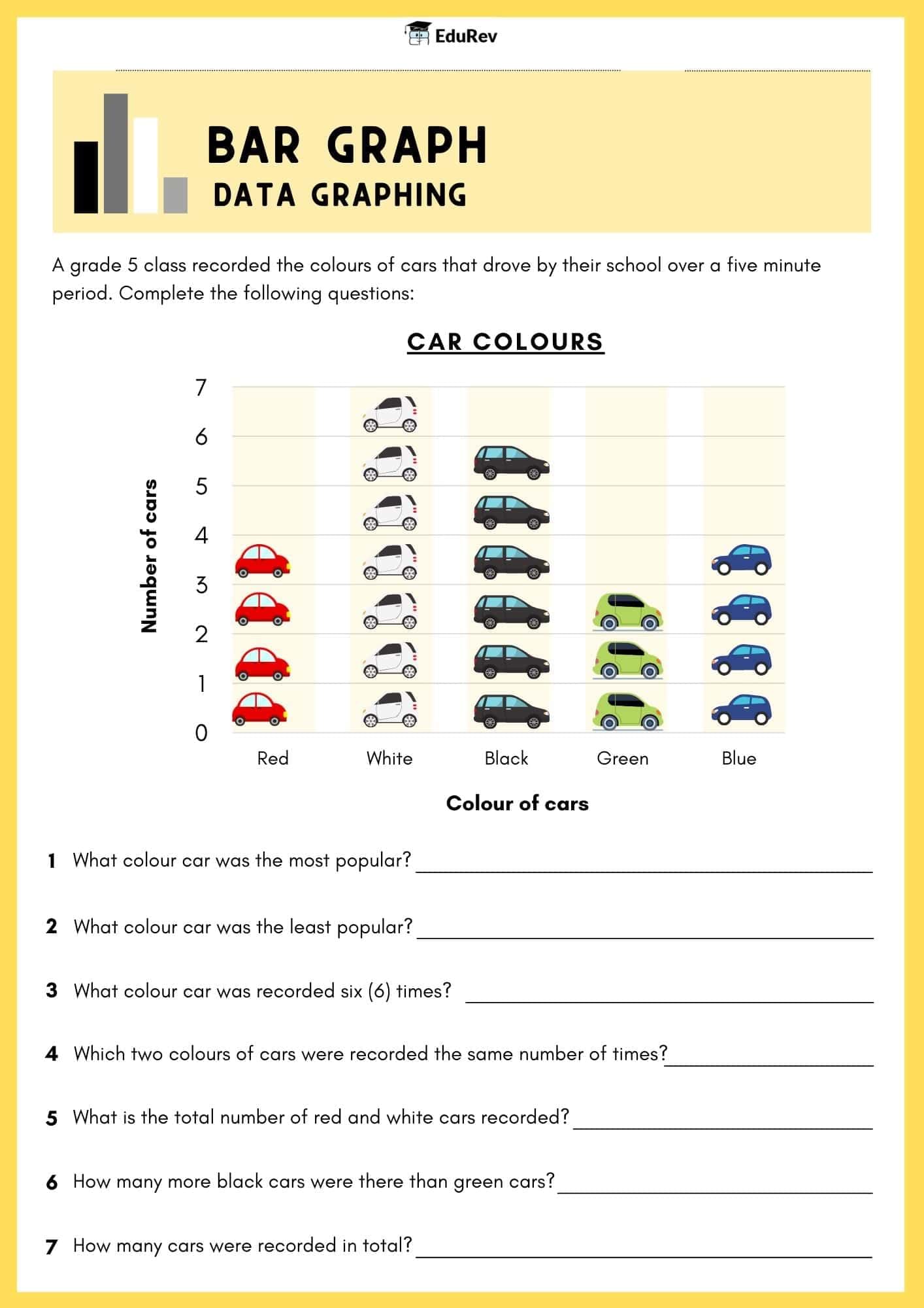
Class 5 Exam > Class 5 Notes > Mathematics for Class 5 > Visual Worksheet: Bar Graph
Visual Worksheet: Bar Graph | Mathematics for Class 5 PDF Download

The document Visual Worksheet: Bar Graph | Mathematics for Class 5 is a part of the Class 5 Course Mathematics for Class 5.
All you need of Class 5 at this link: Class 5
|
56 videos|187 docs|40 tests
|
FAQs on Visual Worksheet: Bar Graph - Mathematics for Class 5
| 1. What is a bar graph and how is it used in data representation? |  |
Ans. A bar graph is a visual representation of data using rectangular bars to show the frequency or value of different categories. Each bar's length or height corresponds to the data it represents, making it easy to compare different groups or track changes over time. Bar graphs are commonly used in various fields, such as business, education, and science, to present information clearly and effectively.
| 2. How do you create a bar graph from a given set of data? |  |
Ans. To create a bar graph, follow these steps: First, collect your data and identify the categories you want to represent. Next, draw the axes—label the horizontal axis with the categories and the vertical axis with the values or frequencies. Then, determine the scale for the vertical axis based on the highest value in your data set. Finally, draw bars for each category, ensuring their heights correspond to the values they represent, and label each bar if necessary.
| 3. What are the advantages of using bar graphs compared to other types of graphs? |  |
Ans. Bar graphs offer several advantages, including simplicity and clarity. They allow for easy comparison between different categories at a glance. Unlike pie charts, which can be difficult to interpret when there are many slices, bar graphs can effectively display larger data sets. Additionally, they can represent both discrete and continuous data, making them versatile for various applications.
| 4. Can bar graphs be used to represent negative values? |  |
Ans. Yes, bar graphs can represent negative values. In this case, the bars extending below the horizontal axis indicate negative values, while those above represent positive values. This allows for a visual comparison of both positive and negative data points, making it easier to understand trends or differences in the data set.
| 5. What are some common mistakes to avoid when creating a bar graph? |  |
Ans. When creating a bar graph, avoid these common mistakes: First, ensure that the scale of the vertical axis is appropriate and clearly labeled to prevent misinterpretation. Second, do not distort the lengths of the bars; they should accurately represent the data values. Third, ensure that categories on the horizontal axis are uniformly spaced and labeled clearly. Lastly, avoid using too many colors or patterns that can confuse the viewer; simplicity is key for effective communication.
Related Searches


