Data Handling Class 7 Notes Maths Chapter 4
| Table of contents |
|
| What is an Average? |
|
| Arithmetic Mean |
|
| Range |
|
| Mode |
|
| Median |
|
| Bar Graphs |
|
| Drawing Double-Bar Graphs |
|

What is an Average?
An average is a way to find out what the middle value or typical amount is when you have different numbers. It's like finding the "fair" amount.
Example: Studying Hours
Let's say you studied for different amounts of time each day this week. Here's how many hours you studied each day:
- Monday: 2 hours
- Tuesday: 3 hours
- Wednesday: 1 hour
- Thursday: 4 hours
- Friday: 2 hours
 To find the average number of hours you studied each day, you follow these steps:
- Add Up All the Hours: Add the number of hours you studied each day.
- 12 hours
- Count the Number of Days: There are 5 days in this example.
- Divide the Total Hours by the Number of Days: Divide the total hours by the number of days to find the average.
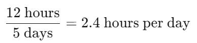
So, the average number of hours you studied each day is 2.4 hours.
This brings us to the realization that the average is a number that represents the central tendency of a group of observations or data. It falls between the highest and lowest values in the data set, serving as a measure of central tendency. Different types of data require different representative values.
Let’s look at some of the different representative values.
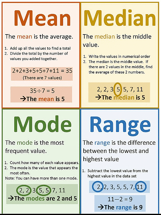
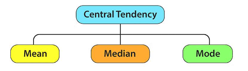 Measures of Central Tendency
Arithmetic Mean
The most commonly used representative value for a group of data is known as the arithmetic mean or simply the mean. It lies between the highest and the lowest value of data.

In other words, The average or arithmetic mean or mean of a given data is defined as :
Mean = Sum of all observations / Number of observations
Steps to calculate Mean:
Step 1: Add all the observations together.
Step 2: Divide the sum by the number of observations used.
To better understand this concept, let's consider the following example:
Example 1: We have two vessels containing 20 litres and 60 litres of milk respectively. If we were to divide the milk equally between both vessels, what amount would each vessel have?
Sol: In the above case, the average or the arithmetic mean would be:
= Total quantity of milk / Number of vessels
= (20 + 60) / 2 litres = 40 litres.
Thus, each vessel would have 40 litres of milk.
Example 2: A batsman scored the following number of runs in six innings: 36, 35, 50, 46, 60, 55 Calculate the mean runs scored by him in an inning.
Sol:
Total runs = 36 + 35 + 50 + 46 + 60 + 55 = 282.
In the above case, the average or the arithmetic mean would be:
= Sum of all observations / Number of observations
Therefore, in this case, mean = 282 / 6 = 47.
Thus, the mean runs scored in an inning is 47.
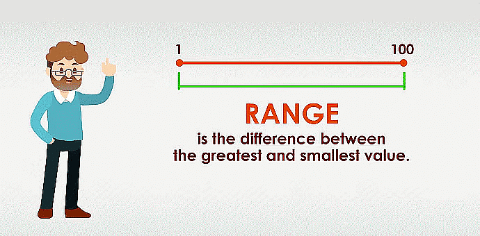
Range
To understand how the observations are spread out, we can look at the difference between the highest and lowest values. To find this difference, we simply subtract the lowest value from the highest value. This difference is called the range of the observations.
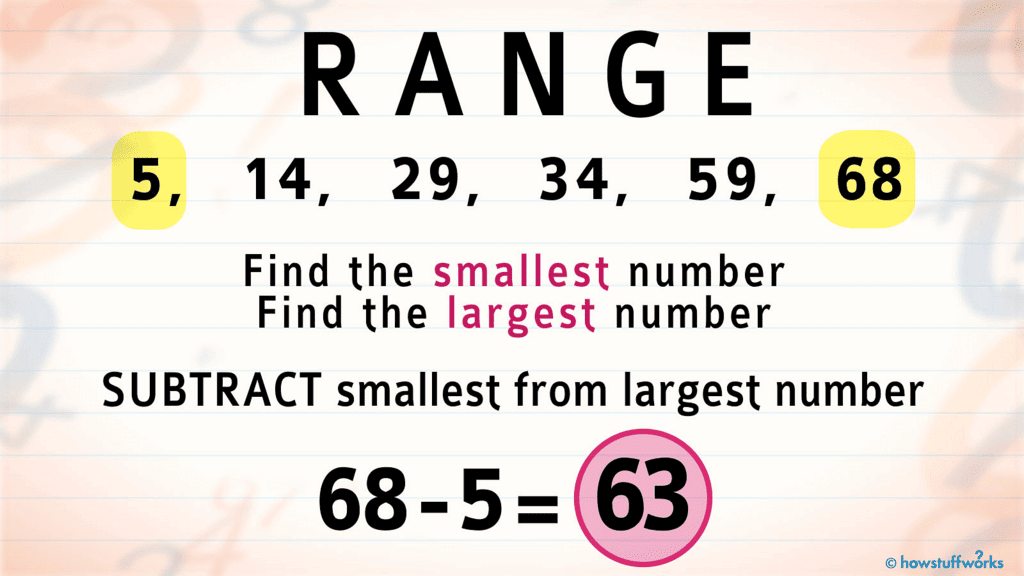
Steps to calculate Range:
Step 1: Find out the highest and the lowest observation(or values from the given data)
Step 2: Calculate their difference to get range
Example 1: Find the range of the following data:
21, 16, 30, 15, 16, 18, 10, 24, 26, 20
Sol: Greatest number(or the highest value) = 30
Smallest number(or the lowest value) = 10Range of the given data = (30 – 10) = 20
Example 2: The ages in years of 10 teachers of a school are: 32, 41, 28, 54, 35, 26, 23, 33, 38, 40 .
(i) What is the age of the oldest teacher and that of the youngest teacher? (ii) What is the range of the ages of the teachers?
Sol: (i) Age of the oldest teacher = 54 years
Age of the youngest teacher = 23 years
(ii) Range of the ages of the teachers = Highest Observation – Lowest Observation = (54 – 23) years = 31 years
35, 30, 45, 65, 39, 20
Mode
The mode of a set of observations is the observation that occurs most often.
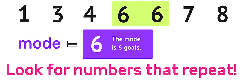
Note: A set of data can have more than 1 mode.
Steps to calculate Mode:
Step 1: Arrange the data in ascending order.
Step 2: Tabulate the data in a frequency distribution table.
Step 3: The most frequently occurring observation will be the mode.
Example 1: Find the mode of data: 13, 16, 12, 14, 19, 12, 14, 13, 14
Sol: Let us arrange the data in ascending order i.e.
12,12,13,13,14,14,14,16,19
Here, 14 occurs the maximum number of times, hence it's the mode.
Example 2: Find the mode of the given set of numbers: 1, 1, 2, 4, 3, 2, 1, 2, 2, 4
Sol: Arranging the numbers with the same values together, we get 1, 1, 1, 2, 2, 2, 2, 3, 4, 4 Mode of this data is 2 because it occurs more frequently than other observations.
Mode of Large Data
When we have many observations, it can be difficult to put them all together and count them. In such cases, we use a method called tabulation.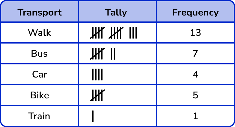 Tally Chart depicting the frequency of people and their mode of transport
Tabulation involves using tally marks and determining the frequency, which you might have learned in your previous class. This helps us organize the data in a more manageable way.
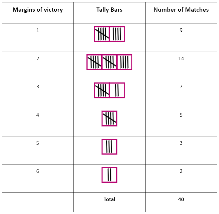
Example: Following are the margins of victory in the football matches of a league. 1, 3, 2, 5, 1, 4, 6, 2, 5, 2, 2, 2, 4, 1, 2, 3, 1, 1, 2, 3, 2, 6, 4, 3, 2, 1, 1, 4, 2, 1, 5, 3, 3, 2, 3, 2, 4, 2, 1, 2 Find the mode of this data.
Sol: Let us put the data in a tabular form:
Looking at the table, we can see that the most common number of goals leading to victory is 2. This means that in most matches, teams have won with a margin of 2 goals. Hence the mode is 2.
Median
The median is the middle value when you arrange all the data in order. Half of the values are higher than the median, and the other half are lower than the median.
Steps to calculate Median:
Step 1: Arrange the data in ascending order.
Step 2: The value that lies in the middle such that half of the observations lie above it and the other half below it will be the median.
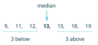
Example 1: The scores in mathematics test (out of 25) of 15 students is as follows:
19, 25, 23, 20, 9, 20, 15, 10, 5, 16, 25, 20, 24, 12, 20
Find the median of this data.
Sol: The data is first arranged in ascending order.
We get - 5, 9, 10, 12, 15, 16, 19, 20, 20, 20, 20, 23, 24, 25, 25.
It can be seen from this arrangement that 20 (at the eighth place) is in the middle of the data. There are 7 observations below 20 and 7 observations above 20. Therefore, 20 is the median of the data.
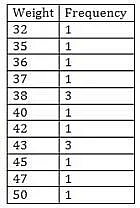
Example 2: The weights (in kg.) of 15 students in a class are:
38, 42, 35, 37, 45, 50, 32, 43, 43, 40, 36, 38, 43, 38, 47
Find the median of this data.
Sol: Firstly, data will be arranged in ascending order in a tabular format.
The middle term is 40, so 40 is the median.
A Quick Recap
Bar Graphs
We learned about organizing information into frequency distribution tables and representing it visually through pictographs or bar graphs. By looking at these bar graphs, we can make observations and gather information from them.For instance, if the bar represents the frequency, we can identify the mode as the tallest bar on the graph.
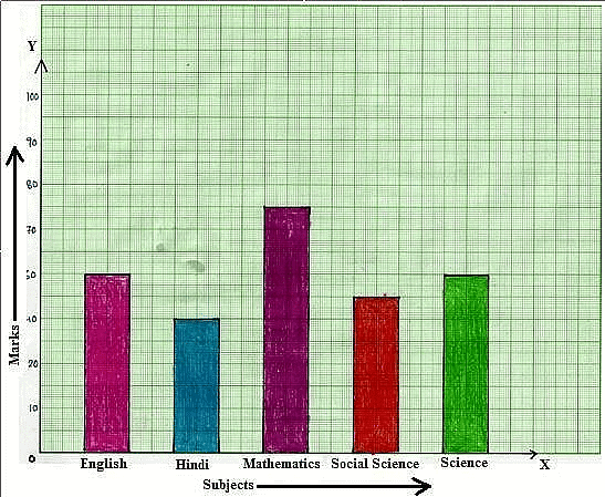 Bar Graph: The Subject Mathematics has the tallest bar
Choosing a Scale
A bar graph is a way of representing numbers using bars that have the same width. The lengths of the bars depend on the frequency and the scale chosen.
For instance, in a bar graph where numbers are shown in units, each bar represents one observation. If the graph is displaying numbers in tens or hundreds, one unit length can represent 10 or 100 observations.
Let's look at an example:
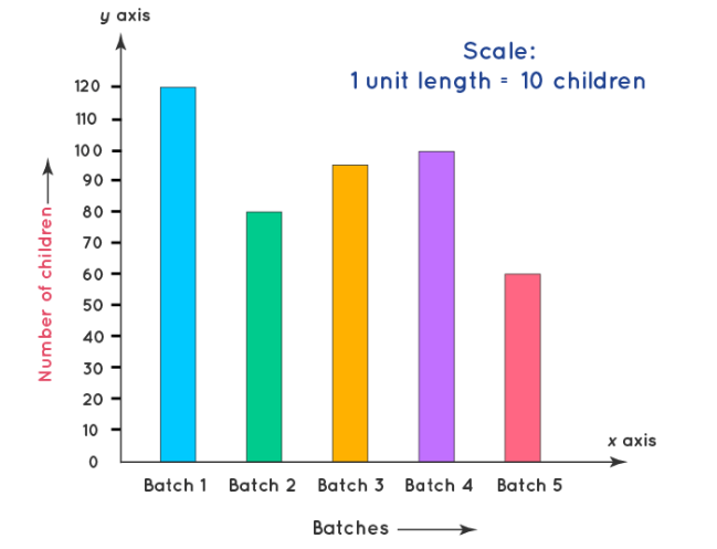 Bar Graph
Example: Two hundred students from 6th and 7th classes were asked to name their favourite colour to decide on the colour of their school building. The results are provided in the table below. Represent this data on a bar graph.
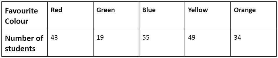
Answer the following questions with the help of the bar graph:
(i) Which is the most preferred colour and which is the least preferred?
(ii) How many colours are there in all? What are they?
Sol: Choose a suitable scale as follows: Start the scale at 0. The greatest value in the data is 55, so end the scale at a value greater than 55, such as 60.
Use equal divisions along the axes, such as increments of 10. You know that all the bars would lie between 0 and 60. We choose the scale such that the length between 0 and 60 is neither too long nor too small.
Here we take 1 unit for 10 students.
We then draw and label the graph as shown. From the bar graph we conclude that:
(i) Blue is the most preferred colour(Because the bar representing Blue is the tallest). Green is the least preferred colour(Because the bar representing Green is the shortest).
(ii) There are five colours. They are Red, Green, Blue, Yellow and Orange. (These can be seen on the horizontal line)
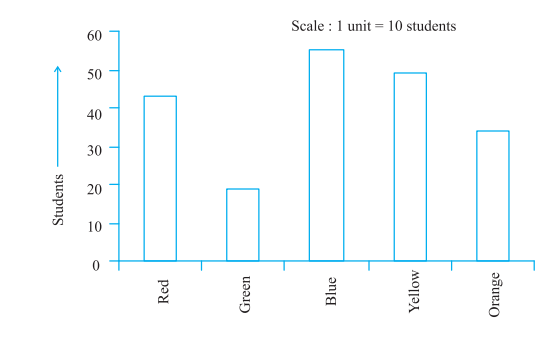
Important note:
A scale: Large numbers of data cannot be represented directly, so the scaling factor is used to reduce or scale down large numbers.
Drawing Double-Bar Graphs
Double bar graphs are used for comparing data between two different things. The difference between a bar graph and a double bar graph is that a bar graph displays one set of data, and a double bar graph compares two different sets of information or data.
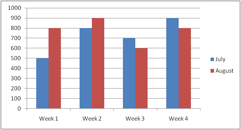 A Double Bar Graph
Example: Sales of English and Hindi books in the years 1995, 1996, 1997,and 1998 are given below:
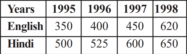
Draw a double bar graph and answer the following questions:
(a) In which year was the difference in the sale of the two language books least?
(b) Can you say that the demand for English books rose faster? Justify.
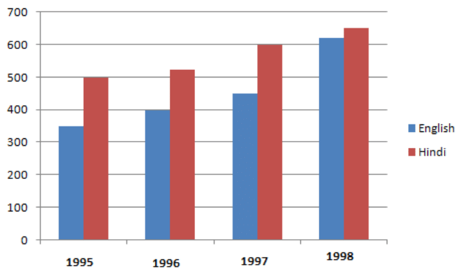
Sol: We can draw the double bar graph by taking the Years on the x-axis and the corresponding values of English and Hindi on the y-axis.
Scale: 1 cm = 100 Books sold
The above bar graph depicts the total production of motorbikes in two consecutive years.
(a) In the year 1998, the difference in the sale of the two language books was least.
(b) Yes, the demand for English books increased. From the graph, it is clear that the difference in the demand for English books from 1995 to 1998 is 620−350=270. Whereas for Hindi books the difference is 650−500=150.
Hence, the demand for English books increased.
|
76 videos|386 docs|39 tests
|
FAQs on Data Handling Class 7 Notes Maths Chapter 4
| 1. What is the purpose of using bar graphs in data handling? |  |
| 2. How can double-bar graphs be used to represent data effectively? | |
| 3. Can bar graphs be used to show averages of a data set? | |
| 4. What are some common mistakes to avoid when creating bar graphs for data handling? | |
| 5. How can bar graphs be used to identify outliers in a data set? | |


practice quizzes
,Data Handling Class 7 Notes Maths Chapter 4
,study material
,ppt
,Exam
,Extra Questions
,Previous Year Questions with Solutions
,mock tests for examination
,Free
,video lectures
,Objective type Questions
,MCQs
,Data Handling Class 7 Notes Maths Chapter 4
,Important questions
,Summary
,Semester Notes
,shortcuts and tricks
,past year papers
,Viva Questions
,Sample Paper
,Data Handling Class 7 Notes Maths Chapter 4
;


Chapter Notes: Data Handling Free PDF Download
Importance of Chapter Notes: Data Handling
Chapter Notes: Data Handling
Chapter Notes: Data Handling Class 7 Questions
Study Chapter Notes: Data Handling on the App
|
© EduRev
|
Education Revolution
|


|


