Line Graphs: Introduction & Examples (with Solutions) | General Aptitude for GATE - Mechanical Engineering PDF Download
| Table of contents |

|
| What is a Line Graph? |

|
| Basic Concepts |

|
| Types of Line Graphs |

|
| Tips to Solve Line Graphs |

|
| Examples |

|
What is a Line Graph?
- A line graph, also known as a line chart, is a simple way to show data visually. It connects data points with straight lines to represent how something changes over time.
- Each point on the line represents a specific piece of information.
- Line graphs are great for comparing changes over time, like how different groups change over the same period.
- Typically, the horizontal axis shows the independent data (like time), while the vertical axis shows the dependent data (like quantities or measurements). This helps us understand relationships between different variables more clearly.
- A Line Graph looks like this:
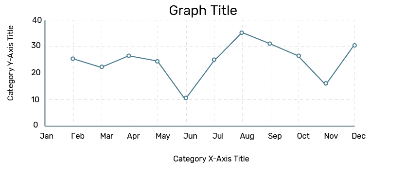 Line Graph
Basic Concepts
- The best way to make a line chart is to put dependent data on the vertical y-axis and independent data (like time) on the horizontal x-axis. Usually, the axes meet at the point (0, 0), with positive numbers shown mostly. Each axis is labelled with different types of information, like time on the x-axis and things like income or cost on the y-axis.
- Line charts are great because they clearly show trends and patterns in data. They can help predict future trends based on existing data. They're commonly used in finance, marketing, and other fields. They're also handy for things like tracking weather or doing scientific experiments. If a line chart has multiple lines, you can compare the data they represent. However, for fair comparisons, both axes should have the same scale.
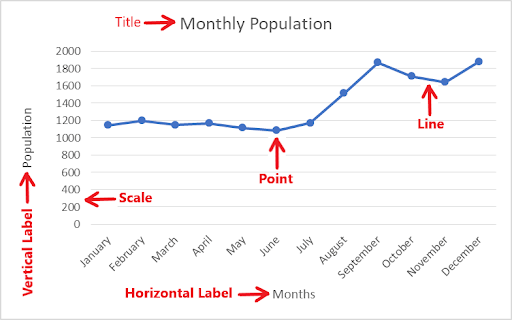
The following is a basic example of a line graph, with its numerous components:
- The graph’s title informs us about what the graph is about.
- Horizontal and vertical labels inform us about the data type.
- Axis: The X and Y axes indicate the data’s unit.
- Dots: The dots on the line graph represent a combination of data on the X and Y axes.
- Line: In the graph above, the blue line connecting the dots represents the data and its variation visually.
Examine the graph below for its various components
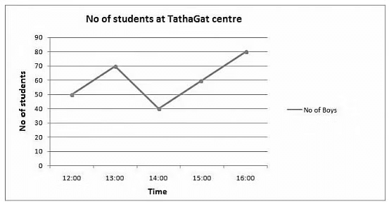
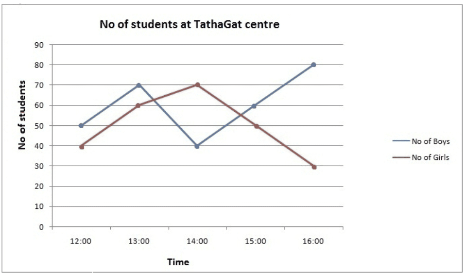
- Label: “Time” is represented horizontally, and “Number of students” is represented vertically.
- Axis: The X axis depicts time in hours, while the Y axis depicts an absolute number.
- Dots: Dots reflect the number of boys at TathaGat at any given time. At 12 o’clock, there were 50 lads at TathaGat centre.
- Line: That line for boys depicts how the number of pupils rises from 12:00 to 13:00’o clock, drops to 40 at 14:00’o clock, and then rises again until 16:00’o clock.
- We may clearly deduce from the above graphic representation that as the line rises, the number of students rises, and as it falls, the number of students reduces. However, the above blue line can also tell us the rate of this increment or decrement, or in other words, the data’s growth (positive or negative).
- The slope of the line is directly proportional to the rate of increase or decrease. The steepness or inclination of the line is referred to as slope. Growth is related to the steepness of the line that is being followed. A thicker line indicates faster growth.
Q1: At what time the number of boys was highest at the centre?
Ans: Based on the graph, it is clear that the number of boys was highest at 16:00 o’clock.
Q2: At what time the total number of students was lowest at the centre?
Ans: To determine the answer to this issue, add the number of boys and girls at various hours.
At 12:00 o’clock total number of students = 90
At 13:00 o’clock total number of students = 130
At 14:00 o’clock total number of students = 110
At 15:00 o’clock total number of students = 110
So the answer is that the number of pupils was highest around 13:00 o’clock.
Q3: During what period the rate of growth of the number of girls were highest?
Ans: Looking at the graph, we can see that the red line is steepest between 12:00 and 13:00, indicating that this is when the number of girls is growing the fastest.
We may check it using the following formula:
Between 12:00 and 13:00, 13:00 and 14:00, 14:00 and 15:00, and 15:00 and 1600, the growth rate is 50 percent, 16.66 percent, – 28.56 percent, and -40 percent, respectively.
Types of Line Graphs
The following are the types of the line graph. They are:
- Simple Line Graph: Only one line is plotted on the graph.
- Multiple Line Graph: More than one line is plotted on the same set of axes. A multiple line graph can effectively compare similar items over the same period of time.
- Compound Line Graph: If information can be subdivided into two or more types of data. This type of line graph is called a compound line graph. Lines are drawn to show the component part of a total. The top line shows the total and line below shows part of the total. The distance between every two lines shows the size of each part.
1. Vertical Line Graph
Vertical line graphs are graphs in which a vertical line extends from each data point down to the horizontal axis. Vertical line graph sometimes also called a column graph. A line parallel to the y-axis is called a vertical line.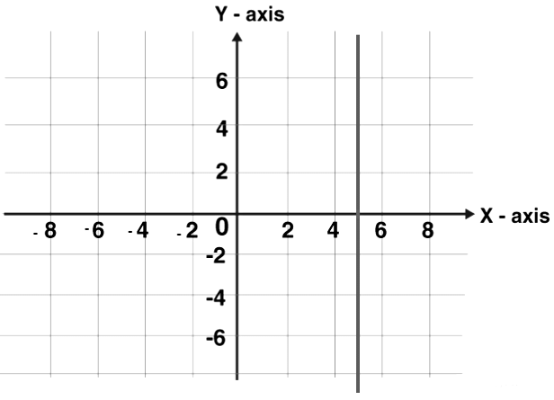
 |
Test: Line Charts- 1
|
Start Test |
2. Horizontal Line Graph
Horizontal line graphs are graphs in which a horizontal line extends from each data point parallel to the earth. Horizontal line graph sometimes also called a row graph. A line parallel to the x-axis is called a vertical line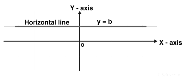
3. Straight Line Graph
A line graph is a graph formed by segments of straight lines that join the plotted points that represent given data. The line graph is used to solve changing conditions, often over a certain time interval. A general linear function has the form y = mx + c, where m and c are constants.
The fundamental rule at the rear of sketching a linear graph is that we require only two points to graph a straight line. The subsequent procedure is followed in drawing linear graphs:
- By substituting two dissimilar values for x in the equation y = mx + c, we get two values for y. Thus, we get two points (x1, y1) and (x2, y2) on the line.
- Plot the horizontal line and vertical line and select the suitable scale for both the axes.
- If the given table values are large choose the scale for that particular value. It depends on the given value.
- Plot the two points in the Cartesian plane of the paper. Join the two points using a line segment and extend to two directions. The closed figure obtained is the required linear graph.
4. Multiple Line Graph
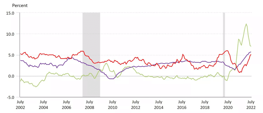
- In a multiple line graph, more than one dependent variable is charted on the graph and compared over a single independent variable (often time). Different dependent variables are often given different coloured lines to distinguish between each data set. Each line relates to only the points in its given data set; lines do not cross between dependent variables.
- For example, the line graph below shows the Consumer Price Index . However, this graph shows the change in price for three different categories: medical care (red), commodities (green), and shelter (blue). In this graph, we can see the growth in price for commodities was higher than the other two categories in July 2022. However, shelter or medical expenses were typically the groups that experienced higher inflation over the past decade.
5. Compound Line Graph
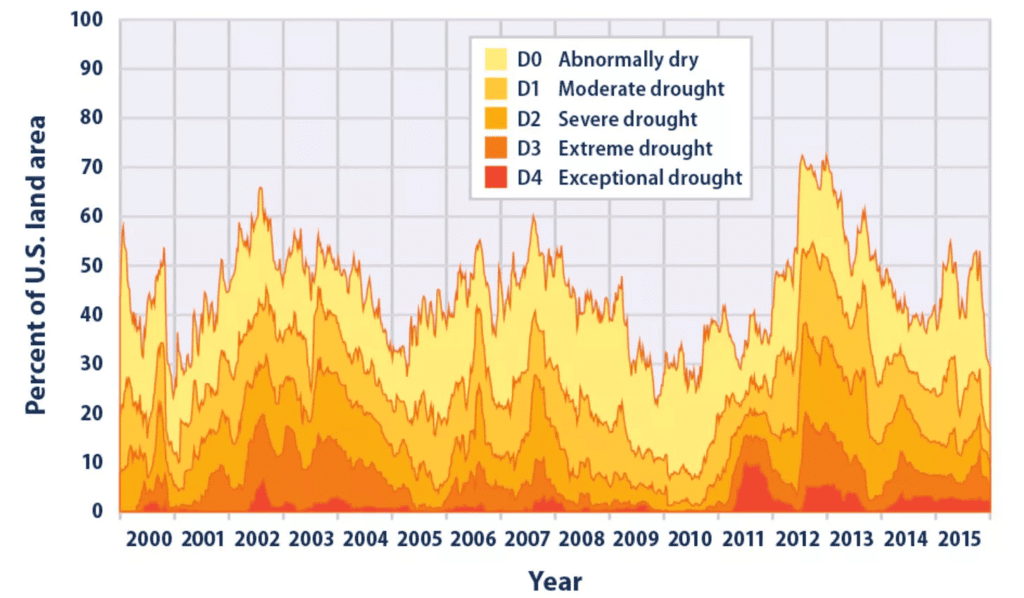
- A compound line graph uses multiple variables similar to a multiple line graph. However, the variables are often stacked on top of each other to show the total quantity across all variables. This not only informs users of the relationship between each of the variables, but it informs of how the total changes as well.
- In the example below from the Environmental Protection Agency (EPA), there are five dependent variables that range from abnormally dry land areas to exceptional drought areas. The most extreme drought data was graphed first, and any empty space under that line graph was shaded dark red. Then, subsequent sets of data were plotted after, with the empty area below each of those lines shaded their respective colors. In total, this shows the relationship between drought descriptions as well as the total percent of U.S. land area in these categories by year.
 |
Download the notes
Line Graphs: Introduction & Examples (with Solutions)
|
Download as PDF |
Tips to Solve Line Graphs
- Know Basic Mathematics: Understand simple math concepts like percentages, profit, and loss. Knowing these basics helps you use shortcuts and formulas effectively.
- Practice: Practice various line graph questions to get comfortable with them. Solve past questions and take practice tests to build confidence.
- Use Approximations and Shortcuts: Sometimes, you can solve questions faster by estimating values or using shortcuts. Look for opportunities to use these techniques to speed up your problem-solving.
- Pay Attention to the Graph: Take a good look at the graph provided. Understanding its slope and trend can often help you answer questions more easily. This simple observation can make problem-solving quicker and more accurate.
Examples
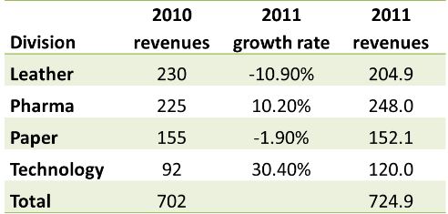
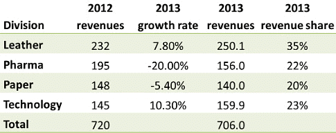
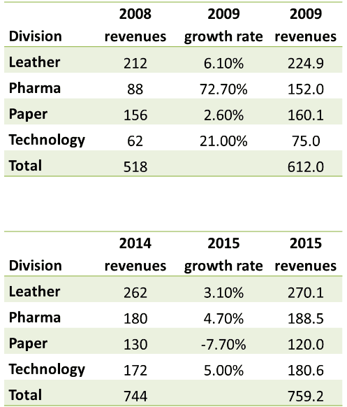
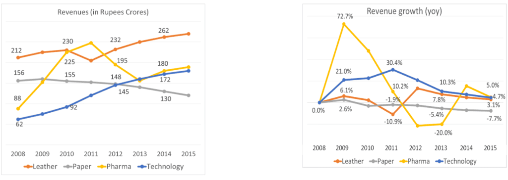
Answer the following questions using the data given in the graph below
Q1.What was the total revenues in 2011?
a. Rs. 640 Crores
b. Rs. 725 Crores
c. Rs. 760 Crores
d. Rs. 680 Crores
Sol: We know 2010 revenues by division and 2011 growth rates by division. We just need to put these two together.
2011 revenues were Rs. 725 Crores.
Hence, the answer is "Rs. 725 Crores".
Choice B is the correct answer.
Q2: In the year 2013, what was the share of revenues of the division Pharma?
a. 27%
b. 35%
c. 19%
d. 22%
Sol: Once again, we can compute 2013 numbers using actual 2012 numbers and 2013 growth rates by division.
The share of Pharma is 22%.
Hence, the answer is "22%".
Choice D is the correct answer.
Q3: Which year saw the highest percentage growth in revenues overall?
Sol:
The maximum year on year growth rate was seen in 2009.
We could have obtained this by scanning at the growth rate graph as well. The Pharma number is off the charts and all 4 growth rates are positive. The 21% growth rate in Technology is also pretty high. So, here was an easy question that we have gone about in a roundabout fashion.
|
194 videos|168 docs|152 tests
|
FAQs on Line Graphs: Introduction & Examples (with Solutions) - General Aptitude for GATE - Mechanical Engineering
| 1. What is a line graph and what is its purpose? |  |
| 2. What are the basic components of a line graph? |  |
| 3. What are the different types of line graphs? |  |
| 4. How can I effectively interpret a line graph? |  |
| 5. What are some common mistakes to avoid when creating a line graph? |  |

