Test: Data Interpretation - 2 (2014-2011) - UPSC MCQ
15 Questions MCQ Test - Test: Data Interpretation - 2 (2014-2011)
The following graph shows the average profit of two fruit-sellers A and B in thousands (₹) per year from the year 1995 to 2000. Consider the graph and answer the 4 (four) items that follow :
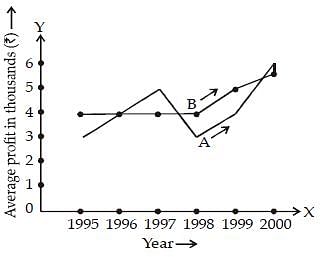
Q. How much more average profit did A make in the year 2000 than in the year 1999?
[2014]

The following graph shows the average profit of two fruit-sellers A and B in thousands (₹) per year from the year 1995 to 2000. Consider the graph and answer the 4 (four) items that follow :

Q. What is the trend of the average profit of B from the year 1997 to the year 2000?
[2014]

| 1 Crore+ students have signed up on EduRev. Have you? Download the App |
Study the two figures given below and answer the questions that follow:

Fig 1: Number of Professors in selected disciplines in a University by sex
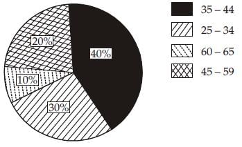
Fig. 2 : Age of Physics Professors
Q. How many Physics professors belong to the age group 35 – 44?
[2013]

Fig 1: Number of Professors in selected disciplines in a University by sex

Fig. 2 : Age of Physics Professors
Study the two figures given below and answer the questions that follow:

Fig 1: Number of Professors in selected disciplines in a University by sex

Fig. 2 : Age of Physics Professors
Q. Which one of the following disciplines has the highest ratio of males to females?
[2013]
Study the two figures given below and answer the questions that follow:
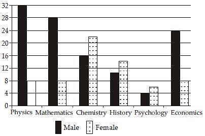
Fig 1: Number of Professors in selected disciplines in a University by sex

Fig. 2 : Age of Physics Professors
Q. What percentage of all Psychology professors are females?
[2013]
Study the two figures given below and answer the questions that follow:

Fig 1: Number of Professors in selected disciplines in a University by sex

Fig. 2 : Age of Physics Professors
Q. If the number of female Physics professors in the age group 25 – 34 equals 25% of all the Physics professors in that age group, then what is the number of male Physics professors in the age group 25 – 34?
[2013]
Study the two figures given below and answer the questions that follow:
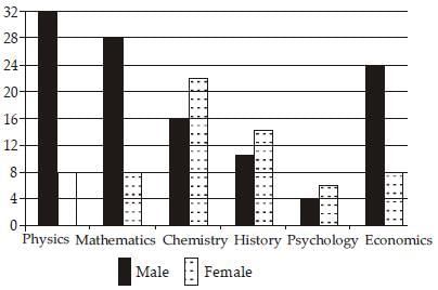
Fig 1: Number of Professors in selected disciplines in a University by sex

Fig. 2 : Age of Physics Professors
Q. If the Psychology professors in the University constitute 2% of all the professors in the University, then what is the number of professors in the University?
[2013]
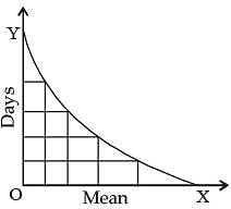
Consider the following diagrams:
x men, working at constant speed, do a certain job in y days. Which one of these diagrams shows the relation between x and y?
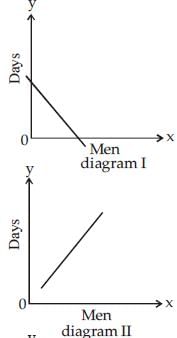
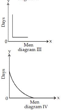
[2013]
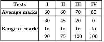
Consider the following information regarding the performance of a class of 1000 students in four different tests:
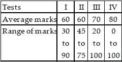
If a student scores 74 marks in each of the four tests, in which one of the following tests is her performance the best comparatively?
[2012]
Consider the following distance - time graph. The graph shows three athletes A, B and C running side by side for a 30 km race.
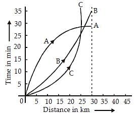
With reference to the above graph, consider the following statements :
1. The race was won by A.
2. B was ahead mark of A up to 25 km mark
3. C ran very slowly from the beginning.
Which of the statements given above is/are correct?
[2011]
Read the passage given below, study the graph that follows and answer the three items given below the figure.
During a party, a person was exposed to contaminated water. A few days later, he developed fever and loose motions. He suffered for some days before going to a doctor for treatment. On starting the treatment, he soon became better and recovered completely a few days later. The following graph shows different phases of the person's disease condition as regions A, B, C, D and E of the curve.
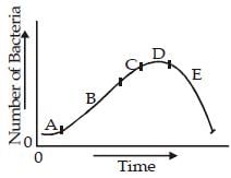
Q. Which region/regions of the curve correspond/corresponds to incubation phase of the infection?
[2011
Read the passage given below, study the graph that follows and answer the three items given below the figure.
During a party, a person was exposed to contaminated water. A few days later, he developed fever and loose motions. He suffered for some days before going to a doctor for treatment. On starting the treatment, he soon became better and recovered completely a few days later. The following graph shows different phases of the person's disease condition as regions A, B, C, D and E of the curve.

Q. Which region of the curve indicates that the person began showing the symptoms of infection?
[2011
Read the passage given below, study the graph that follows and answer the three items given below the figure.
During a party, a person was exposed to contaminated water. A few days later, he developed fever and loose motions. He suffered for some days before going to a doctor for treatment. On starting the treatment, he soon became better and recovered completely a few days later. The following graph shows different phases of the person's disease condition as regions A, B, C, D and E of the curve.
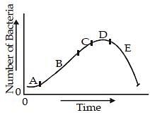
Q. Which region of the curve indicates that the treatment yielded effective relief?
[2011
Consider the following Velocity – Time graph. It shows two trains starting simultaneously on parallel tracks.
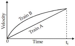
With reference to the above graph, which one of the following statements is not correct?
[2011]
The following pie charts show the break up of disease categories recorded in the patients from two towns, Town A and Town B. Pie charts plot the disease categories as percentage of the total number of patients. Based on these answer the two items that follow the charts.
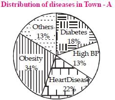
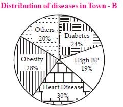
Q. What can we say about persons with more than one disease from these graphs?
[2011]


