UCAT Exam  >  UCAT Tests  >  Test: Charts & Graphs - 1 - UCAT MCQ

Test: Charts & Graphs - 1 - UCAT MCQ


Test Description

10 Questions MCQ Test - Test: Charts & Graphs - 1

Test: Charts & Graphs - 1 for UCAT 2024 is part of UCAT preparation. The Test: Charts & Graphs - 1 questions and answers have been prepared according to the UCAT exam syllabus.The Test: Charts & Graphs - 1 MCQs are made for UCAT 2024 Exam. Find important definitions, questions, notes, meanings, examples, exercises, MCQs and online tests for Test: Charts & Graphs - 1 below.
Solutions of Test: Charts & Graphs - 1 questions in English are available as part of our course for UCAT & Test: Charts & Graphs - 1 solutions in Hindi for UCAT course. Download more important topics, notes, lectures and mock test series for UCAT Exam by signing up for free. Attempt Test: Charts & Graphs - 1 | 10 questions in 7 minutes | Mock test for UCAT preparation | Free important questions MCQ to study for UCAT Exam | Download free PDF with solutions
Test: Charts & Graphs - 1 - Question 1

Item X is the best-selling new sous vide circulator that every wannabe home-chef wishes to own. It has seven speeds and can be controlled from a mobile app. The product has received rave reviews – appearing in the QG magazine of ‘Top Ten Kitchen Items Any Gentleman Should Own’.

Sales of Item X in Shop A in 2018-19

Q. Which of the following statements is incorrect?

Detailed Solution for Test: Charts & Graphs - 1 - Question 1

Without information on the total number of sales, we cannot compare the pie charts. Thus, the claim that the sales were higher in Shop A than Shop B cannot be supported as we only know that the sales were a higher proportion of the whole year in Q1 in Shop A rather than being a higher number sold.

Test: Charts & Graphs - 1 - Question 2

Item X is the best-selling new sous vide circulator that every wannabe home-chef wishes to own. It has seven speeds and can be controlled from a mobile app. The product has received rave reviews – appearing in the QG magazine of ‘Top Ten Kitchen Items Any Gentleman Should Own’.
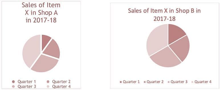
Sales of Item X in Shop A in 2018-19
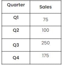
Q. Reading with Q1 to Q4 going clockwise, which of the following shows the correct pie chart for sales of item X in Shop A in 2018-19?

Detailed Solution for Test: Charts & Graphs - 1 - Question 2

1. Identify the trend in size.

As it goes Q1 to Q4 in a clockwise direction, It has to go smallest, second smallest, biggest then smaller but not as small as the first 2.

From this fact alone, we know it must be one of A or C.

2. Find the total sales in each quarter for B and compare

The total sales are 600. The largest section of this is 250/600. This is less than half the total.

This means that C cannot be correct as it has a segment which is half of the total of the pie.

Therefore, A is the only possible correct answer.

1 Crore+ students have signed up on EduRev. Have you? Download the App
Test: Charts & Graphs - 1 - Question 3

Item X is the best-selling new sous vide circulator that every wannabe home-chef wishes to own. It has seven speeds and can be controlled from a mobile app. The product has received rave reviews – appearing in the QG magazine of ‘Top Ten Kitchen Items Any Gentleman Should Own’.

Sales of Item X in Shop A in 2018-19

Q. In 2018-19, Shop B had sales of Item X 33% higher than Shop A in Q1, sales of Item X were 30% lower in Q2 but were 32% higher in Q3. Shop B’s sales were 44% lower in Q4. Which shop sold more of Item X over the year and by how many?

Detailed Solution for Test: Charts & Graphs - 1 - Question 3

1. Find the total sales in each quarter for B and compare

We are looking for 2018-19 so it is based on the information in the table:

For percentage difference:
New Value = Original Value x Multiplier

Top tip: For information on how to find a multiplier for a given percentage difference, look at the Medic Mind Lesson on the topic.

For Quarter 1: 33% higher so
New = 75 x 1.33
New = 100

Repeat these calculations for the figures for Q2 to Q4

Q2: 30% decrease – 100 x 0.7 = 70
Q3: 32% increase – 250 x 1.32 = 330
Q4: 44% decrease – 175 x 0.56 = 98

This gives a total of 100 + 70 + 330 + 98 = 598

For Shop A the total is:
75 + 100 + 250 + 175 = 600 – 2 more than in Shop B – answer option A.

Test: Charts & Graphs - 1 - Question 4

Item X is the best-selling new sous vide circulator that every wannabe home-chef wishes to own. It has seven speeds and can be controlled from a mobile app. The product has received rave reviews – appearing in the QG magazine of ‘Top Ten Kitchen Items Any Gentleman Should Own’.

Sales of Item X in Shop A in 2018-19

Q. Shop A also sells a rival brand’s competing sous vide machine – Item Q. This comes in two variants – blue or red. At the start of the year they stock 250 of blue Item Q and 200 of red Item Q. In January they sell 50% of the blue item Qs in stock and 75 of their red Item Qs. They put in an order for 100 blue Item Qs and 75 red Item Qs. After this order arrives, what is the ratio for blue item Qs to Red item Qs?

Detailed Solution for Test: Charts & Graphs - 1 - Question 4

1. Find the number they have of each in stock and set up the ratio

They sell 50% of their blue Item Qs:

250 x 0.5 = 125 left

They then order 100 so:

125 + 100 = 225

They sell 75 of their red Item Qs but order 75 so there is no net change.

They therefore have 200 red Item Qs

This gives the ratio

225:200

2. Simplify the ratio

To simplify a ratio, divide by the highest common factor for the two sides. This is the largest number which both can be divided by.

For 225 and 200, this is 25.

225 / 25 = 9

200 / 25 = 8

This makes the simplified ratio 9:8.

Test: Charts & Graphs - 1 - Question 5

A university has researched all the 12 species of birds which are endemic to an island group in the Pacific Ocean. The project required the monitoring of the birds resting heart rate measured using trackers over a period of 72 hours. This chart shows the comparison of a resting heart rate of birds in comparison to their wingspan in metres.
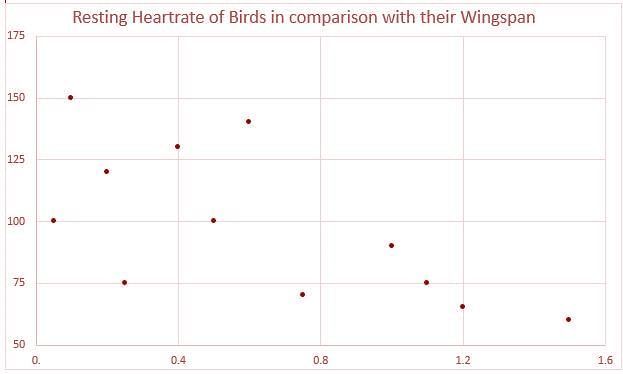
Q. What is the median wingspan?

Detailed Solution for Test: Charts & Graphs - 1 - Question 5

To find the median add one to the number of birds and divide by 2 to find the middle number.
There are 12 birds so the median wingspan is: 12 + 1 = 13 / 2 = 6.5
The median is therefore halfway between the 6th and 7th number.
The sixth is at 0.50m and the seventh is at 0.60m. 0.55 Is halfway between these.

Test: Charts & Graphs - 1 - Question 6

A university has researched all the 12 species of birds which are endemic to an island group in the Pacific Ocean. The project required the monitoring of the birds resting heart rate measured using trackers over a period of 72 hours. This chart shows the comparison of a resting heart rate of birds in comparison to their wingspan in metres.

Q. Considering both factors, what fraction of the birds have a wingspan above the median value or a resting heart rate below the median value?

Detailed Solution for Test: Charts & Graphs - 1 - Question 6

Identify the number with a heart rate below the median and those which don’t but do have an above average wingspan
There are six birds below the median heart rate.
There is one more bird which doesn’t have a low heart rate but does have an above average wingspan.
This means there are 7 meeting the criteria out of 12 birds total so the fraction is 7/12ths – C.

Test: Charts & Graphs - 1 - Question 7

Here is the graph about the number of English counties pupils in two classes at a primary school had visited.
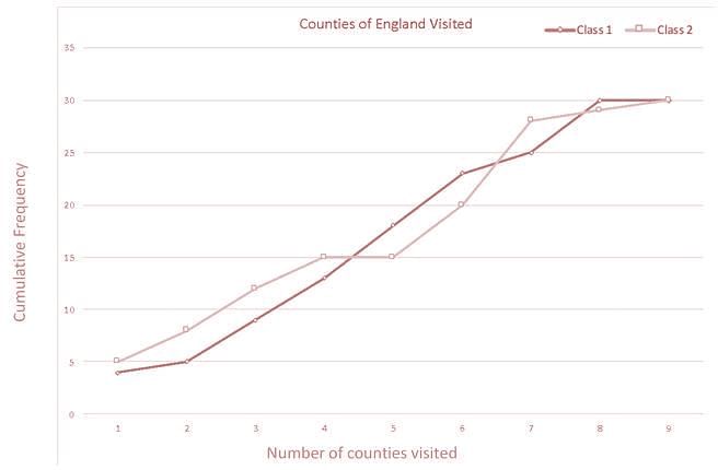

The class size for each was 30.

Q. What was the maximum number of counties visited by a pupil who is part of Class 1?

Detailed Solution for Test: Charts & Graphs - 1 - Question 7

There are 30 in the class so this happens at 8 counties for class 1 – B

Test: Charts & Graphs - 1 - Question 8

Here is the graph about the number of English counties pupils in two classes at a primary school had visited.


The class size for each was 30.

Q. The most common number of counties a Class 2 pupil had visited was:

Detailed Solution for Test: Charts & Graphs - 1 - Question 8

Find the greatest increase.
The increase in cumulative frequency highlights the number who have been to a specific number.
This happens for Class 2 between 6 and 7 so the largest number had been to 7 counties
Timing Tip: This question can be answered by inspection – the largest increase will be shown by the steepest gradient and this is clearly between six and seven.

Test: Charts & Graphs - 1 - Question 9

Here is the graph about the number of English counties pupils in two classes at a primary school had visited.


The class size for each was 30.

Q. What proportion of Class 2 have been to exactly four counties?

Detailed Solution for Test: Charts & Graphs - 1 - Question 9

Remember that a proportion considers one value as a percentage of the total value.
Exactly four counties is the increase from the value for 3 or fewer (12) to the value for 4 or fewer (15).
15 – 12 = 3
There are 30 in the class so:
3/30 = 10%

Test: Charts & Graphs - 1 - Question 10

Here is the graph about the number of English counties pupils in two classes at a primary school had visited.


The class size for each was 30.

Q. In the summer holidays, 50% of Class 1 students who had previously been to one county and 60% of Class 2 students who had previously been to one county visited three more counties each. Those who had previously been to two or more counties did not visit any more. What is the new proportion of the two classes who have been to four or more counties?

Detailed Solution for Test: Charts & Graphs - 1 - Question 10

1. Find the number of students who have been to four or more counties

The easiest way is to find the number who have been to 3 or fewer and take it away from 60 (the size of the classes combined):

Originally this would be: 60 – 12 – 8 = 40.
Now add in the people who have now been to four or more following the summer:
60% of 5 = 3
50% of 4 = 2
40 + 3 + 2 = 45

2. Find this as a proportion of the total

Proportions consider one value in a set as a percentage of the total.

Here the value is the number who have been to four counties or more and the total is all the students in the two classes:

45/60 = 75%

Information about Test: Charts & Graphs - 1 Page
In this test you can find the Exam questions for Test: Charts & Graphs - 1 solved & explained in the simplest way possible. Besides giving Questions and answers for Test: Charts & Graphs - 1, EduRev gives you an ample number of Online tests for practice

Top Courses for UCAT

Download as PDF

Top Courses for UCAT