Class 6 Exam  >  Class 6 Tests  >  Test: Data Handling and Presentation - 1 - Class 6 MCQ

Test: Data Handling and Presentation - 1 - Class 6 MCQ


Test Description

10 Questions MCQ Test - Test: Data Handling and Presentation - 1

Test: Data Handling and Presentation - 1 for Class 6 2025 is part of Class 6 preparation. The Test: Data Handling and Presentation - 1 questions and answers have been prepared according to the Class 6 exam syllabus.The Test: Data Handling and Presentation - 1 MCQs are made for Class 6 2025 Exam. Find important definitions, questions, notes, meanings, examples, exercises, MCQs and online tests for Test: Data Handling and Presentation - 1 below.
Solutions of Test: Data Handling and Presentation - 1 questions in English are available as part of our course for Class 6 & Test: Data Handling and Presentation - 1 solutions in Hindi for Class 6 course. Download more important topics, notes, lectures and mock test series for Class 6 Exam by signing up for free. Attempt Test: Data Handling and Presentation - 1 | 10 questions in 10 minutes | Mock test for Class 6 preparation | Free important questions MCQ to study for Class 6 Exam | Download free PDF with solutions
Test: Data Handling and Presentation - 1 - Question 1

Observe the following bar graph and answer the related question:
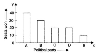

Which political party won the maximum number of seats?

Detailed Solution for Test: Data Handling and Presentation - 1 - Question 1

From the graph:

  • Party A has the highest number of seats (more than 40).
  • Party B has a lower number than Party A.
  • Party C also has fewer seats than Party A.
  • Party D has fewer seats than Party A.
  • Party E has the fewest seats.

∴ The political party that won the maximum number of seats is A.

So, the correct answer is (a) A.

Test: Data Handling and Presentation - 1 - Question 2

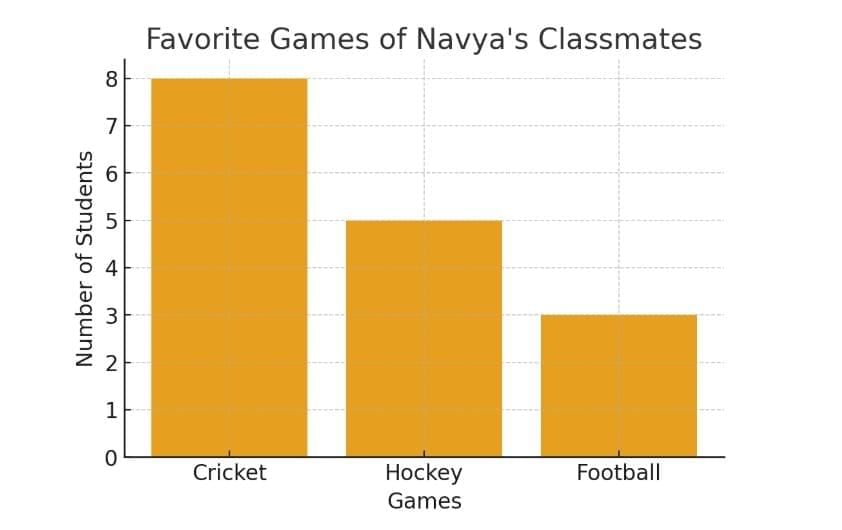
Navya collected data on the favourite games of her classmates and found that 8 students prefer cricket, 5 prefer hockey, and 3 prefer football. What type of chart would best represent this data visually?

Detailed Solution for Test: Data Handling and Presentation - 1 - Question 2

To show the favourite games of Navya's classmates, a bar graph is the best choice. Here’s why:

  • A bar graph uses bars to represent different categories, making it easy to compare the number of students who like each game.
  • Each bar can show the number of students for cricket, hockey, and football clearly.
  • This type of graph is simple to read and understand for everyone.

Other options, like a pictograph or pie chart, may not show the comparison as clearly as a bar graph does.

  • Pictograph – also possible, but it is less precise for larger data.
  • Line Graph – used for trends over time, not suitable here.
  • Pie Chart – also represents proportions well, but with small numbers, a bar graph is simpler and clearer for students.
Test: Data Handling and Presentation - 1 - Question 3

If a pictograph uses one symbol to represent 5 students, how many symbols would represent 25 students?

Detailed Solution for Test: Data Handling and Presentation - 1 - Question 3
  • 1 symbol = 5 students

  • We have 25 students.

  • To find the number of symbols, we divide: 25 ÷ 5 = 5

Answer: 5 symbols are needed to represent 25 students. 

Test: Data Handling and Presentation - 1 - Question 4

A library recorded the number of books borrowed in a week:
Monday - 25 books,
Tuesday - 30 books,
Wednesday - 28 books,
Thursday - 35 books,
Friday - 40 books.
On which day were the least books borrowed? How many more books were borrowed on Friday than on Monday?

Detailed Solution for Test: Data Handling and Presentation - 1 - Question 4

Let’s solve step by step:

Books borrowed:
Monday = 25, Tuesday = 30, Wednesday = 28, Thursday = 35, Friday = 40

  1. Least books borrowed → Monday (25)
  2. Difference between Friday and Monday → 40 – 25 = 15
Test: Data Handling and Presentation - 1 - Question 5

The marks (out of 10) obtained by 28 students in a Mathematics test are listed as given below: 8, 1, 2, 6, 5, 5, 5, 0,1, 9, 7, 8, 0, 5, 8, 3, 0, 8, 10, 3, 4, 8, 7, 8, 9, 2, 0. The number of students who obtained marks more than or equal to 5 is

Detailed Solution for Test: Data Handling and Presentation - 1 - Question 5

To find the number of students who obtained marks more than or equal to 5, we can count the marks that are 5 or higher from the given data:

Marks: 8, 6, 5, 5, 5, 9, 7, 8, 5, 8, 10, 8, 8, 9

Counting these, we find:

  • 8: 6 times
  • 6: 1 time
  • 5: 4 times
  • 9: 2 times
  • 7: 2 times
  • 10: 1 time

In total, there are 16 students who scored 5 or more marks.

Test: Data Handling and Presentation - 1 - Question 6

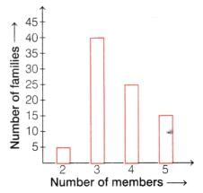
The following bar graph shows the number of members in each family of a colony.
The number of families having 3 members is
Detailed Solution for Test: Data Handling and Presentation - 1 - Question 6

In a bar graph, the height of the bar tells us the number (frequency).

  • The bar for 3 members touches 40 on the y-axis.

  • This means there are 40 families having 3 members.

Test: Data Handling and Presentation - 1 - Question 7

A shopkeeper recorded the number of pencils sold in a week:
Monday - 12,
Tuesday - 15,
Wednesday - 10,
Thursday - 18,
Friday - 20.
On which day were the most pencils sold? How many more pencils were sold on Friday than on Wednesday?

Detailed Solution for Test: Data Handling and Presentation - 1 - Question 7

On which day were the most pencils sold?

The highest number = 20 (Friday)
Most pencils were sold on Friday.

How many more pencils were sold on Friday than on Wednesday?

  • Friday = 20

  • Wednesday = 10

  • Difference = 20 – 10 = 10

10 more pencils were sold on Friday than on Wednesday.

Test: Data Handling and Presentation - 1 - Question 8

If a bar graph shows the number of books borrowed from a library during the week, and Friday has the longest bar, what does this imply?

Detailed Solution for Test: Data Handling and Presentation - 1 - Question 8

In a bar graph, the longest bar represents the largest number (highest frequency). Since Friday has the longest bar, it means the maximum number of books were borrowed on that day.

Test: Data Handling and Presentation - 1 - Question 9

A class conducted a survey on their favourite fruit. The results were: Apples - 8 students, Bananas - 12 students, Mangoes - 15 students, Grapes - 10 students. Which fruit was the most popular? How many more students liked mangoes than apples?

Detailed Solution for Test: Data Handling and Presentation - 1 - Question 9

Data from survey:

  • Apples = 8

  • Bananas = 12

  • Mangoes = 15

  • Grapes = 10

Step 1: Find the most popular fruit

  • Maximum number = 15 (Mangoes)

  • Most popular fruit = Mangoes

Step 2: Find how many more students liked mangoes than apples

  • Mangoes = 15

  • Apples = 8

  • Difference = 15 – 8 = 7

Answer: B: Mangoes, 7 more

Test: Data Handling and Presentation - 1 - Question 10

In a pictograph, each symbol represents 4 apples. If there are 3 symbols next to Tuesday, how many apples were sold on Tuesday?

Detailed Solution for Test: Data Handling and Presentation - 1 - Question 10

The number of apples sold on Tuesday is represented by the 3 symbols. Since each symbol represents 4 apples, we can use the following calculation:

  • Number of symbols = 3
  • Number of apples per symbol = 4
  • Total apples sold = 3 symbols × 4 apples/symbol = 12 apples

Thus, the correct answer is 12 apples.

Information about Test: Data Handling and Presentation - 1 Page
In this test you can find the Exam questions for Test: Data Handling and Presentation - 1 solved & explained in the simplest way possible. Besides giving Questions and answers for Test: Data Handling and Presentation - 1, EduRev gives you an ample number of Online tests for practice
Download as PDF