


All Exams >
Class 5 >
Math Olympiad for Class 5 >
All Questions
All questions of Data Handling for Class 5 Exam

Examine the graph below carefully and answer the following questions. The graph depicts the results of a school’s students.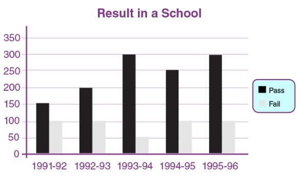 How many times have the same number of kids failed?
- a)2
- b)4
- c)1
- d)3
Correct answer is option 'B'. Can you explain this answer?
Examine the graph below carefully and answer the following questions. The graph depicts the results of a school’s students.
How many times have the same number of kids failed?
a)
2
b)
4
c)
1
d)
3

|
Stoneridge Institute answered |
According to visual observation, the number of failed students in 1991-1992, 1992-1993, 1994-1995, and 1995-1996 is the same. As a result, the answer is four.
How many children are there whose hobby is adventuring?
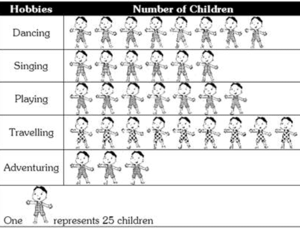
- a)200 children
- b)175 children
- c)100 children
- d)75 children
Correct answer is option 'D'. Can you explain this answer?
How many children are there whose hobby is adventuring?
a)
200 children
b)
175 children
c)
100 children
d)
75 children
|
|
Aditi Sharma answered |
3 × 25 = 75. There are 75 children whose hobby is adventuring.
A graph drawn using pictures is called:- a)Pictograph
- b)Circle graph
- c)Column graph
- d)Line graph
Correct answer is option 'A'. Can you explain this answer?
A graph drawn using pictures is called:
a)
Pictograph
b)
Circle graph
c)
Column graph
d)
Line graph
|
|
Hiral Roy answered |
Answer : a)Pictograph
A graph that conveys its meaning using pictures is called
pictograph.
Find the number of children whose hobby is either travelling or adventuring?
- a)300
- b)200
- c)100
- d)50
Correct answer is option 'A'. Can you explain this answer?
Find the number of children whose hobby is either travelling or adventuring?
a)
300
b)
200
c)
100
d)
50
|
|
Aditi Sharma answered |
Number of children whose hobby is travelling = 9 × 25 = 225 Number of children whose hobby is adventuring = 3×25=75 Total number of children whose hobby is either travelling or adventuring = 225 + 75 = 300.
In the following question, if > represents 30 people, then how many people visit Sri Lanka?
- Maldives: >>
- Sri Lanka: >>>
- Bangladesh: >
- Malaysia: >>>>- a)50
- b)30
- c)120
- d)90
Correct answer is option 'D'. Can you explain this answer?
In the following question, if > represents 30 people, then how many people visit Sri Lanka?
- Maldives: >>
- Sri Lanka: >>>
- Bangladesh: >
- Malaysia: >>>>
- Maldives: >>
- Sri Lanka: >>>
- Bangladesh: >
- Malaysia: >>>>
a)
50
b)
30
c)
120
d)
90
|
|
Ajit rana answered |
Understanding the Symbols
In this question, the symbol ">" represents 30 people. Each additional ">" signifies an increase of 30 people. Let's break down the visitor counts for each country.
Visitor Breakdown
- Maldives:
- Symbol: ">>"
- Count: 2 > means 2 x 30 = 60 people.
- Sri Lanka:
- Symbol: ">>>"
- Count: 3 > means 3 x 30 = 90 people.
- Bangladesh:
- Symbol: ">"
- Count: 1 > means 1 x 30 = 30 people.
- Malaysia:
- Symbol: ">>>"
- Count: 3 > means 3 x 30 = 90 people.
Analyzing Sri Lanka's Visitors
From the breakdown, we see that Sri Lanka has ">>>" which translates to 90 people visiting. The calculation is straightforward:
- 3 (symbols) x 30 (people per symbol) = 90 people.
Conclusion
Thus, the correct answer to the question of how many people visit Sri Lanka is 90, which corresponds to option 'D'. This interpretation ensures clarity in understanding the representation of visitors using the ">" symbol.
_____ is best used to represent data that changes continuously over time.- a)Line Graph
- b)Bar graph
- c)Pictograph
- d)Cryptographs
Correct answer is option 'A'. Can you explain this answer?
_____ is best used to represent data that changes continuously over time.
a)
Line Graph
b)
Bar graph
c)
Pictograph
d)
Cryptographs

|
Dr Manju Sen answered |
A line graph is ideal for displaying data that changes continuously over time. It is effective because:
- It shows trends clearly, making it easy to see increases or decreases.
- Multiple data sets can be compared on the same graph for a comprehensive view.
- The continuous line helps to highlight patterns and fluctuations over periods.
The following table shows the number of books in various categories in a kid’s library. From the table, there are _____ more books in the Fiction category than in the Language category.
- a)80
- b)20
- c)50
- d)40
Correct answer is option 'B'. Can you explain this answer?
The following table shows the number of books in various categories in a kid’s library. From the table, there are _____ more books in the Fiction category than in the Language category.
a)
80
b)
20
c)
50
d)
40

|
Subset Academy answered |
To find how many more books there are in the Fiction category than in the Language category, we can subtract the number of Language books from the number of Fiction books:
120−100=20
There are 20 more books in the Fiction category than in the Language category.
The bar graph given below shows the sales of books (in thousand number) from six branches of a publishing company during two consecutive years 2000 and 2001.
Sales of Books (in thousand numbers) from Six Branches - B1, B2, B3, B4, B5 and B6 of a publishing Company in 2000 and 2001.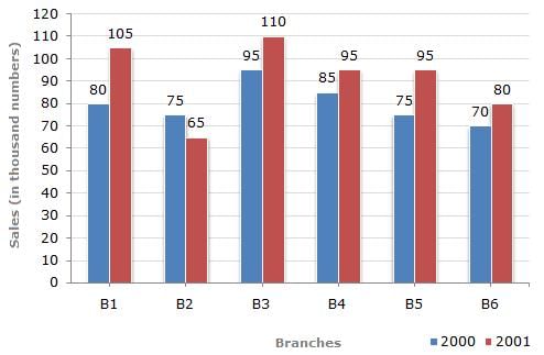 What is the sum of sales of B1 and B5 branches (in thousand numbers) for the year 2000?
- a)125
- b)155
- c)150
- d)140
Correct answer is option 'B'. Can you explain this answer?
The bar graph given below shows the sales of books (in thousand number) from six branches of a publishing company during two consecutive years 2000 and 2001.
Sales of Books (in thousand numbers) from Six Branches - B1, B2, B3, B4, B5 and B6 of a publishing Company in 2000 and 2001.
Sales of Books (in thousand numbers) from Six Branches - B1, B2, B3, B4, B5 and B6 of a publishing Company in 2000 and 2001.
What is the sum of sales of B1 and B5 branches (in thousand numbers) for the year 2000?
a)
125
b)
155
c)
150
d)
140
|
|
Stoneridge Institute answered |
Solution:
- Sales of branch B1 for the year 2000 = 80 Thousand.
- Sales of branch B5 for the year 2000 = 75 Thousand .
- Sum of the sales of B1 and B5 = 80 Thousand + 75 thousand = 155 Thousand
A graph drawn using rectangular bars is known as ________- a)Bar Graph
- b)Line Graph
- c)Pictograph
- d)None of these
Correct answer is option 'A'. Can you explain this answer?
A graph drawn using rectangular bars is known as ________
a)
Bar Graph
b)
Line Graph
c)
Pictograph
d)
None of these
|
|
Pragati Tiwari answered |
Understanding Bar Graphs
A bar graph is a visual representation that uses rectangular bars to display data. The length or height of each bar corresponds to the value it represents, making it easy to compare different categories. Here’s a breakdown of why the correct answer is option 'A':
Characteristics of Bar Graphs
- Rectangular Bars: Bar graphs use bars that can be oriented either vertically or horizontally to represent data.
- Comparison of Values: Each bar's size correlates with the quantity it represents, allowing for straightforward comparisons across different categories.
- Categories on Axes: Typically, one axis (usually the horizontal) lists categories while the other (vertical) shows values, making it intuitive for readers.
Uses of Bar Graphs
- Data Visualization: Bar graphs simplify complex data, making it accessible and easier to understand for various audiences.
- Effective for Large Data Sets: They are particularly useful when comparing multiple groups or categories, such as sales data across different regions or survey results.
- Versatile Applications: Commonly used in business, education, and research to illustrate trends and patterns clearly.
Conclusion
In summary, a graph drawn using rectangular bars is called a Bar Graph. It serves as an effective tool for visualizing data, facilitating easy comparison among different categories, which is why option 'A' is correct. Understanding bar graphs is essential for Class 5 students as it lays the foundation for interpreting data in a visual format.
Chapter doubts & questions for Data Handling - Math Olympiad for Class 5 2025 is part of Class 5 exam preparation. The chapters have been prepared according to the Class 5 exam syllabus. The Chapter doubts & questions, notes, tests & MCQs are made for Class 5 2025 Exam. Find important definitions, questions, notes, meanings, examples, exercises, MCQs and online tests here.
Chapter doubts & questions of Data Handling - Math Olympiad for Class 5 in English & Hindi are available as part of Class 5 exam.
Download more important topics, notes, lectures and mock test series for Class 5 Exam by signing up for free.
Math Olympiad for Class 5
37 videos|109 docs|51 tests
|
|
© EduRev
|
Education Revolution
|


|


Signup to see your scores
go up within 7 days!
Access 1000+ FREE Docs, Videos and Tests
Takes less than 10 seconds to signup