


All Exams >
Class 6 >
Online MCQ Tests for Class 6 >
All Questions
All questions of Data Handling for Class 6 Exam
If  represents 12 men then how many men does
  represent?
 - a)5
- b)50
- c)6
- d)60
Correct answer is option 'D'. Can you explain this answer?
If represents 12 men then how many men does represent?
represents 12 men then how many men does represent? a)
5
b)
50
c)
6
d)
60

|
Vp Classes answered |
If  = 12 men
= 12 menThen,  = 12 x 5 = 60 men
= 12 x 5 = 60 men
The colours of fridges preferred by people living in a locality are shown by the following pictograph. Which colour preferred least?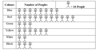
- a)white
- b)black
- c)green
- d)red
Correct answer is option 'A'. Can you explain this answer?
The colours of fridges preferred by people living in a locality are shown by the following pictograph. Which colour preferred least?
a)
white
b)
black
c)
green
d)
red
|
|
Geetika Shah answered |
White is the correct answer.
Because only 20 people preferred the white colour.
Because only 20 people preferred the white colour.
The colours of fridges preferred by people living in a locality are shown by the following pictograph. Find the number of people preferring white colour.
- a)30
- b)20
- c)10
- d)None of these
Correct answer is option 'B'. Can you explain this answer?
The colours of fridges preferred by people living in a locality are shown by the following pictograph. Find the number of people preferring white colour.
a)
30
b)
20
c)
10
d)
None of these
|
|
Priyanka Sharma answered |
In the given pictograph one image represents 10 people.
Therefore, the number of people who prefer white colour are 2 x 10 = 20.
The colours of fridges preferred by people living in a locality are shown by the following pictograph. Which colour preferred most?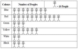
- a)white
- b)red
- c)black
- d)green
Correct answer is option 'B'. Can you explain this answer?
The colours of fridges preferred by people living in a locality are shown by the following pictograph. Which colour preferred most?
a)
white
b)
red
c)
black
d)
green
|
|
Priyanka Sharma answered |
It can be observed that there are larger number of people in the red color representation. Hence, Red colour is preferred most.
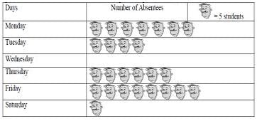
The following pictograph shows the number of absentees in a class of 50 students during the previous week. What was the total number of absentees in that week?
- a)125
- b)110
- c)120
- d)130
Correct answer is option 'D'. Can you explain this answer?
The following pictograph shows the number of absentees in a class of 50 students during the previous week. What was the total number of absentees in that week?
a)
125
b)
110
c)
120
d)
130

|
Praveen Kumar answered |
Each face image counts as 5 people. There are 26 face images in total.
Therefore, 26 x 5 = 130
Therefore, 26 x 5 = 130
Direction: Answer the following set of questions by reading the pictograph given.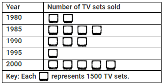 In which year were 4500 TV sets sold?
- a)1985
- b)1995
- c)1990
- d)2000
Correct answer is option 'C'. Can you explain this answer?
Direction: Answer the following set of questions by reading the pictograph given.
In which year were 4500 TV sets sold?
a)
1985
b)
1995
c)
1990
d)
2000
|
|
Anita Menon answered |
In the pictograph, one image equals 1500 TV sets.
In the year 1990, 3 x 1500 = 4500 TV sets were sold.
The colours of fridges preferred by people living in a locality are shown by the following pictograph. Find the number of people preferring green colour.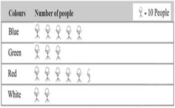
- a)20
- b)30
- c)40
- d)None of these
Correct answer is option 'B'. Can you explain this answer?
The colours of fridges preferred by people living in a locality are shown by the following pictograph. Find the number of people preferring green colour.
a)
20
b)
30
c)
40
d)
None of these
|
|
Ishan Choudhury answered |
In the pictograph, 1 image equals 10 people.
The colour green has 3 such images representing it.
Therefore, the number of people preferring green colour are 3 x 10 = 30
The colours of fridges preferred by people living in a locality are shown by the following pictograph. How many people liked red colour?
- a)100
- b)90
- c)110
- d)None of these
Correct answer is option 'C'. Can you explain this answer?
The colours of fridges preferred by people living in a locality are shown by the following pictograph. How many people liked red colour?
a)
100
b)
90
c)
110
d)
None of these

|
Freak Artworks answered |
As given, 1 image = 10
And 11 images are there for the colour Red.
Therefore, 11 * 10 = 110
And 11 images are there for the colour Red.
Therefore, 11 * 10 = 110
The colours of fridges preferred by people living in a locality are shown by the following pictograph. Find the number of people preferring blue colour.
- a)60
- b)50
- c)80
- d)70
Correct answer is option 'C'. Can you explain this answer?
The colours of fridges preferred by people living in a locality are shown by the following pictograph. Find the number of people preferring blue colour.
a)
60
b)
50
c)
80
d)
70

|
Ashwani Mishra answered |
As we can see, 1 person = 10 people,
so the blue color represents 8 people.
Therefore, 8 people
= 8 * 10 ⇒ 80
so the blue color represents 8 people.
Therefore, 8 people
= 8 * 10 ⇒ 80
Bars of uniform width can be drawn ____________ with equal spacing between them and then the length of each bar represents the given number.- a)horizontally
- b)horizontally or vertically
- c)vertically
- d)None of these
Correct answer is option 'B'. Can you explain this answer?
Bars of uniform width can be drawn ____________ with equal spacing between them and then the length of each bar represents the given number.
a)
horizontally
b)
horizontally or vertically
c)
vertically
d)
None of these
|
|
Ishan Choudhury answered |
Bars of uniform width can be drawn horizontally or vertically with equal spacing between them and then the length of each bar represents the given number.

A symbol is used to represent 100 flowers. How many symbols are to be drawn to show 800 flowers?- a)8
- b)12
- c)10
- d)80
Correct answer is option 'A'. Can you explain this answer?
A symbol is used to represent 100 flowers. How many symbols are to be drawn to show 800 flowers?
a)
8
b)
12
c)
10
d)
80
|
|
Praveen Kumar answered |
One symbol = 100 flowers
800 flowers = 800 / 100 = 8 symbols
The colours of fridges preferred by people living in a locality are shown by the following pictograph. Find the number of people preferring yellow colour.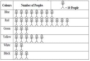
- a)100
- b)60
- c)70
- d)50
Correct answer is option 'B'. Can you explain this answer?
The colours of fridges preferred by people living in a locality are shown by the following pictograph. Find the number of people preferring yellow colour.
a)
100
b)
60
c)
70
d)
50
|
|
Anita Menon answered |
In the given pictograph one image represents 10 people.
Therefore, the number of people who prefer yellow colour are 6 x 10 = 60.
The colours of fridges preferred by people living in a locality are shown by the following pictograph. Which two colours liked by same number of people?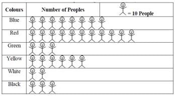
- a)Black and white
- b)Green and black
- c)Red and black
- d)Green and white
Correct answer is option 'B'. Can you explain this answer?
The colours of fridges preferred by people living in a locality are shown by the following pictograph. Which two colours liked by same number of people?
a)
Black and white
b)
Green and black
c)
Red and black
d)
Green and white

|
EduRev Class 6 answered |
In the given pictograph one image represents 10 people.
Green and Black colour has equal number of images i.e. 3. Therefore, these 2 colours are are liked by same number of people.
Direction: Answer the following set of questions by reading the pictograph given.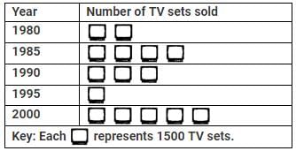 What is the number of TV sets sold in the year 1980?
- a)3000
- b)1500
- c)1250
- d)2000
Correct answer is option 'A'. Can you explain this answer?
Direction: Answer the following set of questions by reading the pictograph given.
What is the number of TV sets sold in the year 1980?
a)
3000
b)
1500
c)
1250
d)
2000
|
|
EduRev Class 6 answered |
In the pictograph, one image equals 1500 TV sets.
Total number of TV sets sold in the year 1980 were 2 x 1500 = 3000
The following pictograph shows the number of absentees in a class of 30 students during the previous week. On which day were the maximum number of students absent?
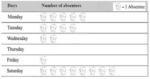
- a)Wednesday
- b)Friday
- c)Saturday
- d)None of these
Correct answer is option 'C'. Can you explain this answer?
The following pictograph shows the number of absentees in a class of 30 students during the previous week. On which day were the maximum number of students absent?
a)
Wednesday
b)
Friday
c)
Saturday
d)
None of these
|
|
Anita Menon answered |
In the pictograph, 1 image equals 1 Absentee.
On Saturday there are 8 such images, which is higher than all the other days in the week.
Therefore, on Saturday the maximum number of students were absent.
If  stands for 300, what doc
  stand for?
- a)60
- b)100
- c)120
- d)260
Correct answer is option 'B'. Can you explain this answer?
If stands for 300, what doc stand for?
stands for 300, what doc stand for? a)
60
b)
100
c)
120
d)
260

|
Shilpa Dasgupta answered |
If stands for 300 then  stands for 50. So, stand for 2 × 50 =100.
stands for 300 then stands for 50. So, stand for 2 × 50 =100.The following pictograph shows the number of absentees in a class of 30 students during the previous week. What was the total number of absentees in that week?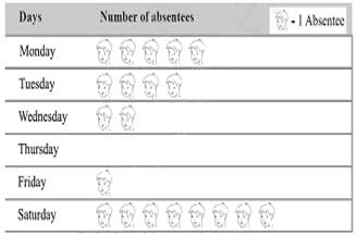
- a)16
- b)20
- c)15
- d)None of these
Correct answer is option 'B'. Can you explain this answer?
The following pictograph shows the number of absentees in a class of 30 students during the previous week. What was the total number of absentees in that week?
a)
16
b)
20
c)
15
d)
None of these
|
|
Avantika Raj answered |
1 head = 1 abesentee
No. of abesntees on Monday = 5
On tuesday = 4
On wednesday = 2
On thursday = 0
On friday = 1
On saturday = 8
5+4+2+0+1+8 = 20
The following pictograph shows the number of absentees in a class of 40 students during the previous week. On which day 30 students were absent?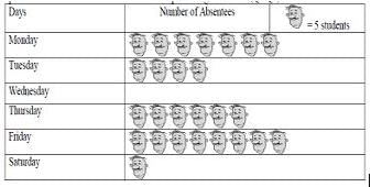
- a)Wednesday
- b)Saturday
- c)Thursday
- d)Tuesday
Correct answer is option 'C'. Can you explain this answer?
The following pictograph shows the number of absentees in a class of 40 students during the previous week. On which day 30 students were absent?
a)
Wednesday
b)
Saturday
c)
Thursday
d)
Tuesday
|
|
Dhruti Thube answered |
ONE PICTURE MEANS 5 STUDENTS 5 × 6 = 30 AND ON THURSDAY IT SHOWS 6 FACES SO THE CORRRECT ANSWER IS C
The width or size of the class interval 30-40 is:- a)10
- b)30
- c)40
- d)70
Correct answer is option 'A'. Can you explain this answer?
The width or size of the class interval 30-40 is:
a)
10
b)
30
c)
40
d)
70
|
|
Pranjal Gupta answered |
Explanation:
Class interval is the range of data values that are included in a class. In this case, the class interval is 30-40.
Formula: Width of class interval = Upper limit - Lower limit
Therefore, width of class interval = 40 - 30 = 10
Hence, the correct answer is option 'A' which states that the width of the class interval 30-40 is 10.
What is a graph drawn using vertical bars called?- a)A bar graph
- b)A line graph
- c)A pictograph
- d)A pie graph
Correct answer is option 'A'. Can you explain this answer?
What is a graph drawn using vertical bars called?
a)
A bar graph
b)
A line graph
c)
A pictograph
d)
A pie graph
|
|
Freak Artworks answered |
A graph drawn using vertical bars is called a bar graph.
The bar graphs can be either vertical or horizontal.
The following pictograph shows the number of absentees in a class of 30 students during the previous week. Which day had full attendance?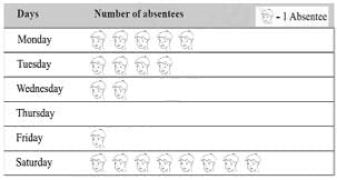
- a)Saturday
- b)Tuesday
- c)Thursday
- d)None of these
Correct answer is option 'C'. Can you explain this answer?
The following pictograph shows the number of absentees in a class of 30 students during the previous week. Which day had full attendance?
a)
Saturday
b)
Tuesday
c)
Thursday
d)
None of these
|
|
Priyanka Sharma answered |
In the pictograph, 1 image equals 1 Absentee.
On Thursday there are no such images.
Therefore, Thursday has full attendance.
The colours of fridges preferred by people living in a locality are shown by the following pictograph. How many people liked red colour?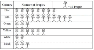
- a)90
- b)110
- c)100
- d)None of these
Correct answer is option 'B'. Can you explain this answer?
The colours of fridges preferred by people living in a locality are shown by the following pictograph. How many people liked red colour?
a)
90
b)
110
c)
100
d)
None of these
|
|
Freak Artworks answered |
In the pictograph, 1 image equals 10 people.
The colour red has 11 such images representing it.
Therefore, the number of people preferring green colour are 11 x 10 = 110
The colours of fridges preferred by people living in a locality are shown by the following pictograph. Find the number of people preferring blue colour.
- a)40
- b)30
- c)50
- d)None of these
Correct answer is option 'C'. Can you explain this answer?
The colours of fridges preferred by people living in a locality are shown by the following pictograph. Find the number of people preferring blue colour.
a)
40
b)
30
c)
50
d)
None of these
|
|
Priyanka Sharma answered |
In the pictograph, 1 image equals 10 people.
The colour blue has 3 such images representing it.
Therefore, the number of people preferring blue colour are 5 x 10 = 50
A _____ is a collection of numbers gathered to give some information.- a)frequency
- b)data
- c)tally mark
- d)None of these
Correct answer is option 'B'. Can you explain this answer?
A _____ is a collection of numbers gathered to give some information.
a)
frequency
b)
data
c)
tally mark
d)
None of these
|
|
Anita Menon answered |
A data is a collection of numbers gathered to give some information.
The choices of the sweets of 10 students in a batch are as follows:
Jalebi, Kaju Katli, Kalakand, Kaju Katli, Kheer, Barfi,
Rasgulla, Kaju Katli, Kheer, Kaju Katli
Q. The sweet preferred by the most of the students is- a)Jalebi
- b)Rasgulla
- c)Kaju Katli
- d)Kheer
Correct answer is option 'C'. Can you explain this answer?
The choices of the sweets of 10 students in a batch are as follows:
Jalebi, Kaju Katli, Kalakand, Kaju Katli, Kheer, Barfi,
Rasgulla, Kaju Katli, Kheer, Kaju Katli
Q. The sweet preferred by the most of the students is
Jalebi, Kaju Katli, Kalakand, Kaju Katli, Kheer, Barfi,
Rasgulla, Kaju Katli, Kheer, Kaju Katli
Q. The sweet preferred by the most of the students is
a)
Jalebi
b)
Rasgulla
c)
Kaju Katli
d)
Kheer
|
|
Tanishq Khanna answered |
Understanding the Choices of Sweets
In this scenario, we have the sweet preferences of 10 students. Let's examine the choices closely to determine which sweet was preferred the most.
List of Sweets Chosen
- Jalebi
- Kaju Katli
- Kalakand
- Kaju Katli
- Kheer
- Barfi
- Rasgulla
- Kaju Katli
- Kheer
- Kaju Katli
Counting the Preferences
Now, let’s tally the number of times each sweet was chosen:
- Jalebi: 1 time
- Kaju Katli: 4 times
- Kalakand: 1 time
- Kheer: 2 times
- Barfi: 1 time
- Rasgulla: 1 time
Identifying the Most Popular Sweet
From the counts, we can see:
- Kaju Katli was chosen 4 times, which is the most compared to the others.
- Kheer was chosen 2 times.
- All other sweets were chosen only once.
Conclusion
The sweet preferred by the most students is clearly Kaju Katli, with a total of 4 votes. Therefore, the correct answer is option C: Kaju Katli. This indicates a strong preference for Kaju Katli among the students in this batch.
Direction: Answer the following set of questions by reading the pictograph given.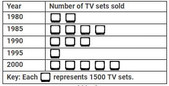 How many TV sets are sold in the year 1995?
- a)1000
- b)1500
- c)5000
- d)2000
Correct answer is option 'B'. Can you explain this answer?
Direction: Answer the following set of questions by reading the pictograph given.
How many TV sets are sold in the year 1995?
a)
1000
b)
1500
c)
5000
d)
2000

|
Eduskill Classes answered |
In the pictograph, one image equals 1500 TV sets.
Total number of TV sets sold in the year 1995 were 1 x 1500 = 1500
The following pictograph shows the number of absentees in a class of 30 students during the previous week. Which day had full attendance?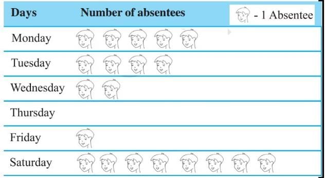
- a)Friday
- b)Monday
- c)Thursday
- d)Saturday
Correct answer is option 'C'. Can you explain this answer?
The following pictograph shows the number of absentees in a class of 30 students during the previous week. Which day had full attendance?
a)
Friday
b)
Monday
c)
Thursday
d)
Saturday

|
Rohini Seth answered |
Since the day Thursday has no absentee, therefore in that day all were present and had full attendance.
What is the number of houses represented by the figure  if each symbol represents 15 houses?
- a)60
- b)20
- c)15
- d)40
Correct answer is option 'A'. Can you explain this answer?
What is the number of houses represented by the figure if each symbol represents 15 houses?
if each symbol represents 15 houses?a)
60
b)
20
c)
15
d)
40
|
|
Akash Tiwari answered |
Each symbole represents 15 houses.
Therefore = 4 x 15 = 60
= 4 x 15 = 60 The following pictograph shows the number of absentees in a class of 40 students during the previous week. On which day were the maximum number of students absent?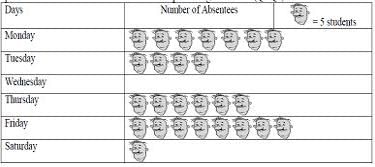
- a)Thursday
- b)Friday
- c)Saturday
- d)Wednesday
Correct answer is option 'B'. Can you explain this answer?
The following pictograph shows the number of absentees in a class of 40 students during the previous week. On which day were the maximum number of students absent?
a)
Thursday
b)
Friday
c)
Saturday
d)
Wednesday

|
Get Idea answered |
Friday is the correct answer.
As it has the most number of face images i.e. 8
As it has the most number of face images i.e. 8
A ________ represents data through pictures of objects.- a)histogram
- b)pictograph
- c)bar graph
- d)None of these
Correct answer is option 'B'. Can you explain this answer?
A ________ represents data through pictures of objects.
a)
histogram
b)
pictograph
c)
bar graph
d)
None of these
|
|
Ishan Choudhury answered |
Pictograph is a graph that shows numerical information by using picture symbols or icon s to represent data sets. The advantage of using a pictograph is that it is easy to read.
The pictograph given shows the number of letters were collected from a post box on each day of a certain week. Key: Each
  letters How many more letters were collected on Friday than on Wednesday?
- a)20
- b)30
- c)40
- d)50
Correct answer is option 'C'. Can you explain this answer?
The pictograph given shows the number of letters were collected from a post box on each day of a certain week.
Key: Each letters How many more letters were collected on Friday than on Wednesday?
letters How many more letters were collected on Friday than on Wednesday?a)
20
b)
30
c)
40
d)
50

|
Subham Nair answered |
No. of letters collected on Friday = 8×10 = 80 letters
No. of letters collected on Wednesday = 4 × 10 = 40 letters
Difference = (80−40) = 40 letters
No. of letters collected on Wednesday = 4 × 10 = 40 letters
Difference = (80−40) = 40 letters
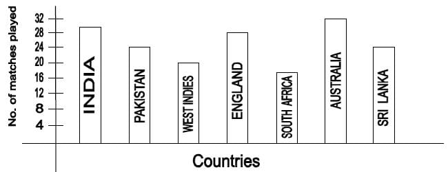
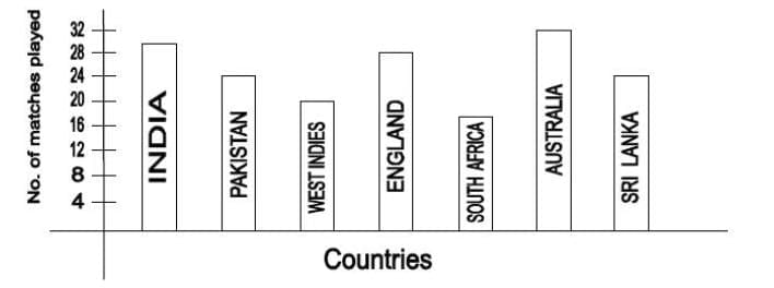
Direction: Observe the adjoining bar graph, showing the number of one-day international matches played by cricket teams of different countries.
Q. Which country played maximum number of matches?- a)Australia
- b)Pakistan
- c)England
- d)India
Correct answer is option 'A'. Can you explain this answer?
Direction: Observe the adjoining bar graph, showing the number of one-day international matches played by cricket teams of different countries.
Q. Which country played maximum number of matches?
Q. Which country played maximum number of matches?
a)
Australia
b)
Pakistan
c)
England
d)
India

|
Coachify answered |
To determine which country played the maximum number of one-day international matches, we analyze the given bar graph carefully. The graph shows the number of matches played by each country's cricket team:
- India: 30 matches
- Pakistan: 24 matches
- West Indies: 18 matches
- England: 30 matches
- South Africa: 12 matches
- Australia: 32 matches
- Sri Lanka: 24 matches
From the data, it is evident that Australia has played the highest number of matches, which is 32.
Answer: Australia
The following pictograph shows the number of absentees in a class of 40 students during the previous week. What was the total number of absentees on Tuesday?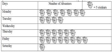
- a)30
- b)20
- c)10
- d)None of these
Correct answer is option 'B'. Can you explain this answer?
The following pictograph shows the number of absentees in a class of 40 students during the previous week. What was the total number of absentees on Tuesday?
a)
30
b)
20
c)
10
d)
None of these
|
|
Get Idea answered |
One image means 5 students and there are 4 images like these on Tuesday.
Therefore, 5 x 4 = 20
Observe this bar graph which is showing the sale of shirts in a ready-made shop from Monday to Saturday. On which day were the minimum number of shirts sold?
- a)Wednesday
- b)Friday
- c)Tuesday
- d)Monday
Correct answer is option 'C'. Can you explain this answer?
Observe this bar graph which is showing the sale of shirts in a ready-made shop from Monday to Saturday. On which day were the minimum number of shirts sold?
a)
Wednesday
b)
Friday
c)
Tuesday
d)
Monday

|
Impact Learning answered |
The minimum number of shirts, that is, 10 shirts were sold on Tuesday.
If  stands for 30, how much does
  stand for?
 - a)6
- b)10
- c)12
- d)26
Correct answer is option 'B'. Can you explain this answer?
If stands for 30, how much does stand for?
stands for 30, how much does stand for? a)
6
b)
10
c)
12
d)
26

|
Shilpa Kulkarni answered |
Each  stands for 30/6 = 5 So, stands for 10.
stands for 30/6 = 5 So, stands for 10.If  represents 5 balloons, number of symbols to be drawn to represent 60 balloons is
- a)5
- b)60
- c)10
- d)12
Correct answer is option 'D'. Can you explain this answer?
If represents 5 balloons, number of symbols to be drawn to represent 60 balloons is
represents 5 balloons, number of symbols to be drawn to represent 60 balloons isa)
5
b)
60
c)
10
d)
12

|
Coders Trust answered |
= 5 balloonsTotal balloons = 60.
Number of symbols needed = 60 ÷ 5 = 12.
Direction: Observe the adjoining bar graph, showing the number of one-day international matches played by cricket teams of different countries.
Q. How many more matches were played by India than Pakistan? IF India Played 30 and Pkaistan played 24- a)6
- b)12
- c)24
- d)30
Correct answer is option 'A'. Can you explain this answer?
Direction: Observe the adjoining bar graph, showing the number of one-day international matches played by cricket teams of different countries.
Q. How many more matches were played by India than Pakistan? IF India Played 30 and Pkaistan played 24
Q. How many more matches were played by India than Pakistan? IF India Played 30 and Pkaistan played 24
a)
6
b)
12
c)
24
d)
30
|
|
Get Idea answered |
The number of more matches played by India than Pakistan = Number of matches played by India - Number of matches played by Pakistan
⇒ The number of more matches played by India than Pakistan = 30 - 24
⇒ The number of more matches played by India than Pakistan = 6 matches
Hence, India played 6 matches more than Pakistan.
Hence, the correct option is A.
⇒ The number of more matches played by India than Pakistan = 30 - 24
⇒ The number of more matches played by India than Pakistan = 6 matches
Hence, India played 6 matches more than Pakistan.
Hence, the correct option is A.
Direction: Observe the adjoining bar graph, showing the number of one-day international matches played by cricket teams of different countries.
Q. How many matches did South Africa play?- a)14
- b)18
- c)20
- d)24
Correct answer is option 'B'. Can you explain this answer?
Direction: Observe the adjoining bar graph, showing the number of one-day international matches played by cricket teams of different countries.
Q. How many matches did South Africa play?
Q. How many matches did South Africa play?
a)
14
b)
18
c)
20
d)
24
|
|
Coders Trust answered |
The bar graph above shows that South Africa played 18 matches, as it is in the middle of 16 and 20
Observe this bar graph, which is showing the sale of shirts in a ready-made shop from Monday to Saturday. How many shirts were sold on Monday?- a)15
- b)10
- c)20
- d)None of these
Correct answer is option 'A'. Can you explain this answer?
Observe this bar graph, which is showing the sale of shirts in a ready-made shop from Monday to Saturday. How many shirts were sold on Monday?
a)
15
b)
10
c)
20
d)
None of these
|
|
Impact Learning answered |
It can be observed from the graph that 3 units, or 15 shirts, were sold on Monday.
The ________ of each vertical bar gives the required information.- a)breadth
- b)height
- c)length
- d)None of these
Correct answer is option 'C'. Can you explain this answer?
The ________ of each vertical bar gives the required information.
a)
breadth
b)
height
c)
length
d)
None of these

|
EduRev CAT answered |
In a horizontal bar graph, the length of each bar represents the value or magnitude being measured.
Therefore, the correct answer is:
- Length
Observe this bar graph, which is showing the sale of shirts in a ready-made shop from Monday to Saturday. How many shirts were sold on Wednesday? - a)20
- b)25
- c)30
- d)15
Correct answer is option 'A'. Can you explain this answer?
Observe this bar graph, which is showing the sale of shirts in a ready-made shop from Monday to Saturday. How many shirts were sold on Wednesday?
a)
20
b)
25
c)
30
d)
15
|
|
Impact Learning answered |
It can be observed from the bar graph that on Wednesday, 20 shirts were sold.
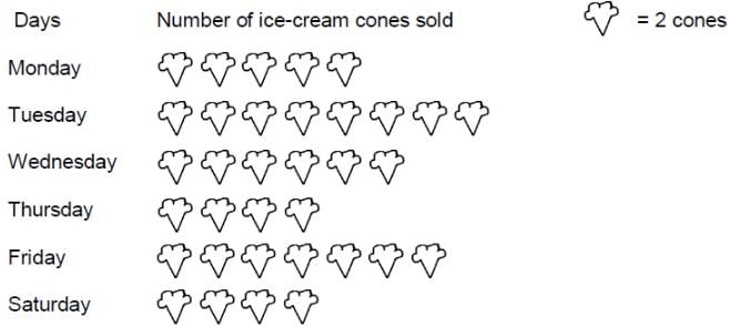
Direction: If the cost of one ice cream cone is Rs.20, then the sale value on Thursday was
- a)Rs.160
- b)Rs.100
- c)Rs.140
- d)Rs.1340
Correct answer is option 'A'. Can you explain this answer?
Direction: If the cost of one ice cream cone is Rs.20, then the sale value on Thursday was
a)
Rs.160
b)
Rs.100
c)
Rs.140
d)
Rs.1340

|
Siddharth Chavan answered |
4 ice-cream shown ( 1 ice-cream image = 2 )
4x2x20 = 160
4x2x20 = 160
If one  symbol represents 10 children, how many children are represented by
  ?
? - a)5
- b)25
- c)15
- d)20
Correct answer is option 'A'. Can you explain this answer?
If one symbol represents 10 children, how many children are represented by ?
a)
5
b)
25
c)
15
d)
20
|
|
Coders Trust answered |
- In a pictograph, we use a “key” to tell what one picture stands for.
- Here, 1 fullsymbol = 10 children.
- The symbol shown is a half symbol (only half of the face is drawn).
- So it represents half of 10 children:
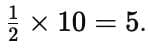
Therefore, the half symbol stands for 5 children.
Which of the following is the probability of an impossible event?- a)0
- b)1
- c)2
- d)None of these
Correct answer is option 'A'. Can you explain this answer?
Which of the following is the probability of an impossible event?
a)
0
b)
1
c)
2
d)
None of these
|
|
EduRev CAT answered |
The probability of an impossible event is 0, as there is no chance of that event ever happening.
Observe this bar graph which is showing the sale of shirts in a ready-made shop from Monday to Saturday. On which day were the maximum number of shirts sold?- a)Saturday
- b)Friday
- c)Monday
- d)Thursday
Correct answer is option 'A'. Can you explain this answer?
Observe this bar graph which is showing the sale of shirts in a ready-made shop from Monday to Saturday. On which day were the maximum number of shirts sold?
a)
Saturday
b)
Friday
c)
Monday
d)
Thursday
|
|
EduRev CAT answered |
The maximum number of shirts were sold on Saturday i.e 60 shirts.
The line plot below shows how students scored on last week's maths test. 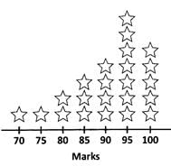 Key: Each
  = 1 student
Q. How many students scored 95 or higher on the test? - a)5
- b)7
- c)12
- d)16
Correct answer is option 'C'. Can you explain this answer?
The line plot below shows how students scored on last week's maths test.
Key: Each = 1 student
Q. How many students scored 95 or higher on the test?
= 1 studentQ. How many students scored 95 or higher on the test?
a)
5
b)
7
c)
12
d)
16
|
|
EduRev Class 6 answered |
It is given that 1 star represents 1 student.
Number of students getting 95 marks = 7
Number of students getting 100 marks = 5
Therefore, the number of students getting 95 or above marks = 5 + 7 = 12 students
Number of students getting 95 marks = 7
Number of students getting 100 marks = 5
Therefore, the number of students getting 95 or above marks = 5 + 7 = 12 students
Chapter doubts & questions for Data Handling - Online MCQ Tests for Class 6 2025 is part of Class 6 exam preparation. The chapters have been prepared according to the Class 6 exam syllabus. The Chapter doubts & questions, notes, tests & MCQs are made for Class 6 2025 Exam. Find important definitions, questions, notes, meanings, examples, exercises, MCQs and online tests here.
Chapter doubts & questions of Data Handling - Online MCQ Tests for Class 6 in English & Hindi are available as part of Class 6 exam.
Download more important topics, notes, lectures and mock test series for Class 6 Exam by signing up for free.
|
© EduRev
|
Education Revolution
|


|


Signup to see your scores
go up within 7 days!
Access 1000+ FREE Docs, Videos and Tests
Takes less than 10 seconds to signup