


All Exams >
JAMB >
Economics for JAMB >
All Questions
All questions of Methods and Tools of Economic Analysis for JAMB Exam
Value that divides the series into hundred equal parts is called- a)percentile.
- b)quartiles.
- c)deciles.
- d)octiles.
Correct answer is option 'A'. Can you explain this answer?
Value that divides the series into hundred equal parts is called
a)
percentile.
b)
quartiles.
c)
deciles.
d)
octiles.
|
|
Kiran Mehta answered |
Values that divide the series into hundred equal parts are called percentiles. In percentile, we get 99 dividing positions denoted by P1, P2,……..,P99.

Measure of dispersion considering only extreme values is called- a)standard deviation.
- b)mean deviation.
- c)range.
- d)quartile deviation.
Correct answer is option 'C'. Can you explain this answer?
Measure of dispersion considering only extreme values is called
a)
standard deviation.
b)
mean deviation.
c)
range.
d)
quartile deviation.
|
|
Aryan Khanna answered |
Range is the difference between the largest value and the smallest value of a series.
Range = L- S
Here, L= Largest value, S= Smallest value.
No other values of the series are taken into consideration in this case.
Range = L- S
Here, L= Largest value, S= Smallest value.
No other values of the series are taken into consideration in this case.
Which of the following is not a measure of central tendency?- a)Mean
- b)Median
- c)Standard deviation
- d)Mode
Correct answer is option 'C'. Can you explain this answer?
Which of the following is not a measure of central tendency?
a)
Mean
b)
Median
c)
Standard deviation
d)
Mode
|
|
Om Desai answered |
► Standard deviation is the measure of how spread out the numbers of a data are.
► Mean is the average.
► Median is the middle number, when data is arranged in numerical order.
► Mode is the data item the appears most frequently.
Mean, median and mode are all measures of central tendencies.
Data can be represented in
- a)one way.
- b)two ways.
- c)four ways.
- d)three ways.
Correct answer is option 'D'. Can you explain this answer?
Data can be represented in
a)
one way.
b)
two ways.
c)
four ways.
d)
three ways.
|
|
Vikas Kapoor answered |
There are three methods of presentation of data.
(1) Tabular Presentation
(2)Textual or Descriptive presentation
(3) Diagrammatic Presentation
(1) Tabular Presentation
(2)Textual or Descriptive presentation
(3) Diagrammatic Presentation
Arithmetic mean is of- a)two types.
- b)three types.
- c)four types.
- d)five types.
Correct answer is option 'A'. Can you explain this answer?
Arithmetic mean is of
a)
two types.
b)
three types.
c)
four types.
d)
five types.
|
|
Tejas Verma answered |
Arithmetic mean is of two types:
- Simple arithmetic mean
- Weighted mean.
On the basis of presence and absence of an attribute, data are classified into- a)one fold classification.
- b)two fold classification.
- c)three fold classification.
- d)four fold classification.
Correct answer is option 'B'. Can you explain this answer?
On the basis of presence and absence of an attribute, data are classified into
a)
one fold classification.
b)
two fold classification.
c)
three fold classification.
d)
four fold classification.

|
Sunil Chahar answered |
When on the basis presence and absence of an attribute, the data are classified into two classes, one possessing that attribute and the other not possessing that attribute, it is called two-fold classification.
The relative measures of dispersion are expressed in- a)numbers.
- b)same units.
- c)percentage.
- d)quartiles.
Correct answer is option 'C'. Can you explain this answer?
The relative measures of dispersion are expressed in
a)
numbers.
b)
same units.
c)
percentage.
d)
quartiles.
|
|
Ræjû Bhæï answered |
Relative measures of dispersion are calculated as ratios or percentages; for example, one relative measure of dispersion is the ratio of the standard deviation to the mean. Relative measures of dispersion are always dimensionless, and they are particularly useful for making comparisons between separate data sets or different experiments that might use different units. They are sometimes called coefficients of dispersion.
Identify the correct pair of items from the following Columns I and II: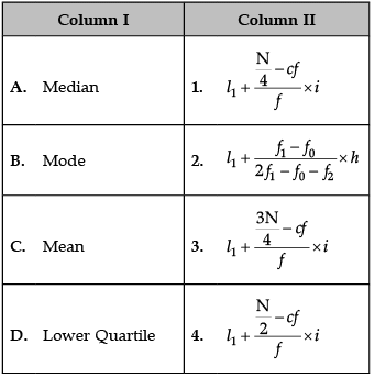
- a)A–1
- b)B–2
- c)C–3
- d)D–4
Correct answer is option 'B'. Can you explain this answer?
Identify the correct pair of items from the following Columns I and II:
a)
A–1
b)
B–2
c)
C–3
d)
D–4
|
|
Amita Das answered |
Correct formulas are:
A. Median: 
B. Mode: 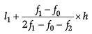
C. Mean: 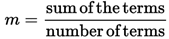
D. Lower Quartile: (N + 1) * 1 / 4
The mathematical average is also called- a)median.
- b)mode.
- c)mean.
- d)quartile.
Correct answer is option 'C'. Can you explain this answer?
The mathematical average is also called
a)
median.
b)
mode.
c)
mean.
d)
quartile.
|
|
Tejas Verma answered |
► Mean is a mathematical average.
The arithmetic mean or mean is defined as the sum of values of a group of items divided by the number of items. It is denoted by mean.
The following is a graphic method of measuring dispersion- a)Bar diagram
- b)Ogives
- c)Lorenz Curve
- d)Frequency polygon
Correct answer is option 'C'. Can you explain this answer?
The following is a graphic method of measuring dispersion
a)
Bar diagram
b)
Ogives
c)
Lorenz Curve
d)
Frequency polygon
|
|
Vikas Kapoor answered |
The departure of the Lorenz curve from the line of equal distribution would indicate the extent of dispersion.
The best measure of dispersion is- a)Quartile deviation.
- b)Standard deviation.
- c)Mean deviation.
- d)Range.
Correct answer is option 'B'. Can you explain this answer?
The best measure of dispersion is
a)
Quartile deviation.
b)
Standard deviation.
c)
Mean deviation.
d)
Range.
|
|
Aryan Khanna answered |
Standard deviation is the best and widely used measure of dispersion. The properties of standard deviation are:
(i) Standard deviation is rigidly defined.
(ii) It requires harder calculations.
(iii) It depends on all the values of the variable.
(iv) It is based on deviations from the arithmetic mean.
(v) It is capable of further statistical treatment.
(i) Standard deviation is rigidly defined.
(ii) It requires harder calculations.
(iii) It depends on all the values of the variable.
(iv) It is based on deviations from the arithmetic mean.
(v) It is capable of further statistical treatment.
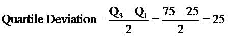
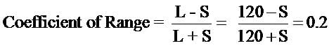
Coefficient of Quartile deviation, with Q1 at 25 and Q3 at 125, equals- a)1.25
- b)0.75
- c)0.66
- d)0.55
Correct answer is option 'C'. Can you explain this answer?
Coefficient of Quartile deviation, with Q1 at 25 and Q3 at 125, equals
a)
1.25
b)
0.75
c)
0.66
d)
0.55
|
|
Naina Sharma answered |
The coefficient of quartile deviation (sometimes called the quartile coefficient of dispersion) allows you to compare dispersion for two or more sets of data. The formula is:
Q3-Q1
Q3+Q1
100/150= 0.66
Q3-Q1
Q3+Q1
100/150= 0.66
Statistical data can be presented in- a)one form.
- b)two forms.
- c)three forms.
- d)four forms.
Correct answer is option 'C'. Can you explain this answer?
Statistical data can be presented in
a)
one form.
b)
two forms.
c)
three forms.
d)
four forms.

|
Aditya Kumar The Best answered |
Statistical data can be presented in three forms namely, tabular presentation, diagrammatic presentation and graphic presentation.

Expands CSO.- a)Central Statistics Office
- b)Central Statistical organisation
- c)Central Statistics organisation
- d)Central Statistical office
Correct answer is option 'A'. Can you explain this answer?
Expands CSO.
a)
Central Statistics Office
b)
Central Statistical organisation
c)
Central Statistics organisation
d)
Central Statistical office
|
|
Gaurav Kumar answered |
The CSO, Central statistics Office is responsible for conducting statistical activities in the economy.
The process of presenting classified data in a suitable form is called- a)calculation of data.
- b)presentation of data.
- c)classification of data.
- d)collection of data.
Correct answer is option 'B'. Can you explain this answer?
The process of presenting classified data in a suitable form is called
a)
calculation of data.
b)
presentation of data.
c)
classification of data.
d)
collection of data.

|
Raman Singh answered |
The objective of presentation of data is to present classified data visually, thus highlighting basic facts and relationships.
The following are the precautions that are to be followed while using secondary data- a)reliability
- b)adequacy
- c)suitability of data
- d)hastily
Correct answer is option 'D'. Can you explain this answer?
The following are the precautions that are to be followed while using secondary data
a)
reliability
b)
adequacy
c)
suitability of data
d)
hastily

|
Rishabh Das answered |
Before using the secondary data the investigator should take the precaution of the reliability, adequacy and suitability of thedata.
Temporal classification is done on the basis of- a)place.
- b)time.
- c)quality.
- d)quantity.
Correct answer is option 'B'. Can you explain this answer?
Temporal classification is done on the basis of
a)
place.
b)
time.
c)
quality.
d)
quantity.

|
Chan singh answered |
When classification is done on the basis of time, the classification is known as temporal classification. Time may be in hours, days, weeks, months, years etc.
Simple bar diagram is effective in representing- a)one variable.
- b)two variables.
- c)three variables.
- d)four variables.
Correct answer is option 'A'. Can you explain this answer?
Simple bar diagram is effective in representing
a)
one variable.
b)
two variables.
c)
three variables.
d)
four variables.

|
Rhea Choudhary answered |
Representation of Data Using Bar Diagrams
Bar diagrams are graphical representations of data using rectangular bars. The bars are drawn horizontally or vertically with equal widths, and the lengths of the bars are proportional to the values they represent. The different types of bar diagrams are simple bar diagrams, multiple bar diagrams, and component bar diagrams.
Simple Bar Diagrams
Simple bar diagrams represent a single variable. They are used to compare the values of a single variable. For instance, if you want to compare the sales of a product across different months, you can use a simple bar diagram. The different months will be represented on the horizontal axis, and the sales figures will be represented on the vertical axis. The bars will have equal widths, and their lengths will be proportional to the sales figures.
Features of Simple Bar Diagrams
• Simple bar diagrams represent a single variable.
• They are used to compare the values of a single variable.
• They have equal-width bars.
• The lengths of the bars are proportional to the values they represent.
• They can be drawn horizontally or vertically.
Conclusion
Simple bar diagrams are effective in representing a single variable. They are easy to understand and can be used to compare different values of a variable. They have equal-width bars, and the lengths of the bars are proportional to the values they represent. Simple bar diagrams can be drawn horizontally or vertically, depending on the nature of the data.
Identify the correct pair of terms with their formulae from the following Columns I and II: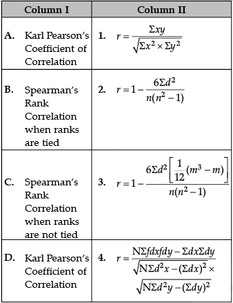
- a)A–1
- b)B–2
- c)C–3
- d)D–4
Correct answer is option 'A'. Can you explain this answer?
Identify the correct pair of terms with their formulae from the following Columns I and II:
a)
A–1
b)
B–2
c)
C–3
d)
D–4

|
Knowledge Hub answered |
Correct formulas are
A. Karl Pearson’s Coefficient of Correlation: 
B. Spearman’s Rank Correlation when ranks are tied: 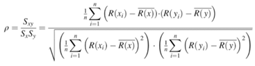
C. Spearman’s Rank Correlation when ranks are not tied: 
D. Karl Pearson’s Coefficient of Correlation: 
The positive square root of the mean of squared deviations from mean is called- a)central tendancy.
- b)quartile deviation.
- c)mean deviation.
- d)standard deviation.
Correct answer is option 'D'. Can you explain this answer?
The positive square root of the mean of squared deviations from mean is called
a)
central tendancy.
b)
quartile deviation.
c)
mean deviation.
d)
standard deviation.
|
|
Raman Singh answered |
Standard deviation is calculated through mean only. Positive square root of the variance is the standard deviation.
Decision to collect primary and secondary data depends upon- a)objective of the project.
- b)organisation of data.
- c)source of the project.
- d)analysis of the project.
Correct answer is option 'A'. Can you explain this answer?
Decision to collect primary and secondary data depends upon
a)
objective of the project.
b)
organisation of data.
c)
source of the project.
d)
analysis of the project.
|
|
Gaurav Kumar answered |
The decision to collect primary or secondary data depends upon the objective of the project. Objective of the data also determines the size of data.
Lower limit of first group and upper limit of last group are undefined in
- a)open-end classes.
- b)close-end classes.
- c)inclusive classes.
- d)exclusive classes.
Correct answer is option 'A'. Can you explain this answer?
Lower limit of first group and upper limit of last group are undefined in
a)
open-end classes.
b)
close-end classes.
c)
inclusive classes.
d)
exclusive classes.

|
Kaavya Mukherjee answered |
In case of classes like, below 10, 10-20, 20-30, 30-40, 40-50, above 50, computation of arithmetic mean would be impossible unless we assume the unknown limits.
Length is used to represent the data in a- a)pie chart
- b)line graph
- c)bar diagram.
- d)histogram
Correct answer is option 'C'. Can you explain this answer?
Length is used to represent the data in a
a)
pie chart
b)
line graph
c)
bar diagram.
d)
histogram

|
Pranavi Das answered |
Width and number of the bar are immaterial in case of bar diagrams. Bar diagram shows statistical data in terms of length of the bar.
The graphical method of studying dispersion is known as- a)standard deviation.
- b)mean deviation.
- c)Lorenz curve method.
- d)kinked curve method.
Correct answer is option 'C'. Can you explain this answer?
The graphical method of studying dispersion is known as
a)
standard deviation.
b)
mean deviation.
c)
Lorenz curve method.
d)
kinked curve method.
|
|
Hardik Handa answered |
The graphical method of studying dispersion is known as Lorenz curve method. It is named after Dr. Max. O. Lorenz who used it for the first time to measure the distribution of income and wealth.
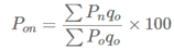
Identify the correct pair of items from the following Columns I and II: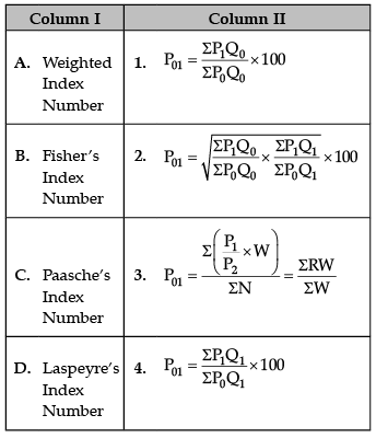
- a)A–1
- b)B–2
- c)C–3
- d)D–4
Correct answer is option 'B'. Can you explain this answer?
Identify the correct pair of items from the following Columns I and II:
a)
A–1
b)
B–2
c)
C–3
d)
D–4
|
|
Anjali Sharma answered |
A. Weighted Index Number:
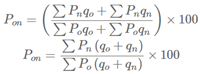
B. Fisher’s Ideal Index Number:
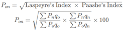
C. Paasche’s Index Number:
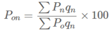
D. Laspeyre’s Index Number:
Arranging of data in the given series is required while computing- a)mean.
- b)median.
- c)mode.
- d)quartile.
Correct answer is option 'B'. Can you explain this answer?
Arranging of data in the given series is required while computing
a)
mean.
b)
median.
c)
mode.
d)
quartile.

|
Jatin Singh answered |
Calculation of median requires arranging of data in ascending or descending order before calculating mean. It can also be located graphically.
Sub-divided bar diagrams presented graphically on percentage basis gives- a)histogram.
- b)pictogram.
- c)pie diagram.
- d)percentage bar diagram
Correct answer is option 'D'. Can you explain this answer?
Sub-divided bar diagrams presented graphically on percentage basis gives
a)
histogram.
b)
pictogram.
c)
pie diagram.
d)
percentage bar diagram
|
|
Raman Singh answered |
Sub-divided bar diagrams presented graphically on percentage basis gives percentage bar diagrams. These diagrams are used to highlight the relative importance of the various component parts to the whole.
Line frequency graph is suitable for presenting- a)continuous variables.
- b)discrete variables.
- c)constant variable.
- d)proportionate variable.
Correct answer is option 'B'. Can you explain this answer?
Line frequency graph is suitable for presenting
a)
continuous variables.
b)
discrete variables.
c)
constant variable.
d)
proportionate variable.
|
|
Om Desai answered |
Line frequency graph is obtained from the frequency distribution of discrete variables. Length of the line represents the frequency of that variable.
Lower value of quartile deviation implies- a)higher mean.
- b)lower mean.
- c)higher dispersion.
- d)lower dispersion.
Correct answer is option 'D'. Can you explain this answer?
Lower value of quartile deviation implies
a)
higher mean.
b)
lower mean.
c)
higher dispersion.
d)
lower dispersion.
|
|
Jatin Singh answered |
Half of the Inter-Quartile Range is called Quartile Deviation. Lower the value of the quartile deviation, lower the dispersion.
Identify the correct pair of terms with their formula from the following Columns I and II: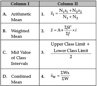
- a)A–1
- b)B–2
- c)C–3
- d)D–4
Correct answer is option 'C'. Can you explain this answer?
Identify the correct pair of terms with their formula from the following Columns I and II:
a)
A–1
b)
B–2
c)
C–3
d)
D–4
|
|
Amita Das answered |
Correct Formulas are
A. Arithmetic Mean: 
B. Weighted Mean: 
C. Mid Value of Class Intervals: 
D. Combined Mean: 
Identify the correct pair of items from the following Columns I and II: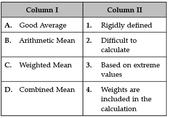
- a)A–1
- b)B–2
- c)C–3
- d)D–4
Correct answer is option 'A'. Can you explain this answer?
Identify the correct pair of items from the following Columns I and II:
a)
A–1
b)
B–2
c)
C–3
d)
D–4
|
|
Anjali Sharma answered |
A. Good Average: Good Average should be based on all the observations:
- Only those averages, where all the data are used give best result, whereas the averages which use less data are not representative of the whole group.
- Good Average should not be unduly affected by extreme value: No term should affect the average too much.
B. Arithmetic Mean: 
A = arithmetic mean
n = number of values
ai = data set values
C. Weighted Mean: Weighted average is a calculation that takes into account the varying degrees of importance of the numbers in a data set. In calculating a weighted average, each number in the data set is multiplied by a predetermined weight before the final calculation is made.
D. Combined Mean: A combined mean is a mean of two or more separate groups, and is found by : Calculating the mean of each group, Combining the results.
Deciles refer to the division of series into- a)two parts.
- b)four parts.
- c)ten parts.
- d)hundred parts.
Correct answer is option 'C'. Can you explain this answer?
Deciles refer to the division of series into
a)
two parts.
b)
four parts.
c)
ten parts.
d)
hundred parts.
|
|
Pooja Saini answered |
The Correct Option is (C)
decile divide any series into 10 parts.
decile divide any series into 10 parts.
Arrangment of data in the given series is required while computing- a)mean.
- b)median.
- c)mode.
- d)percentile.
Correct answer is option 'B'. Can you explain this answer?
Arrangment of data in the given series is required while computing
a)
mean.
b)
median.
c)
mode.
d)
percentile.
|
|
Advsubhashchandra Sharma answered |
For calculating median it is required to set the data either in ascending order or descending order.
The bar diagram showing an aggregate of values and its parts is called- a)multiple bar diagram.
- b)simple bar diagram.
- c)component bar diagram.
- d)cross bar diagram.
Correct answer is option 'C'. Can you explain this answer?
The bar diagram showing an aggregate of values and its parts is called
a)
multiple bar diagram.
b)
simple bar diagram.
c)
component bar diagram.
d)
cross bar diagram.
|
|
Jatin Singh answered |
Subdivided or component bar diagrams are used when various components of a variable are to be represented. In these diagrams we cannot only present the different values graphically but can also compare parts of one with another.
Identify the correct pair of items from the following Columns I and II: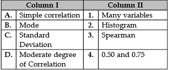
- a)A–1
- b)B–2
- c)C–3
- d)D–4
Correct answer is option 'D'. Can you explain this answer?
Identify the correct pair of items from the following Columns I and II:
a)
A–1
b)
B–2
c)
C–3
d)
D–4
|
|
Arun Yadav answered |
A. Simple Correlation: Simple correlation is a measure used to determine the strength and the direction of the relationship between two variables, X and Y.
B. Mode: The mode is the value that appears most often in a set of data values.
C. Standard Deviation: The standard deviation is a measure of the amount of variation or dispersion of a set of values.
D. Moderate degree of Correlation: In cases (positive or negative), if the value of 'r' is 0.50, it is called moderate correlation. When it lies between 0.50 and 0.75, the degree of correlation is high and when it lies between 0.25 and 0.50, the degree of correlation is low.
The first step towards making a project is- a)drawing conclusion.
- b)identification of the problem.
- c)collection of data.
- d)presentation of data.
Correct answer is option 'B'. Can you explain this answer?
The first step towards making a project is
a)
drawing conclusion.
b)
identification of the problem.
c)
collection of data.
d)
presentation of data.
|
|
Sunil Chahar answered |
The first step towards making a project is the identification of the problem. Only after the area of study is identified or the objective is set, the collection and processing of data can be done.
The work which is made on projects is called- a)practical work.
- b)project work.
- c)thesis.
- d)research.
Correct answer is option 'B'. Can you explain this answer?
The work which is made on projects is called
a)
practical work.
b)
project work.
c)
thesis.
d)
research.
|
|
Jatin Singh answered |
Project work is like a unit in which various types of programmes can be entered to get the desired result.
Identify the correct pair of terms and definitions from the following Columns I and II: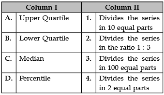
- a)A–1
- b)B–2
- c)C–3
- d)D–4
Correct answer is option 'B'. Can you explain this answer?
Identify the correct pair of terms and definitions from the following Columns I and II:
a)
A–1
b)
B–2
c)
C–3
d)
D–4
|
|
Ishan Choudhury answered |
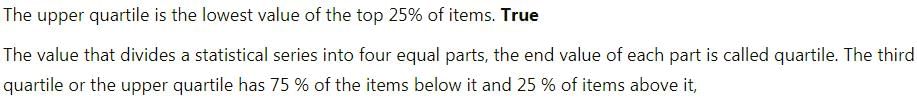
A. Upper Quartile: The upper quartile (sometimes called Q3) is the number dividing the third and fourth quartile. The upper quartile can also be thought of as the median of the upper half of the numbers. The upper quartile is also called the 75th percentile; it splits the lowest 75% of data from the highest 25%.
B. Lower Quartile: The lower quartile, or first quartile (Q1), is the value under which 25% of data points are found when they are arranged in increasing order. The upper quartile, or third quartile (Q3), is the value under which 75% of data points are found when arranged in increasing order.
C. Median: The median is the middle number in a sorted, ascending or descending, list of numbers and can be more descriptive of that data set than the average. If there is an odd amount of numbers, the median value is the number that is in the middle, with the same amount of numbers below and above.
D. Percentile: A percentile (or a centile) is a measure in statistics. It is a way of expressing where an observation falls in a range of other observations. For example, if a score falls in the 20th percentile, this means that 20 percent of all the scores recorded are lower.
Identify the correct pair of items from the following Columns I and II: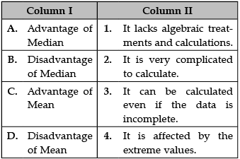
- a)A–1
- b)B–2
- c)C–3
- d)D–4
Correct answer is option 'D'. Can you explain this answer?
Identify the correct pair of items from the following Columns I and II:
a)
A–1
b)
B–2
c)
C–3
d)
D–4
|
|
Kiran Mehta answered |
A. Advantages of Median: The median is not affected by very large or very small values.
B. Disadvantages of Median: Since the median is an average of position, therefore arranging the data in ascending or descending order of magnitude is time-consuming in the case of a large number of observations.
C. Advantage of Mean: Takes account of all values to calculate the average.
D. Disadvantage of Mean: It is affected by the extreme values.
Data should have clarified nature and specified- a)Source of data
- b)Population
- c)Analysis of data
- d)Objective
Correct answer is option 'D'. Can you explain this answer?
Data should have clarified nature and specified
a)
Source of data
b)
Population
c)
Analysis of data
d)
Objective

|
Bhavana Chauhan answered |
On the basis of this objective, the required data will be collected.
Identify the correct pair of terms and definitions from the following Columns I and II: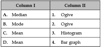
- a)A–1
- b)B–2
- c)C–3
- d)D–4
Correct answer is option 'A'. Can you explain this answer?
Identify the correct pair of terms and definitions from the following Columns I and II:
a)
A–1
b)
B–2
c)
C–3
d)
D–4
|
|
Naina Sharma answered |
A. Median: An ogive is a free-hand graph showing the curve of a cumulative distribution function.
B. Mode: The mode is the value that appears most frequently in a data set.
C. Mean: The mean formula is given as the average of all the observations. It is expressed as Mean = {Sum of Observation} ÷ {Total numbers of Observations}.
D. Mean: The mean formula is given as the average of all the observations. It is expressed as Mean = {Sum of Observation} ÷ {Total numbers of Observations}.
Calculation of mean is very difficult in case of- a)open end classes.
- b)inclusive series.
- c)pictograms.
- d)histograms.
Correct answer is option 'A'. Can you explain this answer?
Calculation of mean is very difficult in case of
a)
open end classes.
b)
inclusive series.
c)
pictograms.
d)
histograms.

|
Sushil Ku answered |
In case of open end classes, computation of arithmetic mean would be difficult unless we assume the unknown limits.
The another name of the 'measure of central tendency' is called- a)average.
- b)collection of data.
- c)summation.
- d)regression.
Correct answer is option 'A'. Can you explain this answer?
The another name of the 'measure of central tendency' is called
a)
average.
b)
collection of data.
c)
summation.
d)
regression.
|
|
Sushil Ku answered |
Measures of central tendency refers to all those methods of statistical analysis which are used to calculate the average of a set of data.
Bibliography mentions the- a)objective of survey.
- b)target group.
- c)sources of primary data.
- d)sources of secondary data.
Correct answer is option 'D'. Can you explain this answer?
Bibliography mentions the
a)
objective of survey.
b)
target group.
c)
sources of primary data.
d)
sources of secondary data.
|
|
Hardik Handa answered |
Bibliography refers to the mentioning of sources of secondary data. It is stated at the bottom of the report.
Identify the correct pair of items from the following Columns I and II: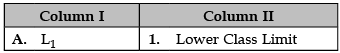
- a)A–1
- b)B–2
- c)C–3
- d)D–4
Correct answer is option 'A'. Can you explain this answer?
Identify the correct pair of items from the following Columns I and II:
a)
A–1
b)
B–2
c)
C–3
d)
D–4
|
|
Amita Das answered |
A. L1: L1 is denoted as Lower Class Limit.
B. Q2: Q2 is denoted as second financial quarter.
C. Q3: Q2 is denoted as The upper or third quartile.
D. Q2: Q2 is denoted as second financial quarter.
Identify the correct pair of terms with their common symbols from the following Columns I and II: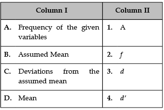
- a)A–1
- b)B–2
- c)C–3
- d)D–4
Correct answer is option 'C'. Can you explain this answer?
Identify the correct pair of terms with their common symbols from the following Columns I and II:
a)
A–1
b)
B–2
c)
C–3
d)
D–4
|
|
Ishan Choudhury answered |
Correct Symbols are
A. Frequency of the given variable: The symbols most often used for frequency are f and the Greek letters nu (ν) and omega (ω).
B. Assumed Mean: Correct symbol of assumed mean is a.
C. Deviations from the assumed mean: Correct symbol of assumed mean is d.
D. Mean: The symbol 'μ' represents the population mean.
To measure income inequality we can use- a)correlation.
- b)mean.
- c)median.
- d)dispersion.
Correct answer is option 'D'. Can you explain this answer?
To measure income inequality we can use
a)
correlation.
b)
mean.
c)
median.
d)
dispersion.
|
|
Chan singh answered |
A measure of dispersion can tell us about income inequalities.
Chapter doubts & questions for Methods and Tools of Economic Analysis - Economics for JAMB 2025 is part of JAMB exam preparation. The chapters have been prepared according to the JAMB exam syllabus. The Chapter doubts & questions, notes, tests & MCQs are made for JAMB 2025 Exam. Find important definitions, questions, notes, meanings, examples, exercises, MCQs and online tests here.
Chapter doubts & questions of Methods and Tools of Economic Analysis - Economics for JAMB in English & Hindi are available as part of JAMB exam.
Download more important topics, notes, lectures and mock test series for JAMB Exam by signing up for free.
Economics for JAMB
162 videos|101 docs|66 tests
|
|
© EduRev
|
Education Revolution
|


|


Signup to see your scores
go up within 7 days!
Access 1000+ FREE Docs, Videos and Tests
Takes less than 10 seconds to signup