


All Exams >
Grade 9 >
Computer Science for Grade 9 >
All Questions
All questions of Data representation for Grade 9 Exam


In order to draw a frequency polygon by using a histogram, which of the following statements is incorrect?- a)Obtain the mid-points of three class- intervals of highest frequency on Y-axis, one adjacent to the first on its right and one adjacent to the last, on its left.
- b)Obtain the frequency distribution and draw a histogram representing it.
- c)Join these mid-points of the adjacent rectangles of the histogram by dotted line
- d)Obtain the mid points of the upper horizontal side of each rectangle.
Correct answer is 'A'. Can you explain this answer?
In order to draw a frequency polygon by using a histogram, which of the following statements is incorrect?
a)
Obtain the mid-points of three class- intervals of highest frequency on Y-axis, one adjacent to the first on its right and one adjacent to the last, on its left.
b)
Obtain the frequency distribution and draw a histogram representing it.
c)
Join these mid-points of the adjacent rectangles of the histogram by dotted line
d)
Obtain the mid points of the upper horizontal side of each rectangle.

|
Ankur Kumar answered |
Correct Answer is A
A frequency polygon is drawn for the following data. So the x-coordinate of the point having y coordinate as 21 is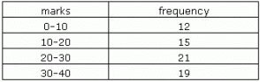
- a)30
- b)20
- c)25
- d)35
Correct answer is option 'C'. Can you explain this answer?
A frequency polygon is drawn for the following data. So the x-coordinate of the point having y coordinate as 21 is
a)
30
b)
20
c)
25
d)
35

|
Kriti Arora answered |
A frequency polygon is made by joining the mid points of each bar of a histogram along with 2 imaginary class intervals. Hence, for any point on a frequency polygon the y co-ordinate is the frequency and x co - ordinate is the Class Mark of the interval. In this case, the class mark of the interval 20-30 is 25 . Therefore the correct option is 'c'.
If this helps you please upvote and follow
A graphical representation of a frequency distribution in the form of rectangles with class interval as bases and heights proportional to corresponding frequencies such that there is no gap between any two successive rectangles is called a- a)Frequency polygon
- b)Histogram
- c)Bar graph
- d)Pie chart
Correct answer is option 'B'. Can you explain this answer?
A graphical representation of a frequency distribution in the form of rectangles with class interval as bases and heights proportional to corresponding frequencies such that there is no gap between any two successive rectangles is called a
a)
Frequency polygon
b)
Histogram
c)
Bar graph
d)
Pie chart
|
|
Nilotpal Yadav answered |
Histogram
A histogram is a graphical representation of a frequency distribution in the form of rectangles. It is a type of bar graph, with the class intervals as the bases and the heights proportional to the corresponding frequencies. The histogram is used to represent numerical data in a more visual and effective way.
Steps to create a histogram:
1. Gather data and decide on the intervals: The data is first collected and then grouped into intervals or classes. The intervals should be mutually exclusive and exhaustive.
2. Draw the X and Y-axis: The X-axis represents the intervals or classes, and the Y-axis represents the frequency of the data.
3. Draw the rectangles: The height of each rectangle is proportional to the frequency of the data in the corresponding interval. The width of the rectangle represents the range of the interval.
4. Label the graph: The graph should be labeled with a title, the X and Y-axis, and the interval boundaries.
Advantages of Histogram:
1. Easy to understand: Histograms are easy to understand and interpret. It provides a clear picture of the data distribution.
2. Effective for large data sets: Histograms are effective for large data sets. It can provide a quick overview of the data distribution.
3. Helps in identifying outliers: Histograms can help in identifying outliers and anomalies in the data.
4. Helps in decision making: Histograms can help in decision making by providing a visual representation of the data.
Conclusion:
Histograms are an effective way to represent data in a graphical form. It is used to understand the distribution of data and to identify patterns and anomalies. It is widely used in various fields such as statistics, finance, and science.
Chapter doubts & questions for Data representation - Computer Science for Grade 9 2025 is part of Grade 9 exam preparation. The chapters have been prepared according to the Grade 9 exam syllabus. The Chapter doubts & questions, notes, tests & MCQs are made for Grade 9 2025 Exam. Find important definitions, questions, notes, meanings, examples, exercises, MCQs and online tests here.
Chapter doubts & questions of Data representation - Computer Science for Grade 9 in English & Hindi are available as part of Grade 9 exam.
Download more important topics, notes, lectures and mock test series for Grade 9 Exam by signing up for free.
Computer Science for Grade 9
18 docs|10 tests
|
|
© EduRev
|
Education Revolution
|


|


Signup to see your scores
go up within 7 days!
Access 1000+ FREE Docs, Videos and Tests
Takes less than 10 seconds to signup