Class 8 Exam > Class 8 Questions > Why we draw a pie chart?
Start Learning for Free
Why we draw a pie chart?
Most Upvoted Answer
Why we draw a pie chart?
Consider the following example:
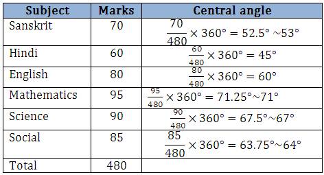
The number of marks scored by a student in different subjects in an examination is given below. Display the data in a pie chart.
Solution:
The total angle at the centre of a circle is 360degree. The central angle of the sectors will be a fraction of 360degree. Let’s make a table to find the central angle of the sectors as shown.


Step 1: Draw a circle with any convenient radius. Mark its centre and a radius.
Step 2: The angle of the sector for Sanskrit is 180degree. With the help of a protractor draw a sector making an angle of 53degree.
Step 3: Next mark another sector making an angle of 45degree for Hindi.
Step 4: Continue marking the remaining sectors.


Community Answer
Why we draw a pie chart?
Introduction:
A pie chart is a circular statistical graphic that is used to represent data in a visual and organized manner. It is composed of slices that represent different categories or values, with each slice's size proportional to the quantity it represents. Pie charts are widely used in various fields, including business, finance, economics, and research. They provide a clear and concise way to present data, making it easier for viewers to understand and interpret the information.
Purpose of Drawing a Pie Chart:
There are several reasons why we draw a pie chart, and each serves a specific purpose:
1. Comparison of Proportions:
Pie charts are particularly useful when we want to compare the proportions of different categories or values within a whole. By visually representing the data as slices of a circle, it becomes easier to observe the relative sizes of each category and identify any significant differences or trends.
2. Simplification of Complex Data:
When dealing with complex data sets or large amounts of information, pie charts help simplify the presentation of data. They condense the data into a clear and concise visual form, allowing viewers to grasp the main insights quickly.
3. Highlighting Key Components:
Pie charts are effective in emphasizing key components or significant portions of a whole. By allocating a larger slice to a specific category or value, we can visually emphasize its importance or significance.
4. Overall Distribution:
Pie charts also provide a holistic view of the overall distribution of data. They help in understanding how the different categories or values contribute to the total, enabling viewers to assess the distribution pattern and identify any outliers or anomalies.
5. Visual Appeal and Engagement:
Using a pie chart to present data adds visual appeal to the information, making it more engaging and interesting for the viewers. This can enhance the overall impact of the data presentation and increase the chances of effective communication.
Conclusion:
Pie charts serve as a valuable tool for visualizing and communicating data effectively. They allow for easy comparison of proportions, simplification of complex data, highlighting key components, understanding overall distribution, and adding visual appeal. By utilizing pie charts, we can present data in a visually appealing and organized manner, facilitating better comprehension and analysis.

|
Explore Courses for Class 8 exam
|

|
Similar Class 8 Doubts
Question Description
Why we draw a pie chart? for Class 8 2025 is part of Class 8 preparation. The Question and answers have been prepared according to the Class 8 exam syllabus. Information about Why we draw a pie chart? covers all topics & solutions for Class 8 2025 Exam. Find important definitions, questions, meanings, examples, exercises and tests below for Why we draw a pie chart?.
Why we draw a pie chart? for Class 8 2025 is part of Class 8 preparation. The Question and answers have been prepared according to the Class 8 exam syllabus. Information about Why we draw a pie chart? covers all topics & solutions for Class 8 2025 Exam. Find important definitions, questions, meanings, examples, exercises and tests below for Why we draw a pie chart?.
Solutions for Why we draw a pie chart? in English & in Hindi are available as part of our courses for Class 8.
Download more important topics, notes, lectures and mock test series for Class 8 Exam by signing up for free.
Here you can find the meaning of Why we draw a pie chart? defined & explained in the simplest way possible. Besides giving the explanation of
Why we draw a pie chart?, a detailed solution for Why we draw a pie chart? has been provided alongside types of Why we draw a pie chart? theory, EduRev gives you an
ample number of questions to practice Why we draw a pie chart? tests, examples and also practice Class 8 tests.

|
Explore Courses for Class 8 exam
|

|
Signup to solve all Doubts
Signup to see your scores go up within 7 days! Learn & Practice with 1000+ FREE Notes, Videos & Tests.


