Bar Graphs: Introduction and Examples (with Solutions) | General Aptitude for GATE - Mechanical Engineering PDF Download
| Table of contents |
|
| What are Bar Graphs? |
|
| The Use of Bar Charts to Show Deviations |
|
| Representation of Percentage on a Stacked Bar Chart |
|
| Solved Examples |
|
| Strategies and Practice |
|

- Bar graphs are essential for data visualisation in competitive exams, testing analytical and quantitative skills.
- This document covers types of bar graphs—simple, stacked, and composite—and their use in data interpretation.
- With clear explanations and solved examples, it equips aspirants to tackle bar graph questions efficiently in aptitude-based assessments.
What are Bar Graphs?
Bar charts are one of the simplest and most visually engaging ways to represent data, making them a popular choice for presenting all kinds of information. They are particularly effective when comparing different sets or categories of data.
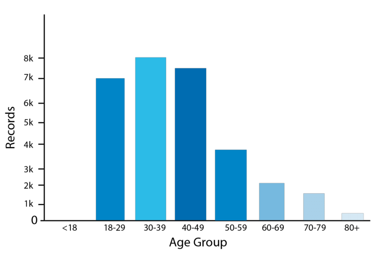 Bar Chart
Understanding Bar Graphs
A bar chart consists of a series of bars, each representing a specific category or value. These bars are typically arranged in either horizontal or vertical alignment and are spaced evenly apart. The height or length of each bar corresponds to the value or frequency of the category it represents, making it easy to visually compare the data.
Data Series and Variables: Bar charts are great for displaying data series, where the series consists of continuous variables. The values for these variables are measured at specific, discrete points, with each bar representing one of these data points.
Comparative Study: One of the biggest advantages of bar charts is that they simplify the comparative analysis of data. By examining the length or height of the bars, we can quickly identify trends, differences, and relationships between different data points.
Bar Width: The width of the bars in a bar chart is typically not significant; it’s mainly used for clarity and visual appeal. The key focus is on the length or height of the bars, which represent the data values.
Now let's have a look at the different kinds of bar charts and the kinds of data that can be represented on a bar chart.
1. Simple Bar Graph
A simple bar chart is a basic and effective way to compare one continuous variable against one discrete variable. In this type of chart, one axis typically represents the discrete categories (e.g., different groups or items), and the other axis represents the values of the continuous variable (e.g., quantities, measurements, or scores).
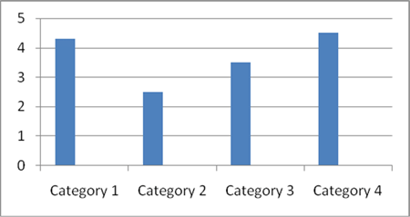 Simple Bar Chart
In a simple bar chart, each bar corresponds to a specific category or group. The height (or length, if horizontal) of the bar represents the value of the continuous variable for that category. The bars are evenly spaced, and each bar is proportional to the value it represents.
For example, a simple bar chart can be used to compare monthly sales figures, with the months on the x-axis and the sales (in dollars) on the y-axis, where the height of each bar represents the sales value for each month.
2. Stacked Bar Graph
They are used to display information about the sub-groups that make up different categories.
- In a stacked bar chart, bars representing the sub-groups are placed on top of each other to make a single column or side by side to make a single bar.
- The overall height or length of the bar shows the total size of the category, whilst different colours or shadings are used to indicate the relative contribution of the sub-group.
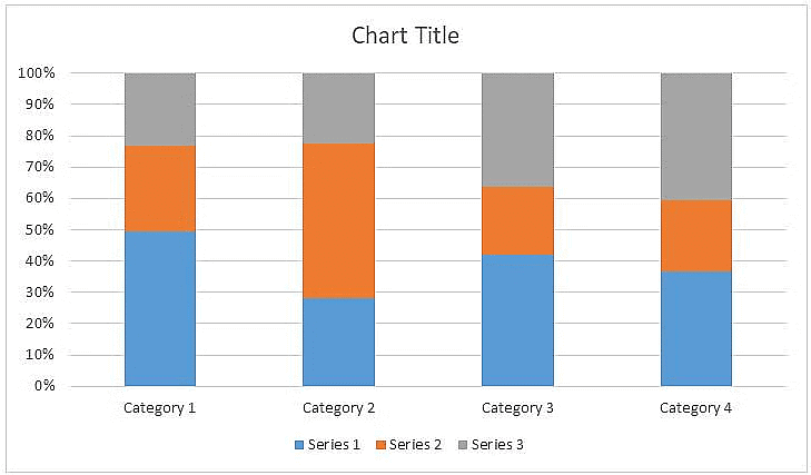 Stacked Bar Graph
- Stacked bar charts are also used to show the percentage contribution that different sub-groups contribute to each separate category. In this case, the bars representing the individual categories are all the same.
- For example, a stacked bar graph can be used to display the total sales of different products in each month, where each bar represents a month, and the segments of each bar represent the sales of individual products, stacked on top of one another to show the total sales for that month.
3. Composite Bar Graph
One of the primary limitations of the simple bar chart is that it can only be used to display a single continuous variable.
- If two or more sets of continuous variables are to be shown on the same bar chart, we use what is called a composite bar chart.
- The figure below shows an example of the Composite Bar Chart.
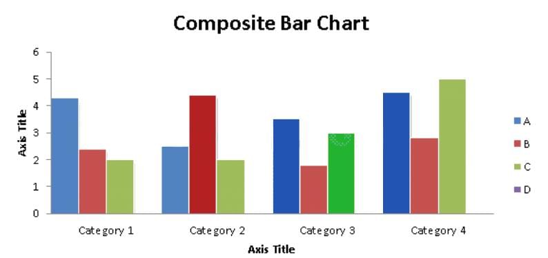
For example, a composite bar chart can show the performance of two students in five different subjects, where each subject has a single bar divided into two segments representing the marks scored by each student, allowing easy comparison within each subject.
What is the ratio of the total sales of branch B2 for both years to the total sales of branch B4 for both years?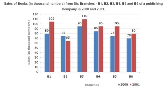
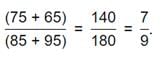
The Use of Bar Charts to Show Deviations
Deviation bars are useful for graphic presentation of continuous variables which can have both positive and negative values, i.e., surplus or deficit, net profit or loss, net of imports and exports.
- In general continuous variables which have both positive and negative values are best represented on bar charts.
- A baseline is created, and positive values (such as profit, surplus), etc., are represented by bars above the baseline, while negative deviations (loss or deficit) are represented by bars below the baseline, as shown in the figure above.
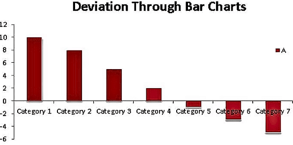
Representation of Percentage on a Stacked Bar Chart
Sometimes stacked bars can also be used to represent the break-up of some continuous variable. The figure below will make it clear.
- Such use of bar charts is quite convenient for comparing two or more sets of data.
- The figure below shows the breakdown of the various sources of revenue for the Government of India over a two-year period.
What was the percentage of students who cleared CAT in 2000?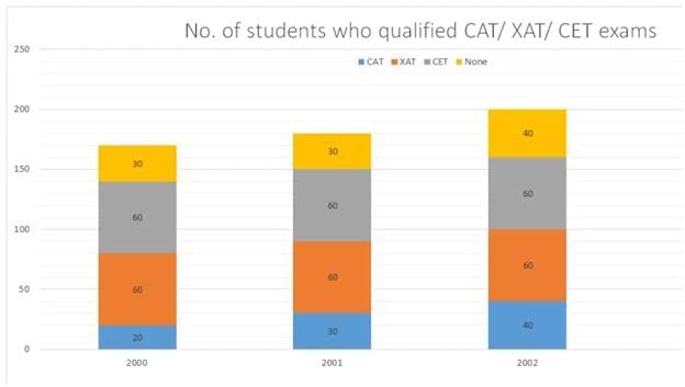
Solved Examples
Q1: Production of paper (in lakh tonnes) by three companies X, Y and Z over the years. Study the graph and answer the questions that follow.
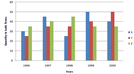
(i) What is the difference between the production of company Z in 1998 and company Y in 1996?
Ans: Required difference
= [(45 - 25) * 1,00,000] tones
= 20,00,000 tons.
(ii) What is the ratio of the average production of company X in the period 1998-2000 to the average production of company Y in the same period?
Ans: Average production of company X in the period 1998-2000 = [1/3 * (25 + 50 + 40)] = (115/3) lakh tons. Average production of company Y in the period 1998-2000 = [1/3 * (35 + 40 + 50)] = (125/3) lakh tons. Required ratio = (115/3)/(125/3) = 115/125 = 23/25
(iii) What is the percentage increase in the production of company Y from 1996 to 1999?
Ans: Percentage increase in the production of company Y from 1996 to 1999 = [(40 - 25)/25 * 100]% = (15/25 * 100)% = 60%
(iv) The average production for five years was maximum for which company?
Ans: For company
- X = [1/5 * (30 + 45 + 25 + 50 + 40)] = 190/5 = 38
- For company Y = [1/5 * (25 + 35 + 35 + 50 + 40)] = 185/5 = 37
- For company Z = [1/5 * (35 + 40 + 45 + 35 + 35)] = 190/5 = 38
- Average production of five years in maximum for both the companies X and Z.
(v) In which year was the percentage of production of company Z to the production of company Y the maximum?
Ans: The percentage of production of company Z to the production of company Z for various years are:
For 1996 = (35/25 * 100)% = 140%
Clearly, this percentage is highest for 1996.
Q2: The following chart gives the revenue share of different companies in the tech sector in Cuckooland. : In 2001, the company that grew the quickest grew by 100%, what was the growth rate of the company that had the least growth rate?
(a) 50%
(b) 25%
(c) 20%
(d) 33%
Ans: Note that we can answer this question even if we do not know the overall numbers in 2000 and 2001. Let the total revenues of the entire industry be X in 2000 and Y in 2001.
FINY has grown from 22.9% of X to 21.1% of Y, which is nothing but 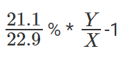 expressed as a percentage.
Likewise, growth of PRIWO would be 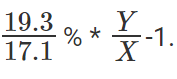 And so on for the rest.
So the company that grew the quickest would be the one that had the maximum ration of 2001 revenue share to 2000 revenue share. Only the shares matter, X's and Y's do not matter.
So, to find the company that grew quickest, all we need to do is find the highest of 
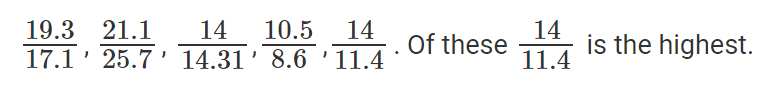
Now, we know that CENTURE saw the highest growth and that this growth number was 100%. Or, CENTURE saw its revenues double.
Or 14% of Y = 11.4% of X * 2 Or 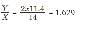
To find out the company that saw the least growth rate, we need to find the least among the listed fractions. Or the least among 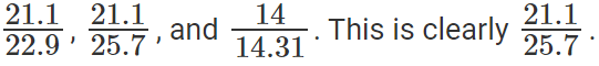
Or, the company that saw the least growth rate is SCT.
SCT's growth rate is 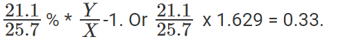
Or, SCT grew by 33%.
The question is "growth rate of the company that had the least growth rate?"
Hence, the answer is "33%".
Choice D is the correct answer.
Q3: The following chart gives the revenue share of different companies in the tech sector in Cuckooland. :
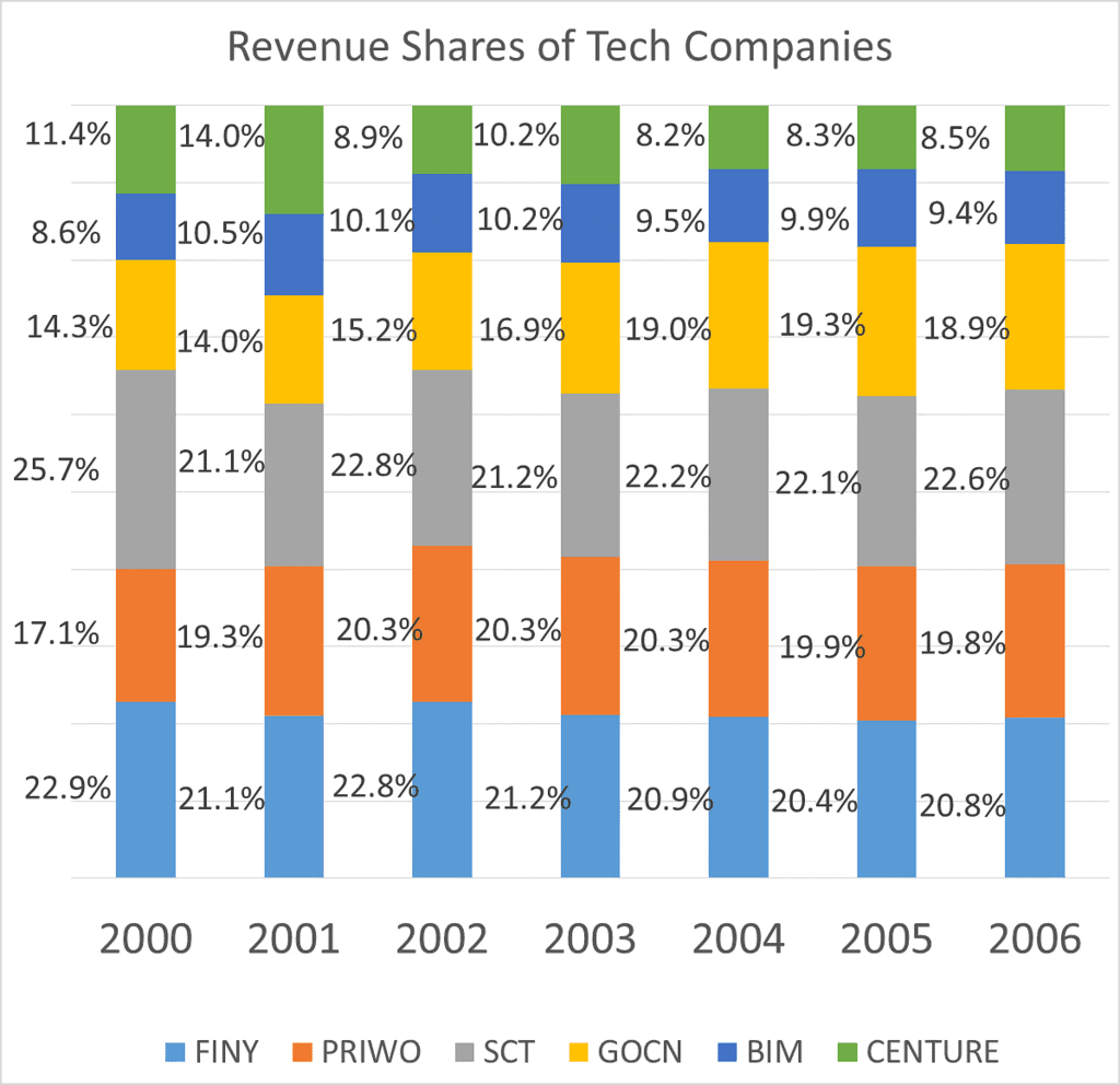
In 2002, the growth rate of the overall sector was 39%, what was the growth rate seen by SCT?
(a) 50%
(b) 75%
(c) 30%
(d) 40%
Solution: Let 2002 revenues be Z, and let 2001 revenues be Y. We know Z/Y =1.39.
Growth rate of SCT is  expressed as a percentage.
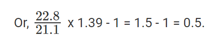
There was a 50% growth rate.
The question is "what was the growth rate seen by SCT?"
Hence, the answer is "50%".
Choice A is the correct answer.
Strategies and Practice
Bar graphs are a staple in Data Interpretation (DI) section of various competitive exams, often paired with tables or other charts. To excel, focus on:
- Speed: Estimate values visually to save time (e.g., approximate percentages).
- Accuracy: Double-check calculations for ratios or percentage changes.
- Patterns: Identify trends (e.g., consistent growth) to answer inference questions.
Practice Tips:
- Solve 2–3 DI sets daily to build speed.
- Use approximation for large numbers (e.g., 298 ≈ 300).
- Check for common patterns like percentage change or ratio questions.
|
229 videos|191 docs|158 tests
|
FAQs on Bar Graphs: Introduction and Examples (with Solutions) - General Aptitude for GATE - Mechanical Engineering
| 1. What are bar charts and how are they used to represent data? |  |
| 2. How can bar charts be used to show deviations in data? | |
| 3. How is the percentage of a category represented on a stacked bar chart? | |
| 4. Provide an example of how bar graphs are used in SSC CGL exams? | |
| 5. What are some frequently asked questions related to bar graphs in SSC CGL exams? | |


ppt
,Previous Year Questions with Solutions
,Objective type Questions
,Exam
,Viva Questions
,MCQs
,video lectures
,Summary
,Important questions
,Bar Graphs: Introduction and Examples (with Solutions) | General Aptitude for GATE - Mechanical Engineering
,past year papers
,Bar Graphs: Introduction and Examples (with Solutions) | General Aptitude for GATE - Mechanical Engineering
,Semester Notes
,shortcuts and tricks
,study material
,mock tests for examination
,Extra Questions
,practice quizzes
,Sample Paper
,Free
,Bar Graphs: Introduction and Examples (with Solutions) | General Aptitude for GATE - Mechanical Engineering
;


Bar Graphs: Introduction and Examples (with Solutions) Free PDF Download
Importance of Bar Graphs: Introduction and Examples (with Solutions)
Bar Graphs: Introduction and Examples (with Solutions) Notes
Bar Graphs: Introduction and Examples (with Solutions) Mechanical Engineering Questions
Study Bar Graphs: Introduction and Examples (with Solutions) on the App
|
© EduRev
|
Education Revolution
|


|


