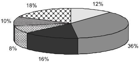
Pie Charts | General Aptitude for GATE - Mechanical Engineering PDF Download

Introduction

Pie charts are specific types of data presentation where the data is represented in the form of a circle. In a pie chart, a circle is divided into various sections or segments such that each sector or segment represents a certain proportion or percentage of the total. In such a diagram, the total of all the given items is equated to 360 degrees and the degrees of angles, representing different items, are calculated proportionately. The entire diagram looks like a pie and its components resemble slices cut from a pie. The pie chart is used to show the break-up of one continuous variable into its component parts.

The Types of Pie Charts

There are two approaches to constructing a pie chart from any given data:

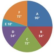
(a) Degree Approach: The central angle in a circle represents 360°, so any part or segment in a pie chart is calculated as a proportion of 360°.
Pie Charts | General Aptitude for GATE - Mechanical Engineering

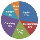
(b) Percentage Approach: In this case, any part or segment in a pie chart is calculated as a part of 100%. 

Pie Charts | General Aptitude for GATE - Mechanical Engineering

Conversion of degree approach to percentage approach:
Pie Charts | General Aptitude for GATE - Mechanical Engineering

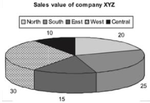
If we convert the same pie chart into the degree format, we will be required to do the following conversions:
Total = 100%
Hence, 1% = 3.6°
Central = 10% = 36°
North = 20% = 72°
South = 25% = 90°
East = 15% = 54°
West =30% = 108°

There are two types of pie charts

(a) Normal Pie Chart
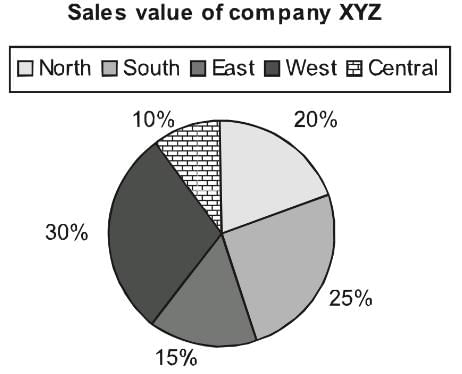

Pie Charts | General Aptitude for GATE - Mechanical Engineering


This displays the contribution of each component of the pie. 

(b) Exploded Pie Chart
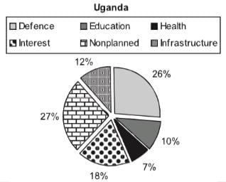
Pie Charts | General Aptitude for GATE - Mechanical Engineering

(C) Mixed Layer Pie Chart

It is conventional to have multiple pie charts related to the same paragraph question to determine different aspects & drawing comparisons between the data. 

  • Once in CAT 2018 aspirants like you were posed with a multi-layered pie chart question like below; let’s solve the same pie chart to understand the concept better.
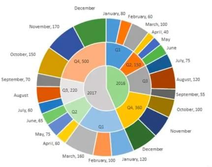
Pie Charts | General Aptitude for GATE - Mechanical Engineering

  • The multi-layered pie-chart below shows the sales of LED television sets for a big retail electronics outlet during 2016 and 2017. The outer layer shows the monthly sales during this period, with each label showing the month followed by sales figure of that month. 
  • For some months, the sales figures are not given in the chart. The middle-layer shows quarter-wise aggregate sales figures (in some cases, aggregate quarter-wise sales numbers are not given next to the quarter). The innermost layer shows annual sales. 
  • It is known that the sales figures during the three months of the second quarter (April, May, June) of 2016 form an arithmetic progression, as do the three-monthly sales figures in the fourth quarter (October, November, December) of that year.

Q.1. What is the percentage increase in sales in December 2017 as compared to the sales in December 2016?
(a) 38.46
(b) 22.22
(c) 50.00
(d) 28.57


Q.2. In which quarter of 2017 was the percentage increase in sales from the same quarter of 2016 the highest?
(a) Q4
(b) Q1
(c) Q2
(d) Q3
Sol: To easily solve the questions we can first represent the information given in pie-chart in a consolidated table to make it easier to read and understand.
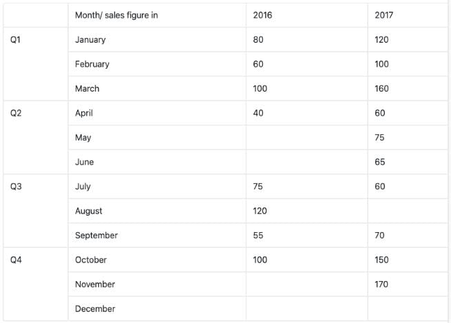
Pie Charts | General Aptitude for GATE - Mechanical Engineering

As you can see in the above table there a few month’s sales are missing and we need to evaluate them first from the given information and then find the answers to above given question.
Now, it’s been given in the question that the months of April, May, June in 2016 forms an A.P. and so does the months of Quarter 4 of 2016, i.e. Oct, Nov, Dec.
Total sale in Quarter 2 = 150
Let a-d, a, a+d be the three terms of A.P.
Hence, a-d + a + a+d =150

  • 3a = 150
  • a = 50

Since, April sale is 40, i.e. a-d = 40

  • d = 10

Using that we can easily find the rest of the month sales values i.e. 50 and 60 respectively.
Similarly, using the above method we can find out the values for the month of Nov’16 and Dec’16. In this case, a would-be 120 and d = 20.
Thus, sales for these months are 120 and 140 respectively.
Now as you can see in the table, we have found out all missing monthly sales figure except for December’17 and August’17 which can be easily find out as
Total sales in Quarter 4 of 2017 = 500
And sales in Oct’17 and Nov’17 are 150 and 170 respectively.
Hence, the sale for December = 500 -150 - 170 = 180
And similarly, Sale for August’17 = 220 – 60 – 70 = 90
Therefore, our table becomes,
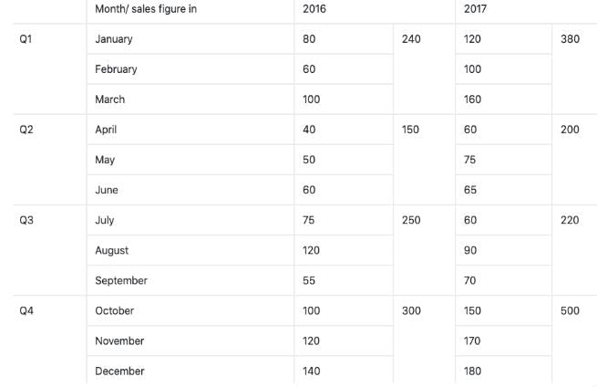
Pie Charts | General Aptitude for GATE - Mechanical EngineeringNow we are in position to answer all the given questions using the above table.
Ans 1: Percentage increase in sales of Dec’17 as compared to Dec’16 =
Ans 2: We need to evaluate the quarter with the highest increase in sales in percentage terms.
Pie Charts | General Aptitude for GATE - Mechanical Engineering


Significance of Pie Charts

The pie chart has gained prominence due to the following reasons:

  • In a pie chart, we get a clear picture of the contribution of different sectors to the build up of the total. E.g., presentation of budgets.
  • Comparing two pie charts is easier than comparing two bar charts or any other format of data representation.

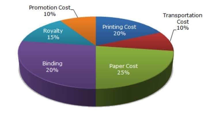
Following is the cost analysis of a book “Guide to Digital Marketing”.

Pie Charts | General Aptitude for GATE - Mechanical Engineering

Pie Charts | General Aptitude for GATE - Mechanical EngineeringWhat is the central angle showing the cost of paper?
(a) 42.8°
(b) 32.6°
(c) 36.8°
(d) 57.6°
Sol: Percentage of paper cost in total cost - 16%
We know that the sum of angles in pie chart is 100°
Hence, Required Angle = (16/100 × 360) = 57.6° 

Practice Question
Question for Pie Charts
Try yourself:If 5500 copies of the book are published and the miscellaneous expenditure amounts to Rs.36,960 and the marked price is 40% above the cost price, then the marked price of each copy is

Pie Charts | General Aptitude for GATE - Mechanical Engineering

View Solution

Question for Pie Charts
Try yourself:The central angle of a sector is 72º. What percentage of the circle is comprised by the sector?
View Solution

Question for Pie Charts
Try yourself:During which month was the percentage increase in sales from the previous month’s sales the highest?
View Solution

Question for Pie Charts
Try yourself:During which quarter was the percentage decrease in sales from the previous quarter’s sales the highest?
View Solution

The document Pie Charts | General Aptitude for GATE - Mechanical Engineering is a part of the Mechanical Engineering Course General Aptitude for GATE.
All you need of Mechanical Engineering at this link: Mechanical Engineering
198 videos|165 docs|152 tests

Top Courses for Mechanical Engineering

FAQs on Pie Charts - General Aptitude for GATE - Mechanical Engineering

1. What are the two types of pie charts?
Ans. The two types of pie charts are: 1. Simple Pie Chart: This type of pie chart displays the proportion of different categories or groups as a percentage of the whole. Each category is represented by a slice of the pie, and the size of each slice represents the proportion of that category. 2. Exploded Pie Chart: In an exploded pie chart, one or more slices are pulled out or separated from the main pie to highlight a specific category or group. This helps in emphasizing the importance or significance of that particular category.
2. How are pie charts significant?
Ans. Pie charts are significant in the following ways: 1. Visualization of Proportions: Pie charts provide a visual representation of the proportions or percentages of different categories or groups. This makes it easier to understand the distribution and relative sizes of the data. 2. Comparison of Categories: Pie charts allow for easy comparison between different categories or groups. By simply comparing the sizes of the slices, one can quickly identify which category is the largest or smallest. 3. Effective Communication: Pie charts are a powerful tool for effectively communicating data to a wide audience. The visual representation helps in conveying complex information in a simple and easily understandable manner. 4. Trend Analysis: Pie charts can also be used to analyze trends over time. By comparing pie charts from different time periods, one can identify changes in the distribution of data and track the progress or decline of various categories. 5. Decision Making: Pie charts assist in decision-making processes by providing a clear visual representation of data. They help in identifying areas of focus or concern, enabling informed decision making based on the data presented.
3. How can pie charts be used in data analysis?
Ans. Pie charts can be used in data analysis in the following ways: 1. Identifying Major Contributors: Pie charts help in identifying the major contributors or categories that have the highest or lowest proportions. This information can be useful in understanding the overall distribution and impact of different categories. 2. Comparing Data Sets: Pie charts can be used to compare data sets from different time periods, regions, or groups. By visually comparing the sizes of the slices, one can identify any significant changes or differences between the data sets. 3. Highlighting Disproportions: Pie charts are effective in highlighting disproportions or imbalances in data. If one slice appears significantly larger or smaller than the others, it indicates an area that requires further analysis or attention. 4. Visualizing Percentages: Pie charts provide a visual representation of percentages, making it easier to understand the relative sizes and proportions of different categories. This aids in the interpretation and analysis of data. 5. Supporting Decision Making: Pie charts assist in data-driven decision making by presenting information in a clear and concise manner. They provide a quick overview of the data, enabling decision makers to identify patterns, trends, and areas of focus.
4. How can pie charts be created and interpreted?
Ans. Pie charts can be created and interpreted as follows: 1. Creating a Pie Chart: To create a pie chart, first, gather the data and calculate the proportions or percentages for each category. Then, plot the slices of the pie according to these proportions using a graphing software or tool. Label each slice with the corresponding category name. 2. Interpreting a Pie Chart: To interpret a pie chart, start by looking at the entire pie as a whole. The total sum of all the slices represents 100% of the data. Next, compare the sizes of the slices to understand the relative proportions of different categories. The larger the slice, the greater the proportion of that category. Finally, analyze the patterns and trends within the pie chart to draw conclusions or make informed decisions based on the data presented.
5. What are some limitations of using pie charts?
Ans. There are certain limitations of using pie charts: 1. Limited Data Representation: Pie charts are best used to represent data with a small number of categories. If there are too many categories, the pie chart can become cluttered and difficult to interpret. 2. Difficulty in Comparisons: It can be challenging to compare the sizes of slices accurately, especially when the differences are small. A bar chart or a different type of graph may be more suitable for precise comparisons. 3. Misleading Perception: The visual nature of pie charts can sometimes create a misleading perception of the data. The use of 3D effects or exploding slices can distort the proportions and make accurate interpretation difficult. 4. Lack of Time Dimension: Pie charts are not suitable for representing data over time. They are static representations and do not show changes or trends over different time periods. 5. Subjectivity in Interpretation: The interpretation of pie charts can be subjective, as individuals may perceive the proportions differently. It is essential to provide clear labels and explanations to minimize any misinterpretation of the data.
198 videos|165 docs|152 tests
Download as PDF
Explore Courses for Mechanical Engineering exam

Top Courses for Mechanical Engineering

Signup for Free!
Signup to see your scores go up within 7 days! Learn & Practice with 1000+ FREE Notes, Videos & Tests.
10M+ students study on EduRev
Related Searches

ppt

,

MCQs

,

mock tests for examination

,

Pie Charts | General Aptitude for GATE - Mechanical Engineering

,

pdf

,

Pie Charts | General Aptitude for GATE - Mechanical Engineering

,

Semester Notes

,

Important questions

,

Exam

,

Previous Year Questions with Solutions

,

past year papers

,

Free

,

study material

,

Extra Questions

,

shortcuts and tricks

,

Pie Charts | General Aptitude for GATE - Mechanical Engineering

,

practice quizzes

,

Summary

,

Objective type Questions

,

Sample Paper

,

video lectures

,

Viva Questions

;