Be a Data Expert Chapter Notes | Year 3 Computing IGCSE (Cambridge) - Class 3 PDF Download
| Table of contents |
|
| Understanding data |
|
| Identifying problems |
|
| Presenting data using a digital tool |
|
| Computing devices |
|

Understanding data
- In this unit, students learn that data can be collected and analyzed to solve problems.
- Data helps in making informed decisions by providing meaningful insights.
- Students will explore:
- Problems that can be solved using data.
- Different ways of representing data, such as charts and graphs.
- How to record data using computing devices, such as spreadsheets.
Identifying problems
Collecting and understanding data

- Problems are situations or questions that require answers, encountered daily in various contexts.
- Data is used to solve problems by following a structured process:
- Collect data: Gather relevant information related to the problem.
- Look at the data: Examine the collected data carefully to identify patterns or trends.
- Find meaning in the data: Interpret the data to understand its implications and make decisions.
- Decisions are made based on the understanding derived from the data.
- Data can be applied to solve problems in different settings, including home, school, and businesses
Home Example:
- Problem: Vanessa needs to save $30.00 by May to buy a book.
- Data collected: Vanessa’s pocket money for January ($5.00), February ($6.00), March ($5.00), April ($5.00), and May ($4.00).
- Data analysis: Total savings amount to $25.00, which is less than the required $30.00.
- Understanding: Vanessa has not saved enough money to buy the book.
- Possible decisions: Borrow the additional money from her parents or continue saving.
School Example:
- Problem: Mr. Jensen wants to award points to students with full attendance for a week.
- Data collected: Attendance records for students (e.g., Sally: 5 days, Jim: 4 days due to illness, Kirk: 5 days).
- Data analysis: Identify students with full attendance (5 days).
- Understanding: Sally and Kirk have full attendance, while Jim does not.
- Decision: Award points to Sally and Kirk based on the attendance data.
Business Example:
- Problem: Toys Inc. needs to determine which toys and games are most popular to increase production.
- Data collected: Sales data from toy stores (Building blocks: 120 units, Board games: 250 units, Video games: 500 units).
- Data analysis: Compare sales figures to identify the highest-selling product.
- Understanding: Video games have the highest sales, indicating they are the most popular.
- Decision: Toys Inc. should produce more video games to meet demand.
Did you know?
Data indicates that LEGO® is the most popular toy of all time.
Presenting data using a digital tool
Categorical data
- Categorical data can be divided into groups or categories, such as hair color or birth months.
- Charts, such as pie charts, bar charts, and column charts, can be created from categorical data to visualize it.
- Spreadsheets are digital tools used to create charts and graphs from categorical data.
To create a chart in a spreadsheet:
- Data must be organized in a table format.
- Data is sorted and grouped by category.
- The frequency of each category (e.g., number of occurrences) is counted and summarized in a table.
- The summarized data is selected, and a chart type (e.g., bar, column, or pie chart) is chosen.
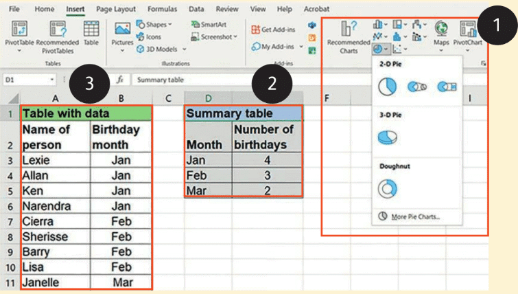
Example: A table showing students’ birth months (e.g., Lexie: Jan, Allan: Jan, Cierra: Feb, Lisa: Mar) is used to create a chart.
- Data is grouped by month, and the number of birthdays per month is counted (e.g., Jan: 4, Feb: 3, Mar: 2).
- This summary data is used to generate a chart.
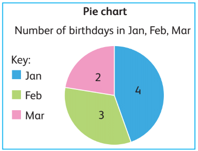
Pie Chart:
- Represents categorical data with slices, where each slice corresponds to a category.
- The size of each slice is proportional to the number of items in that category.
- Example: A pie chart showing birthdays in January (4), February (3), and March (2) has three slices with labels indicating the counts.
Bar Chart:
- Uses horizontal bars to represent categorical data.
- Each bar corresponds to a category, and the length of the bar indicates the number of items in that category.
- Example: A bar chart for birth months shows horizontal bars for January, February, and March, with lengths corresponding to 4, 3, and 2, respectively.
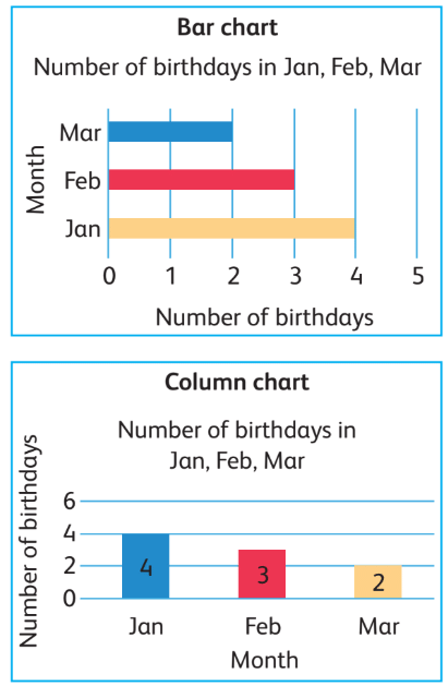
Column Chart:
- Uses vertical columns to represent categorical data.
- Each column corresponds to a category, and the height of the column indicates the number of items in that category.
- Example: A column chart for birth months shows vertical columns for January, February, and March, with heights corresponding to 4, 3, and 2, respectively.
Discrete data
- Discrete data is numerical data that can only take whole number values.
- Examples of discrete data include:
- The number of students in a class (e.g., 20 students, not 20.5).
- The number of cars in a car park (e.g., 10 cars, not 10.3).
- The number of people in a family (e.g., 4 people, not 4.5).
- Discrete data cannot include fractions or decimals because it represents counts of distinct items.
- Spreadsheets can be used to present discrete data as charts and graphs, similar to categorical data.
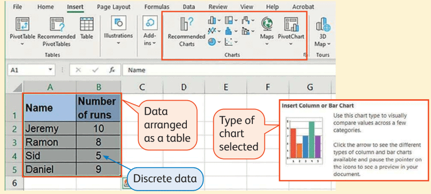
To create a chart for discrete data:
- Data must be organized in a table format.
- The table is selected, and a chart type (e.g., bar or column chart) is chosen.
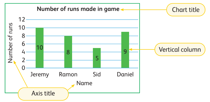
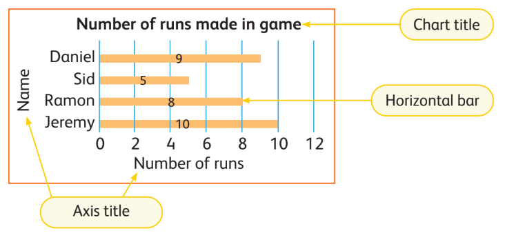
- Example: A table showing the number of runs scored by four boys in a cricket match (Jeremy: 10, Ramon: 8, Sid: 5, Daniel: 9) represents discrete data.
- Discrete data is best presented using bar or column charts.
Column Chart:
- Displays discrete data with vertical columns.
- Each column represents an individual or category (e.g., a boy’s name), and the height shows the value (e.g., number of runs).
- Example: A column chart shows Jeremy (10 runs), Ramon (8 runs), Sid (5 runs), and Daniel (9 runs) with columns of corresponding heights.
Bar Chart:
- Displays discrete data with horizontal bars.
- Each bar represents an individual or category, and the length shows the value.
- Example: A bar chart shows Jeremy (10 runs), Ramon (8 runs), Sid (5 runs), and Daniel (9 runs) with bars of corresponding lengths.
Computing devices
Recording discrete and categorical data
- Data can be collected by asking questions designed to gather either categorical or discrete data.
- Categorical data consists of data that can be grouped into categories, such as yes/no responses or types of items.
- Discrete data consists of numerical data that can only take whole number values, such as the number of tickets.
- Data can be recorded directly into a computing device using input devices, which allow users to type or select answers.
Typical input devices include:
- Keyboard: Used to type text or numbers into a computing device.
- Mouse: Used to point and click to select options on a screen.
- Touchpad: A pointing device used to select or navigate options, often found on laptops.
- Touchscreen: Allows users to interact directly with the screen by touching to select or input data.
Example: An electronic form titled "Going to the Circus" includes two questions:
First question: "Are you going to the circus?" with options "Yes" or "No."
- This question collects categorical data, as the answers fall into distinct categories (Yes/No).
- Users answer by clicking a checkbox, which can be done using a mouse, touchpad, or touchscreen.
Second question: "How many tickets do you want?" requiring a numerical response.
- This question collects discrete data, as the answer is a whole number (e.g., 3 tickets).
- Users answer by typing a number, which requires a keyboard.
A keyboard can be used to enter both:
- Discrete data: By typing numbers (e.g., the number of tickets).
- Categorical data: By typing words or selecting text-based options (e.g., typing "Yes" or "No").
Pointing devices (mouse, touchpad, touchscreen) are typically used to select categorical data options, such as clicking checkboxes or radio buttons on forms.
Did you know?
Infographics are a popular way to present categorical data, making it visually appealing and easy to understand.
Infographics often use:
- Bar charts to show categorical data with horizontal bars.
- Column charts to show categorical data with vertical columns.
- Pie charts to show proportions of categories as slices.
- Pictograms to represent data with images or icons for visual impact.
Keyword
- Decision: A choice made about something based on data analysis.
- Numerical: Data made of numbers, such as counts or measurements.
|
12 docs|12 tests
|
FAQs on Be a Data Expert Chapter Notes - Year 3 Computing IGCSE (Cambridge) - Class 3
| 1. What is the importance of collecting and understanding data? |  |
| 2. How do pie charts and bar charts differ in representing data? | |
| 3. What is discrete data, and how is it different from continuous data? | |
| 4. How can I effectively record discrete and categorical data? | |
| 5. What skills are necessary to become a data expert? | |


Be a Data Expert Chapter Notes | Year 3 Computing IGCSE (Cambridge) - Class 3
,Sample Paper
,Free
,practice quizzes
,Semester Notes
,MCQs
,Be a Data Expert Chapter Notes | Year 3 Computing IGCSE (Cambridge) - Class 3
,mock tests for examination
,Exam
,ppt
,Extra Questions
,Be a Data Expert Chapter Notes | Year 3 Computing IGCSE (Cambridge) - Class 3
,shortcuts and tricks
,Objective type Questions
,Important questions
,Summary
,past year papers
,Viva Questions
,video lectures
,Previous Year Questions with Solutions
,study material
;


Chapter Notes: Be a Data Expert Free PDF Download
Importance of Chapter Notes: Be a Data Expert
Chapter Notes: Be a Data Expert
Chapter Notes: Be a Data Expert Class 3 Questions
Study Chapter Notes: Be a Data Expert on the App
|
© EduRev
|
Education Revolution
|


|


