UPSC Exam  >  UPSC Notes  >  CSAT Preparation  >  Line Graph Examples with Questions

Line Graph Examples with Questions | CSAT Preparation - UPSC PDF Download

Data interpretation Line Graphs

What is a Line Graph?

A modified version of Bar Graph representation is said to be a Line Graph. On connecting the upper points of two adjacent Bars of a Bar Graph we get a line and on further repeating this procedure with other Bars we get a Line Graph representation.

Solving a Line Graph question

Problems based on line graphs appear frequently in competitive exams having data interpretation as a component. Given below is a popular type of question asked from line graphs:
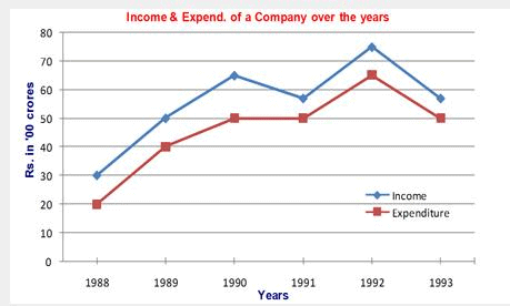
DIRECTIONS: Study the following graph carefully and answer the questions given below.
Line Graph Examples with Questions | CSAT Preparation - UPSC

Example 1: In which of the following years was the percentage increase in income over the previous year the maximum?
1. 1989
2. 1990
3. 1991
4. 1992

Solution: Percentage increase= 100 × Increase/Previous year income. Option 3 is eliminated because there’s a decrease in income in 1991.

In 1989, percentage increase = 100 × 20/30 = 66.67%.

In 1990, percentage increase = 100 × 15/50 = 30%.

In 1992, percentage increase = 100 × 17.5/57.5 = 30.43%

(All the data is in Rs '00 cr.) Thus, Option 1 is the answer.

Alternatively,

For maximum % change, numerator should be the greatest and the denominator should be smallest. The numerator for 1989 is the greatest, while the denominator for the same year is the lowest as compared to corresponding figures for 1990 and 1992. So, you need not to find the exact percent increase of all the options given. Hence, answer is 1st option.
Example 2: What was the average income of the company over the years (approximately)?
1. 4500 cr
2. 500 cr
3. 5500 cr
4. 550 cr

Solution: Average in Rs '00 cr. = (30 + 50 +65 + 55 + 75 + 55)/6 = 55 =>Average= Rs 5500 cr. Hence, answer is 3rd option.

Example 3: What is the ratio of income to expenditure in the year 1990?
1. 1.2
2. 1.3
3. 1.1
4. 1.4
Solution: The income in the year 1990 is Rs. 6500 cr. and the expenditure is Rs. 5000 cr. Thus, the ratio in the year 1990 will be 6500/5000 = 1.3. Hence, answer is 2nd option.

Example 4: The total expenditure in 1988 and 1989 together was equal to the income in which of the following years?

1. 1900
2. 1991

3. 1993
4. None of these

Solution: The total expenditure in 1988 and 1989 together = Rs. 6000cr, which does not match with any other year's expenditure. So, the correct answer will be Option 4.

The document Line Graph Examples with Questions | CSAT Preparation - UPSC is a part of the UPSC Course CSAT Preparation.
All you need of UPSC at this link: UPSC
218 videos|139 docs|151 tests

Top Courses for UPSC

FAQs on Line Graph Examples with Questions - CSAT Preparation - UPSC

1. What is a line graph?
A line graph is a type of chart that displays data points connected by line segments. It is commonly used to show the change in a variable over time or to compare multiple variables. The x-axis represents the time or independent variable, while the y-axis represents the dependent variable being measured.
2. How do you interpret a line graph?
To interpret a line graph, you should look at the trend or pattern of the line. If the line is increasing, it indicates a positive relationship between the variables. Conversely, a decreasing line suggests a negative relationship. The steepness of the line also provides information about the rate of change. Additionally, comparing multiple lines on the same graph allows for comparisons and identifying relative trends.
3. What are the advantages of using a line graph?
Line graphs have several advantages. Firstly, they provide a clear visual representation of the data, making it easier to understand trends and patterns. Secondly, line graphs are effective in showing changes over time, making them suitable for tracking progress or analyzing historical data. Lastly, line graphs allow for easy comparison of multiple variables, enabling the identification of relationships or correlations.
4. How can I create a line graph in Excel?
To create a line graph in Excel, you can follow these steps: 1. Enter your data into an Excel spreadsheet. 2. Select the data range you want to include in the graph. 3. Go to the "Insert" tab in the Excel toolbar. 4. Click on the "Line" chart type and choose the desired subtype. 5. Excel will generate the line graph based on your selected data.
5. What are some common mistakes to avoid when creating line graphs?
When creating line graphs, it is important to avoid certain mistakes to ensure accurate representation of the data. Some common mistakes to avoid include: - Using a line graph when the data points are not connected or continuous. - Mislabeling the axes or failing to provide units of measurement. - Using a line graph when there are too many data points, making it difficult to interpret. - Choosing inappropriate scaling for the axes, leading to distorted representation of the data. By avoiding these mistakes, you can create line graphs that effectively communicate the intended information.
218 videos|139 docs|151 tests
Download as PDF
Explore Courses for UPSC exam

Top Courses for UPSC

Signup for Free!
Signup to see your scores go up within 7 days! Learn & Practice with 1000+ FREE Notes, Videos & Tests.
10M+ students study on EduRev
Related Searches

Free

,

Line Graph Examples with Questions | CSAT Preparation - UPSC

,

Line Graph Examples with Questions | CSAT Preparation - UPSC

,

Summary

,

Previous Year Questions with Solutions

,

Objective type Questions

,

practice quizzes

,

Viva Questions

,

shortcuts and tricks

,

pdf

,

Line Graph Examples with Questions | CSAT Preparation - UPSC

,

mock tests for examination

,

ppt

,

Important questions

,

Exam

,

Semester Notes

,

Sample Paper

,

video lectures

,

study material

,

MCQs

,

past year papers

,

Extra Questions

;