Solved Examples: Pie Charts | Quantitative Aptitude for SSC CGL PDF Download
Definition
A pie chart is a graphical depiction employed to present data in a circular format, resembling the slices of a pie. Its common use is to illustrate the contributions of various parts or categories to a complete whole.
What is a Pie Chart?
A pie chart is a visual representation in a circular geometric form that displays data, information, numerical values, and statistics through easily interpretable 'pie slices' of varying sizes, indicating the proportion of each data component. The size of each slice corresponds to the amount of that specific data category, with larger slices representing a higher quantity of grouped data.
How to solve Pie Chart Questions and Answers
- Initiate with your intended illustration: Your chart's title should directly address the main topic.
- Collect the data: Pie charts are designed to represent percentages. Ensure that the cumulative percentages equal 100%, and rectify any rounding discrepancies that may result in a total different from 100%. SmartDraw allows for direct entry of percentages into a pie chart template, or you can adjust the size of each wedge manually.
- Consider incorporating a legend: If a wedge is too compact to accommodate text, you can craft a label and draw a line to indicate the corresponding slice. Alternatively, you can devise a key that clarifies the representation of each color.
Some Important Points about Pie Chart
- Pie charts are straightforward and demand minimal effort for comprehension.
- Well-suited for illustrating data portraying components of a whole—examples include budget allocations, market share, or demographic composition.
- Possess visual appeal, enhancing the engagement and memorability of your data presentation.
Below is a Sample image to understand what Pie chart is
The below image shows the expenditure of Mukesh and Nita in terms of a Pie chart.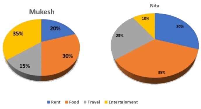
Solved Examples
Example 1: The following pie-charts displays the percentage distribution Indian market share by Value of different smartphone companies for the year 2009.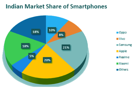 The following pie-charts displays the percentage distribution Indian market share by Volume of different smartphone companies for the year 2009.
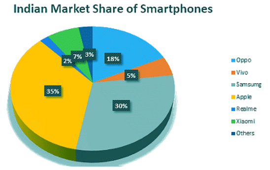 Number of smartphones sold in 2009 in India = 2,500
Value of smartphones sold in 2009 in India = Rupees 45, 000,000
For the year 2009, what is the average unit sales price of Apple and Samsung smartphones?
(a) 22886
(b) 22550
(c) 22850
(d) 22880
Ans: (a)
Apple has 20% value share and 35% volume share.
20% of 45, 000,000 = 20 * 45000000/100 = 9000000
35% of 2500 = 35 * 2500/100 = 875
Therefore, average unit sale price of Apple = 9000000/875 = 10286(Approximately)
Samsung has 21% value share and 30% volume share.
21% of 45, 000,000 = 21 * 45000000/100 = 9450000
30% of 2500 = 30 * 2500/100 = 750
Therefore, average unit sale price of Apple = 9450000/750= 12600
Therefore, the average unit sales price of Apple and Samsung smartphones = 10286 + 12600 = 22886
Example 2: The following pie-charts displays the percentage distribution Indian market share by Value of different smartphone companies for the year 2009. The following pie-charts displays the percentage distribution Indian market share by Volume of different smartphone companies for the year 2009.
Number of smartphones sold in 2009 in India = 2,500
Value of smartphones sold in 2009 in India = Rupees 45, 000,000
For the year 2009, what is the average unit sales price of Apple and Samsung smartphones?
(a) 22886
(b) 22550
(c) 22850
(d) 22880
Ans: (a)
Apple has 20% value share and 35% volume share.
20% of 45, 000,000 = 20 * 45000000/100 = 9000000
35% of 2500 = 35 * 2500/100 = 875
Therefore, average unit sale price of Apple = 9000000/875 = 10286(Approximately)
Samsung has 21% value share and 30% volume share.
21% of 45, 000,000 = 21 * 45000000/100 = 9450000
30% of 2500 = 30 * 2500/100 = 750
Therefore, average unit sale price of Apple = 9450000/750= 12600
Therefore, the average unit sales price of Apple and Samsung smartphones = 10286 + 12600 = 22886
Example 3: The following pie-charts displays the percentage distribution Indian market share by Value of different smartphone companies for the year 2009. The following pie-charts displays the percentage distribution Indian market share by Volume of different smartphone companies for the year 2009.
Number of smartphones sold in 2009 in India = 2,500
Value of smartphones sold in 2009 in India = Rupees 45, 000,000
For the year 2009, what is the average unit sales price of Vivo smartphones?
(a) 25500
(b) 27700
(c) 29500
(d) 28800
Ans: (d)
Vivo has 8% value share and 5% volume share.
8% of 45, 000,000 = 8 * 45000000/100 = 3600000
5% of 2500 = 5 * 2500/100 = 125
Therefore, average unit sale price = 3600000/125 = 28800
Example 4: The pie-charts below displays the percentage distribution of people going out of India and the age group of those people. Study the pie-chart below carefully and then answer the questions accordingly.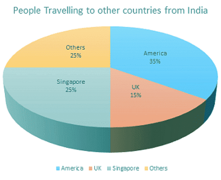

If between other countries, Germany accounted for 27% of the Indian people traveling, and it is recognized from records that a total of 20 lakh Indian tourists had gone to Germany during the year, then how many people of 25-35 year who went abroad in that year?
(a) 18 lakh
(b) 180 Lakh
(b) 175 Lakh
(c) 75 Lakh
Ans: (b)
Tourist from other countries to Germany is 25%
Among that 25%, 27% is Indian people
Therefore, 27% of 25% = 2% corresponding to Indian people in Germany
2% corresponds of Germany’s 20 Lakh.
1% = 10 lakh.
Therefore 18%(25-35 year of age) = 18 * 10 = 180 Lakh people.
Example 5: The pie-charts below displays the percentage distribution of people going out of India and the age group of those people. Study the pie-chart below carefully and then answer the questions accordingly.


Find the ratio of the number of Indian people that went to America to the number of Indian people whose age was below 25 years.
(a) 35 : 11
(b) 22 : 7
(c) 5 : 1
(d) 10 : 3
Ans: (a)
The percent of the number of Indian people that went to America = 35%
The percent of the number of Indian people whose age was below 25 years = 11%
Therefore, ratio = 35 : 11
Example 6: The pie-charts below displays the percentage distribution of people going out of India and the age group of those people. Study the pie-chart below carefully and then answer the questions accordingly.

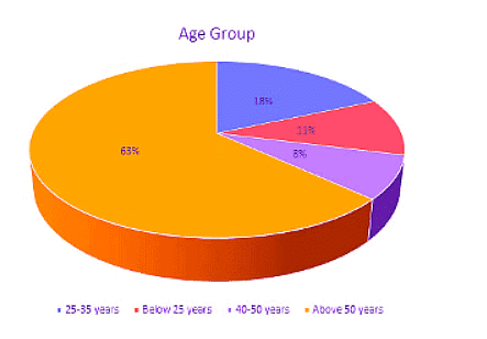
What percent of Indian people went to UK or Singapore?
(a) 35%
(b) 40%
(c) 41%
(d) 58%
Ans: (b)
According to the 1st chart above the Indian people went to UK is 15% and Indian people went to Singapore is 25%
Therefore, Indian people went to UK or Singapore = 15 + 25 = 40%.
Example 7: The following pie-chart displays the percentage distribution of the cost in self-publishing a book. Study the pie-chart below and then answer the questions accordingly.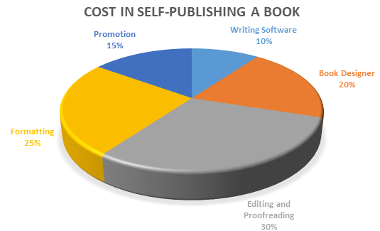
By how much amount the formatting of the book is a lesser amount for editing the book?
(a) 25%
(b) 16.66%
(c) 51%
(d) 32%
Ans: (b)
Editing Cost = 30% of the cost price of the book
Formatting cost = 25% of the cost price of the book
Difference = (30%) - (25%) = 5%
Therefore, percentage difference = 5% / Editing cost * 100
= 5/30 * 100 = 16.66%
Example 8: The following pie-chart displays the percentage distribution of the cost in self-publishing a book. Study the pie-chart below and then answer the questions accordingly.
If 4200 copies of the book are published and its cost for editing and proofreading cost is 65800, then find at what price the seller will sell the book if he wants to earn 20% profit?
(a) 61.5
(b) 62.66
(c) 69.05
(d) None of the above
Ans: (b)
For the seller wants to earn 20 % profit, then selling price = 120% of cost price.
Also editing and proofreading cost = 30% of C.P.
Then, let us assume the selling price of 4200 books as x
Then, 30 : 120 = 65800 : x
x = 120 * 65800 / 30 = 263200
Therefore, selling price of one book = 263200/4200 = Rs. 62.66
Example 9: The following pie-chart displays the percentage distribution of the cost in self-publishing a book. Study the pie-chart below and then answer the questions accordingly.
Find the sector’s central angle which is corresponding to the amount paid on Book Designing?
(a) 54o
(b) 68o
(c) 72o
(d) 81o
Ans: (c)
Sector’s central angle corresponding to Book Designing: 20% of 360o
= 20/100 * 360 = 72o.
Example 10: The following pie-chart displays the percentage distribution of the cost in self-publishing a book. Study the pie-chart below and then answer the questions accordingly.
If for certain number of books, the publisher paid the amount of Rs. 21,500 for the cost for book designer, then how much amount will be paid for promotion of the book?
(a) 16125
(b) 18559
(c) 12489
(d) 16000
Ans: (a)
Let the amount paid for promotion be x
Then, 20 : 15 = 21500 : x
x = 21500 * 15/20 = 16125
Therefore, the amount paid for promotion is Rs. 16125.
|
315 videos|182 docs|185 tests
|
FAQs on Solved Examples: Pie Charts - Quantitative Aptitude for SSC CGL
| 1. What is a pie chart? |  |
| 2. What are the main uses of a pie chart? |  |
| 3. How is data represented in a pie chart? |  |
| 4. What are the advantages of using a pie chart? |  |
| 5. Are there any limitations or drawbacks of using a pie chart? |  |


