Diagrammatic Representation of data - Presentation of Data, Business Mathematics & Statistics | SSC CGL Tier 2 - Study Material, Online Tests, Previous Year PDF Download

DIAGRAMATIC REPRESENTATION OF DATA
Data : A statistician begins the work with the collection of data i.e. numerical facts. The data so collected are called raw materials (or raw data). It is from these raw materials, a statistician analysis after proper classification and tabulation, for the final decision or conclusion. Therefore it is undoubtedly important that the raw data collected should be clear, accurate and reliable. Before the collection of data, every enquiry must have a definite object and certain scope, that is to say, what information will be collected for whom it will be collected, how often or at what periodically it will be collected and so on. If the object and the scope of enqiry are not clearly determined before hand, difficulties may arise at the time of collection which will be simply a wastage of time and money.
Statistical Units : The unit of measurement applied to the data in any particular problem is the statistical unit. Physical units of the measurement like quintal, kilogramme, metre, hour and year, etc. do not need any explanation or definition. But in some cases statistician has to give some proper definition regarding the unit. For examples, the wholesale price of commodity. Now what does the form ‘wholesale price’ signify ? Does it stand for the price at which the producer sells the goods concrened to the stockist, or the price at which the stockist sells to a wholesaler ? Is it the price at which the market opened at the day of enquiry ? Many such problems may arise as stated. It is thus essential that a statistician should define the units of data before he starts the work of collection.
Types of Methods of Collection of Data : Statistical data are usually of two types :
(i) Primary, (ii) Secondary
Data which are collected for the first time, for a specific purpose are known as primary data, while those used in an investigation, which have been originally collected by some one else, are known as secondary data.
For example, data relating to national income collected by government are primary data, but the same data will be secondary while those will be used by a different concern. Let us take another example, known to everyone. In our country after every ten years counting of population is done, which is commonly known as Census. For this data are collected by the Government of India.
The data collected are known as primary data. Now in the data, except population information about age of persons, education, income etc. are available. Now a separate department of the government or any other private concern use these related data for any purpose, then the data will be known as secondary data to them.
Data are primary to the collector, but secondary to the user.
Example.
For primary data :
(i) Reserve Bank of India Bulletin (monthly)
(ii) Jute Bulletin (monthly), (published by Govt. of India).
(iii) Indian Textile Bulletin (monthly).
(vi) Statement of Railway Board (yearly), (published by Ministry of Railway, Govt. of India).
For secondary data : (i) Statistical Abstract of the Indian Union (ii) Monthly Abstract of Statictics. (iii) Monthly Statistical Digest. (iv) International Labour Bulletin (monthly).
Primary Method : The following methods are common in use :
(i) Direct Personal Observation : Under this method, the investigator collects the data personally. He has to go to the spot for conducting enquiry has to meet the persons concerned. It is essential that the investigator should be polite, tactful and have a sense of observation. This method is applicable when the field of enquiry is small and there is an intention of greater accuracy. This method however, gives satisfactory result provided the investigator is fully dependable.
(ii) Indirect Oral Investigation : In this method data are collected through indirect sources. Persons having some knowledge regarding the enquiry are cross-examined and the desired information is collected. Evidence of one person should bot be relied, but a number of views should be taken to find out real position. This method is usually adopted by enquiry committees or commissions appointed by governments or semi-government or private institutions.
(iii) Schedules and Questionnaires : A list of questions regarding the enquiry is prepared and printed. Data are collected in any of the following ways :
(a) By sending the questionnaire to the persons concerned with a request to answer the questions and return the questionnaire.
(b) By sending the questionnaire through enumerators for helping the informants.
(iv) Local Reports : This method does not imply a formal collection of data. Only local agents or correspondents are requested to supply the estimate required. This method gives only approximate results, of course at a low cost.
Secondary Method : The main sources from which secondary data are collected are given below–
(i) Official publications by the Central and State Government, District Boards,
(ii) Reports of Committees, Commissions.
(iii) Publications by Research Institutions, Universities,
(iv) Economic and Commercial Journals.
(v) Publications of Trade Associations, Chambers of Commerce, etc.
(vi) Market reports, individual research works of Statisticians.
Secondary data are also available from unpublished records of government offices, chambers of commerce, labour bureaus, etc.
Editing and Scrutiny : Secondary data should be used only after careful enquiry and with due criticism. It is advisable not to take them at their face value. Scrutiny is essential because the data might be inaccurate, unsuitable and inadequate. According to Bowley, “It is never safe to take published statistics at their face value without knowing their meanings and limitations ….”
Universe or Population : Statistics is taken in relation to a large data. Single and unconnected data is not statistics. In the field of any statistical enquiry there may be persons, items or any other similar units. The aggregate of all such similar units under consideration is called Universe or Population. That is, for collecting the data regarding height, weight or age of the male candidates who appeared in the last H.S. Examination, the aggregate of such candidates is universe. Universe may be aggregate of items or any other similar things other than persons. The books in your college library or produced goods in a factory may be taken as Universe. Population may be finite or infinite according to finite or infinite number of members. In the field of enquiry if the number of units is finite, then Population or Universe is finite. For Example, first class cricket or football players in India is finite. But the temperature in any day at Calcutta is infinite, although temperature lies between two finite limits. Within these two finite limits it takes up an infinity of values.
Sample : If a part is selected out of the Universe then the selected part (or portion) is sample. It means sample is a part of the Universe. So, suppose the screws or bulbs produced in a factory are to be tested. The aggregate of all such items is universe but it is not possible to test every item. So in such case, a part of the whole i.e., universe is taken and then tested. Now this part is known as sample.
Note. While collecting primary data (discussed before) it should be decided at first whether the purpose will be solved if collection is made from universe or sample.
Clasification and Tabulation
Classification : It is the process of arranging data into different classes or group according to resemblance and similarities. An ideal classification should be unambiguous, stable and flexible. Type of Classification :
There are two types of classification depending upon the nature of data.
(i) Classification according to attribute – if the data is of a descriptive nature having several qualifications i.e. males, female, illiterate, etc.
(ii) Classification according to class-interval if the data are expressed in numerical quantities i.e… ages of person vary and so do their heights and weights.
Classification according to Attributes :
(i) Simple classification is that when one attribute is present i.e. classification of persons according to sex –males or female.
(ii) Manifold classification is that when more than one attributes are present simultaneously two attributes deafness and sex. A person may be either deaf or not deaf, further a person may be a male or a female. The data, thus are to be divided into four classes :-
(a) males who are deaf,
(b) males who are not deaf,
(c) females who are deaf,
(d) females who are not deaf.
The study can be further continued, if we find another attribute, say religion.
Classification according to Class-intervals : The type arises when direct measurements of data is possible. Data relating to height, weight, production etc. comes under this category. For instance persons having weight, say 100-110 Lbs, can form one group, 110-120 lbs. another group and so on. In this way data are divided into different classes ; each of which is known as class interval. Number of items which fall in any class-interval is known as class frequency. In the class-intervals mentioned above, the first figures in each of them are the lower limits, while the second figure are the upper limits. The difference between the limits of a class interval is known as magnitude of the class interval. If for each class intervals the frequencies given are aggregates of the preceding frequencies, they are known as cumulative frequencies. The frequencies may be cumulated either from top or from below.
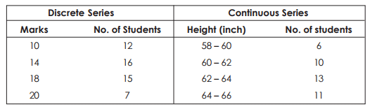
DISCRETE AND CONTINUOUS SERIES : Statistical series may be either discrete or continuous. A discrete series is formed from items which are exactly measurable, Every unit of data is separate, complete and not capable of divisions. For instance, the number of students obtaining marks exactly 10, 14, 18, 29, can easily be counted. But phenomenon like height or weight cannot be measured exactly or with absolute accuracy. So the number of students (or individuals) having height exactly 5’ 2” cannot be counted. Exact height may be either 5’2” by a hundredth part of an inch. In such cases, we are to count the number of students whose heights lie between 5’ 0” to 5’ 2”. Such series are known as ‘continuous’ series.
Example 1:
TABULATION : Tabulation is a systematic and scientific presentation of data in a suitable form for analysis and interpretation. After the data have been collected, they are tabulated i.e. put in a tabular form of columns and rows. The function of tabulation is to arrange the classified data in an orderly manner suitable for analysis and interpretation. Tabulation is the last stage in collection and compilation of data, and is a kind of steppingstone to the analysis and interpretation.
A table broadly consists of five parts –
(i) Number and Title indicating the serial number of the table and subject mater of the table.
(ii) stub i.e. the column indicating the headings or rows.
(iii) Caption i.e. the headings of the column (other than stub)
(iv) Body i.e. figures to be entered in the table
(v) Foot-note is source from which the data have been obtained. Thus table should be arranged as follows :- 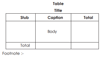
Types of Tabulation : Mainly there are two types of tables – Simple and Complex. Simple tabulation reveals information regarding one or more groups of independent question, while complex table gives information about one or more interrelated questions.
Advantages of Diagrammatic Data Presentation
- Easy to understand – Diagrammatic data presentation makes it easier for a common man to understand the data. Diagrams are usually attractive and impressive and many newspapers and magazines use them frequently to explain certain facts or phenomena. Modern advertising campaigns also use diagrams.
- Simplified Presentation – You can represent large volumes of complex data in a simplified and intelligible form using diagrams.
- Reveals hidden facts – When you classify and tabulate data, some facts are not revealed. Diagrammatic data presentation helps in bringing out these facts and also relations.
- Quick to grasp – Usually, when the data is represented using diagrams, people can grasp it quickly.
- Easy to compare – Diagrams make it easier to compare data.
- Universally accepted – Almost all fields of study like Business, economics, social institutions, administration, etc. use diagrams. Therefore, they have universal acceptability.
Limitations of Diagrammatic Data Presentation
You need to exercise caution while drawing inferences from diagrams. Here are some of their limitations:
- Provides vague ideas – While diagrams offer a vague idea about the problem, it is useful only to a common man. An expert, who seeks an exact idea of the problem cannot benefit from them.
- Limited information – Classified and tabulated data provides more information than diagrams.
- Low precision – Diagram offer a low level of precision of values.
- Restricts further data analysis – Diagrams do not allow the user to analyze the data further.
- Portrays limited characteristics – Diagrams tend to portray only a limited number of characteristics. Therefore, it is difficult to understand a large number of characteristics using diagrams.
- A possibility of misuse – Sometimes diagrams are misused to present an illusory picture of the problem.
- Fail to present a meaningful look in certain situations – If the data has various measurements and wide variation, then diagrams do not present a meaningful look.
- Careful usage – If diagrams are drawn on a false baseline, then the user must analyze them carefully.
|
1597 videos|1638 docs|920 tests
|
FAQs on Diagrammatic Representation of data - Presentation of Data, Business Mathematics & Statistics - SSC CGL Tier 2 - Study Material, Online Tests, Previous Year
| 1. What is the importance of diagrammatic representation of data? |  |
| 2. What are the different types of diagrams used for data presentation? | |
| 3. How can diagrammatic representation of data enhance business decision-making? | |
| 4. What are the key steps to create an effective diagram for data presentation? | |
| 5. What are the advantages of using diagrammatic representation of data over textual representation? | |


Viva Questions
,Extra Questions
,Diagrammatic Representation of data - Presentation of Data
,past year papers
,Online Tests
,Business Mathematics & Statistics | SSC CGL Tier 2 - Study Material
,Diagrammatic Representation of data - Presentation of Data
,Sample Paper
,Semester Notes
,Business Mathematics & Statistics | SSC CGL Tier 2 - Study Material
,Objective type Questions
,Diagrammatic Representation of data - Presentation of Data
,Previous Year
,Previous Year
,Business Mathematics & Statistics | SSC CGL Tier 2 - Study Material
,Online Tests
,Online Tests
,Summary
,Exam
,ppt
,practice quizzes
,video lectures
,shortcuts and tricks
,Important questions
,mock tests for examination
,study material
,Previous Year Questions with Solutions
,MCQs
,Previous Year
,Free
;


Diagrammatic Representation of data - Presentation of Data, Business Mathematics & Statistics Free PDF Download
Importance of Diagrammatic Representation of data - Presentation of Data, Business Mathematics & Statistics
Diagrammatic Representation of data - Presentation of Data, Business Mathematics & Statistics Notes
Diagrammatic Representation of data - Presentation of Data, Business Mathematics & Statistics SSC CGL Questions
Study Diagrammatic Representation of data - Presentation of Data, Business Mathematics & Statistics on the App
|
© EduRev
|
Education Revolution
|


|


within 7 days!