Data Handling Class 5 Notes Maths
| Table of contents |
|
| Introduction |
|
| Pictographs and Bar Graphs |
|
| Double Bar Graphs |
|
| Pie Chart |
|
| Line Graph |
|

Introduction
- Data is often conveyed through visual means such as tables, images, bars and diagrams. Data handling utilizes visual representations like images, bars or figures to enhance our understanding of numerical data.
- Data handling serves as the collection of raw information which forms the basis from which statistics are derived. Statistics represent the outcomes of data which includes the processes of interpretation and presentation.
Types of Data
Data is classified into two types:
(i) Quantitative Data: Data that gives numerical information. For example: height of students of grade 5.
(ii) Qualitative Data: Data that gives descriptive information about anything. For example: blood types.
Types of Graphical Representations
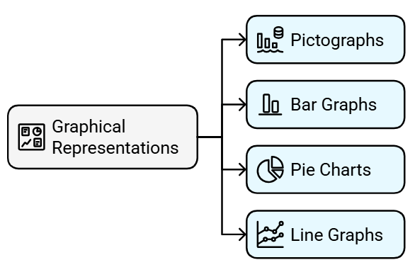
Pictographs and Bar Graphs
You have already learnt about pictographs and bar graphs in Class IV.
Let us revise the same with the help of the following example.
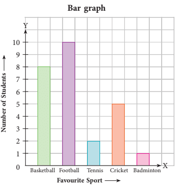
Example 1: Rohit conducted a study in his class of 26 students to know about their favourite sports. Below is the given data.
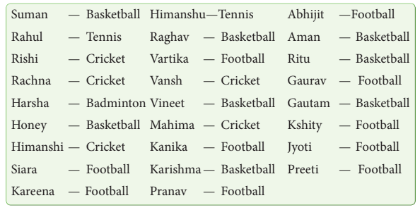
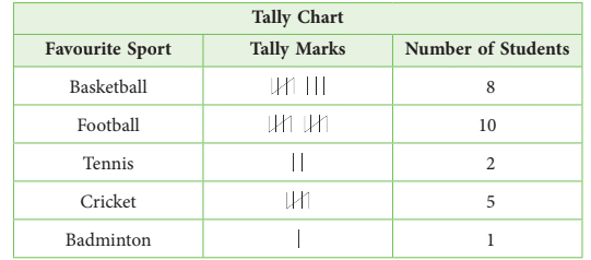
Draw a tally chart, pictograph and bar graph for the above data.
Sorting out the data according to the favourite sport of students, we have,
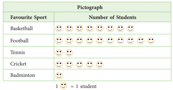
Let us take the symbol
to represent 1 student. Now, drawing a pictograph, we get
Now, we draw the bar graph for the given data. The horizontal axis, i.e., X-axis represents the favourite sport, the vertical axis, i.e., Y-axis represents the number of students.
Choose a title for the bar graph. Here, the title is “Favourite sport of students.”
Reading a Bar Graph
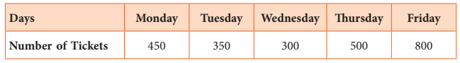
Example 2: The following bar graph shows the tickets for the movie ‘Avengers’ sold in the following week for a particular showtime.
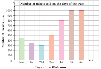
Look at the graph given above and answer the questions that follow.
1. On which day were the least number of tickets sold?
2. On which days were the maximum tickets sold?
3. How many tickets were sold altogether from Mon-Fri?
Ans:
1. The maximum number of tickets, i.e., 1000 tickets, were sold on the weekends — Saturday and Sunday.
2. Analysing the bar graph, we can see that the least number of tickets, i.e., 300 tickets were sold on Wednesday.
3. Total number of tickets = 450 + 350 + 300 + 500 + 800 = 2400.Thus, 2400 tickets were sold from Monday to Friday.
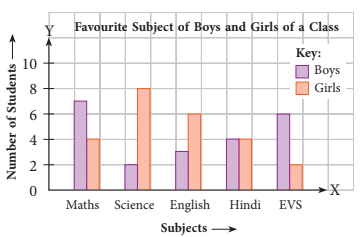
Double Bar Graphs
- A graphical display of information using two bars of different or same heights, beside each other, to compare the data is called a double bar graph.
Example 3: Arpita conducted a survey in her class to find out which subjects the boys and girls of her class liked the most. She recorded the results in a tabular form as under:
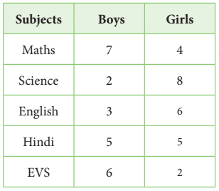
Ans: To draw a double bar graph, follow these steps:
Step 1. Take two axes.
Mark the vertical axis as ‘Number of Students’ and the horizontal axis as ‘Subjects’.Step 2. Choose an appropriate scale for the vertical axis.
Here, you may take, 1 cm = 2 students.
Step 3. For each subject, draw one graph for boys and one for girls. Make a key to show boys and girls bars.
Step 4. Give a title to the graph.
Pie Chart
- A pie chart, often called a circle graph, is a visual representation of data divided into sectors, where each sector represents a part or a percentage of the whole.
- The pie chart illustrates the favourite activities of a group of people. From the chart, we can see that boxing is the most liked activity at 40%, followed by walking at 24% and swimming at 18%.
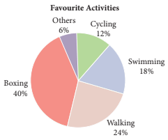
- Even without the exact percentages, the size of the sectors makes it easy to see which activity is most popular.
- Reading a pie chart is simple; just look for the biggest section (pie slice), as it represents the most important information compared to the others.
Example 4: The following pie chart shows the favourite superhero of a group of children.
Look at the pie chart and answer the questions that follow.
(a) Which superhero is the most popular?
(b) Which superhero is the least popular?
(c) What per cent of people said Iron Man is their favourite?
(d) What per cent of people said either Iron Man or Batman is their favourite?
(e) Which two heroes did about half the people say is their favourite?
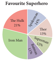
(a) As the sector that shows Iron Man is the biggest, we say that Iron Man is the most popular.
(b) The sector showing Batman is the smallest with 11% of the children preferring him.
(c) As a whole means 100%, therefore, per cent of people with Iron Man as favourite
= 100% – (21% + 14% + 13% + 12% + 11%)
= 100% – 71% = 29%
(d) We add the sectors of Iron Man and Batman. So, 29% + 11% = 40%.
(e) As can be seen from the graph, half the circle is occupied by The Hulk and Iron Man.
Example 5: The following pie chart shows the old books, clothes and other things collected by five sections of Class 5 of a school for a charity fair. Study the pie chart and answer the following questions.
(a) What per cent of things did section B collect?
(b) Which section could collect the least amount of things?
(c) Which two sections collected the same amount of things?
(d) How much more did section D collect than section A?
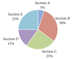
(a) Section B collected 30% of the things.
(b) Section A could collect the least amount of things.
(c) Section C and section E collected same amount of things.
(d) Difference in collection of section D and Section A = (15% – 5%) = 10%
Line Graph
Line Graph is a type of pictorial representation of information or data that changes continuously over time. It has a vertical axis and a horizontal axis, as in the case of bar graphs. It represents data using points connected by line segments.
Given below is an illustration of a line graph with its various parts defined below.
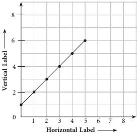
Now that we are familiar with the parts of a line graph, we try to understand a line graph and interpret a line graph with the help of some examples.
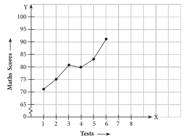
Example 6: The table given below shows Kartik’s Maths scores in weekly tests taken over a period of 6 weeks.
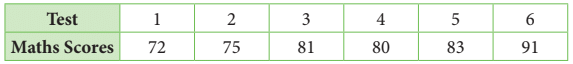
Draw a line graph for the given data.
These test scores have been summarised in the line graph as shown below.
Interpreting a Line Graph
Example 7: The following line graph shows the total number of animals in a zoo.
Look at the graph and answer the questions that follow.
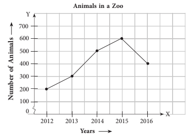
(a) In which year did the zoo have the largest number of animals?
(b) What is the percentage increase of animals in the zoo from 2012 to 2016?
(c) What is the decrease in the number of animals in the zoo from 2015 to 2016?
(d) Between which years were the increase in the number of animals maximum?
(a) 2015
(b) (400 – 200)/200 × 100% = 100%
(c) 600 – 400 = 200
(d) 2013-2014
Example 8: The following line graph shows the number of people in a grocery store
at different times during the day.
Look at the graph carefully and answer the questions given below.
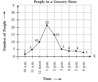
(a) What is the line graph about?
(b) What is the busiest time of the day at the store?
(c) At what time does the business start to slow down?
(d) How many people are there in the store when it opens?
(e) About how many people are there in the store at 2:30 p.m.?
(f) What was the greatest number of people in the store?
(a) Number of people in a grocery store
(b) 1 p.m.
(c) 3 p.m.
(d) 2
(e) 10(f) 22
|
96 videos|462 docs|47 tests
|
FAQs on Data Handling Class 5 Notes Maths
| 1. What is a pictograph and how is it used in data handling? |  |
| 2. How is a bar graph read and interpreted? | |
| 3. What are double bar graphs and when are they used? | |
| 4. How are pie charts used in data handling? | |
| 5. What is the purpose of a line graph and how is it interpreted? | |


Data Handling Class 5 Notes Maths
,Summary
,practice quizzes
,MCQs
,Sample Paper
,shortcuts and tricks
,ppt
,Data Handling Class 5 Notes Maths
,Viva Questions
,Extra Questions
,Important questions
,Data Handling Class 5 Notes Maths
,Exam
,study material
,Objective type Questions
,Semester Notes
,mock tests for examination
,Free
,past year papers
,Previous Year Questions with Solutions
,video lectures
;


Chapter Notes: Data Handling Free PDF Download
Importance of Chapter Notes: Data Handling
Chapter Notes: Data Handling
Chapter Notes: Data Handling Class 5 Questions
Study Chapter Notes: Data Handling on the App
|
© EduRev
|
Education Revolution
|


|


