What is Data Interpretation? | General Test Preparation for CUET UG - CUET Commerce PDF Download

Introduction
Data interpretation involves analyzing provided data and utilizing it to derive the necessary information. This data can be presented in diverse formats such as tables, pie charts, line graphs, bar graphs, or a combination thereof. Data interpretation is important in competitive exams as it tests analytical skills and helps candidates quickly analyze and draw conclusions from data. It improves problem-solving abilities and time management, making it essential for success in various exams.

What is the Data Interpretation Method?
Data interpretation method is a way to analyze and help people make sense of numerical data which has been collected, analyzed and presented. When data is collected, it normally stays in a raw form which may be difficult for the normal person to comprehend, and that is why we try to break down the information gathered to make sense of it. These methods are essential for extracting meaningful information and answering questions accurately in competitive exams.
There are 2 principal methods by which data interpretation can be done:
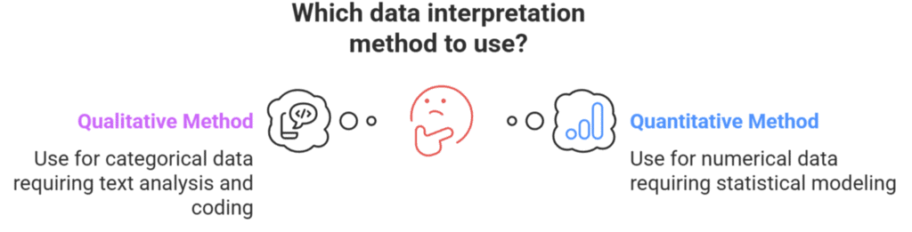
1. Qualitative Data Interpretation Method
Qualitative data interpretation is used to analyze categorical data, which is represented through text instead of numbers. This data needs to be coded into numbers for analysis, as text is time-consuming. The coding process is documented for future use and review. There are two types of qualitative data: nominal and ordinal. Both use the same method for analysis, but ordinal data is easier to interpret. Ordinal data is often labeled with numbers during data collection, so coding may not be necessary, whereas nominal data still requires coding for proper interpretation.
2. Quantitative Data Interpretation Method
Quantitative data interpretation is used to analyze numerical data, which consists of numbers rather than text. It is divided into two types: discrete and continuous data. Continuous data is further classified into interval and ratio data, all of which are numeric. Since quantitative data is already in numeric form, coding is not required before analysis. Analyzing this data involves statistical techniques like standard deviation, mean, and median.
Visualization Techniques in Data Analysis
Data visualization is the graphical representation of data using charts, graphs, and maps. It helps us understand trends, outliers, and patterns in data more easily. In the era of Big Data, these tools are essential for interpreting large datasets and making informed decisions. Humans are naturally drawn to colors and patterns, allowing us to quickly spot differences, such as red versus blue or square versus circle. Data visualization functions as a form of visual art that captures attention and helps us quickly grasp the message by making trends and outliers visible and easier to understand.Types of Data Interpretation
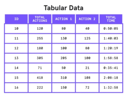
The various types of Data Interpretation are given below:1. Tabular DI: In Tabular DI, data is provided in horizontal rows and vertical columns called tabular form. A table is one of the simplest and most convenient tools used for summarizing data and presenting it in a meaningful way. In a table, data is arranged systematically in columns and rows. While reading a table, the following parts need to be given careful observation.
- Title of the Table: It gives the description of the content of the table and precisely describes the kind of data, measurements and the period for which it occurred.
- Column Heading: This defines the information contained in the various columns with specifications of the unit of measurement in some cases.
- Head Note: In general, the unit of measurement is specified in the head note.
- Footnote: These are used to point out any exceptions in arriving at the data.
2. Pie Charts:
A pie chart is a circular chart divided into sectors, where each sector's area is proportional to the value it represents. The entire circle represents 100% or 360°, and each slice shows a portion of the total data, often in percentages or fractions. Pie charts can be of two types:
- Exploded Pie Chart: One or more sectors are separated to highlight specific data points.
- Doughnut Pie Chart: Similar to a pie chart but with a blank center, allowing for multiple statistics to be shown at once. It also comes in exploded versions.
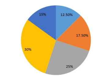
Pie graph
3. Bar Graph:
A bar graph displays data using horizontal or vertical bars. The x-axis shows categories, and the y-axis shows values. Bar graphs can be:
- Grouped Bar Graph: Groups of bars are clustered together for comparison.
- Cumulative (Stacked) Bar Graph: Bars are divided into sub-parts to show the cumulative effect of different categories.
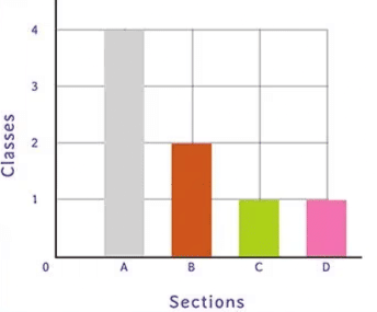
Bar Graph
4. Line Graph: A line graph shows the relationship between two changing variables over time, using a line or curve. Data points are plotted based on the independent and dependent variables. It is commonly used for analyzing trends in categories like income, expenses, population, or supply and demand.
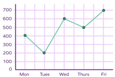
Line Graph
5. Caselet DI: In Caselet DI, a long paragraph is provided, and with that as the basis, a set of questions is asked. We need to understand the given information and then answer the given questions.
Tips to Solve Questions Based on Data Interpretation
Students can use different tips and tricks to solve questions based on Data Interpretation:
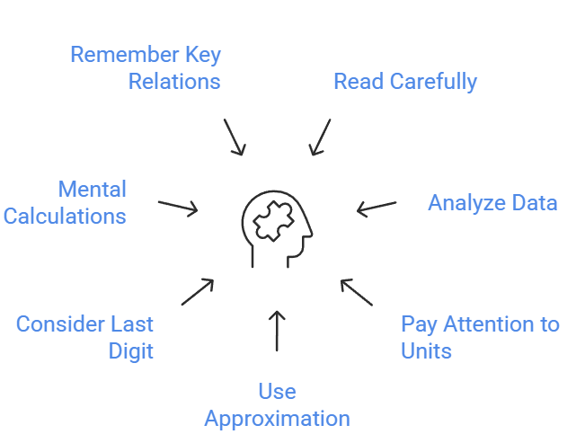
Tip 1: Read the entire question carefully – Read the complete data given in the form of values, graph etc.
Tip 2: Analyze the data – Take a look and analyze the data carefully. Don’t get diverted or afraid due to a lot of information and avoid skipping the information before giving a glance to it.
Tip 3: Pay attention to the units – Many times, different units are used in one question. For example, speed is given in km/h and time is to be calculated in seconds.
Tip 4: Use of approximation – If the options are adequately far apart then you can approximate values, fractions and percentages to nearby numbers, which can ease our calculations.
Tip 5: Use of last Digit – Check if all options have different last digits then to find the correct option we can just calculate the last digit of our answer (but then approximation is not at all allowed).
Tip 6: Mental calculations – Try to do mental calculations as frequently as possible while practicing. It will help in minimizing the time to solve the question.
Tip 7: Remember the following relations – Value of sector = (Angle of sector/360°) × Total Value & Value of sector = (Percentage of sector/100) × Total value
Solved Examples of Data Interpretation
Example 1: How many percentage more teak trees planted by the government in the year 2017 as compared to 2016?
Sol: Total teak trees planted in year 2017 = 35000
Total teak tree planted in year 2016 = 25000
Percentage increase = (35000 – 25000)/25000 × 100 = 40%
Example 2: Find the difference between a total number of red color candies and a total number of blue color candies produced throughout the 6 years.
Sol: Total number of red color candies = 20 + 25 + 35 + 20 + 50 + 40 = 190 lakhs Total number of blue color candies = 30 + 40 + 25 + 30 + 35 + 20 = 180 lakhs
Required difference = 190 – 180 = 10 lakhs.
|
164 videos|628 docs|1136 tests
|
FAQs on What is Data Interpretation? - General Test Preparation for CUET UG - CUET Commerce
| 1. What is Data Interpretation? |  |
| 2. What is Data Interpretation Method? | |
| 3. How can Data Interpretation help in decision-making? | |
| 4. What are some common tools used for Data Interpretation? | |
| 5. Why is Data Interpretation important in various fields like business, research, and healthcare? | |


Viva Questions
,ppt
,Semester Notes
,What is Data Interpretation? | General Test Preparation for CUET UG - CUET Commerce
,shortcuts and tricks
,What is Data Interpretation? | General Test Preparation for CUET UG - CUET Commerce
,mock tests for examination
,study material
,Objective type Questions
,past year papers
,Free
,MCQs
,Exam
,practice quizzes
,Extra Questions
,video lectures
,Sample Paper
,Important questions
,What is Data Interpretation? | General Test Preparation for CUET UG - CUET Commerce
,Summary
,Previous Year Questions with Solutions
;


What is Data Interpretation? Free PDF Download
Importance of What is Data Interpretation?
What is Data Interpretation? Notes
What is Data Interpretation? CUET Commerce Questions
Study What is Data Interpretation? on the App
|
© EduRev
|
Education Revolution
|


|


