Understanding Line Graphs | General Test Preparation for CUET UG - CUET Commerce PDF Download
| Table of contents |
|
| Introduction |
|
| Types of Line Graphs |
|
| Different Parts of Line Graph |
|
| How to Make a Line Graph? |
|
| Double Line Graph |
|
| Uses of Line Graph |
|

Introduction
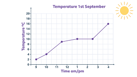
A line graph, also known as a line chart or line plot, depicts changes over time using points and lines. It illustrates the relationship between points by connecting them with a line. This graph displays quantitative data between two variables that change over time, showing a continuous line or curve connecting successive data points. Typically, the two variables are compared along the vertical and horizontal axes. Following is the example of line graph between time of the day and temperature for 1st September.
Types of Line Graphs
Simple Line Graph: This graph has only one line plotted, representing a single set of data points.
Multiple Line Graph: In this graph, more than one line is plotted on the same set of axes. It is useful for comparing similar items over the same time period.
Compound Line Graph: This type of graph is used when information can be broken down into two or more categories. Multiple lines are drawn to show the components of a total. The top line represents the total, and the lines below show the individual components. The space between the lines indicates the size of each component.
Vertical Line Graph
Vertical line graphs have a vertical line that extends from each data point to the horizontal axis. They are sometimes called column graphs. A vertical line is one that runs parallel to the y-axis.
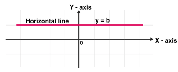
Horizontal Line Graph
Horizontal line graphs have a horizontal line that extends from each data point parallel to the x-axis. These are sometimes called row graphs. A horizontal line runs parallel to the x-axis.
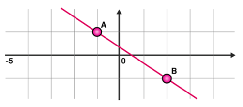
Straight Line Graph
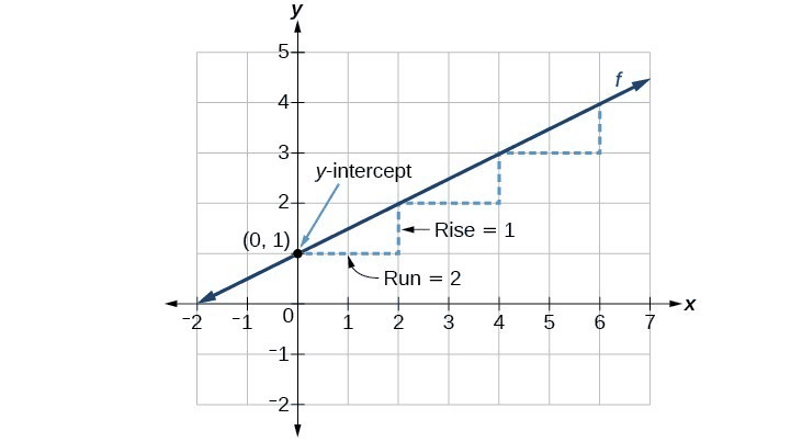
A line graph is created by connecting plotted points with straight line segments to represent given data. It is typically used to show changes in conditions over a specific time period. The general form of a linear function is y = mx + c, where m and c are constants. To draw a linear graph, only two points are needed. The steps to plot a linear graph are as follows:
- Substitute two different values for x in the equation y = mx + c to find two corresponding values for y.
- This gives us two points, (x1, y1) and (x2, y2), on the line.
- Set up horizontal and vertical axes, choosing an appropriate scale for each axis. If the values in the table are large, select a suitable scale for those values.
- Plot the two points on the Cartesian plane.
- Draw a line segment connecting the two points and extend the line in both directions. The resulting figure is the required linear graph.
Different Parts of Line Graph
- Title: The title explains what graph is to be plotted.
- Scale: The scale is the numbers that explain the units utilized on the linear graph.
- Labels: Both the side and the bottom of the linear graph have a label that indicates what kind of data is represented in the graph. The x-axis describes the data points on the line, and the y-axis shows the numeric value for each point on the line.
- Bars: They measure the data number.
- Data values: These are the actual numbers for each data point.
How to Make a Line Graph?
If we have created data tables, then we draw linear graphs using the data tables. These graphs are plotted as a series of points, which are later joined with straight lines to provide a simple way to review data collected over time. It offers an excellent visual format of the outcome data collected over time.
To plot a linear/line graph follow the below steps:
- Use the data from the data-table to choose a suitable scale.
- Draw and label the scale on the vertical (y-axis) and horizontal (x-axis) axes.
- List each item and place the points on the graph.
- Join the points with line segments.
Double Line Graph
Double Line Graph
A double line graph is a line graph with two lines. A graph that compares two different subjects over a period of time. A double line graph shows how things change over a period of time. The double line graph shows two line graphs within one chart. Double line graphs are used to compare trends and patterns between two subjects.
Steps to Make a Double Line Graph:
- Use the data from the table to choose an appropriate scale.
- Draw and label the scale on the vertical and horizontal axis.
- List each item and locate the points on the graph for both the lines.
- Connect the points with line segments separately of both the lines.
- Draw two line graphs within one chart.
Example: See the graph below.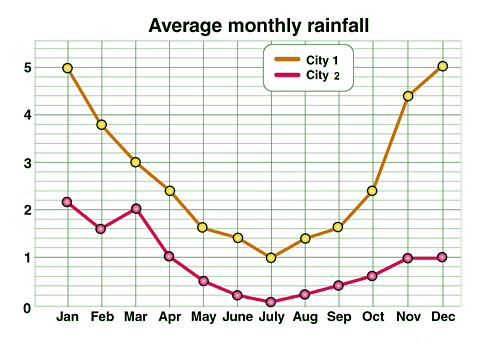
The points on the double line graph show the average monthly rainfall in the two cities (city 1, city 2). The separate lines that are made by connecting the points for each city.
Uses of Line Graph
- The main purpose of a line graph is to observe how things change over both short and long periods of time.
- It is also effective for comparing changes during the same time frame across different groups.
- A line graph is generally preferred over a bar graph when there are small changes to highlight.
- For instance, if a company’s finance team wants to display the variations in the amount of cash available to the company over time, they would use a line graph.
- In this graph, points are plotted along the horizontal and vertical axes.
- The horizontal axis typically represents the time period of the data.
Example
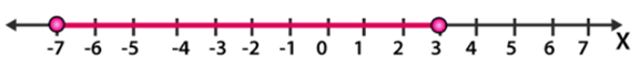
Question: Sketch the solution on number line |x + 2| ≤ 5.
Sol: Given, inequality |x + 2| ≤ 5
Step 1: Change the inequality into a compound inequality
– 5 ≤ x + 2 ≤ 5
Step 2: Subtract 2 from all three sides to get
– 5 – 2 ≤ x + 2 – 2 ≤ 5 – 2
= – 7 ≤ x ≤ 3
Step 3: Place this value on a number line
|
164 videos|628 docs|1133 tests
|
FAQs on Understanding Line Graphs - General Test Preparation for CUET UG - CUET Commerce
| 1. What is a line graph and how is it used? |  |
| 2. How do you create a line graph? | |
| 3. What is a double line graph and when should it be used? | |
| 4. What are some common uses of line graphs? | |
| 5. How can I interpret a line graph effectively? | |


Sample Paper
,Summary
,Understanding Line Graphs | General Test Preparation for CUET UG - CUET Commerce
,Exam
,Free
,Understanding Line Graphs | General Test Preparation for CUET UG - CUET Commerce
,ppt
,study material
,Important questions
,Objective type Questions
,Previous Year Questions with Solutions
,Extra Questions
,Viva Questions
,past year papers
,practice quizzes
,shortcuts and tricks
,Semester Notes
,Understanding Line Graphs | General Test Preparation for CUET UG - CUET Commerce
,video lectures
,mock tests for examination
,MCQs
;


Understanding Line Graphs Free PDF Download
Importance of Understanding Line Graphs
Understanding Line Graphs Notes
Understanding Line Graphs CUET Commerce Questions
Study Understanding Line Graphs on the App
|
© EduRev
|
Education Revolution
|


|


