Overview: Tables | CSAT Preparation - UPSC PDF Download
CSAT Angle
Based on the analysis of Previous Years’ Papers, it has come to notice that this chapter carries great importance. In the years 2022 and 2011, no question was asked but in the year 2023, 1 question was asked from this chapter.
Questions generally asked from this chapter are based on average, analysis of performances, comparisons, etc.
In the year 2014, two questions were asked. Only one question was asked during the years 2013-2012.
Tables
It is the systematic and scientific presentation of quantitative data in a tabular form to understand the given information and to elucidate the problem in a certain field of study.

Tables are often used to represent a set of numerical facts. They enable the readers to make comparison of facts and draw quick conclusions. It is one of the easiest and most accurate ways of presenting the data. They require much closer reading than graphs or charts. Indeed, the amount of the data that can be presented on a table is much higher than that which can be presented on any type of graph or chart.
Interpretation of Data of Tables
The interpretation of data of the tables is done on the basis of assessment of numerical figures in the light of interrelated column captions and style of the table. Infact, more attention is focused on the relative position of different items (subentries) in a table and questions are answered mostly regarding it.
1. Maximum and minimum values.
2. Average value.
3. Maximum and minimum ratios of any two parameters in column/row.
4. Maximum/minimum rate of increase/decrease.
5. Items showing eccentric behaviour.
Illustration 1: Consider the following information regarding the performance of a class of 1000 students in four different tests. UPSC (CSAT) 2012
If a student scores 74 marks in each of the four tests, then in which one of the following tests his performance is the best comparatively?
(a) Test I
(b) Test II
(c) Test III
(d) Test IV
Sol: (b) In tests I and II, the average marks are minimum and thus a score of 74 marks will be best relatively, whereas since range of marks in test II is upto 75. Thus, his performance is best in test II comparatively.
Following Points to be Kept in Mind
While Attempting the Questions Based on Tables
- Read the table title and the column headings carefully.
- The title of the table will give you general idea of the type and often the purpose of the information presented.
- The column headings tell you about the specific kind of information given in that column.
Categories of Tables
A table/tables can be divided into the categories as given below :
Geographical Tables
In such tables, the discrete variable is geographical or locational and either the row or the column of the table is filled up with a set of values for this discrete variable. The set of values may comprise of states, cities, regions, zones, areas etc.
Directions (Illustrations 3-5) Study the data carefully and answer the following questions.
The data given below shows the comparative data for statewise literacy and population growth.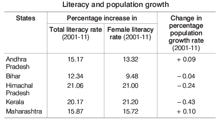
Illustration 3: In which state, the percentage increase in female literacy exceeds the percentage increase in total literacy?
(a) Andhra Predesh
(b) Himachal Pradesh
(c) Kerala
(d) Maharashtra
Sol: (c) From the given table, it is clear that in the state Kerala, percentage increase in total literacy rate is 20.17% and percentage increase in female literacy rate is 21.20%. Thus, Kerala is the required state.
Illustration 4: For the state showing the minimum percentage increase in total literacy, the numerical ratio of the percentage increase in total literacy to the percentage change in the population growth is nearly
(a) 308.5
(b) 320.4
(c) 299.6
(d) 296.8
Sol: (a) Here, percentage increase in total literacy rate is minimum in Bihar.
∴ Required ratio
Illustration 5: For which state, the ratio of the percentage increase in female literacy to the percentage increase in total literacy is maximum? (a) Andhra Pradesh
(b) Kerala
(c) Himachal Pradesh
(d) Maharashtra
Sol: (b) The ratio of the percentage increase in female literacy to the percentage increase in total literacy will be maximum in that state in which numerator (percentage increase in female) is greater than the denominator (percentage increase in total literacy) and this condition holds only in one state Kerala.
In all other states other than Kerala, numerator is less than the denominator.
Chronological Tables
Chronological tables are those in which data are classified on the basis of differences in time. e.g. The production of an industrial concern for different periods, the profit of a big business house over different years etc.
Directions (Illustrations 6-8) Study the table given below and answer the questions.
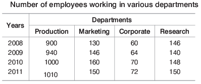
Illustration 6: In which year did the total number of employees reach (approximately) twice the total number of employees that the factory had in the year 2008?
(a) 2009
(b) 2010
(c) 2011
(d) 2008
Sol: (b) Number of employees in the factory in any year
= Number of employees in (Production + Marketing + Corporate + Research)
Number of employees in the factory in the year
2008 = 900 + 130 + 60 + 146 = 1236
2009 = 940 + 146 + 64 + 140 = 1290
2010 = 1000 + 160 + 70 + 148 = 1378
2011 = 1010 + 150 + 72 + 150 = 1382
Thus, it is clear that the number of employees in none of the years double that it had in the year 2008.
Illustration 7: In which department did the number of employees (approximately) remain the same during the years 2008-2011?
(a) Production
(b) Marketing
(c) Corporate
(d) Research
Sol: (d) From the table, it is clear that in the research department the number of employees has remained approximately the same during the year 2008-11.
Illustration 8: In how many years was the number of employees in the production department more than 50% of the total number of employees?
(a) One
(b) Two
(c) Three
(d) Four
Sol: (d)
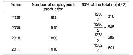
From the above table, it is clear that in all the four years, i.e. 2008, 2009, 2010 and 2011 number of employees in production were more than 50% of the total employees.
Qualitative Tables
In such tables, data are classified according to some qualitative phenomena like honesty, employment, intelligence etc., which are not capable of quantitative measurements. The tables, thus obtained are known as qualitative tables.
Directions (Illustrations 9-11) Study the following table carefully and answer the questions that follow.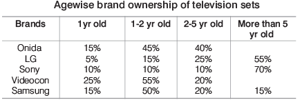
Illustration 9: If 100000 TVs were sold last year, then how many Onida sets were sold?
(a) 7000
(b) 12000
(c) 20000
(d) Cannot be determined
Sol: (d) It cannot be determined as the percentage breakup is given for total sale of a particular brand for the last five years not for a particular year.
Illustration 10: If total Sony sets sold till date are 500000, then how many are more than one year old?
(a) 45000
(b) 42000
(c) 40000
(d) None of these
Sol: (d) Required number of Sony TV = Percentage of Sony sets (1-2 yr old + 2-5 yr old + More than 5 yr old) of 500000 = (10% + 10% + 70%) of 500000 = 90% of 500000 = 450000
Illustration 11: Assume that these are the only brands of TVs that were sold and to date the number sold are provided below: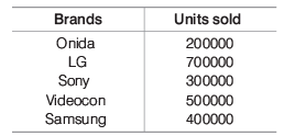
How many sets were sold five years back?
(a) 650000
(b) 655000
(c) 665000
(d) 656000
Sol: (b) Required number = 55% of total sale of LG
+ 70% of total sale of Sony
+ 15% of total sale of Samsung
= 55% of 700000 + 70% of 300000 + 15% of 400000
= 385000 + 210000 + 60000 = 655000
Miscellaneous Tables
There are a few more types of tables other than discussed above. While studying these, it should be clearly remembered that the student should concentrate on understanding the variables and their interactions such as quantitative tables.
Here, data are classified on the basis of phenomena which are capable of quantitative measurements like age, height, weight, price, production, income, expenditure, sales, profits etc.
Directions (Illustrations 12-14) Study the data given below carefully and answer the questions.
A table showing the percentage of the total population of a state in different age groups is given below.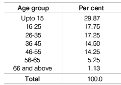
Illustration 12: Which one of the age groups listed above accounts for the maximum population in the country?
(a) Upto 15 yr
(b) 16-25
(c) 26-35
(d) 66 and above
Sol: (a) It is clear from the table that the age group upto 15 yr accounts for the maximum population in the country.
Illustration 13: Out of every 4000000 people, find the approximate number of persons below 25 yr.
(a) 1874300
(b) 1789400
(c) 1940800
(d) 1904800
Sol: (d) Percentage of persons below 25 yr = (29. 87 + 17.75)%
= 47.62%
∴ Required number = 47. 62% of 4000000 = 1904800
Illustration 14: If it is known that there are 40 million people below 36 yr of age, then how many million people (approximately) are in the age group of 56-65?
(a) 3.08 million
(b) 3.24 million
(c) 4.04 million
(d) 4.25 million
Sol: (b) People below 36 yr of age = People upto 15 yr + People between 16-25 yr + People between 26-35 yr
= (29.87 + 17.75 + 17.25)% = 64. 87 %
Given that, 64.87% = 40 million people
Now, people in age group 56-65 = 5.25%
Types of Questions Asked
There are multiple types of questions which are asked from the chapter ‘Data Table’, so it is quite difficult to predict exact type of questions that are asked but on the basis of observation, analysis and experience, here we are giving different types of questions that are usually asked in the examination.
Type I Questions Based on Single Table
It includes one table. On the basis of this table, questions are to be answered.
Directions (Illustrations 15-17) Production of fertilizers by six major companies of India during the year 2012 for the months of April to August are given in the following table. Study the following table carefully and answer the questions given there after following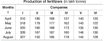
Illustration 15: In which month does company II have a contribution of approximately 15% in the total fertilizer production?
(a) None
(b) May
(c) June
(d) April
Sol: (a) Total fertilizer production of company II
= 180 + 179 + 160 + 167 + 150 = 836 lakh tonne
So, there is no such contribution of approximately 15% in the total fertilizer production in any month.
Hence, option (a) is correct.
Illustration 16: In which company, there is a continuous increase in production over the months?
(a) I
(b) II
(c) III
(d) IV
Sol: (a) It is clear from the given table that, company I has a continuous increase in production over the months.
Illustration 17: In the month of June, how many companies have a share of more than 25% of the total production of fertilizers of that company?
(a) Two
(b) Three
(c) None
(d) Data inadequate
Sol: (c) Total production of fertilizers of
Company I = 1601
Company II = 836
Company III = 906
Company IV = 830
Company V = 706
Company VI = 630
Now, we check that is the month of ‘June’ how many companies have a share of more than 25% of the total production of that company.
From company I,
25% of 1601
which is greater than the share in the month of June.
Similarly, on calculating for every month it is found that, there is no company that have a share of more than 25% of the total production of fertilizers of that company.
Type II Questions Based on Two Tables
It includes two tables. On the basis of these tables, questions are to be answered.
Directions (Illustrations 18-19) Study the following tables carefully and answer the questions given below.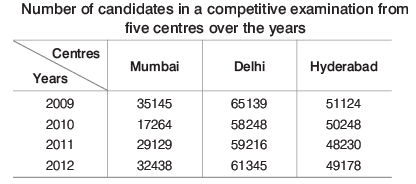
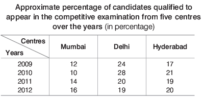
Illustration 18: Approximately what was the difference between the number of candidates qualified from Hyderabad in 2009 and 2010?
(a) 1680
(b) 2440
(c) 1450
(d) 1860
Sol: (d) Number of candidates qualified from Hyderabad in 2009 = 17% of 51124 ∼ 8691 Number of candidates qualified from Hyderabad in 2010 = 21% of 50248 ∼ 10552 ∴Required difference = 10552 − 8691 = 1861 ≈ 1860
Illustration 19: Approximately what was the total number of candidates qualified from Delhi in 2010 and 2011 together?
(a) 27250
(b) 25230
(c) 30150
(d) 28150
Sol: (d) Number of candidates qualified from Delhi in 2010
= 28% of 58248 = 16309
Number of candidates qualified from Delhi in 2011
= 20% of 59216 = 11843
∴ Required number = 16309 + 11843 = 28152 ≈ 28150
Type III Questions Based on New Table
It includes one or two tables. On the basis of the information given in the tables, we create a new table to solve the questions easily.
Illustration 20: The following table shows the number of Science, Arts and Commerce students in a group of boys and girls:
The total number of students in the group is
(a) 127
(b) 130
(c) 131
(d) 135
Sol: (c) On the basis of the information given in the table, we create a new table to solve the question easily.
Hence, the total number of students in the group is 131.
|
205 videos|264 docs|136 tests
|
FAQs on Overview: Tables - CSAT Preparation - UPSC
| 1. What are the different categories of tables discussed in the article? |  |
| 2. What types of questions are typically asked based on tables in exams? |  |
| 3. Can you provide an example of a Type II Question based on two tables? |  |
| 4. How should one interpret data from tables effectively? |  |
| 5. Why are tables important for organizing and presenting data? |  |


