Graphical Representation & Data Interpretation: Previous Years Questions- 2 | Data Interpretation for UGC NET PDF Download
Q51: Approximately what percentage of the total sample indicates that Hip-Hop is their favourite style of music? (June 2016)
(a) 6%
(b) 8%
(c) 14%
(d) 12%
Ans: (d)
Sol: Total population = 134
People who like Hip Hop = 9 + 3 + 4 = 16
% People who like Hip Hop = 16/134 × 100 = 12%
Q52: What percentage of respondents aged 31+ indicated a favourite style other than classical music? (June 2016)
(a) 64%
(b) 60%
(c) 75%
(d) 50%
Ans: (c)
Sol: Total sample aged 31 and above = 68
Total sample other than classical 31 and above = 68 – 17 = 51
% Age of sample other than classical 31 and above = 51/68 × 100 = 75%
Direction for Questions (53 to 58): Study the table carefully and answer the questions that follow: A company has 20 employees with their age (in years) and salary (in thousand rupees per month) mentioned against each of them: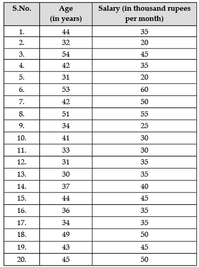
Q53: Classify the data of age of each employee in class interval of 5 years. Which class interval of 5 years has the maximum average salary? (June 2015)
(a) 35–40 years
(b) 40–45 years
(c) 45–50 years
(d) 50–55 years
Ans: (d)
Sol: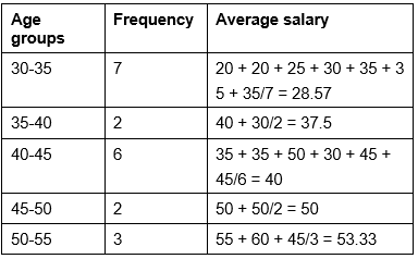
Q54: What is the frequency (%) in the class interval of 30-35 years? (June 2015)
(a) 20%
(b) 25%
(c) 30%
(d) 35%
Ans: (d)
Sol: Frequency of class 30–35 = 7
Total number of workers = 20
% of frequency of group 30–35 = 7 × 100/20 = 35%
Q55: What is the average age of the employees? (June 2015)
(a) 40.3 years
(b) 38.6 years
(c) 47.2 years
(d) 45.3 years
Ans: (a)
Sol: Average age of employees = Sum of ages/no. of workers
Sum of ages = 44 + 32 + 54 + 42 + 31 + 53 + 42 + 51 + 34 + 41 + 33 + 31 + 30 + 37 + 44 + 36 + 34 + 49 + 43 + 45 = 806
Number of workers = 20
Average age of workers = 806/20 = 40.3 years.
Q56: What is the fraction (%) of employees getting salary ₹ 40,000 per month? (June 2015)
(a) 45%
(b) 50%
(c) 35%
(d) 32%
Ans: (a)
Sol: Workers getting salary equal or more than 40,000 = 9 workers
Total workers = 20
Fraction (%) of workers getting equal or more than 40,000 salary = 9 × 100/20 = 45 workers.
Q57: What is the average salary (in thousand per month) in the age group 40-50 years? (June 2015)
(a) 35
(b) 42.5
(c) 40.5
(d) 36.5
Ans: (b)
Sol: Employees in the group 40–50 = 8 employees
Sum of salaries of this age group = 35 + 35 + 50 + 30 + 45 + 50 + 45 + 50 = 340
Average salary of this age group = 340/8 = 42.5 (in thousands)
Q58: What is the fraction of employees getting salary less than the average salary of all the employees? (June 2015)
(a) 45%
(b) 50%
(c) 55%
(d) 47%
Ans: (c)
Sol: Average salary of all the employees = 35 + 20 + 45 + 35 + 20 + 60 + 50 + 55 + 25 + 30 + 30 + 35 + 35 + 40 + 45 + 35 + 35 + 50 + 45 + 50 = 775
No. of employees = 20
Average salary = 38.75 (000)
Employees getting salary less than 38.75 = 11 employees
% of employees getting salary less than average salary of all employees = 11 × 100/20 = 55%.
Direction for Questions (59 to 63): Study the table carefully and answer the questions that follow:
Net Area under Irrigation by sources in a country (Thousand Hectares)

Q59: Which of the following sources of Irrigation has registered the largest percentage of decline in Net area under irrigation during 1997-98 and 2005-06? (June 2014)
(a) Government canals
(b) Private canals
(c) Tanks
(d) Other sources
Ans: (c)
Sol: Percentage of decline in Net area:
Government canals:-(17,117 – 15,268) 100/17,117 = 10.80%
Private canals:-(211 – 207) 100/211 = 1.89%
Tanks:-(2,593 – 2,034) 100/2,593 = 21.56%
Other sources = increase in the given term. Hence, tanks have registered the largest percentage of decline.
Q60: Find out the source of Irrigation that has registered the maximum improvement in terms of percentage of Net irrigated area during 2002–03 and 2003–04. (June 2014)
(a) Government canals
(b) Tanks
(c) Tube wells and other wells
(d) Other sources
Ans: (d)
Sol: Improvement in terms of percentage of net irrigated area during 2002–03 and 2003–04:-
Government canals:-(14,444 – 13,863) 100/13,863 = 4.19%
Tanks:-(1,908 – 1,802) 100/1,802 = 5.99%
Tube wells and other wells:-(35,779 – 34,250) 100/34,250 = 4.46%
Other sources:-(4,281 – 3,657) 100/3,657 = 17.06%
Hence, other sources have registered maximum improvement.
Q61: In which of the following years, net irrigation by tanks increased at the highest rate? (June 2014)
(a) 1998–99
(b) 2000–01
(c) 2003–04
(d) 2005–06
Ans: (d)
Sol: Net irrigation by tanks increased:-
In 1988–99, (2,792 – 2,593) 100/2,593 = 7.67%
In 2000–01, Decreased in given term
In 2003–04, (1,908 – 1,802) 100/1,802 = 5.88%
In 2005–06, (2,034 – 1,727) 100/1,727 = 20.03%
Hence, in 2005–06 net irrigation by tanks increased at the highest rate.
Q62: Identify the source of Irrigation that has recorded the maximum incidence of negative growth in terms of Net irrigated area during the years given in the table. (June 2014
(a) Government canals
(b) Private canals
(c) Tube wells and other wells
(d) Other sources
Ans: (a)
Sol: By observing the given table, government canals have the maximum incidence of negative growth. This item has five times negative growth or decline.
Private canals have two incidences of negative growth.
Tube well and other wells have declined three times.
Other sources have a fourfold decrease in incidence for four times.
Q63: In which of the following years, share of the tube wells and other wells in the total net irrigated area was the highest? (June 2014)
(a) 1998–99
(b) 2000–01
(c) 2002–03
(d) 2004–05
Ans: (c)
Sol: Share of the tube-wells and other wells in the total net irrigated area:-
In 1998–99, (33,988/57,411) 100 = 59.20%
In 2000–01, (33,796/55,076) 100 = 61.36%
In 2002–03, (34,250/53,778) 100 = 63.69%
In 2004–05, (34,785/58,867) 100 = 59.09%
Hence in 2002–03, the share of the tube-wells and other wells in the total net irrigated area was the highest.
Direction for Questions (64 to 67): Study the table carefully and answer the questions that follow:
Following table provides details about the Foreign Tourist Arrivals (FTAs) in India from different regions of the world in different years. Study the table carefully and answer questions.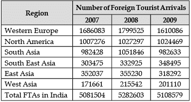
Q64: Find out the region that contributed around 20 per cent of the total foreign tourist arrivals in India in 2009. (December 2013)
(a) Western Europe
(b) North America
(c) South Asia
(d) South East Asia
Ans: (b)
Sol: Percentage of Contribution of region in the total FTA arrivals in India in 2009:
Western Europe: (1,61,0086/5,10,8579) × 100 = 31.52%
North America: (1,02,4469/5,10,8579) × 100 = 20.05%
Hence North America contributed around 20 per cent of total FTAs in India in 2009.
Q65: Which of the following regions has recorded the highest negative growth rate of foreign tourist arrivals in India in 2009? (December 2013)
(a) Western Europe
(b) North America
(c) South Asia
(d) West Asia
Ans: (a)
Sol: Negative growth rate of FTAs in India in 2009:
From Western Europe: {(FTAs in 2009 – FTAs in 2008)/FTAs in 2008} × 100 {(1,61,0086 – 1,79,9525)/1,79,9525} × 100 = –10.53%
Similarly, From North America: {(1,02,4469 – 1,02,7297)/1,02,4469} × 100 = – 0.28%
From South East Asia: {(3,48,495 – 3,32,925)/3,32,925} × 100 = +4.67%
From West Asia: {(2,01,110 – 2,15,542)/2,15,542} × 100 = – 6.70%
From South Asia: {(9,82,633 – 10,51,846)/10,51,846} × 100 = – 6.59%
From East Asia: {(3,18,292 – 3,55,230)/3,55,230} × 100 = – 10.39%
Hence West Europe has the highest negative growth rate of FTAs in India in 2009.
Q66: Find out the region that has been showing declining trend in terms of share of foreign tourist arrivals in India in 2008 and 2009. (December 2013)
(a) Western Europe
(b) South East Asia
(c) East Asia
(d) West Asia
Ans: (a)
Sol: Negative growth rate of FTAs in India in 2009:
From Western Europe: {(FTAs in 2009 – FTAs in 2008)/FTAs in 2008} × 100 {(1,61,0086 – 1,79,9525)/1,79,9525} × 100 = –10.53%
Similarly, From North America: {(1,02,4469 – 1,02,7297)/1,02,4469} × 100 = – 0.28%
From South East Asia: {(3,48,495 – 3,32,925)/3,32,925} × 100 = +4.67%
From West Asia: {(2,01,110 – 2,15,542)/2,15,542} × 100 = – 6.70%
From South Asia: {(9,82,633 – 10,51,846)/10,51,846} × 100 = – 6.59%
From East Asia: {(3,18,292 – 3,55,230)/3,55,230} × 100 = – 10.39%
Hence West Europe has the highest negative growth rate of FTAs in India in 2009.
we know that Western Europe has highest declining trend in 2008 and 2009
Q67: Identify the region that has shown hyper growth rate of foreign tourist arrivals than the growth rate of the total FTAs in India in 2008. (December 2013)
(a) Western Europe
(b) North America
(c) South Asia
(d) East Asia
Ans: (c)
Sol: Growth rate of FTAs in India in 2008:
From Western Europe: {(FTAs in 2008 – FTAs in 2007)/FTAs in 2007} × 100 {(17,99,525 – 16,86,083)/16,86,083} × 100 = 6.72%
Similarly, From North America: {(10,27,297 – 10,07,276)/10,07,276} × 100 = 1.98%
From South Asia: {(10,51,846 – 9,82,428)/9,82,482} × 100 = 7.06%
From East Asia: {(3,55,230 – 3,52,037)/3,52,037} × 100 = 0.90%
Hence, South Asia is the correct answer.
Direction for Questions (68 to 73): Study the table carefully and answer the questions that follow: Government Expenditures on Social Services (As per cent of total expenditure)
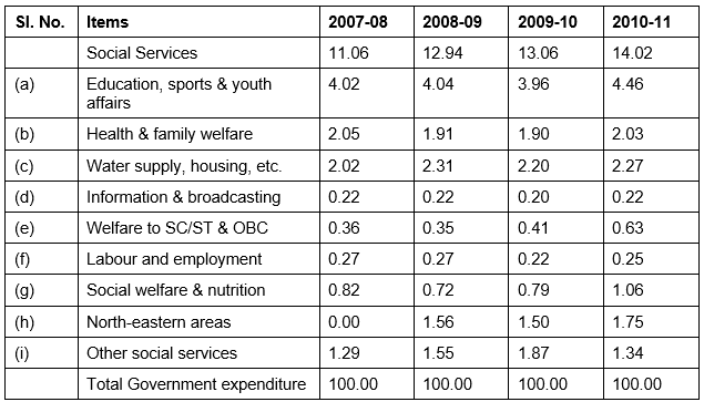
Q68: How many activities in the social services are there where the expenditure has been less than 5 per cent of the total expenditures incurred on the social services in 2008-09? (December 2012)
(a) One
(b) Three
(c) Five
(d) All of these
Ans: (d)
Sol: There are more than three areas in which expense is more than 5%. So the answer should be all of the above.
Q69: In which year, the expenditures on the social services have increased at the highest rate? (December 2012)
(a) 2007–08
(b) 2008–09
(c) 2009–10
(d) 2010–11
Ans: (b)
Sol: Increase percentage 2008–09 = (12.94 – 11.06) × 100/11.06 = 17%
2009–10 = (13.06 – 12.94) × 100/12.94 = 0.92%
2010–11 = (14.02 – 13.06) × 100/12 = 7.35%
Highest increase in 2008–09
Q70: Which of the following activities remains almost stagnant in terms of share of expenditures? (December 2012)
(a) North–eastern areas
(b) Welfare to SC/ST & OBC
(c) Information & broadcasting
(d) Social welfare and nutrition
Ans: (c)
Sol: From the given options, Information and broadcasting is showing a static expenditure in the given tenure.
Q71: Which of the following item’s expenditure share is almost equal to the remaining three items in the given years? (December 2012)
(a) Information & broadcasting
(b) Welfare to SC/ST and OBC
(c) Labour and employment
(d) Social welfare & nutrition
Ans: (d)
Sol: 0.22 + 0.36 + 0.27 = 85
Sum of all other three items is almost equal to the portion of social welfare and nutrition.
Q72: Which of the following items of social services has registered the highest rate of increase in expenditures during 2007-08 to 2010-11? (December 2012)
(a) Education, sports & youth affairs
(b) Welfare to SC/ST & OBC
(c) Social welfare & nutrition
(d) Overall social services
Ans: (b)
Sol: Rate of increase during the given period:-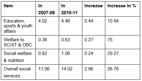
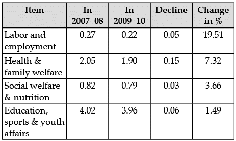
Q73: Which of the following items has registered the highest rate of decline in terms of expenditure during 2007–08 to 2009–10? (December 2012)
(a) Labour and employment
(b) Health & family welfare
(c) Social welfare & nutrition
(d) Education, sports & youth affairs
Ans: (a)
Sol:
Direction for Questions (74 to 76): Study the table carefully and answer the questions that follow: Questions are based upon the following diagram in which there are three interlocking circles A, P and S where A stands for Artists, circle P for Professors and circle S for Sports persons.
Different regions in the figure are lettered from a to f: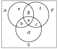
Q74: The region which represents artists who are neither sportsmen nor professors. (June 2011)
(a) d
(b) e
(c) b
(d) g
Ans: (b)
Sol: In the given diagram, the region represents the people who are only artists neither professors nor sportsmen.
Q75: The region which represents professors, who are both artists and sportspersons. (June 2011)
(a) a
(b) c
(c) d
(d) g
Ans: (a)
Sol: Region a is representing the people who are all i.e., Artists, professors and sportsmen.
Q76: The region which represents professors, who are also sports persons, but not artists. (June 2011)
(a) e
(b) f
(c) c
(d) g
Ans: (c)
Sol: Region C represents the people who are professors as well as sportsmen but not artists.
Q77: The value of X, which is exceeded 10% of the time in the duration of measurement, is (June 2011)
(a) 69
(b) 68
(c) 67
(d) 66
Ans: (b)
Sol: Data will be arranged in descending order first 70, 69, 68, 67, 66, 66, 66, 65, 65, 65, 64, 64, 64, 64, 63, 63, 62, 62, 61, 60.
Value of X exceeding 10%: 10% = 2 values
Value after 2 values = 68
Q78: The value of X, which is exceeded 90% of the time in the duration of measurement, is (June 2011)
(a) 63
(b) 62
(c) 61
(d) 60
Ans: (c)
Sol: Data will be arranged in descending order first 70, 69, 68, 67, 66, 66, 66, 65, 65, 65, 64, 64, 64, 64, 63, 63, 62, 62, 61, 60.
Value of X exceeding 90% 90% of values = 18 values
Value of X after 18 values= 61
Q79: The value of X, which is exceeded 50% of the time in the duration of measurement, is (June 2011)
(a) 66
(b) 65
(c) 64
(d) 63
Ans: (c)
Sol: Data will be arranged in descending order first 70, 69, 68, 67, 66, 66, 66, 65, 65, 65, 64, 64, 64, 64, 63, 63, 62, 62, 61, 60.
Value of X exceeding 50% 50% values = 10 values
Value after 10 values = 64
Q80: The region which represents non-Indian scientists who are politicians. (June 2010)
(a) f
(b) d
(c) a
(d) c
Ans: (a)
Sol: In the given diagram, f is the point which represents scientist politicians but not Indian.
Q81: The region which represents politicians who are Indians as well as scientists. (June 2010)
(a) b
(b) c
(c) a
(d) d
Ans: (c)
Sol: In the given diagram, A is the point which represents the people who are Indian politicians as well as scientists.
Q82: The population of a city is plotted as a function of time (years) in graphic form below: Which of the following inference can be drawn from above plot? (June 2010)
(a) The population increases exponentially.
(b) The population increases in parabolic fashion.
(c) The population initially increases in a linear fashion and then stabilises.
(d) The population initially increases exponentially and then stabilises.
Ans: (d)
Sol: In the given diagram, the line graph represents the population of an area. It can be seen that population increases at the initial stage but then it gets stabilised as the graph tends to a horizontal line.
Q83: Which product shows the maximum percentage increase in price over the period? (June 2010)
(a) Saw timber
(b) Plywood
(c) Log
(d) None of the above
Ans: (b)
Sol: Percentage change over this period of time:-
Plywood = 4 × 100/3 = 133.33%
Saw timber = 8 × 100/10 = 80%
Log = 3 × 100/18 = 16.67%
Maximum percentage of change = Plywood
Q84: What is the maximum percentage increase in price per cubic metre of log? (June 2010)
(a) 6
(b) 12
(c) 18
(d) 20
Ans: (d)
Sol: Price of 1 cubic meter of log in 2000 = 18
Price of 1 cubic meter of log in 2006 = 21
Percentage change in per cubic meter over this period of time = 21 – 18 × 100/18 = 16.66%
Round off = 18 (according to options) (Nearly round off value)
Q85: In which year the prices of two products increased and that of the third increased? (June 2010)
(a) 2000
(b) 2002
(c) 2003
(d) 2006
Ans: (b)
Sol: In the year 2002, prices of all three products increased. In other years, the price of at least one product has been decreased.
|
17 videos|20 docs|16 tests
|
FAQs on Graphical Representation & Data Interpretation: Previous Years Questions- 2 - Data Interpretation for UGC NET
| 1. What are some common types of graphical representations used in data interpretation? |  |
| 2. How can graphical representations help in understanding data better? |  |
| 3. What is the importance of data interpretation in research and analysis? |  |
| 4. How can one choose the most appropriate type of graphical representation for a given set of data? |  |
| 5. What are some common mistakes to avoid when creating graphical representations for data interpretation? |  |

