Data Exploration Chapter Notes | Artificial Intelligence (AI) for Class 9 PDF Download
| Table of contents |
|
| Data Exploration |
|
| Advantages of Data Visualization |
|
| Data Visualization Tools |
|
| How to select a proper graph for data visualization |
|

Data Exploration
Data Exploration is the process of visualisation of collected data in a graphical format for better understanding to build the aimed project.
Explanation:
After acquiring data, you must have noticed that the data is so complex to understand or to make some sense out of it.Therefore, we need to work some patterns out of it.
For example : If you go to the library and pick up a random book, you first try to go through its content quickly by turning pages and by reading the description before borrowing it for yourself, because it helps you in understanding if the book is appropriate to your needs and interests or not. Thus, to analyse the data, you need to visualise it in some user-friendly format so that you can:
- Quickly get a sense of the trends, relationships and patterns contained within the data.
- Define strategy for which model to use at a later stage.
- Communicate the same to others effectively. To visualise data, we can use various types of visual representations.
Advantages of Data Visualization
- Enhances comprehension of data
- Delivers insights derived from data
- Facilitates user engagement
- Enables real-time data evaluation
- Aids in decision-making processes
- Simplifies data complexity
- Reveals relationships and patterns within data
- Establishes a strategy for your data framework
- Offers an efficient communication method among users
So far, you have learned about defining problems and gathering data. Now that you have established your goals for your AI project and identified methods for data acquisition, you’ve encountered a primary challenge: the complexity of the data due to its numerical nature. To effectively utilize these numbers, users require a specific pattern to interpret the data.
For instance, consider the process of selecting a book at a library. When you choose a book, your initial action is to flip through the pages to get an overview before deciding on whether it suits your interests. Similarly, when analyzing data, you must employ data visualization techniques.
Data Visualization Tools
There are many data visualization tools available.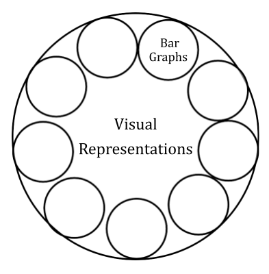 Here I made a list of 20 data visualization tools for you. Although there are many more tools available and these numbers increasing day by day.
- Microsoft Excel
- Tableau
- Qlikview
- FusionCharts
- DataWrapper
- MS Power BI
- Google Data Studio
- Sisense
- HiCharts
- Xplenty
- HubSpot
- Whatagraph
- Adaptive Discovery
- Teammate Analytics
- Jupyter
- Dundas BI
- Infogram
- Google Charts
- Visme
- Domo
A small research to visualize your data with a few tools given below:
- Google Charts: Google chart tools are powerful, simple to use, and free. Try out our rich gallery of interactive charts and data tools.
- Tableau : Tableau is often regarded as the grand master of data visualization software and for good reason.
Tableau has a very large customer base of 57,000+ accounts across many industries due to its simplicity of use and ability to produce interactive visualizations far beyond those provided by general BI solutions. - FusionCharts : This is a very widely-used, JavaScript-based charting and visualization package that has established itself as one of the leaders in the paid-for market. It can produce 90 different chart types and integrates with a large number of platforms and frameworks giving a great deal of flexibility.
- Highcharts: A simple options-structure allows for deep customization, and styling can be done via JavaScript or CSS. Highcharts is also extendable and pluggable for experts seeking advanced animations and functionality.
How to select a proper graph for data visualization
Now that you are acquainted with various types of charts, the next step is to choose an appropriate chart for data visualization. The selection of a chart depends on the data at hand and the specific goal you aim to achieve with your model. Here are some fundamental purposes of charts that can guide your selection:- Comparison of Values: To display changes over specific periods, use a Bar Chart.
- Comparison of Trends: To illustrate changes over time, opt for a Line Chart.
- Distribution of Data by Categories: To represent data according to categories, a Histogram is suitable.
- Highlighting a Portion of a Whole: To emphasize data by value, consider using a Pie Chart.
- Show the Relationship Between Data: Multiple charts can be utilized for this purpose.
|
32 videos|57 docs
|
FAQs on Data Exploration Chapter Notes - Artificial Intelligence (AI) for Class 9
| 1. What is data exploration and why is it important? |  |
| 2. What are the advantages of data visualization? | |
| 3. What are some popular data visualization tools? | |
| 4. How do I select the proper graph for data visualization? | |
| 5. How does data visualization impact decision-making? | |


Exam
,Sample Paper
,Semester Notes
,Viva Questions
,mock tests for examination
,Data Exploration Chapter Notes | Artificial Intelligence (AI) for Class 9
,Summary
,Data Exploration Chapter Notes | Artificial Intelligence (AI) for Class 9
,Previous Year Questions with Solutions
,video lectures
,Important questions
,past year papers
,MCQs
,Objective type Questions
,ppt
,practice quizzes
,Extra Questions
,shortcuts and tricks
,study material
,Data Exploration Chapter Notes | Artificial Intelligence (AI) for Class 9
,Free
;


Chapter Notes: Data Exploration Free PDF Download
Importance of Chapter Notes: Data Exploration
Chapter Notes: Data Exploration
Chapter Notes: Data Exploration Class 9 Questions
Study Chapter Notes: Data Exploration on the App
|
© EduRev
|
Education Revolution
|


|


