Statistics | Year 3 Mathematics IGCSE (Cambridge) - Class 3 PDF Download
| Table of contents |
|
| Introduction: |
|
| 1. What is Statistics? |
|
| 2. Collecting Data |
|
| 3. Organizing Data |
|
| 4. Displaying Data |
|
| 5. Analyzing Data |
|
| 6. Interpreting Data |
|
| 7. Practice Questions: |
|

Introduction:
In this chapter, we will learn about statistics, which is a way of organizing and understanding information. Statistics helps us collect data, make charts, and find patterns. By the end of this chapter, you will be able to collect data, show it in a table or graph, and understand it to make decisions.
1. What is Statistics?
- What is Data?
Data is just information we collect. For example, if we count how many apples are in a basket, the number of apples is the data. We can collect different kinds of data, like people's ages, favorite colors, or how many toys they have.
- What is Statistics?
Statistics is when we take the data we have collected, organize it, and try to understand it. This can help us see patterns or make decisions. For example, if we ask a class about their favorite fruits, we can count how many people like each fruit and find out which fruit is the most popular.
2. Collecting Data
- How Do We Collect Data?
We can collect data by asking questions, counting things, or observing. For example, if we want to know how many students in the class like apples, we can ask them. The answers will give us the data.
- Example of Collecting Data:
If we ask 10 students in our class about their favorite colors, we might get the following answers: Red, Blue, Green, Blue, Red, Green, Yellow, Blue, Red, Green.
This data tells us what colors the students like, and we can count how many times each color was chosen.
3. Organizing Data
- Frequency Tables:
Once we have collected data, we can organize it in a frequency table. A frequency table shows how many times each item or answer appears in the data.
Example: If we collected data on favorite colors, the frequency table might look like this:
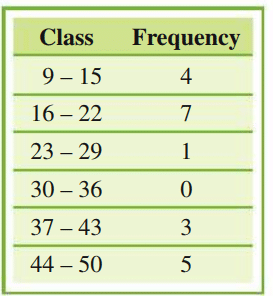
- What is Frequency?
Frequency means how many times something happens or appears. In the table above, we can see that Red, Blue, and Green were each chosen 3 times, while Yellow was chosen only 1 time.
4. Displaying Data
- Bar Charts:
We can use bar charts to show data. A bar chart uses bars to show how many times something happens. Each bar represents one category (like a color), and the height of the bar shows how many times that category appears.
Example: The bar chart for our favorite color data would have 4 bars, one for each color, and the height of each bar would show how many students chose that color.
- Picture Graphs:
We can also use picture graphs to show data. In a picture graph, we use pictures or symbols to represent data. For example, one picture of a red apple might represent 2 students who like apples. This helps make data easy to understand!
5. Analyzing Data
- Mean (Average):
The mean is the average of a set of numbers. To find the mean, add up all the numbers and divide by how many numbers there are. For example, if 3 students score 10, 20, and 30 on a test, the mean score is:
(10 + 20 + 30) ÷ 3 = 60 ÷ 3 = 20 - Mode:
The mode is the most common number in a set of data. For example, if the data is 1, 2, 3, 2, 4, the mode is 2 because it appears the most.
- Range:
The range is the difference between the largest and smallest numbers in a set of data. For example, if the data is 5, 7, 3, 10, the range is:
10 - 3 = 7The range is 7.
6. Interpreting Data
- Making Conclusions:
After collecting and organizing the data, we can make conclusions. For example, if we find that most students in the class like apples, we can conclude that apples are the favorite fruit in the class.
- Comparing Data:
We can also compare different sets of data to understand patterns. For example, we could compare the favorite colors of boys and girls in the class to see if there are any differences.
7. Practice Questions:
- Collect data from your class about their favorite ice cream flavors. Then, create a frequency table to organize the data.
- Draw a bar chart showing the number of students who like different sports in your class.
- Find the mean, mode, and range of the following set of numbers: 5, 7, 7, 3, 9, 10.
- Create a picture graph to show how many students in your class have pets. Use pictures to represent 2 students each.
- What is the most common color in this data set: Blue, Green, Blue, Yellow, Blue, Red, Green?
|
65 docs|19 tests
|
FAQs on Statistics - Year 3 Mathematics IGCSE (Cambridge) - Class 3
| 1. What is the importance of collecting data in statistics? |  |
| 2. How can I effectively organize data for analysis? | |
| 3. What are some common methods for displaying data visually? | |
| 4. What steps should I follow to analyze data effectively? | |
| 5. How do I interpret the results of my data analysis? | |


Statistics | Year 3 Mathematics IGCSE (Cambridge) - Class 3
,mock tests for examination
,Extra Questions
,Objective type Questions
,MCQs
,past year papers
,Important questions
,practice quizzes
,Statistics | Year 3 Mathematics IGCSE (Cambridge) - Class 3
,Viva Questions
,shortcuts and tricks
,Free
,Semester Notes
,video lectures
,ppt
,Statistics | Year 3 Mathematics IGCSE (Cambridge) - Class 3
,Exam
,Previous Year Questions with Solutions
,Summary
,Sample Paper
,study material
;


Statistics Free PDF Download
Importance of Statistics
Statistics Notes
Statistics Class 3 Questions
Study Statistics on the App
|
© EduRev
|
Education Revolution
|


|


