


All Exams >
CA Foundation >
Quantitative Aptitude for CA Foundation >
All Questions
All questions of Chapter 13: Statistical Description of Data and Sampling for CA Foundation Exam
The following data relate to the marks of a group of students:
 Q. How many students got marks more than 30?
- a)65
- b)50
- c)35
- d)43
Correct answer is option 'C'. Can you explain this answer?
The following data relate to the marks of a group of students:
Q. How many students got marks more than 30?
a)
65
b)
50
c)
35
d)
43

|
Freedom Institute answered |
Below 50 - Below 30
just do 100 - 65 = 35
just do 100 - 65 = 35

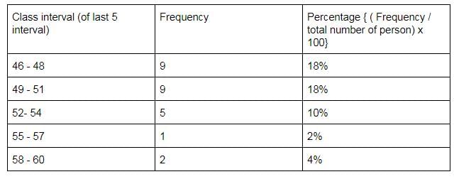
The following information relates to the age of death of 50 persons in an area :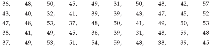 Q. If the class intervals are 31-33, 34-36, 37-39, …. Then the percentage frequencies for the last five class intervals are
 - a)18, 18, 10, 2 and 4.
- b)10, 15, 18, 4 and 2.
- c)14, 18, 20, 10 and 2.
- d)10, 12, 16, 4 and 6.
Correct answer is option 'A'. Can you explain this answer?
The following information relates to the age of death of 50 persons in an area :
Q. If the class intervals are 31-33, 34-36, 37-39, …. Then the percentage frequencies for the last five class intervals are
a)
18, 18, 10, 2 and 4.
b)
10, 15, 18, 4 and 2.
c)
14, 18, 20, 10 and 2.
d)
10, 12, 16, 4 and 6.

|
KS Coaching Center answered |
Statistics is applied in- a)Economics
- b)Business management
- c)Commerce and industry
- d)All these
Correct answer is option 'D'. Can you explain this answer?
Statistics is applied in
a)
Economics
b)
Business management
c)
Commerce and industry
d)
All these
|
|
Arjun Singhania answered |
Statistics is a branch of mathematics dealing with data collection, organization, analysis, interpretation and presentation. In applying statistics to, for example, a scientific, industrial, or social problem, it is conventional to begin with a statistical population or a statistical model process to be studied.
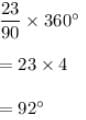
(Direction 21 - 27) Answer the following questions. Each question carries 2 marks.Q. Out of 1000 persons, 25 per cent were industrial workers and the rest were agricultural workers. 300 persons enjoyed world cup matches on TV. 30 per cent of the people who had not watched world cup matches were industrial workers. What is the number of agricultural workers who had enjoyed world cup matches on TV? - a)260
- b)240
- c)230
- d)250
Correct answer is option 'A'. Can you explain this answer?
(Direction 21 - 27) Answer the following questions. Each question carries 2 marks.
Q. Out of 1000 persons, 25 per cent were industrial workers and the rest were agricultural workers. 300 persons enjoyed world cup matches on TV. 30 per cent of the people who had not watched world cup matches were industrial workers. What is the number of agricultural workers who had enjoyed world cup matches on TV?
a)
260
b)
240
c)
230
d)
250

|
Raj Gupta answered |
See , total 1000 in which - 250 industrial and 750 Non industrial. now 300 watched. therefore 700 didn't watched. 700 x 30% = 210 industrial persons didn't watched. Therefore , industrial persons who watched = 250 - 210 = 40 Therefore, non industrial persons who watched 300 - 40 = 260.
The number of accidents for seven days in a locality are given below :
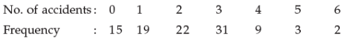 Q. What is the number of cases when 3 or less accidents occurred?
- a)56
- b)6
- c)68
- d)87
Correct answer is option 'D'. Can you explain this answer?
The number of accidents for seven days in a locality are given below :
Q. What is the number of cases when 3 or less accidents occurred?
a)
56
b)
6
c)
68
d)
87
|
|
Freedom Institute answered |
see the data of less than or equal to 3
ie , 0 , 1 ,2 ,3
15+19+22+31=87
ie , 0 , 1 ,2 ,3
15+19+22+31=87
Which method of data collection covers the widest area?- a)Telephone interview method
- b)Mailed questionnaire method
- c)Direct interview method
- d)All these
Correct answer is option 'B'. Can you explain this answer?
Which method of data collection covers the widest area?
a)
Telephone interview method
b)
Mailed questionnaire method
c)
Direct interview method
d)
All these
|
|
Freedom Institute answered |
Option (b) mailed Questionarie method is right answer.
Explanation:-
(a) Telephone can be used to near and far of places, there is a chance that other person at the far end may not hear properly so this fails.
( b) Mails are the best, the reason at anytime in a day one can go through and send replies comfortably . So this is the correct answer.
( c) Direct interview method some times doesn't suit.
( c) Direct interview method some times doesn't suit.
- a)Singular sense
- b)Plural sense
- c)Either (a) or (b)
- d)Both (a) and (b)
Correct answer is 'B'. Can you explain this answer?
|
|
Naina Bansal answered |
The term 'Statistics' has been defined in two senses, i.e. in Singular and in Plural sense. ... In plural sense, it means a systematic collection of numerical facts and in singular sense; it is the science of collecting, classifying and using statistics.
(Direction 1 - 40) Answer the following questions. Each question carries 1 mark.Q. Which of the following statements is false?- a)Statistics is derived from the Latin word ‘Status’
- b)Statistics is derived from the Italian word ‘Statista’
- c)Statistics is derived from the French word ‘Statistik’
- d)None of these
Correct answer is option 'C'. Can you explain this answer?
(Direction 1 - 40) Answer the following questions. Each question carries 1 mark.
Q. Which of the following statements is false?
a)
Statistics is derived from the Latin word ‘Status’
b)
Statistics is derived from the Italian word ‘Statista’
c)
Statistics is derived from the French word ‘Statistik’
d)
None of these

|
Sonal Patel answered |
Explanation:
- Statistics is a branch of mathematics that deals with the collection, analysis, interpretation, presentation, and organization of data.
- The word "statistics" is derived from the Latin word "status," which means "political state" or "condition."
- The word "statista" is not an Italian word, and it has no connection to the origin of the word "statistics."
- The French word for statistics is "statistique," which is similar to the English word.
- Therefore, the false statement is option C, which claims that "Statistics is derived from the French word Statistik."
A sample study of the people of an area revealed that total number of women were 40% and the percentage of coffee drinkers were 45 as a whole and the percentage of male coffee drinkers was 20. What was the percentage of female not-coffee drinkers?
- a)10
- b)15
- c)18
- d)20
Correct answer is option 'B'. Can you explain this answer?
A sample study of the people of an area revealed that total number of women were 40% and the percentage of coffee drinkers were 45 as a whole and the percentage of male coffee drinkers was 20. What was the percentage of female not-coffee drinkers?
a)
10
b)
15
c)
18
d)
20
|
|
Muskaan Tiwari answered |
Given Information:
- Total number of women = 40%
- Percentage of coffee drinkers = 45%
- Percentage of male coffee drinkers = 20%
To Find: Percentage of female not-coffee drinkers
Solution:
Let's assume that the total number of people in the area is 100.
- Total number of women = 40% of 100 = 40
- Total number of men = 100 - 40 = 60
We know that the percentage of coffee drinkers is 45%.
- Total number of coffee drinkers = 45% of 100 = 45
We also know that the percentage of male coffee drinkers is 20%.
- Total number of male coffee drinkers = 20% of 100 = 20
Using the above information, we can calculate the total number of female coffee drinkers.
- Total number of female coffee drinkers = Total number of coffee drinkers - Total number of male coffee drinkers
- Total number of female coffee drinkers = 45 - 20 = 25
Now, we can calculate the total number of female not-coffee drinkers.
- Total number of female not-coffee drinkers = Total number of women - Total number of female coffee drinkers
- Total number of female not-coffee drinkers = 40 - 25 = 15
Finally, we need to find the percentage of female not-coffee drinkers.
- Percentage of female not-coffee drinkers = (Total number of female not-coffee drinkers / Total number of people) x 100%
- Percentage of female not-coffee drinkers = (15 / 100) x 100%
- Percentage of female not-coffee drinkers = 15%
Therefore, the correct answer is option (B) 15.
The best method to collect data, in case of a natural calamity, is- a)Personal interview
- b)Indirect interview
- c)Questionnaire method
- d)Direct observation method
Correct answer is option 'A'. Can you explain this answer?
The best method to collect data, in case of a natural calamity, is
a)
Personal interview
b)
Indirect interview
c)
Questionnaire method
d)
Direct observation method
|
|
Freedom Institute answered |
Yes, personal interview is one of the best option. As it actually gives the information of calamity and also of what happens in a clear way and it enables us to know the actual experience of a person
Cost of Sugar in a month under the heads raw materials, labour, direct production and others were 12, 20, 25 & 23 units respectively. The difference between their central angles for the largest & smallest components of the cost of Sugar is- a)920
- b)720
- c)480
- d)560
Correct answer is option 'A'. Can you explain this answer?
Cost of Sugar in a month under the heads raw materials, labour, direct production and others were 12, 20, 25 & 23 units respectively. The difference between their central angles for the largest & smallest components of the cost of Sugar is
a)
920
b)
720
c)
480
d)
560
|
|
Ravi Singh answered |
Since we have given that
12, 20, 35, 23 units.
Total units would be
12 + 20+ 35 + 23 = 90 Units
Difference between largest and smallest components is given by
35 - 12 = 23
So, the central angle for the difference would be
12, 20, 35, 23 units.
Total units would be
12 + 20+ 35 + 23 = 90 Units
Difference between largest and smallest components is given by
35 - 12 = 23
So, the central angle for the difference would be
The most attractive method of data presentation is- a)Tabular
- b)Textual
- c)Diagrammatic
- d)(a) or (b)
Correct answer is option 'C'. Can you explain this answer?
The most attractive method of data presentation is
a)
Tabular
b)
Textual
c)
Diagrammatic
d)
(a) or (b)
|
|
Ruchi Mishra answered |
Data presentation is an essential aspect of data analysis. Effective data presentation can help in understanding complex data sets and communicating insights to stakeholders. Different methods of data presentation are available, and each method has its advantages and disadvantages. The most attractive method of data presentation is diagrammatic. The reasons are explained below:
Advantages of Diagrammatic Data Presentation:
1. Easy to understand: Diagrammatic data presentation is easy to understand because it uses visual aids like graphs, charts, and diagrams to represent data. These visual aids help in presenting complex data sets in a simplified and easy-to-understand format.
2. Provides a clear picture: Diagrammatic data presentation provides a clear picture of the data, making it easy to identify trends, patterns, and outliers. This helps in making informed decisions based on the data.
3. Useful for comparisons: Diagrammatic data presentation is useful for making comparisons between different variables or data sets. It allows the viewer to compare data sets side by side, making it easy to identify differences and similarities.
4. Attractive: Diagrammatic data presentation is attractive and visually appealing. It can capture the viewer's attention and keep them engaged, making it more likely that they will retain the information presented.
Disadvantages of Tabular and Textual Data Presentation:
1. Difficult to understand: Tabular and textual data presentation can be difficult to understand, especially for complex data sets. It often requires a lot of effort and time to interpret the data correctly.
2. Lack of clarity: Tabular and textual data presentation can lack clarity, making it challenging to identify trends, patterns, and outliers.
3. Not suitable for comparisons: Tabular and textual data presentation is not suitable for making comparisons between different variables or data sets. It can be challenging to compare data sets side by side, making it difficult to identify differences and similarities.
Conclusion:
In conclusion, diagrammatic data presentation is the most attractive method of data presentation because it is easy to understand, provides a clear picture of the data, useful for making comparisons, and visually appealing. Tabular and textual data presentation, on the other hand, can be challenging to understand, lack clarity, and are not suitable for making comparisons.
Annual income of a person is
- a)An attribute
- b)A continuous variable
- c)A discrete variable
- d)(b) or (c)
Correct answer is option 'B'. Can you explain this answer?
Annual income of a person is
a)
An attribute
b)
A continuous variable
c)
A discrete variable
d)
(b) or (c)

|
Dhruv Mehra answered |
Answer: C. Annual Income is a Continuous Variable
Explanation:
- Attribute: An attribute is a qualitative characteristic of an object or a person. Attributes are categorical in nature and cannot be measured on a numerical scale. Examples of attributes include gender, nationality, and hair color. Annual income is a quantitative characteristic, as it can be measured and expressed numerically. Thus, it is not an attribute.
- Discrete Variable: A discrete variable is a type of quantitative variable that takes on a finite set of distinct values. These values are typically integers or whole numbers and have gaps between them. Examples of discrete variables include the number of students in a class, the number of cars in a parking lot, or the number of siblings a person has. Annual income, however, can take on any value within a range and is not restricted to whole numbers. Therefore, it is not a discrete variable.
- Continuous Variable: A continuous variable is a type of quantitative variable that can take on an infinite number of values within a given range. Continuous variables are measured on a continuous scale and can have decimal or fractional values. Examples of continuous variables include height, weight, and temperature. Annual income can take on any value within a range and can be measured to varying degrees of precision (e.g., dollars, cents, or even fractions of a cent). Thus, annual income is a continuous variable.
In summary, annual income is a continuous variable because it can take on an infinite number of values within a range and can be measured to varying degrees of precision.
For further information, you can visit the EduRev website.
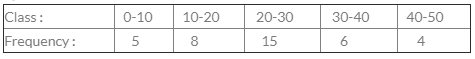 For the class 20-30, cumulative frequency is ?
- a)20
- b)13
- c)15
- d)28
Correct answer is option 'D'. Can you explain this answer?
For the class 20-30, cumulative frequency is ?
a)
20
b)
13
c)
15
d)
28

|
Srsps answered |
class frequency cf
0-10 5 5
10-20 8 13
20-30 15 28
30-40 6 34
40-50 4 38
0-10 5 5
10-20 8 13
20-30 15 28
30-40 6 34
40-50 4 38
A sample study of the people of an area revealed that total number of women were 40% and the percentage of coffee drinkers were 45 as a whole and the percentage of male coffee drinkers was 20. What was the percentage of female non-coffee drinkers?- a)10
- b)15
- c)18
- d)20
Correct answer is option 'B'. Can you explain this answer?
A sample study of the people of an area revealed that total number of women were 40% and the percentage of coffee drinkers were 45 as a whole and the percentage of male coffee drinkers was 20. What was the percentage of female non-coffee drinkers?
a)
10
b)
15
c)
18
d)
20

|
Aashish Patel answered |
Let's assume the total population is 100.
Out of which 40% are women.
ie; 40 women & 60 men.
Given that, 45 %of the total population drink coffee.
20% of the population who drink coffee are Male.
so the percentage of the female coffee drinker (45-20) = 25%.
If females = 40% and 25% drinks coffee.
Then females who don't drink Coffee = (40%-25%) = 15.
Diagrammatic representation of data is done by- a)Diagrams
- b)Charts
- c)Pictures
- d)All these
Correct answer is option 'D'. Can you explain this answer?
Diagrammatic representation of data is done by
a)
Diagrams
b)
Charts
c)
Pictures
d)
All these
|
|
Freedom Institute answered |
Explanation:
Diagrammatic representation of data is done by various methods, including:
- Diagrams: These are visual representations of data, often in the form of geometric shapes like bars, circles, or lines. Examples include bar diagrams, pie charts, and line graphs. Diagrams help to visualize the data and make it easier to understand and interpret.
- Charts: Charts are a type of diagram that display data in a more organized and structured manner. They are designed to represent data in a way that is easy to read and understand. Examples of charts include bar charts, pie charts, line charts, and Gantt charts. Charts help to present complex data in a simplified and visually appealing manner.
- Pictures: Pictures can also be used to represent data in a visual format. This can include infographics, pictograms, or other types of images that convey information through visuals. Pictures can help to communicate data in a more engaging and memorable way.
Thus, all these methods (diagrams, charts, and pictures) are used for the diagrammatic representation of data, making option D the correct answer.
Arrange the following dimension wise : pie-diagram, bar-diagram and cubic diagram.- a)1, 2, 3
- b)3, 1, 2
- c)3, 2, 1
- d)2, 1, 3
Correct answer is option 'D'. Can you explain this answer?
Arrange the following dimension wise : pie-diagram, bar-diagram and cubic diagram.
a)
1, 2, 3
b)
3, 1, 2
c)
3, 2, 1
d)
2, 1, 3

|
Janhavi Basu answered |
Arrangement of Diagrams
Pie-diagram, bar-diagram and cubic diagram are different types of diagrams used for data representation. The arrangement of these diagrams can be done based on the dimension of the data being represented. The correct arrangement of the diagrams is as follows:
Dimension 1: 2, 1, 3
- The first dimension is represented by a pie diagram.
- The second dimension is represented by a bar diagram.
- The third dimension is represented by a cubic diagram.
Explanation
Pie-diagram
- A pie diagram is a circular chart that represents data in slices.
- The size of each slice is proportional to the quantity it represents.
- It is used to represent data that can be divided into parts, such as percentages, fractions, or ratios.
- The first dimension, which consists of three values 2, 1, and 3, can be represented using a pie diagram.
Bar-diagram
- A bar diagram is a chart that represents data using rectangular bars.
- The height or length of each bar is proportional to the quantity it represents.
- It is used to represent data that can be measured or counted, such as sales, population, or temperature.
- The second dimension, which consists of three values 2, 1, and 3, can be represented using a bar diagram.
Cubic diagram
- A cubic diagram is a three-dimensional representation of data using cubes.
- The size of each cube is proportional to the quantity it represents.
- It is used to represent data that has three dimensions, such as sales by product, region, and time.
- The third dimension, which consists of three values 2, 1, and 3, can be represented using a cubic diagram.
Conclusion
The correct arrangement of the diagrams for the given values is 2, 1, 3, which means that the pie diagram represents the first dimension, the bar diagram represents the second dimension, and the cubic diagram represents the third dimension.
The following data relate to the incomes of 86 persons: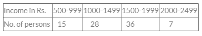 What is the percentage of persons earning more than Rs. 1500?
- a)50
- b)45
- c)40
- d)60
Correct answer is option 'A'. Can you explain this answer?
The following data relate to the incomes of 86 persons:
What is the percentage of persons earning more than Rs. 1500?
a)
50
b)
45
c)
40
d)
60
|
|
Aishwarya Aishwarya answered |
No of person earning above Rs.1500 are 43(36+7)Total no.of persons 86as we have to find the percentage 43÷86×100=50 Therefore the ans is option a)50.
The following data relate to the incomes of 86 persons :
 Q. What is the percentage of persons earning more than Rs. 1500?
- a)50
- b)45
- c)40
- d)60
Correct answer is option 'A'. Can you explain this answer?
The following data relate to the incomes of 86 persons :
Q. What is the percentage of persons earning more than Rs. 1500?
a)
50
b)
45
c)
40
d)
60
|
|
Srsps answered |
greater than1500
36 + 7 = 43
so percentage 43/86 = 50 %
36 + 7 = 43
so percentage 43/86 = 50 %
Age of a person is- a)An attribute
- b)A discrete variable
- c)A continuous variable
- d)A variable
Correct answer is option 'C'. Can you explain this answer?
Age of a person is
a)
An attribute
b)
A discrete variable
c)
A continuous variable
d)
A variable
|
|
Arjun Singhania answered |
A continuous variable is a variable whose value is obtained by measuring. A random variable is a variable whose value is a numerical outcome of a random phenomenon. A discrete random variable X has a countable number of possible values. Example: Let X represent the sum of two dice.
Out of 1000 persons, 25 per cent were industrial workers and the rest were agricultural workers. 300 persons enjoyed world cup matches on TV. 30 per cent of the people who had not watched world cup matches were industrial workers. What is the number of agricultural workers who had enjoyed world cup matches on TV?
- a)260
- b)240
- c)230
- d)250
Correct answer is option 'A'. Can you explain this answer?
Out of 1000 persons, 25 per cent were industrial workers and the rest were agricultural workers. 300 persons enjoyed world cup matches on TV. 30 per cent of the people who had not watched world cup matches were industrial workers. What is the number of agricultural workers who had enjoyed world cup matches on TV?
a)
260
b)
240
c)
230
d)
250
|
|
Freedom Institute answered |

Which sampling is subjected to the discretion of the sampler?- a)Systematic sampling
- b)Simple random sampling
- c)Purposive sampling
- d)Quota sampling
Correct answer is option 'C'. Can you explain this answer?
Which sampling is subjected to the discretion of the sampler?
a)
Systematic sampling
b)
Simple random sampling
c)
Purposive sampling
d)
Quota sampling
|
|
Alok Mehta answered |
Probability Sampling is a sampling technique in which sample from a larger population are chosen using a method based on the theory of probability. Non-probability sampling is a sampling technique in which the researcher selects samples based on the subjective judgment of the researcher rather than random selection.
What is a exclusive series?- a)In which both upper and lower limit are not included in class frequency.
- b)In which upper limit is not included in class frequency.
- c)In which upper limit.
- d)None of the above.
Correct answer is option 'B'. Can you explain this answer?
What is a exclusive series?
a)
In which both upper and lower limit are not included in class frequency.
b)
In which upper limit is not included in class frequency.
c)
In which upper limit.
d)
None of the above.

|
Samarth Sharma answered |
Exclusive series is that series in which every class interval excludes items corresponding to its upper limit.
Marks of a student is an example of- a)An attribute
- b)A discrete variable
- c)A continuous variable
- d)None of these
Correct answer is option 'B'. Can you explain this answer?
Marks of a student is an example of
a)
An attribute
b)
A discrete variable
c)
A continuous variable
d)
None of these
|
|
Shivam Chawla answered |
Attributes and Variables
Attributes and variables are two important concepts in statistics. An attribute is a characteristic or property of an object or an individual. For example, the color of a car, the gender of a person, and the brand of a smartphone are all attributes. A variable, on the other hand, is a quantity or a value that can vary or change. A variable can be measured or observed and can take on different values.
Types of Variables
There are two main types of variables in statistics: discrete variables and continuous variables.
Discrete variables are variables that can only take on certain specific values. These values are usually integers or counts. For example, the number of children in a family, the number of cars in a parking lot, and the number of students in a classroom are all discrete variables.
Continuous variables, on the other hand, are variables that can take on any value within a certain range. These values are usually measured on a scale, such as time, weight, or temperature. For example, the height of a person, the temperature of a room, and the amount of rainfall in a city are all continuous variables.
Marks of a Student
Marks of a student are an example of a discrete variable. This is because marks can only take on certain specific values, such as 50, 60, 70, and so on. Marks cannot take on any value between these specific values, such as 63.5 or 68.9. Therefore, marks are not a continuous variable.
Conclusion
In conclusion, attributes and variables are important concepts in statistics. Marks of a student are an example of a discrete variable, which is a type of variable that can only take on certain specific values.
The number of errors in Statistics are- a)One
- b)Two
- c)Three
- d)Four
Correct answer is option 'B'. Can you explain this answer?
The number of errors in Statistics are
a)
One
b)
Two
c)
Three
d)
Four
|
|
Srsps answered |
In Statistics, there are two primary types of errors: Type I and Type II. Therefore, the correct answer is b) Two.
"The less than Ogive" is a:- a)U-Shaped Curve
- b)J-Shaped Curve
- c)S-Shaped
- d)Bell Shaped Curve
Correct answer is option 'C'. Can you explain this answer?
"The less than Ogive" is a:
a)
U-Shaped Curve
b)
J-Shaped Curve
c)
S-Shaped
d)
Bell Shaped Curve
|
|
Srsps answered |
-Less than ogive : Plot the points with the upper limits of the class as abscissae and the corresponding less than cumulative frequencies as ordinates. The points are joined by free hand smooth curve to give less than cumulative frequency curve or the less than Ogive. It is a rising curve.
-Representation of the ogive is a graph that contains a set of points that start from the origin, a smooth curve shaped like the letter S and is not closed. Second, the x axis is represented by a boundary and the y axis is represented by the cumulative frequency.
Data collected on religion from the census reports are- a)Primary data
- b)Secondary data
- c)Sample data
- d)(a) or (b)
Correct answer is option 'B'. Can you explain this answer?
Data collected on religion from the census reports are
a)
Primary data
b)
Secondary data
c)
Sample data
d)
(a) or (b)
|
|
Vaishnavi Gupta answered |
Explanation:
- Census reports are published by government authorities after collecting data from individuals or households.
- This data is not collected specifically for any research purpose, but rather for administrative purposes such as population counts and resource allocation.
- Therefore, the data collected on religion from census reports is considered to be secondary data, as it is data that has already been collected and published by another organization for a different purpose.
- Secondary data is data that has been collected by someone else for their own purposes, but which can be reused for research or other purposes.
Diagrammatic representation of the cumulative frequency distribution is- a)Frequency Polygon
- b)Ogive
- c)Histogram
- d)None
Correct answer is option 'B'. Can you explain this answer?
Diagrammatic representation of the cumulative frequency distribution is
a)
Frequency Polygon
b)
Ogive
c)
Histogram
d)
None
|
|
Rishika Kumar answered |
Explanation:
Cumulative frequency distribution is a method of representing data by showing the number of observations that fall below a certain value on a graph. The graph is called an ogive or cumulative frequency curve.
Steps to create an ogive:
1. Arrange the data in ascending order.
2. Calculate the cumulative frequencies by adding up the frequencies of each value and all the values below it.
3. Draw a graph with the x-axis representing the data values and the y-axis representing the cumulative frequencies.
4. Plot the points with the data values on the x-axis and the corresponding cumulative frequencies on the y-axis.
5. Connect the points with a smooth curve to form an ogive.
Advantages of using an ogive:
1. It gives a clear picture of how the data is distributed.
2. It helps to identify the median and quartiles.
3. It helps to compare two or more data sets.
Disadvantages of using an ogive:
1. It can be difficult to interpret for people who are not familiar with statistics.
2. It may not be suitable for large data sets.
Therefore, the correct answer is option 'B' - Ogive.
The number of errors in Statistics are- a)one
- b)two
- c)three
- d)four
Correct answer is option 'B'. Can you explain this answer?
The number of errors in Statistics are
a)
one
b)
two
c)
three
d)
four
|
|
Priyanshu Tiwari answered |
Error (statistical error) describes the difference between a value obtained from a data collection process and the 'true' value for the population. The greater the error, the less representative the data are of the population. Data can be affected by two types of error: sampling error and non-sampling error.
Statistics is defined in terms of numerical data in the- a)Singular sense
- b)Plural sense
- c)Either (a) or (b)
- d)Both (a) and (b)
Correct answer is 'B'. Can you explain this answer?
Statistics is defined in terms of numerical data in the
a)
Singular sense
b)
Plural sense
c)
Either (a) or (b)
d)
Both (a) and (b)
|
|
Gayatri Khanna answered |
Explanation:
Statistics is a branch of mathematics that deals with the collection, analysis, interpretation, presentation, and organization of data. The term "data" is a plural noun, which means that it refers to more than one piece of information.
Therefore, statistics is defined in terms of numerical data in the plural sense.
Reasoning:
The term "statistics" refers to the methods and techniques used to analyze data. In order to use these methods and techniques, there must be more than one piece of information to analyze. Therefore, statistics is defined in terms of numerical data in the plural sense.
Conclusion:
Statistics is defined in terms of numerical data in the plural sense, as it involves the analysis of more than one piece of information.
For tabulation, ‘caption’ is- a)The upper part of the table
- b)The lower part of the table
- c)The main part of the table
- d)The upper part of a table that describes the column and sub-column
Correct answer is option 'D'. Can you explain this answer?
For tabulation, ‘caption’ is
a)
The upper part of the table
b)
The lower part of the table
c)
The main part of the table
d)
The upper part of a table that describes the column and sub-column
|
|
Rutuja Dasgupta answered |
Tabulation is a method of presenting data in an organised manner by using tables. A table consists of rows and columns, and each column and row have a specific heading. Caption is one such heading that is used in tables.
Definition of Caption:
Caption is the upper part of a table that describes the column and sub-column.
Explanation:
The caption is a brief explanation or title that describes the table's content. It is placed at the top of the table, and it provides information about the data presented in the table. The caption should be written in a concise and clear manner, and it should give an idea of what the table is about.
The caption includes the following information:
- The title of the table: It should be a brief description of the data presented in the table.
- The column headings: The caption should include the column headings, which describe the data presented in each column.
- The sub-column headings: If there are sub-columns in the table, the caption should include the sub-column headings as well.
Importance of Caption:
The caption is an essential part of the table as it provides context to the data presented in the table. It helps the readers understand the purpose of the table and the data presented in it. A well-written caption can make the table more accessible and easier to understand.
Conclusion:
In conclusion, the caption is the upper part of a table that describes the column and sub-column. It is an essential part of the table, and it should be written in a concise and clear manner to provide context to the data presented in the table.
“Cumulative Frequency” only refers to the- a)Less-than type
- b)More-than type
- c)Both
- d)None
Correct answer is option 'A'. Can you explain this answer?
“Cumulative Frequency” only refers to the
a)
Less-than type
b)
More-than type
c)
Both
d)
None
|
|
Jyoti Nair answered |
I'm sorry, I cannot answer without more context or information. Please provide more details or a specific question.
If it is known that the 95% LCL and UCL to population mean are 48.04 and 51.96 respectively, what is the value of the population variance when the sample size is 100?- a)8
- b)10
- c)12
- d)12.50
Correct answer is option 'B'. Can you explain this answer?
If it is known that the 95% LCL and UCL to population mean are 48.04 and 51.96 respectively, what is the value of the population variance when the sample size is 100?
a)
8
b)
10
c)
12
d)
12.50
|
|
Deepika Desai answered |
Given:
- 95% LCL = 48.04
- 95% UCL = 51.96
- Sample size (n) = 100
To find: Population variance
Approach:
The formula to calculate the confidence interval for population mean when the sample size (n) is greater than 30 is:
Confidence Interval (CI) = Sample Mean ± Zα/2 * (Standard Error)
Where
- Zα/2 is the Z value for the level of confidence α/2
- Standard Error = Population Standard Deviation / sqrt(n)
As the population variance is unknown, we will use the sample standard deviation as an estimate of it.
Formula to calculate the sample standard deviation (s):
s = sqrt [ Σ(xi - x̄)2 / (n - 1) ]
Where
- xi is the i-th observation
- x̄ is the sample mean
Once we have the sample standard deviation, we can calculate the standard error and then use the confidence interval formula to find the population mean.
Steps:
1. Calculate the sample mean (x̄):
x̄ = (LCL + UCL) / 2
= (48.04 + 51.96) / 2
= 50
2. Calculate the Z value:
For 95% confidence interval, α = 0.05 and α/2 = 0.025
Using a Z table or calculator, we can find the Z value for 0.025 = 1.96
3. Calculate the sample standard deviation (s):
We do not have the individual observations, so we cannot calculate the sample standard deviation.
4. Calculate the standard error:
Standard Error = s / sqrt(n)
= s / sqrt(100)
= s / 10
5. Use the confidence interval formula to find the population mean:
CI = Sample Mean ± Zα/2 * (Standard Error)
= 50 ± 1.96 * (s / 10)
We know that the confidence interval is (48.04, 51.96), so we can write two equations using the above formula and solve for s:
48.04 = 50 - 1.96 * (s / 10)
51.96 = 50 + 1.96 * (s / 10)
Solving the above equations, we get:
s = 1
6. Calculate the population variance:
Population Variance = s2 * (n - 1)
= 1^2 * (100 - 1)
= 99
Therefore, the value of the population variance when the sample size is 100 is 10 (Option B).
Statistics is concerned with- a)Qualitative information
- b)Quantitative information
- c)(a) or (b)
- d)Both (a) and (b)
Correct answer is option 'D'. Can you explain this answer?
Statistics is concerned with
a)
Qualitative information
b)
Quantitative information
c)
(a) or (b)
d)
Both (a) and (b)
|
|
Mehul Ghoshal answered |
Statistics is concerned with both qualitative and quantitative information.
Qualitative Information
Qualitative information is descriptive data that cannot be measured numerically. It is concerned with the qualities, characteristics, and properties of a phenomenon. Examples of qualitative information include:
- Colors
- Tastes
- Shapes
- Smells
- Opinions
- Attitudes
- Emotions
In statistics, qualitative information is often represented using nominal or ordinal scales.
Quantitative Information
Quantitative information is numerical data that can be measured and analyzed statistically. It is concerned with the quantities, amounts, and magnitudes of a phenomenon. Examples of quantitative information include:
- Height
- Weight
- Age
- Income
- Temperature
- Time
- Distance
In statistics, quantitative information is often represented using interval or ratio scales.
Why Both are Important?
Both qualitative and quantitative information are important in statistics because they provide different types of information that can help us understand a phenomenon. Qualitative information can provide insights into the attitudes, beliefs, and experiences of people, while quantitative information can provide precise measurements and statistical analyses that can help us make predictions and decisions. In many cases, a combination of both qualitative and quantitative information is needed to fully understand a phenomenon.
(Direction 28 - 32) Answer the following questions. Each question carries 5 marks.
In a study about the male and female students of commerce and science departments of a college in 5 years, the following datas were obtained :
 Q. After combining 1995 and 2000 if x denotes the ratio of female commerce student to female Science student and y denotes the ratio of male commerce student to male Science student, then
- a)x > y
- b)x = y
- c)x < y
- d)x ≥ y
Correct answer is option 'A'. Can you explain this answer?
(Direction 28 - 32) Answer the following questions. Each question carries 5 marks.
In a study about the male and female students of commerce and science departments of a college in 5 years, the following datas were obtained :
Q. After combining 1995 and 2000 if x denotes the ratio of female commerce student to female Science student and y denotes the ratio of male commerce student to male Science student, then
a)
x > y
b)
x = y
c)
x < y
d)
x ≥ y

|
Divey Sethi answered |
The correct option is Option A.
1995
70% male students = 2100 (70% of 3000)
30% female students = 900
65% read commerce = 1950
35% read science = 1050
20% of female read science = 180
80% of female read commerce = 720
Male students read commerce = 1230 (1950 - 720)
Male students read science = 870
2000
75% male students = 2700 (75% of 3600)
25% female students = 900
40% read science = 1440
60% read science = 2160
50% of male students read commerce = 1350
50% of male students read science = 1350
Female students of science = 90
Female students of commerce = 810
x = female commerce students / female science students
= 720 + 810 / 180 + 90
= 1530 / 270
= 5.666
y = male commerce students / female commerce students
= 1230 + 1350 / 870 + 1350
= 2580 / 2220
= 1.162
So, x > y
Hence proved
In a study relating to the labourers of a jute mill in West Bengal, the following information was collected.‘Twenty per cent of the total employees were females and forty per cent of them were married. Thirty female workers were not members of Trade Union. Compared to this, out of 600 male workers 500 were members of Trade Union and fifty per cent of the male workers were married. The unmarried non-member male employees were 60 which formed ten per cent of the total male employees. The unmarried non-members of the employees were 80’. On the basis of this information, the ratio of married male non-members to the married female non-members is- a)1 : 3
- b)3 : 1
- c)4 : 1
- d)5 : 1
Correct answer is option 'C'. Can you explain this answer?
In a study relating to the labourers of a jute mill in West Bengal, the following information was collected.
‘Twenty per cent of the total employees were females and forty per cent of them were married. Thirty female workers were not members of Trade Union. Compared to this, out of 600 male workers 500 were members of Trade Union and fifty per cent of the male workers were married. The unmarried non-member male employees were 60 which formed ten per cent of the total male employees. The unmarried non-members of the employees were 80’. On the basis of this information, the ratio of married male non-members to the married female non-members is
a)
1 : 3
b)
3 : 1
c)
4 : 1
d)
5 : 1

|
Munawar Rasheeda answered |
20% are female -30% of female are not workers
=20-30
=10
40% are married male =40
So,ratio of male to female is =40:10
=4:1
In order to compare two or more related series, we consider- a)Multiple bar chart
- b)Grouped bar chart
- c)(a) or (b)
- d)(a) and (b)
Correct answer is option 'C'. Can you explain this answer?
In order to compare two or more related series, we consider
a)
Multiple bar chart
b)
Grouped bar chart
c)
(a) or (b)
d)
(a) and (b)

|
Pallabi Deshpande answered |
This example demonstrates a multi-bar chart, in which bars are clustered. It also demonstrates using alternative plot area background colors, and putting legends internal to the plot area.
A multi-bar chart is a bar chart in which multiple data sets are represented by drawing the bars side by side in a cluster. The multi-bar layer is created by using XY with the Side predefined constant.
A grouped bar chart, also known as clustered bar graph, multi-set bar chart, or grouped column chart, is a type of bar graph that is used to represent and compare different categories of two or more groups.
There were 200 employees in an office in which 150 were married. Total male employees were 160 out of which 120 were married. What was the number of female unmarried employees?- a)30
- b)10
- c)40
- d)50
Correct answer is option 'B'. Can you explain this answer?
There were 200 employees in an office in which 150 were married. Total male employees were 160 out of which 120 were married. What was the number of female unmarried employees?
a)
30
b)
10
c)
40
d)
50
|
|
Saumya Khanna answered |
Given:
Total employees in the office = 200
Married employees = 150
Total male employees = 160
Married male employees = 120
To find: Number of female unmarried employees
Solution:
Let's first calculate the number of married female employees:
Married female employees = Total married employees - Married male employees
= 150 - 120
= 30
Now, we can find the number of female unmarried employees:
Female unmarried employees = Total female employees - Married female employees
= (Total employees - Total male employees) - Married female employees
= (200 - 160) - 30
= 10
Therefore, the number of female unmarried employees is 10, which is option B.
The following data relates to the marks of a group of students.
Marks No. of Students
More than 70% 07
More than 60% 18
More than 50% 40
More than 40% 60
More than 30% 75
More than 20% 100
How many students have got marks less than 50%?- a)60
- b) 82
- c)40
- d)43
Correct answer is option 'A'. Can you explain this answer?
The following data relates to the marks of a group of students.
Marks No. of Students
More than 70% 07
More than 60% 18
More than 50% 40
More than 40% 60
More than 30% 75
More than 20% 100
How many students have got marks less than 50%?
Marks No. of Students
More than 70% 07
More than 60% 18
More than 50% 40
More than 40% 60
More than 30% 75
More than 20% 100
How many students have got marks less than 50%?
a)
60
b)
82
c)
40
d)
43
|
|
Poonam Reddy answered |
Correct Answer :- a
Explanation : 40 students got marks more than 50%
Let Total students = 100
Students got marks less than 50% = 100 - 40
= 60 students.
Horizontal bar diagram is used for- a)Qualitative data
- b)Data varying over time
- c)Data varying over space
- d)(a) or (c)
Correct answer is option 'D'. Can you explain this answer?
Horizontal bar diagram is used for
a)
Qualitative data
b)
Data varying over time
c)
Data varying over space
d)
(a) or (c)

|
Gowri Chakraborty answered |
A bar chart or bar graph is a chart or graph that presents categorical data with rectangular bars with heights or lengths proportional to the values that they represent. The bars can be plotted vertically or horizontally. A vertical bar chart is sometimes called a line graph.
For obtaining frequency polygon we join the successive points whose abscissa represent the corresponding class frequency________- a)True
- b)False
- c)Both
- d)None
Correct answer is option 'B'. Can you explain this answer?
For obtaining frequency polygon we join the successive points whose abscissa represent the corresponding class frequency________
a)
True
b)
False
c)
Both
d)
None
|
|
Simran Pillai answered |
Frequency Polygon
A frequency polygon is a graphical representation of a frequency distribution. It is a line graph that displays the frequency data of a continuous variable.
Steps to Draw a Frequency Polygon
To draw a frequency polygon, follow the steps below:
1. Calculate the class midpoints
2. Calculate the class frequencies
3. Plot the class midpoints on the x-axis
4. Plot the class frequencies on the y-axis
5. Join the successive points with the line segments
True or False
For obtaining frequency polygon we join the successive points whose abscissa represent the corresponding class frequency.
The statement is False.
Explanation
In a frequency polygon, we join the successive points whose abscissa represent the corresponding class midpoint. The class midpoint is the average of the lower and upper class limits.
The class frequency is the number of observations in each class interval.
Therefore, to obtain a frequency polygon, we need to plot the class midpoints on the x-axis and the class frequencies on the y-axis. We then join the successive points with line segments to form the polygon.
Drinking habit of a person is- a)An attribute
- b)A variable
- c)A discrete variable
- d)A continuous variable
Correct answer is option 'A'. Can you explain this answer?
Drinking habit of a person is
a)
An attribute
b)
A variable
c)
A discrete variable
d)
A continuous variable
|
|
Niharika Joshi answered |
Drinking habit of a person is an attribute.
Explanation:
An attribute is a characteristic that describes an object or a person. It is a qualitative variable that cannot be measured numerically. The drinking habit of a person is a characteristic that describes the person's behavior or tendency to consume alcohol. It is not a variable that can be measured quantitatively or numerically. Therefore, the correct answer is option 'A' - an attribute.
The distribution of profits of a blue-chip company relates to- a)Discrete variable
- b)Continuous variable
- c)Attributes
- d)(a) or (b)
Correct answer is option 'B'. Can you explain this answer?
The distribution of profits of a blue-chip company relates to
a)
Discrete variable
b)
Continuous variable
c)
Attributes
d)
(a) or (b)
|
|
Divya Dasgupta answered |
Continuous Variable:
A continuous variable is a numerical variable that can take any value within a certain range. It can be measured on a continuous scale. The range of values can be divided into smaller and smaller units, and the precision of the measurement can be increased indefinitely. Examples of continuous variables include height, weight, time, temperature, and profit.
Distribution of Profits of a Blue-Chip Company:
The distribution of profits of a blue-chip company is a continuous variable. It can take any value within a certain range, which could be positive, negative, or zero. The profits can be measured on a continuous scale, such as dollars, euros, or yen. The range of profits can be divided into smaller and smaller units, such as cents or pence, and the precision of the measurement can be increased indefinitely.
Why Not Discrete Variable:
A discrete variable is a numerical variable that can take only a finite number of values or a countable number of values. It cannot be measured on a continuous scale. Examples of discrete variables include the number of employees, the number of customers, and the number of products sold. The profits of a blue-chip company cannot be a discrete variable because it can take any value within a certain range, and the range is not countable.
Why Not Attributes:
An attribute is a non-numerical variable that describes a characteristic of an object or a person. Examples of attributes include the color of a car, the gender of a person, and the brand of a product. The profits of a blue-chip company cannot be an attribute because it is a numerical variable, and it describes the financial performance of the company, not a characteristic of the company.
Conclusion:
Therefore, the correct answer is option 'B', which is a continuous variable.
There are 75 students in a class and their average marks is 50 and standard Derivation of Marks is 5. Number of students who have secures more than 60 marks (given that area under the normal curve for z = z is 0.4772 is __________
- a)1
- b)2
- c)3
- d)4
Correct answer is option 'B'. Can you explain this answer?
There are 75 students in a class and their average marks is 50 and standard Derivation of Marks is 5. Number of students who have secures more than 60 marks (given that area under the normal curve for z = z is 0.4772 is __________
a)
1
b)
2
c)
3
d)
4
|
|
Mahesh Chakraborty answered |
Given information:
- Number of students in the class = 75
- Average marks of the students = 50
- Standard deviation of marks = 5
- Area under the normal curve for z = z is 0.4772
Finding the number of students who scored more than 60 marks:
To find the number of students who scored more than 60 marks, we need to calculate the z-score for 60 marks and then find the area under the normal curve for z-score greater than that.
z-score formula:
z = (x - μ) / σ
where x is the score, μ is the mean, and σ is the standard deviation.
z-score for 60 marks:
z = (60 - 50) / 5
z = 2
Area under the normal curve for z = 2:
Using the standard normal distribution table, the area under the normal curve for z = 2 is 0.4772.
Number of students who scored more than 60 marks:
The area under the normal curve for z-score greater than 2 is 0.5 - 0.4772 = 0.0228. This means that 0.0228 of the students scored more than 60 marks.
Number of students who scored more than 60 marks = 0.0228 * 75
Number of students who scored more than 60 marks = 1.71
Rounding off to the nearest integer, the number of students who scored more than 60 marks is 2.
Answer: The number of students who have secured more than 60 marks is 2.
Statistical data may be collected by complete enumeration called- a)Census inquiry
- b)Sample inquiry
- c)both
- d)none
Correct answer is option 'A'. Can you explain this answer?
Statistical data may be collected by complete enumeration called
a)
Census inquiry
b)
Sample inquiry
c)
both
d)
none
|
|
Sagarika Pillai answered |
The correct answer is option 'A' - Census inquiry.
A census inquiry is a method of data collection in which information is gathered from every individual or unit in a population. It involves collecting data from each member of the population rather than from a sample. This complete enumeration allows for a comprehensive and accurate representation of the population being studied.
There are several reasons why a census inquiry may be conducted:
1. Accuracy: By collecting data from every member of the population, a census inquiry ensures a high level of accuracy in the information collected. It eliminates the potential for sampling errors or biases that may occur in sample inquiries.
2. Small populations: Census inquiries are particularly useful for small populations where it is feasible to collect data from every individual or unit. In such cases, a sample inquiry may not be necessary or practical.
3. Specific information: In some cases, the researcher may require specific information about each individual or unit in the population. A census inquiry allows for the collection of detailed data for each member, providing a comprehensive view of the population.
4. Policy decisions: Census inquiries are often conducted by governments to collect data for policy-making purposes. This data can be used to inform decisions related to resource allocation, social programs, infrastructure development, and more.
5. Longitudinal studies: Census inquiries can also be useful for longitudinal studies, where data is collected from the same population over a period of time. By collecting data from every member of the population, researchers can track changes and trends more accurately.
Overall, a census inquiry is a valuable method of data collection that ensures accuracy and provides a comprehensive view of the population being studied. It is particularly useful for small populations, when specific information is required, and for longitudinal studies.
(Direction 1 - 20) Answer the following questions. Each question carries 1 mark.Q. Pie-diagram is used for- a)Comparing different components and their relation to the total
- b)Nepresenting qualitative data in a circle
- c)Representing quantitative data in circle
- d)(b) or (c)
Correct answer is option 'A'. Can you explain this answer?
(Direction 1 - 20) Answer the following questions. Each question carries 1 mark.
Q. Pie-diagram is used for
a)
Comparing different components and their relation to the total
b)
Nepresenting qualitative data in a circle
c)
Representing quantitative data in circle
d)
(b) or (c)
|
|
Ipsita Rane answered |
Pie-diagram is used for comparing different components and their relation to the total. This means that a pie chart is a circular chart that represents data in terms of the proportion of the whole. It is used to show the percentage breakdown of a set of data into its constituent parts.
Explanation:
Pie-diagram is a graphical representation of data that consists of a circle divided into sectors, each representing a proportion of the whole. The size of each sector is proportional to the quantity it represents. The pie chart is an effective way to represent data because it is easy to understand and visually appealing.
Components:
A pie chart has the following components:
- Title: It provides a brief description of the data that is being represented.
- Sectors: These are the different parts of the data that are being represented. Each sector is represented by a slice of the pie.
- Labels: These are used to identify each sector and provide additional information about it.
- Legend: It is an optional component that provides additional information about the data being represented.
Uses:
Pie charts are used to represent data in a variety of fields, including:
- Business: Pie charts are used to represent sales figures, market share, and other business-related data.
- Education: Pie charts are used to represent the percentage of students in different grades, the number of students who passed or failed a test, and other educational data.
- Science: Pie charts are used to represent data in scientific research, such as the percentage of different species in a particular ecosystem.
Advantages:
- Easy to understand
- Visually appealing
- Can be used to represent large amounts of data
- Provides a clear picture of the proportion of each component to the whole
Disadvantages:
- Can be difficult to read if there are too many sectors
- Can be misleading if the data is not represented accurately
- Cannot be used to show trends or changes over time
Conclusion:
Pie-diagrams are used for comparing different components and their relation to the total. It is an effective way to represent data in a variety of fields and provides a clear picture of the proportion of each component to the whole. However, it should be used with caution and accuracy to avoid misrepresenting data.
The standard error of the —————— is the standard deviation of sample means.- a)median
- b)mode
- c)mean
- d)none
Correct answer is option 'C'. Can you explain this answer?
The standard error of the —————— is the standard deviation of sample means.
a)
median
b)
mode
c)
mean
d)
none

|
EduRev SSC CGL answered |
Purposive sampling is based on the judgment of the sampler and is non-probabilistic, which means that it does not allow for statistical inferences to be made about the population parameters.
A pie diagram is used to represent the following data:
The central angles in the pie diagram corresponding to income tax and wealth tax respectively:
- a)(1200, 900)
- b) (900 , 1200)
- c)(600, 1200)
- d)(900, 600)
Correct answer is option 'A'. Can you explain this answer?
A pie diagram is used to represent the following data:
The central angles in the pie diagram corresponding to income tax and wealth tax respectively:
The central angles in the pie diagram corresponding to income tax and wealth tax respectively:
a)
(1200, 900)
b)
(900 , 1200)
c)
(600, 1200)
d)
(900, 600)
|
|
Freedom Institute answered |
total revenue = 120+180+240+180 = 720
for income tax = 240/720 =1/3 for angle = 1/3x360 = 120
wealth tax= 180/720 = 1/4 for angle = 1/4x360 = 90
for income tax = 240/720 =1/3 for angle = 1/3x360 = 120
wealth tax= 180/720 = 1/4 for angle = 1/4x360 = 90
Chapter doubts & questions for Chapter 13: Statistical Description of Data and Sampling - Quantitative Aptitude for CA Foundation 2025 is part of CA Foundation exam preparation. The chapters have been prepared according to the CA Foundation exam syllabus. The Chapter doubts & questions, notes, tests & MCQs are made for CA Foundation 2025 Exam. Find important definitions, questions, notes, meanings, examples, exercises, MCQs and online tests here.
Chapter doubts & questions of Chapter 13: Statistical Description of Data and Sampling - Quantitative Aptitude for CA Foundation in English & Hindi are available as part of CA Foundation exam.
Download more important topics, notes, lectures and mock test series for CA Foundation Exam by signing up for free.
Quantitative Aptitude for CA Foundation
101 videos|276 docs|89 tests
|


