Class 8 Exam > Class 8 Questions > explain the indifference map with a diagrams ...
Start Learning for Free
explain the indifference map with a diagrams
? Related: Diagram
Verified Answer
explain the indifference map with a diagrams Related: Diagram?
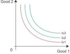
Indifference map refers to a set of indifference curves. An indifference curve which is to the right and above another shows a higher level of satisfaction to the consumer. Here, IC3 shows higher level of satisfaction than IC2. Thus, the indifference curve relates to a higher level of income of the consumer.


 This question is part of UPSC exam. View all Class 8 courses
Most Upvoted Answer
explain the indifference map with a diagrams Related: Diagram?
Indifference Map: Understanding Preferences with Diagrams
An indifference map is a graphical representation used in economics to illustrate an individual's preferences or indifference towards different combinations of goods or services. It helps us understand how a person values different options and makes choices based on their preferences. The map consists of a series of indifference curves, which represent different levels of satisfaction or utility.
Indifference Curves
- An indifference curve shows all the combinations of two goods that provide the same level of satisfaction or utility to an individual.
- The curve is downward-sloping, indicating that as the quantity of one good increases, the quantity of the other good must decrease to keep the individual equally satisfied.
- Indifference curves are typically convex to the origin, representing the concept of diminishing marginal rate of substitution. This means that as the individual consumes more of one good, they are willing to give up less of the other good to maintain the same level of satisfaction.
Understanding Preferences
- Each indifference curve in the map represents a different level of satisfaction or utility. Higher curves indicate greater levels of satisfaction.
- Indifference curves that are further from the origin represent preferred combinations of goods over those that are closer to the origin.
- The slope of an indifference curve is known as the marginal rate of substitution (MRS), which measures the rate at which the individual is willing to trade one good for another while maintaining the same level of satisfaction.
- The MRS is usually negative because of the trade-off between the two goods. For example, if an individual values apples and oranges, they might be willing to give up some oranges to get more apples, but the amount of oranges they are willing to sacrifice decreases as they have more apples.
Interpreting the Map
- The shape and position of indifference curves reflect an individual's preferences and can vary from person to person.
- If two indifference curves intersect, it implies that the individual is indifferent between the combinations of goods on those curves.
- A higher indifference curve means greater satisfaction, so an individual always prefers combinations of goods on higher curves.
- The slope of an indifference curve determines the rate at which the individual is willing to substitute one good for another.
- The map helps economists analyze consumer behavior, predict choices, and understand the impact of changes in prices or income on consumer preferences.
Overall, an indifference map provides a visual representation of how individuals make choices based on their preferences. It helps us analyze consumer behavior and understand the trade-offs individuals are willing to make between different goods or services to maintain their satisfaction levels.
Attention Class 8 Students!
To make sure you are not studying endlessly, EduRev has designed Class 8 study material, with Structured Courses, Videos, & Test Series. Plus get personalized analysis, doubt solving and improvement plans to achieve a great score in Class 8.

|
Explore Courses for Class 8 exam
|

|
Similar Class 8 Doubts
explain the indifference map with a diagrams Related: Diagram?
Question Description
explain the indifference map with a diagrams Related: Diagram? for Class 8 2024 is part of Class 8 preparation. The Question and answers have been prepared according to the Class 8 exam syllabus. Information about explain the indifference map with a diagrams Related: Diagram? covers all topics & solutions for Class 8 2024 Exam. Find important definitions, questions, meanings, examples, exercises and tests below for explain the indifference map with a diagrams Related: Diagram?.
explain the indifference map with a diagrams Related: Diagram? for Class 8 2024 is part of Class 8 preparation. The Question and answers have been prepared according to the Class 8 exam syllabus. Information about explain the indifference map with a diagrams Related: Diagram? covers all topics & solutions for Class 8 2024 Exam. Find important definitions, questions, meanings, examples, exercises and tests below for explain the indifference map with a diagrams Related: Diagram?.
Solutions for explain the indifference map with a diagrams Related: Diagram? in English & in Hindi are available as part of our courses for Class 8.
Download more important topics, notes, lectures and mock test series for Class 8 Exam by signing up for free.
Here you can find the meaning of explain the indifference map with a diagrams Related: Diagram? defined & explained in the simplest way possible. Besides giving the explanation of
explain the indifference map with a diagrams Related: Diagram?, a detailed solution for explain the indifference map with a diagrams Related: Diagram? has been provided alongside types of explain the indifference map with a diagrams Related: Diagram? theory, EduRev gives you an
ample number of questions to practice explain the indifference map with a diagrams Related: Diagram? tests, examples and also practice Class 8 tests.

|
Explore Courses for Class 8 exam
|

|
Suggested Free Tests
Signup for Free!
Signup to see your scores go up within 7 days! Learn & Practice with 1000+ FREE Notes, Videos & Tests.


