Class 10 Exam > Class 10 Notes > Mathematics for GCSE/IGCSE > Bar Charts & Pictograms
Bar Charts & Pictograms | Mathematics for GCSE/IGCSE - Class 10 PDF Download

Bar Charts & Pictograms
What is a bar chart and what is it used for?
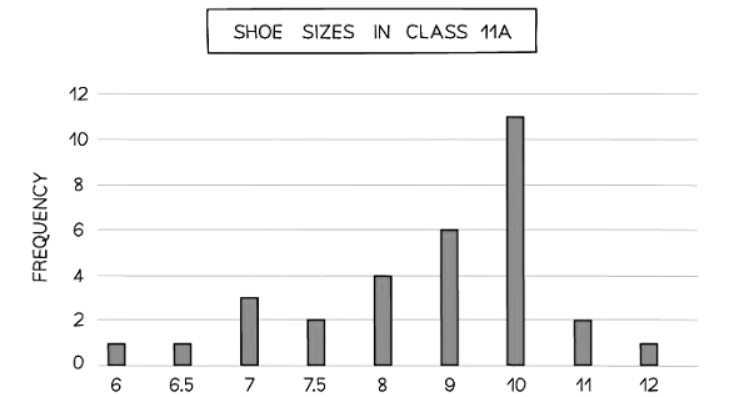
- A bar chart visually represents qualitative and/or discrete data such as colors of cars, shoe sizes, and names of students.
- Bar charts are ideal for situations with a small number of possible outcomes where the data is categorical (non-numerical).
- The vertical axis displays the frequency, starting at zero and increasing equally.
- The horizontal axis shows the different outcomes.
- Each bar in a bar chart represents an outcome, with the height indicating the frequency.
- All bars should have the same width, and there should be gaps between them.
- You can easily identify the mode using a bar chart.
- The mode represents the most common outcome in a dataset.
- It is depicted by the bar with the highest height.
- For instance, in a bar chart showing shoe sizes, if size 10 has a frequency of 11, then 10 is the modal shoe size.
- Comparative bar charts are useful for comparing two or more datasets.
- In these charts, bars for each outcome are displayed for every dataset side by side without any gaps.
- To differentiate between bars from different datasets, colors or shading are used along with a key for clarity.
What is a pictogram and what is it used for?
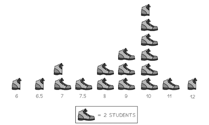
- A pictogram offers an alternative to a bar chart, providing a visual representation of qualitative and/or discrete data.
- Like bar charts, pictograms are typically employed for categorical (non-numerical) data.
- Pictograms lack axes; instead, they use symbols to denote frequency.
- It's crucial to include a key in a pictogram indicating the frequency represented by one symbol.
- Half and quarter symbols are commonly utilized.
- Pictograms should follow similar conventions as bar charts to ensure ease of reading and interpretation.
- All symbols should maintain uniform size and shape.
- Symbols should be arranged in a manner that facilitates the clear observation of the highest frequency (the mode) and other relevant features.
- Here's what a pictogram depicting the shoe sizes of class 11A would resemble.
Question for Bar Charts & PictogramsTry yourself: What is the purpose of using a bar chart?View Solution
The document Bar Charts & Pictograms | Mathematics for GCSE/IGCSE - Class 10 is a part of the Class 10 Course Mathematics for GCSE/IGCSE.
All you need of Class 10 at this link: Class 10
|
38 videos|413 docs|19 tests
|
FAQs on Bar Charts & Pictograms - Mathematics for GCSE/IGCSE - Class 10
| 1. What is the difference between a bar chart and a pictogram? |  |
Ans. A bar chart represents data using rectangular bars of different lengths, while a pictogram uses pictures or symbols to represent data.
| 2. How can a bar chart be used to compare different categories or groups of data? | |
Ans. A bar chart visually displays the data for each category or group using bars of varying lengths, making it easy to compare the values among different categories.
| 3. What are some advantages of using a pictogram to represent data? | |
Ans. Pictograms are visually appealing and can make data easier to understand for those who may have difficulty interpreting numerical data. They can also help in making data more engaging and memorable.
| 4. How can one ensure that a bar chart or pictogram is accurately representing the data? | |
Ans. To ensure accuracy, one should check that the scale on the chart is clearly labeled, that the bars or pictures accurately represent the data values, and that the chart is properly labeled and titled.
| 5. In what situations would it be more appropriate to use a bar chart over a pictogram, and vice versa? | |
Ans. Bar charts are typically used when precise numerical data needs to be compared, while pictograms are more suitable for representing data in a more visual and engaging way, especially when dealing with simpler data sets.
About this Document

Sep 23, 2025
Last updated
Related Exams
Document Description: Bar Charts & Pictograms for Class 10 2025 is part of Mathematics for GCSE/IGCSE preparation.
The notes and questions for Bar Charts & Pictograms have been prepared according to the Class 10 exam syllabus. Information about Bar Charts & Pictograms covers topics
like Bar Charts & Pictograms and Bar Charts & Pictograms Example, for Class 10 2025 Exam. Find important definitions, questions, notes, meanings, examples, exercises and tests below for Bar Charts & Pictograms.
Introduction of Bar Charts & Pictograms in English is available as part of our Mathematics for GCSE/IGCSE
for Class 10 & Bar Charts & Pictograms in Hindi for Mathematics for GCSE/IGCSE course.
Download more important topics related with notes, lectures and mock test series for Class 10
Exam by signing up for free. Class 10: Bar Charts & Pictograms | Mathematics for GCSE/IGCSE - Class 10
Description
Full syllabus notes, lecture & questions for Bar Charts & Pictograms | Mathematics for GCSE/IGCSE - Class 10 - Class 10 | Plus excerises question with solution to help you revise complete syllabus for Mathematics for GCSE/IGCSE | Best notes, free PDF download
Information about Bar Charts & Pictograms
In this doc you can find the meaning of Bar Charts & Pictograms defined & explained in the simplest way possible. Besides explaining types of
Bar Charts & Pictograms theory, EduRev gives you an ample number of questions to practice Bar Charts & Pictograms tests, examples and also practice Class 10
tests

Related Searches
Viva Questions
,study material
,Exam
,past year papers
,shortcuts and tricks
,practice quizzes
,Sample Paper
,Summary
,MCQs
,Objective type Questions
,Semester Notes
,Previous Year Questions with Solutions
,Bar Charts & Pictograms | Mathematics for GCSE/IGCSE - Class 10
,video lectures
,Free
,Extra Questions
,mock tests for examination
,Important questions
,ppt
,Bar Charts & Pictograms | Mathematics for GCSE/IGCSE - Class 10
,Bar Charts & Pictograms | Mathematics for GCSE/IGCSE - Class 10
;


Additional Information about Bar Charts & Pictograms for Class 10 Preparation
Bar Charts & Pictograms Free PDF Download
The Bar Charts & Pictograms is an invaluable resource that delves deep into the core of the Class 10 exam.
These study notes are curated by experts and cover all the essential topics and concepts, making your preparation more efficient and effective.
With the help of these notes, you can grasp complex subjects quickly, revise important points easily,
and reinforce your understanding of key concepts. The study notes are presented in a concise and easy-to-understand manner,
allowing you to optimize your learning process. Whether you're looking for best-recommended books, sample papers, study material,
or toppers' notes, this PDF has got you covered. Download the Bar Charts & Pictograms now and kickstart your journey towards success in the Class 10 exam.
Importance of Bar Charts & Pictograms
The importance of Bar Charts & Pictograms cannot be overstated, especially for Class 10 aspirants.
This document holds the key to success in the Class 10 exam.
It offers a detailed understanding of the concept, providing invaluable insights into the topic.
By knowing the concepts well in advance, students can plan their preparation effectively.
Utilize this indispensable guide for a well-rounded preparation and achieve your desired results.
Bar Charts & Pictograms Notes
Bar Charts & Pictograms Notes offer in-depth insights into the specific topic to help you master it with ease.
This comprehensive document covers all aspects related to Bar Charts & Pictograms.
It includes detailed information about the exam syllabus, recommended books, and study materials for a well-rounded preparation.
Practice papers and question papers enable you to assess your progress effectively.
Additionally, the paper analysis provides valuable tips for tackling the exam strategically.
Access to Toppers' notes gives you an edge in understanding complex concepts.
Whether you're a beginner or aiming for advanced proficiency, Bar Charts & Pictograms Notes on EduRev are your ultimate resource for success.
Bar Charts & Pictograms Class 10 Questions
The "Bar Charts & Pictograms Class 10 Questions" guide is a valuable resource for all aspiring students preparing for the
Class 10 exam. It focuses on providing a wide range of practice questions to help students gauge
their understanding of the exam topics. These questions cover the entire syllabus, ensuring comprehensive preparation.
The guide includes previous years' question papers for students to familiarize themselves with the exam's format and difficulty level.
Additionally, it offers subject-specific question banks, allowing students to focus on weak areas and improve their performance.
Study Bar Charts & Pictograms on the App
Students of Class 10 can study Bar Charts & Pictograms alongwith tests & analysis from the EduRev app,
which will help them while preparing for their exam. Apart from the Bar Charts & Pictograms,
students can also utilize the EduRev App for other study materials such as previous year question papers, syllabus, important questions, etc.
The EduRev App will make your learning easier as you can access it from anywhere you want.
The content of Bar Charts & Pictograms is prepared as per the latest Class 10 syllabus.
|
© EduRev
|
Education Revolution
|


|


Signup to see your scores
go up within 7 days!
Access 1000+ FREE Docs, Videos and Tests
Takes less than 10 seconds to signup