Correlation Class 11 Economics
| Table of contents |
|
| Introduction |
|
| What is Correlation Analysis? |
|
| Types of Correlation |
|
| Techniques for Measuring Correlation |
|
| Conclusion |
|

Introduction
- Correlation Analysis is a statistical tool used to establish the relationship between two variables.
- It helps us understand how changes in one variable might be related to changes in another.
- For example, if students who study more usually score higher marks, then study time and exam scores have a positive correlation. That is, if one variable increases, the other also increases.
- But not all relationships are direct; some might be just coincidences or caused by an external factor.
- By analysing correlations, we can find patterns, make predictions, and understand real-world relationships better.

What is Correlation Analysis?
Correlation Analysis helps us understand the relationship between two variables. It answers questions like:
- If one variable changes, does the other change too?
- Do they increase or decrease together?
- How strong is the relationship between them?
Examples:
1. Temperature and Ice-Cream Sales: As the temperature increases, ice cream sales increase. The two variables (temperature and ice cream sales) move in the same direction.
2. Supply and Price of Tomatoes: When supply increases (lots of tomatoes in the market), the price drops. The two variables (supply and price) move in opposite directions.

Types of Relationships
1. Cause and Effect Relationship
- One variable directly affects the other.
- Example: Low rainfall leads to low agricultural productivity.
2. Coincidence (No Cause and Effect)
- Two variables may seem related, but it’s just a coincidence.
- Example: On a random day, it is found in a classroom that those students who had bigger shoe sizes had more money in their pockets. Is there a real correlation between them, or is this a coincidence?
3. Third Variable Impact
- Sometimes, a third variable affects both variables, making them appear related.
- Example: High temperature ➔ More ice-cream sales & More people swimming ➔ More deaths by drowning.
- Does this mean that more ice-cream sales are causing more deaths by drowning?
- Temperature is the real reason both ice cream sales and drowning incidents rise, but they are not directly related to each other.

What Does Correlation Measure?
Correlation measures the direction and strength of the relationship between two variables. It tells us whether the variables move together in the same direction (positive correlation) or in opposite directions (negative correlation). Importantly, correlation measures only the degree of association between variables, not causation. This means even if two variables are correlated, one doesn't necessarily cause the other to change.
Types of Correlation
- Positive Correlation: Positive correlation is observed when two variables move in the same direction, meaning that an increase in one variable is accompanied by an increase in the other variable, and vice versa.
- Negative Correlation: Negative correlation occurs when two variables move in opposite directions, meaning that an increase in one variable is accompanied by a decrease in the other variable, and vice versa.
Examples of positive correlation:
- Price and supply of a commodity.
- Increase in Height and Weight.
- Age of husband and age of wife.
- The family income and expenditure on luxury items.
Examples of negative correlation:
- Sale of woollen garments and the day temperature.
- Price and Demand of a commodity.
- Yield of crops and price.
Techniques for Measuring Correlation
- Scatter Diagrams: A visual representation of data points plotted on a graph to show the relationship between two variables.
- Karl Pearson’s Coefficient of Correlation: A numerical measure of the strength and direction of the linear relationship between two variables.
- Spearman’s Rank Correlation: Measures the relationship between ranks of data points rather than their actual values.

Scatter Diagrams
Scatter diagrams are the simplest way to visually examine relationships. For instance:
- Positive Correlation: Points form a pattern that rises upward.
- Negative Correlation: Points form a pattern that slopes downward.
- No Correlation: Points are randomly scattered.
- Perfect Positive Correlation: All points fall on a straight upward line.
- Perfect Negative Correlation: All points fall on a straight downward line.

Karl Pearson’s Coefficient of Correlation
Karl Pearson’s Coefficient of Correlation is a numerical measure of the strength and direction of the linear relationship between two variables.
It is also known as the product-moment correlation coefficient or simple correlation coefficient.
Key Points:
Purpose: Measures how strongly two variables (X and Y) are related to each other in a linear way.
Formula: 
Characteristics of 'r':
Range:
- It always lies between -1 and +1.
- r = +1: Perfect positive relationship.
- r = -1: Perfect negative relationship.
- r = 0: No linear relationship.
Direction of Relationship:
- Positive Correlation: When both variables increase or decrease together (e.g., income and spending).
- Negative Correlation: When one variable increases, the other decreases (e.g., price and demand).
Unit-Free:
- The value of 'r' is a pure number, which means it doesn’t depend on the units of the variables. For example, it doesn't matter if we measure height in meters or centimetres, the value of 'r' will remain the same.
No Cause-and-Effect:
- Just because two variables are correlated, it doesn’t mean one causes the other to change.
- For example, there might be a high correlation between ice cream sales and drowning cases, but the cause is actually rising temperatures, which leads to more ice cream consumption and swimming activities.
Linear Relationship Only:
- 'r' should only be used if the relationship between the variables can be represented by a straight line. If the relationship is curved, this method can be misleading.
- We usually check this by plotting a scatter diagram first.


- Karl Pearson’s coefficient of correlation is calculated by the following methods:
Actual mean method:
Here,
r = Coeff. Of correlation
- Assumed Mean method:


Here,
dx = Deviations of x-series from assumed mean = (X – A)
dy = Deviation of Y-series from assumed mean = (Y – A)
∑dxdy = Sum of multiple of dx and dy.
∑dx2 = Sum of the square of dx.
∑dy2 = Sum of the square of dy
∑dx = Sum of the deviation of x-series
∑dy = Sum of the deviation of Y-series
N = Number of pairs of observations
When the value of the variables is large, we use the step deviation method to reduce the burden of calculation. - Step deviation method:

Here,
 dx = deviation of X-series from assumed mean = (X-A)
dy = deviation of Y-series from assumed mean = (Y-A)
∑dxdy = Sum of multiple of dx and dy.
∑dx2 = Sum of the square of dx.
∑dy2 = Sum of the square of dy
∑dx = Sum of the deviation of x-series
∑dy = Sum of the deviation of Y-series
N = Number of pairs of observations
C1 is common factor for series -x
C2 is common factor for series -y
Example
This example is about finding the correlation between the years of education of farmers and the annual yield per acre of land. In simpler words, we want to see if better-educated farmers produce more crops.

Steps to Calculate 'r' (Karl Pearson’s Coefficient of Correlation)
1. Find the Mean of X and Y

2. Calculate the Deviation of Each Value from the Mean
- X−Mean of X and Y−Mean of Y
- Example: For the first row, , so, and for ,
3. Calculate Squares and Products

4. Apply the Formula

Putting the values in the formula:

Interpretation
- The value of 'r' is 0.644, which is a positive number and close to 1.
- This means there is a strong positive correlation between the years of education of farmers and their annual yield per acre.
- The higher the education of farmers, the better their crop yield.
- This example shows the importance of education in improving agricultural productivity.
Important Points to Remember
- A positive value of 'r' means both variables increase together.
- If 'r' was negative, it would mean that as one variable increases, the other decreases.
- If 'r' is close to 0, it means there’s almost no linear relationship between the variables.
Spearman’s Rank Correlation
- Developed by C.E. Spearman (British Psychologist)
- It aims to measure the strength and direction of the relationship between two sets of ranked data—that is, data arranged in order of preference, performance, or any other ranking.
- Instead of using actual values (like marks or income), Spearman’s method looks at the ranks of those values. It is especially useful when the data is not evenly spaced or not suitable for other correlation methods like Pearson’s.
When to Use Spearman’s Rank Correlation:
1. When Precise Measurements are Unavailable:
- If you don’t have tools to measure something accurately (like height and weight in a remote village), you can rank them based on observation and calculate correlation.
2. When Dealing with Qualitative Characteristics:
- If you are comparing abstract qualities like honesty, fairness, or beauty, which can’t be measured directly but can be ranked based on perception.
- Note: Different people or cultures may rank such qualities differently.
3. Non-Linear Relationships:
- Sometimes the relationship between two variables is clear but not linear (not a straight line). Spearman’s rank correlation can handle this.
4. Data with Extreme Values:
- Unlike Karl Pearson’s method, this method is not affected by extreme values (very high or very low numbers), making it more reliable when your data has outliers.
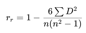
The formula for Spearman’s Rank Correlation (rᵣ):
 Where:
- n = Total number of observations
- D = Difference between the ranks of each pair of data points (X and Y)
Steps to Calculate Spearman’s Rank Correlation:
1. Rank the Data:
- Assign ranks to both sets of data (X and Y).
- If there are tied values, give them an average rank.
2. Calculate Differences (D):
- Find the difference between the ranks of each corresponding pair.
3. Square the Differences (D²):
- Square each difference value.
4. Apply the Formula:
- Use the formula to find the value of
Interpretation of Results:
- : Perfect Positive Correlation (Ranks increase together)
- : Perfect Negative Correlation (One rank increases while the other decreases)
- : No Correlation (No consistent pattern between the ranks)
Comparison with Pearson’s Correlation Coefficient:
- Spearman’s Rank Correlation is generally less accurate than Pearson’s Correlation because it only considers ranks, not the actual values.
- It’s a good choice when the data has extreme values or when the relationship is non-linear.
Calculation of Rank Correlation Coefficient
The calculation of rank correlation will be illustrated under three situations:
1. The ranks are given.
2. The ranks are not given. They have to be worked out from the data.
3. Ranks are repeated.
Case 1: When Ranks Are Given (Direct Calculation)
In this case, ranks are already assigned, and you just need to apply the formula.
Example:
Five people are judged by three judges (A, B, and C) in a beauty contest. The ranks given are:

We have to compare the ranks given by the judges two at a time:
1. A & B:

2. A & C:

3. B & C:
Similarly, the rank correlation between the rankings of judges B and C is 0.9.
Therefore, the closest match in perception is between Judges B and C (0.9).
Case 2: When Ranks Are Not Given (Convert Data to Ranks)
In this case, you are given numerical data, and you need to assign ranks first.
Example:
Marks obtained by 5 students in Statistics (X) and Economics (Y):
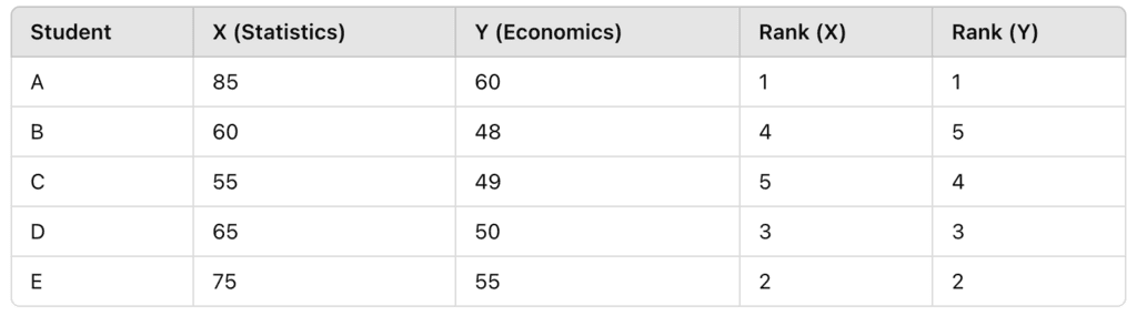 For given Marks in X and Y, ranking can be obtained as shown in the table.
Now, apply the formula with calculated ranks.
Case 3: When Ranks Are Repeated (Tied Ranks)
When data values are repeated, average ranks are given to those items.
Example:
Values of and are given:

Steps to Calculate Spearman’s Rank Correlation Coefficient
1. Assign Ranks (Average Ranks for Repeated Values):
- The value Y = 50 appears three times.
- The ranks for these repeated values are 9, 10, and 11.
- So, the average rank is:

2. Apply the Formula:
- Calculate the Correction Factor (for repeated ranks):

- Total Correction Factor:
3. Use the Given Values:

Conclusion
We have discussed various techniques for studying the relationship between two variables, particularly focusing on linear relationships. The methods include:
- Scatter Diagrams: Providing a visual representation of relationships, which can reveal both linear and non-linear patterns.
- Karl Pearson’s Coefficient of Correlation: Measuring the strength and direction of a linear relationship between two variables.
- Spearman’s Rank Correlation: Useful when variables cannot be measured precisely and only their ranks or relative positions are known.
It is important to note that these measures only describe the degree of association between variables and do not imply causation. They provide valuable insights into the direction and intensity of changes in one variable when the correlated variable changes.
|
59 videos|222 docs|43 tests
|
FAQs on Correlation Class 11 Economics
| 1. What is Spearman's rank correlation? |  |
| 2. How is Spearman's rank correlation calculated? | |
| 3. When should Spearman's rank correlation be used instead of Pearson's correlation? | |
| 4. What is the interpretation of Spearman's rank correlation coefficient? | |
| 5. Can Spearman's rank correlation coefficient be used for categorical variables? | |


Exam
,Correlation Class 11 Economics
,past year papers
,Objective type Questions
,Sample Paper
,Extra Questions
,study material
,mock tests for examination
,Viva Questions
,ppt
,Correlation Class 11 Economics
,Previous Year Questions with Solutions
,video lectures
,Important questions
,shortcuts and tricks
,practice quizzes
,Free
,Semester Notes
,MCQs
,Correlation Class 11 Economics
,Summary
;


Chapter Notes - Correlation Free PDF Download
Importance of Chapter Notes - Correlation
Chapter Notes - Correlation
Chapter Notes - Correlation Commerce Questions
Study Chapter Notes - Correlation on the App
|
© EduRev
|
Education Revolution
|


|


within 7 days!