Introduction
In our daily lives, we often come across various pieces of information, whether it's the list of our classmates' favorite colors or the measurements of different students' weights. This collection of information is what we call data.
Data is essentially any set of facts, numbers, observations, or measurements that help us understand and convey details about the world around us.
In today's world, we are surrounded by data in many forms—charts, graphs, tables, and more. These visual representations help us make sense of the information, allowing us to draw conclusions and make decisions based on it. Understanding how to present and interpret data correctly is an important skill. In this chapter, we will delve into the different ways data is displayed and learn how to analyze it effectively to make accurate inferences.
Collecting and Organizing Data
Imagine you and your friends are at a school event where there are several fun activities, like a magic show, a dance-off, and a treasure hunt. You want to find out which activity is the most popular. So, you ask each of your friends which activity they liked the most and note down their answers. This list of activities is data.
But just having this list doesn't immediately tell you which activity is the most popular. To figure that out, you need to organize the data.
For example:
- Different options are listed in rows (like types of food).
- For each response, a | is added in the corresponding row
- The number of marks in each row shows how many people chose that option.
- This method helps easily see and count the number of responses for each choice.
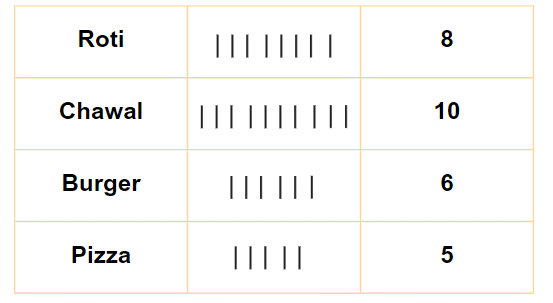
- But counting single marks by hand can be exhausting and may lead to mistakes. Hence, we come up with Tally Marks.
Tally Marks
Tally marks are a simple way to count and organize data.
Making Groups: Instead of counting each mark individually, group them in sets of five. Four vertical lines and a fifth diagonal line make a group of five (like this:  ).
).
Counting: Each group of five helps you count more quickly. For example,  means five, and two groups
 means ten.
Using in Tables: In a table, tally marks help keep track of how many people chose each option. For example, if you have tally marks for different shoe sizes, you can easily see which size is most or least popular.
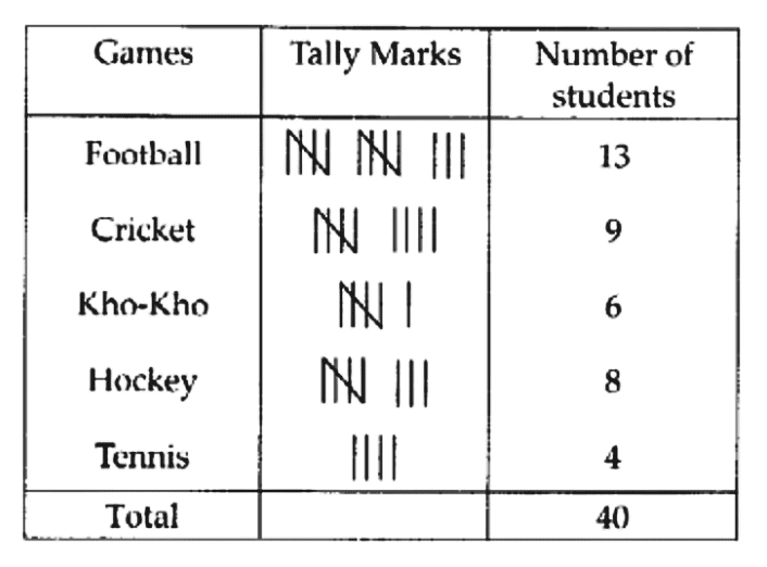
Now, imagine another situation, If you have tallies for games played by students, counting the marks quickly tells you how many students play which game.

By arranging the numbers this way, it becomes much easier to see which shoe sizes are the most common. In this case, size 5 is the most popular because it appears the most frequently.
Example: A survey was conducted among a few people regarding their favourite beverages. The below tally marks table shows the data:
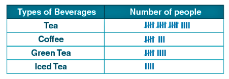
(i) How many more people like green tea than coffee?
(ii) How many people like tea?
(iii) How many total people were surveyed?
Ans:
(i) Number of people like green tea = 9
Number of people like coffee = 8
∴ One more people like green tea than coffee
(ii) Number of people who liked tea = 19
(iii) Total number of people surveyed = 40
This method of organizing data—whether by using tally marks to count preferences or by arranging numbers in order—helps you make sense of the information quickly and easily.
Question for Chapter Notes: Data Handling and Presentation
Try yourself:
What is the first step in organizing data to make it easier to analyze?Explanation
- The first step in organizing data to make it easier to analyze is to arrange the data in ascending order. This helps in seeing patterns and identifying the most common or repeated values more efficiently.
Report a problem
Pictographs
A pictograph is a fun and simple way to show data using pictures instead of numbers. Imagine you're at a school event, and you want to know how many students took part in different activities like drawing, singing, or dancing. Instead of writing down numbers, you decide to draw pictures.
For example: Riya collected fruits. She got 5 bananas, 4 apples, and 4 cherries.
You could draw these pictures in a chart to represent how many students took part in each activity: 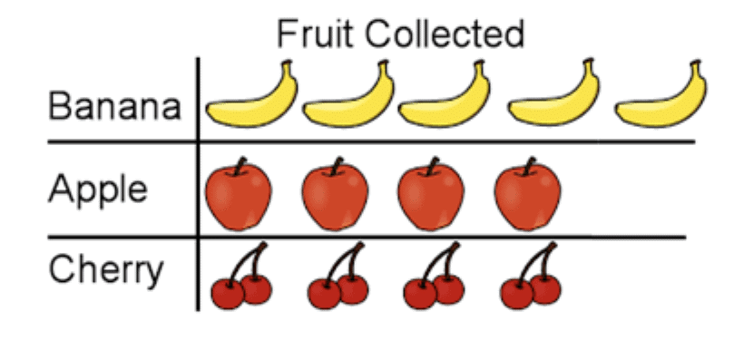
With just a quick glance at this pictograph, you can tell which activity was the most popular and which was the least popular.
A pictograph represents data through pictures of objects. It helps answer questions about data with just a quick glance.
Interpretation of a Pictograph
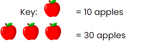
A pictograph uses pictures to show data, where each picture represents a set number of items. A key explains how many items one picture stands for, making it easier to represent larger quantities.
Example: If the key shows that one apple picture equals 10 apples, and you see 3 apple pictures in the pictograph, it means there are 30 apples in total.
Example:The number of cars parked in a parking lot every day is given in the pictograph.
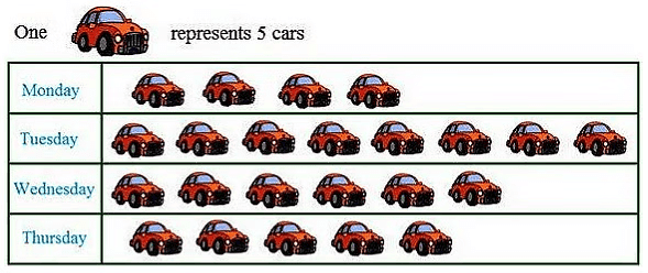
(i)Find the day when the highest number of cars are parked and how many?
(ii)When the least number of cars did park?
Ans:
(i) In the above pictograph one car represent 5 cars.
As there is the maximum number of cars is shown on Tuesday so the highest number of cars was parked on Tuesday.
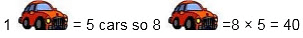 Hence, 40 cars were parked on Tuesday in the parking lot.
(ii) Least number of cars were parked on Monday as there are only 4 pictures of cars are shown on that day.
Drawing a Pictograph
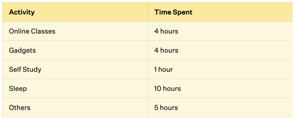
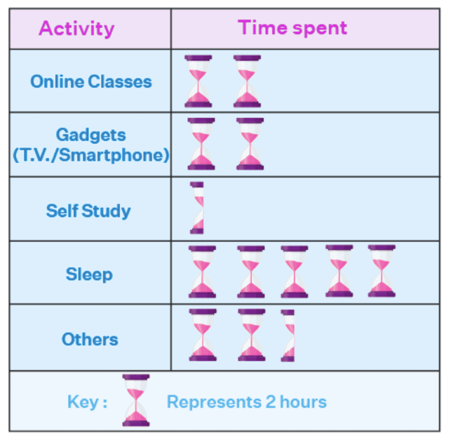
Let us take an example. We will represent the average hours spent by students on different activities.
The following table gives this data:
To create a pictograph:
Collect Data: Gather data and organize it into a table or list.
Pick a Symbol: Choose a symbol that represents the data, such as an hourglass for time spent.
Assign a Key: Decide how much one symbol represents (e.g., one hourglass = 1 hour) and write it as a key.
Draw the Pictograph: Draw two columns for categories and data, then add symbols based on the data values.
Review: Ensure the pictograph is accurate, properly labeled, and easy to understand.
Understanding Pictographs
Pictographs use pictures or symbols to represent data instead of numbers.
They make it easy to quickly understand information, like popular games, favorite colors, or student absences.
Categories can be arranged horizontally or vertically.
Pictures/symbols are drawn based on the frequency of each category.
A key explains what each picture represents (e.g., 1 picture = 1 student or 5 students).
Challenges: They can be tricky with large amounts of data or when numbers don't perfectly match the scale.
Bar Graphs
Bar graphs are similar to pictographs in that they help us quickly understand and compare information, like identifying the highest value or comparing different categories. However, when there's a lot of data, using pictographs can become difficult and take a lot of time.
In bar graphs, we draw bars of the same width either horizontally or vertically, with equal spaces between them. The length or height of each bar shows the value or number it represents. Just like in pictographs, when the numbers are large, we can use a scale or key to make it easier to read the graph.
Example: Imagine you and your friends are tracking how many books each of you read over the summer. Here's the data you collected:
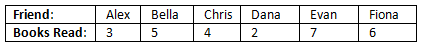
You decide to create a bar graph to show this data. In the graph, each bar’s height represents the number of books read by each friend. Here’s how it would look: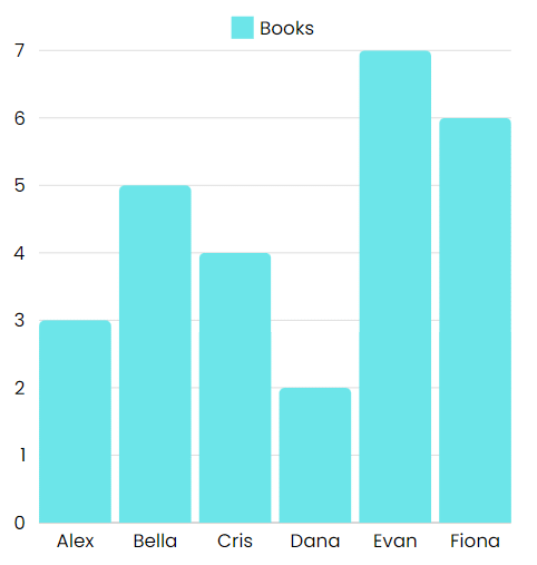
In this bar graph, the length or height of each bar shows the number of books read. The taller the bar, the more books that friend read. It’s an easy way to compare at a glance who read the most and who read the least.
A bar graph is a visual tool that uses bars to represent data, allowing for easy comparison of different categories.
Key Points to Remember:
- Bar graphs help you compare different categories easily.
- The length or height of each bar represents the value for that category.
- Sometimes, using a scale (like 1 unit = 10 people) makes it easier to represent large numbers.
- Bar graphs are useful when you have a lot of data or when you want to see trends over time.
Drawing a Bar Graph
Let us understand how to draw a bar graph with the help of an example. Liza bought 5 apples, 3 mangoes, 2 watermelons, 3 strawberries, and 6 oranges. To display this data in a bar graph, she can draw bars for each fruit, with the height representing the quantity, helping her easily see which fruit she bought the most.
Let us use the following steps to make a bar diagram of the most bought fruit.
- Step 1: Take graph paper and give the title of the bar graph like "Most Bought Fruits".
- Step 2: Draw the horizontal axis (x-axis) and vertical axis (y-axis) on a plane.
- Step 3: Now label the horizontal axis as "Types of Fruits" which is an independent category and the vertical axis as "Number of Fruits" which is a dependent category.
- Step 4: Label the fruits' names such as apples, mangoes, watermelon, strawberries, oranges and give an equal gap or leave equal space between each fruit on the horizontal axis.
- Step 5: Give the scale of the graph which shows the way in which numbers are used in the data. It is a system of marks at fixed intervals which helps in measuring objects. For example, the scale of a graph can be written as 1 unit = 1 fruit.
- Step 6: Now start making rectangular bars with equal gaps for each fruit and give height to their respective numbers.
- Step 7: The bar graph is ready, observe the heights of the rectangular bars of each fruit and find out the most bought fruit.
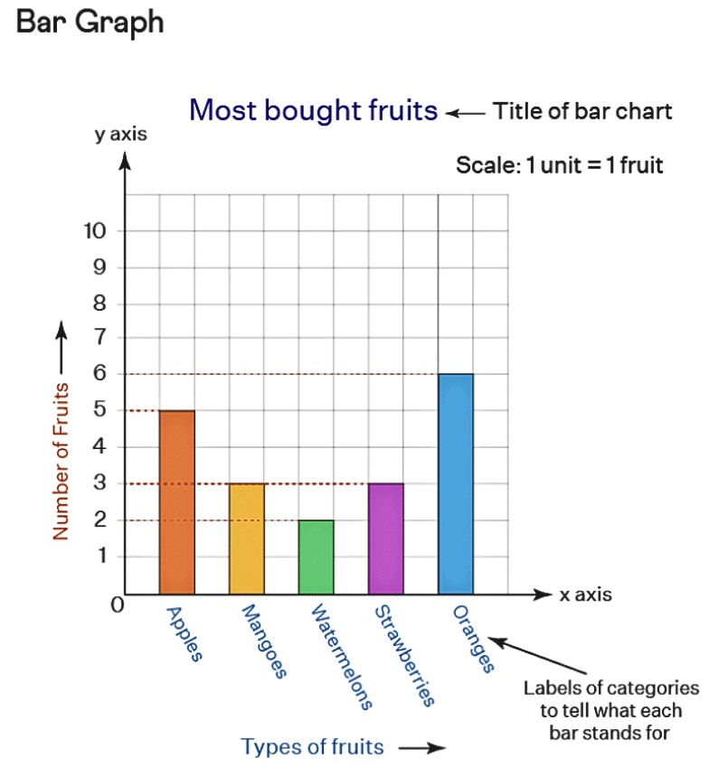
From the above graph, we can easily say that orange is the most bought fruit that Liza buys.
Why Bar Graphs Are Useful
Bar graphs visually represent data using bars of equal width and spacing. The height or length of each bar shows the frequency or amount for each category.
Each bar represents a different category, making it easy to compare data, like costs or runs scored, quickly.
Bars are spaced evenly to separate categories and show that each bar represents a distinct category.
The scale tells what each unit of length represents (e.g., 1 unit = 1 student or 1 unit = 200 people) and should be based on the data's smallest and largest values.
The scale should always begin from zero to ensure the graph is accurate and clear.
Question for Chapter Notes: Data Handling and Presentation
Try yourself:
What is a pictograph?Explanation
- A pictograph is a visual representation of data using pictures or symbols instead of numbers.
- It helps in quickly understanding and comparing information by using images or icons to represent data.
- Pictographs are a fun and simple way to present data, making it easier to interpret and analyze.
Report a problem
Artistic and Aesthetic Considerations
When creating data visuals like pictographs or bar graphs, focus on both accuracy and aesthetics. Ensure the scale fits the space and make the graph visually appealing. This helps your audience quickly understand the information being presented.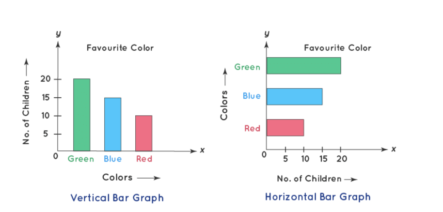
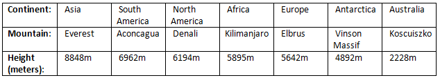
Example: Tallest Mountains on Each Continent
Imagine you have a list of the tallest mountains on each continent and their heights:
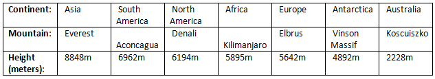
You might want to know how much taller Mount Everest is compared to Mount Koscuiszko, or whether Denali and Kilimanjaro have similar heights. Looking at just the numbers in a table can make this a bit tricky.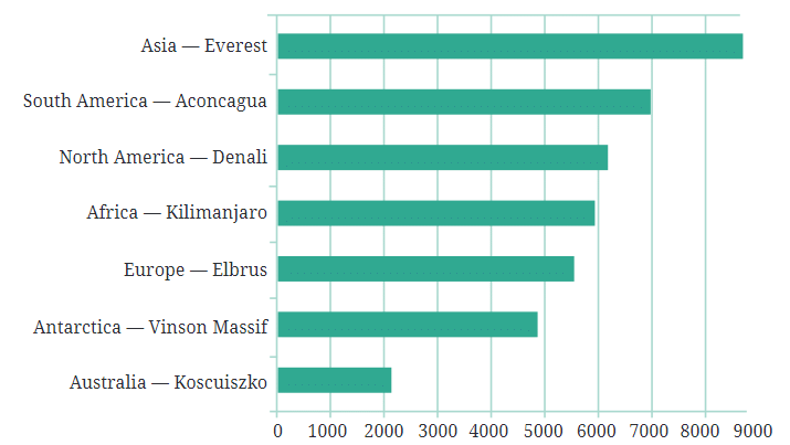
Using a Bar Graph
To make this easier to understand, you could convert the table of numbers into a bar graph. Imagine drawing horizontal bars, where each bar’s length represents the height of a mountain. This way, you can quickly compare the heights of all these mountains.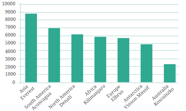
But here’s a tip: since we’re talking about the heights of mountains, it might be more visually appealing to rotate the bars so they grow upwards, like mountains themselves! This type of bar graph, where the bars grow vertically, is called a column graph.
Why Vertical Bars?
Vertical bars are best for showing things like height, as they grow upwards, like mountains or tall buildings. Horizontal bars are better for showing things like distances, as they stretch out like roads between cities.
Infographics
When you take data visualizations like bar graphs and make them even more visually appealing by adding artistic touches, you create something called infographics. Infographics use eye-catching visuals to communicate information more clearly and quickly, making the data both informative and engaging.
Understanding Infographics with examples
Example 1: Imagine you and your friends are comparing how many apples, bananas, and oranges each of you ate last week. You could make a simple bar graph to show the numbers:
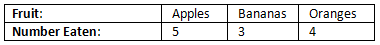
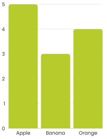
In a bar graph, each bar would represent how many of each fruit was eaten, and the height of the bar would show the number. For example:
- Apples: A bar 5 units high
- Bananas: A bar 3 units high
- Oranges: A bar 4 units high
Turning It into an Infographic
Now, let’s say you want to make this data look more fun and interesting. Instead of using plain bars, you decide to draw pictures of the fruits:
- You draw 5 apples stacked on top of each other to show how many apples were eaten.
- You draw 3 bananas in a row to represent the bananas.
- You draw 4 oranges next to each other for the oranges.

This is what we call an infographic—it’s a way of showing data using pictures instead of just bars. It makes the information easier to understand and more fun to look at.
Example 2: Tallest Mountains
Let’s say we have the data about the tallest mountains on each continent. Initially, we used a bar graph with vertical bars to represent the heights of these mountains:
In the bar graph, each bar was the same width, and the height of the bar represented the height of the mountain.
Turning a Bar Graph into an Infographic
Now, if we wanted to turn this bar graph into an infographic, we could make the bars look like mountains by changing the shape of the bars from rectangles to triangles. We might also add some color to make the infographic more visually appealing.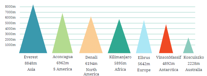
For example, each triangle could represent a mountain, with the height of the triangle showing how tall the mountain is. Here’s how it might look:
- Everest: A tall, sharp triangle reaching up to 8848 meters
- Aconcagua: A slightly shorter triangle at 6962 meters
- Kilimanjaro: A medium triangle at 5895 meters
- Koscuiszko: A small triangle at 2228 meters
This infographic would be more visually striking, and it might catch your attention more quickly than a plain bar graph. However, there are some things to be cautious about.
Potential Pitfalls of Infographics
In this infographic, the taller triangles (mountains) might also appear wider. This could unintentionally suggest that taller mountains are also wider, which isn’t necessarily true. For example, Mount Everest is the tallest, but that doesn’t mean it’s the widest. This visual choice could be misleading, implying information that the data doesn’t actually support.
Making Infographics Even More Engaging
Imagine creating an infographic where mountains represent data. You could add details like snowcaps and climbers to make it more realistic. While this would make the infographic fun, it could also mislead viewers.
For example, if Everest looks twice as tall as Elbrus in the infographic, it could suggest that Elbrus is much shorter than it actually is.
Be Careful with Infographics
Infographics are great for presenting data visually, but they must be accurate. Make sure your visuals don’t mislead people and that they truly represent the data.
Why This Matters
While making data look interesting, always ensure you’re presenting the truth. Misleading visuals, like making one fruit look much bigger than the others, could create the wrong impression.
Key Points
- Collecting favorite items, like ice cream flavors, creates a list, which is data.
- Data is information collected as facts, numbers, or descriptions.
- Tally marks and ordering help organize data to identify popular choices quickly.
- Pictographs use pictures to represent data; each picture can stand for one or more items.
- Bar graphs use bars to compare data; the height or length shows the value.
- Bar graphs are helpful for large data or precise comparisons, like population over years.
- Infographics make data visually appealing but must accurately represent information to avoid misleading viewers.