Class 10 Exam > Class 10 Notes > Mathematics for GCSE/IGCSE > Cumulative Frequency Graphs
Cumulative Frequency Graphs | Mathematics for GCSE/IGCSE - Class 10 PDF Download
Cumulative Frequency
- Cumulative means "running total" or "adding up as you go along."
- In a table of grouped data, cumulative frequency means the total of all frequencies up to the end of that group.
- Cumulative frequencies can be presented in two ways:
- A regular grouped data table with an extra column for cumulative frequencies.
- Example: rows labeled 0 ≤ x < 20, 20 ≤ x < 40, 40 ≤ x < 60, etc.
- A separate table where each group is relabeled to start at the beginning (often zero).
- Example: rows labeled x < 20, x < 40, x < 60, etc.
- A regular grouped data table with an extra column for cumulative frequencies.
Drawing Cumulative Frequency Diagrams
How do I draw a cumulative frequency graph?
- This is best explained with an example:
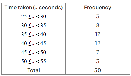
- The times taken to complete a quiz by 50 students are shown in the table below:

- The times taken to complete a quiz by 50 students are shown in the table below:
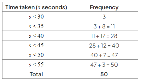
- Cumulative frequency is the running total of the frequencies:
- Time taken (s seconds) | Frequency | Cumulative Frequency

- Time taken (s seconds) | Frequency | Cumulative Frequency
- To draw the cumulative frequency graph:
- Plot cumulative frequency against the end (upper bound) of the class interval.
- Example: first two points to plot would be (30, 3) and (35, 11).
- Consider the second row (30 ≤ s < 35):
- The 11 students in this group could have taken any time between 30 and 35 seconds.
- They are all accounted for at 35 seconds.
- Plot all points from the table:
- Add a starting point at the lowest time from the table (25 seconds) with a cumulative frequency of 0.
- Plot the point (25, 0).
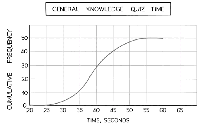
- Join the points with a smooth curve:
- A cumulative frequency graph generally has a stretched-S-shape appearance.
- The graph will never move back towards the x-axis.
- Here is the final cumulative frequency graph for the quiz times.

Question for Cumulative Frequency GraphsTry yourself: What does cumulative frequency mean in a table of grouped data?View Solution
Interpreting Cumulative Frequency Diagrams
How do I use and interpret a cumulative frequency graph?
- A cumulative frequency graph is a useful tool for estimating important statistical values like the median, lower quartile, upper quartile, interquartile range, and percentiles.
- These values are approximations since the original raw data is not known.
- Cumulative frequency graphs are typically employed when dealing with grouped or summarized data. Data points on the graph are connected by a smooth curve, indicating a smooth distribution over each interval.
How do I find the median, lower quartile and upper quartile from a cumulative frequency graph?
- Understanding the number of data values represented by a cumulative frequency graph is crucial.
- This may be explicitly stated in the question or determined by the highest value reached on the frequency (y-) axis of the graph.
- Typically, the highest value is located at the top right of the graph, given the stretched-S shape of cumulative frequency graphs.
Median:
- Step 1: Find the position of the median, which is n/2 for n data values.
- No need to worry about whether nnn is odd or even, nor about using n+1n + 1n+1 as in other methods.
- Step 2: Draw a horizontal line from n/2 on the cumulative frequency axis until it intersects the curve.
- Step 3: Draw a vertical line from the curve down to the horizontal (x-) axis and take a reading. This value represents the median.
Lower Quartile:
- Step 1: Find the position of the lower quartile using n/4.
- Step 2: Draw a horizontal line from n/4 on the cumulative frequency axis until it intersects the curve.
- Step 3: Draw a vertical line from the curve to the horizontal (x-) axis and take a reading. This value represents the lower quartile.
Upper Quartile:
- Step 1: Find the position of the upper quartile using 3n/4.
- Step 2: Draw a horizontal line from 3n/4 on the cumulative frequency axis until it intersects the curve.
- Step 3: Draw a vertical line from the curve to the horizontal (x-) axis and take a reading. This value represents the upper quartile.
How do I find a percentile from a cumulative frequency graph?
- Percentiles divide the data into 100 parts, with each part representing a percentile.
- The 50th percentile is another term for the median.
- The 25th and 75th percentiles correspond to the lower and upper quartiles, respectively.
pth Percentile:
- Step 1: Find the position of the percentile, which for nnn data values is
 .
. - Step 2: Draw a horizontal line from
 on the cumulative frequency axis until it intersects the curve.
 - Step 3: Draw a vertical line from the curve to the horizontal (x-) axis and take a reading. This value represents the pth percentile.
The document Cumulative Frequency Graphs | Mathematics for GCSE/IGCSE - Class 10 is a part of the Class 10 Course Mathematics for GCSE/IGCSE.
All you need of Class 10 at this link: Class 10
|
66 videos|674 docs|19 tests
|
FAQs on Cumulative Frequency Graphs - Mathematics for GCSE/IGCSE - Class 10
| 1. How can cumulative frequency diagrams help in analyzing data? |  |
Ans. Cumulative frequency diagrams provide a visual representation of how data is distributed, making it easier to identify patterns, trends, and outliers in the data set.
| 2. What is the difference between a frequency diagram and a cumulative frequency diagram? |  |
Ans. A frequency diagram shows the frequency of each data point, while a cumulative frequency diagram shows the running total of frequencies up to a certain point in the data set.
| 3. How can you calculate the median from a cumulative frequency diagram? |  |
Ans. To find the median from a cumulative frequency diagram, locate the middle value on the y-axis and then read off the corresponding value on the x-axis. This value represents the median of the data set.
| 4. What does a steep slope in a cumulative frequency diagram indicate? |  |
Ans. A steep slope in a cumulative frequency diagram indicates that there is a large increase in frequency over a short range of values, suggesting that those values occur more frequently in the data set.
| 5. How can cumulative frequency diagrams be used to compare different data sets? |  |
Ans. Cumulative frequency diagrams can be overlaid or compared side by side to visually compare the distribution of frequencies in different data sets, helping to identify similarities and differences between the data sets.
Related Searches


